
Search results for "Forgotten" in Home Design Ideas

 Gravelle Woodworking
The Function of a kitchen should never be forgotten in the design
Stefanie Daugilis Photography
Eat-in kitchen - mid-sized transitional l-shaped medium tone wood floor eat-in kitchen idea in Toronto with an undermount sink, raised-panel cabinets, white cabinets, granite countertops, beige backsplash, stone tile backsplash, paneled appliances and an island
Eat-in kitchen - mid-sized transitional l-shaped medium tone wood floor eat-in kitchen idea in Toronto with an undermount sink, raised-panel cabinets, white cabinets, granite countertops, beige backsplash, stone tile backsplash, paneled appliances and an island
 Drew Designs LLC
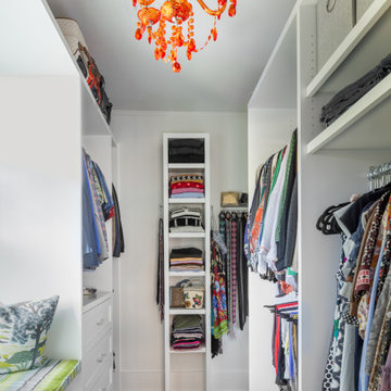
Carefully planned nooks and crannies line every bit of space in this walk-in closet—plus, a bright orange chandelier adds a shock of fun to this oft-forgotten room.
 Samsung Canada
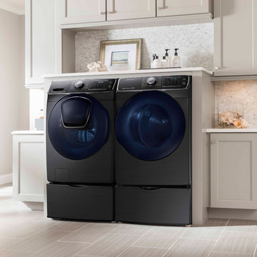
Forgot a sock? The AddWash™ washing machine features a convenient door within door design, allowing you to add to the wash mid-cycle. Just pause the load to add forgotten clothes, extra detergent, or delicate items you want to rinse. Plus, its sleek and streamlined design is a complement to any laundry space.
Find the right local pro for your project

 Casa Josephine
Small tuscan enclosed family room photo in Madrid with blue walls, no fireplace and no tv

 Jay Sifford
Combination of foliage colors, textures and shapes add interest to a previously forgotten space. Photo by Jay Sifford.
Photo of a traditional landscaping in Charlotte.
Photo of a traditional landscaping in Charlotte.

 Classic Coastal
This shed is hardly just a storage unit. Meant to echo the home, no detail was forgotten.
Shed - coastal shed idea in Philadelphia
Shed - coastal shed idea in Philadelphia
 TVL Creative Ltd.
This 1910 West Highlands home was so compartmentalized that you couldn't help to notice you were constantly entering a new room every 8-10 feet. There was also a 500 SF addition put on the back of the home to accommodate a living room, 3/4 bath, laundry room and back foyer - 350 SF of that was for the living room. Needless to say, the house needed to be gutted and replanned.
Kitchen+Dining+Laundry-Like most of these early 1900's homes, the kitchen was not the heartbeat of the home like they are today. This kitchen was tucked away in the back and smaller than any other social rooms in the house. We knocked out the walls of the dining room to expand and created an open floor plan suitable for any type of gathering. As a nod to the history of the home, we used butcherblock for all the countertops and shelving which was accented by tones of brass, dusty blues and light-warm greys. This room had no storage before so creating ample storage and a variety of storage types was a critical ask for the client. One of my favorite details is the blue crown that draws from one end of the space to the other, accenting a ceiling that was otherwise forgotten.
Primary Bath-This did not exist prior to the remodel and the client wanted a more neutral space with strong visual details. We split the walls in half with a datum line that transitions from penny gap molding to the tile in the shower. To provide some more visual drama, we did a chevron tile arrangement on the floor, gridded the shower enclosure for some deep contrast an array of brass and quartz to elevate the finishes.
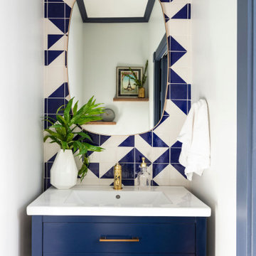
Powder Bath-This is always a fun place to let your vision get out of the box a bit. All the elements were familiar to the space but modernized and more playful. The floor has a wood look tile in a herringbone arrangement, a navy vanity, gold fixtures that are all servants to the star of the room - the blue and white deco wall tile behind the vanity.
Full Bath-This was a quirky little bathroom that you'd always keep the door closed when guests are over. Now we have brought the blue tones into the space and accented it with bronze fixtures and a playful southwestern floor tile.
Living Room & Office-This room was too big for its own good and now serves multiple purposes. We condensed the space to provide a living area for the whole family plus other guests and left enough room to explain the space with floor cushions. The office was a bonus to the project as it provided privacy to a room that otherwise had none before.

 JandB Kitchen Designs
3" FILLER SHOULD ALWAYS HAVE SPICE PULL-OUT ACCESSORY.....NORMALLY MUST BE INSTALLED BETWEEN 2 CABS. BUT USE OF 3/4" END PANEL (BY STOVE) SOLVES PROBLEM.....9" TRAY-DIVIDER CABINET IS ALWAYS VERY USEFUL BUT SO OFTEN FORGOTTEN.....REFR. END PANEL NOT ONLY HIDES UNATTRACTIVE SIDE OF FRIDGE BUT PROVIDES SURFACE FOR GRANITE TO BUTT UP TO.....ELIMINATES OPEN SPACE FOR FOOD TO DROP THROUGH.
 PlantMe Love
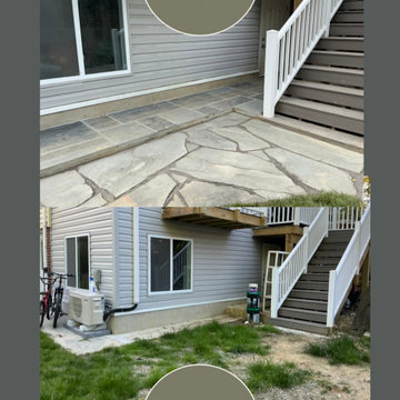
This once patchy, uneven side yard was prone to mud and completely underutilized. We transformed it with clean flagstone hardscaping that not only enhances drainage but creates a beautiful, walkable connection between the lower entrance and the rest of the yard. A simple yet elegant upgrade that brings structure, usability, and curb appeal to this previously forgotten corner.


 Southview Design
Plenty of space around the swimming pool - stamped/colored concrete deck. Outdoor living room with a fireplace construction of modular block and pavers - it's a kit! Plant bed separates the living spaces. And whether it's used as a cozy, dining spot or a shady spot out of the summer sun, the area under the deck is not forgotten.


 Steven Dailey Construction
Another great example of attention to detail. Even the most forgotten of places (window wells) deserve a little attention. These rock window wells provide a much more attractive view out this basement window.

 Home Design & Decor Magazine
Photographer: Dustin Peck Photography
http://www.houzz.com/pro/dpphoto/dustinpeckphotographyinc
Designer: Laura Covington
http://lauracovington.com/
Apr/May 2016
Chancery Place
http://urbanhomemagazine.com/feature/1531

 Metal + Petal
Window seats are a tough space to design. They're such a small forgotten space yet have so much potential for adding the final touch on a great space. Here we layered textured and patterned pillows on custom window seat cushions made from Schumacher's Bagan fabric in Peacock.

 Meridian Homes Inc.
Example of a large transitional dark wood floor staircase design in DC Metro with gray walls

 Kahrs
KahrsThe aged mansard has almost been forgotten and abundant. With interesting internal geometry and the grand focal point of a centrally placed window, the quirky design opportunities were endless.
The idea was to play with the complex geometry of the mansard’s walls, angles and most importantly the sharp ceiling drop. An optical illusion effect of black and white stripes has been adapted to even out sharp angles of the walls, giving the mansard an airy feel.
The mansards balance is maintained by parallel white walls, which offset the optical illusion effect. Oak furnishings and flooring bring the final soft touch to the cool interior of the mansard, adding just enough warmth to make it feel homely again.

 User
UserDesigned by Lynn Casanova of Closet Works
An area for staging important papers that must not be forgotten when leaving for the office, as well as other work priorities, was desired on his side.


 J Malone Designs LLC
Airbnb bathroom with the touches of home complete with a jar of things you may need to borrow that you may have forgotten!
Small trendy master bathroom photo in Raleigh with flat-panel cabinets and black cabinets
Small trendy master bathroom photo in Raleigh with flat-panel cabinets and black cabinets
14