
Search results for "Large tile backsplash" in Home Design Ideas
 Kitchen Design Concepts
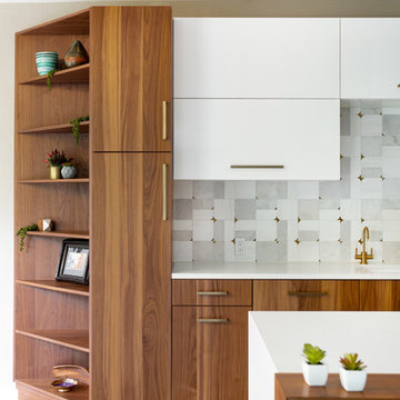
In our world of kitchen design, it’s lovely to see all the varieties of styles come to life. From traditional to modern, and everything in between, we love to design a broad spectrum. Here, we present a two-tone modern kitchen that has used materials in a fresh and eye-catching way. With a mix of finishes, it blends perfectly together to create a space that flows and is the pulsating heart of the home.
With the main cooking island and gorgeous prep wall, the cook has plenty of space to work. The second island is perfect for seating – the three materials interacting seamlessly, we have the main white material covering the cabinets, a short grey table for the kids, and a taller walnut top for adults to sit and stand while sipping some wine! I mean, who wouldn’t want to spend time in this kitchen?!
Cabinetry
With a tuxedo trend look, we used Cabico Elmwood New Haven door style, walnut vertical grain in a natural matte finish. The white cabinets over the sink are the Ventura MDF door in a White Diamond Gloss finish.
Countertops
The white counters on the perimeter and on both islands are from Caesarstone in a Frosty Carrina finish, and the added bar on the second countertop is a custom walnut top (made by the homeowner!) with a shorter seated table made from Caesarstone’s Raw Concrete.
Backsplash
The stone is from Marble Systems from the Mod Glam Collection, Blocks – Glacier honed, in Snow White polished finish, and added Brass.
Fixtures
A Blanco Precis Silgranit Cascade Super Single Bowl Kitchen Sink in White works perfect with the counters. A Waterstone transitional pulldown faucet in New Bronze is complemented by matching water dispenser, soap dispenser, and air switch. The cabinet hardware is from Emtek – their Trinity pulls in brass.
Appliances
The cooktop, oven, steam oven and dishwasher are all from Miele. The dishwashers are paneled with cabinetry material (left/right of the sink) and integrate seamlessly Refrigerator and Freezer columns are from SubZero and we kept the stainless look to break up the walnut some. The microwave is a counter sitting Panasonic with a custom wood trim (made by Cabico) and the vent hood is from Zephyr.
 Aspen Leaf Interiors
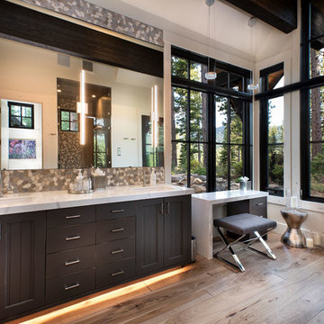
Large mountain style master multicolored tile and pebble tile medium tone wood floor and brown floor bathroom photo in Other with recessed-panel cabinets, dark wood cabinets, white walls, an undermount sink, white countertops and marble countertops
 Inplace Studio
Roland Bishop Photography
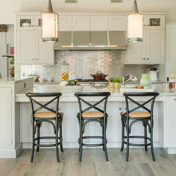
We used Wood-Mode Cabinetry with a custom brushed “warm concrete” finish. The countertops are Sea Pearl quartzite and Haze CaeserStone. The floors are a French white oak custom tinted to just the right shade of gray.
Find the right local pro for your project
 Morey Remodeling Group
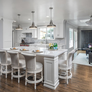
Large elegant galley dark wood floor eat-in kitchen in Long Beach, CA with white cabinets, grey marble backsplash, stainless steel appliances, large cutom-built island, beaded inset cabinets, a farmhouse sink, and solid surface Quarz countertops.
 Design Group Three
Firm: Design Group Three
Designer: Alan Freysinger
Cabinetry: Greenfield Cabinetry
Photography: Jim Tschetter IC360 Images
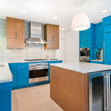
Veteran kitchen designer Alan Freysinger worked closely with the Fox Point, WI homeowners on this kitchen. Admittedly, not afraid of color, the homeowner loved Alan's suggestion of adding the wood veneer to the mix of cabinetry, adding an additional layer of interest and the addition of texture.
Design Group Three, together with custom Greenfield Cabinetry, stepped up the living pleasure of this Fox Point family's home.
When this kitchen remodel was first underway, the homeowner envisioned a blue kitchen (orange was her 2nd choice!). She went to the paint store & found blues she liked, taped those color samples to the kitchen wall & one by one she and her husband whittled down their choices to the color blue you see now!
From Milwaukee to Chicago, clean lines are much desired in today's kitchen designs. Design Group Three hears many requests for Transitionally styled kitchens such as this one.
Want a pop of orange? blue? red? in your kitchen? Milwaukee's Design Group Three can custom match any color in paint (or stain!) for cabinetry in your home, as we did in for this blue kitchen in Fox Point, WI.
Not sure if you are up for this much color in your kitchen? Begin with remodeling a bathroom vanity with a pop of color, live with it for a while & then, if you decide it's for you too, call in Design Group Three & we'll work with you to uncover your perfect color palette.
Can you imagine this same kitchen in orange? This Fox Point, WI homeowners preliminary vision for her kitchen remodel walked the line between orange & blue!
Blue kitchens are completely on trend in today's kitchens!
According to the National Kitchen & Bath Association, Transitionally styled kitchens, such as this blue one, are the most commonly requested design genre. In fact, in 2012, for the first time ever since the NKBA started keeping track, Transitional beat out Traditional as the most requested style by homeowners.
What exactly is affordably luxury? You are witnessing it in these photos. Discover it via Milwaukee's Design Group Three & Greenfield Cabinetry.
Transitional Style (also known as "updated classic", "classic with a contemporary twist", "new takes on old classics") in interior design & furniture design refers to a blend of traditional and contemporary styles, midway between old world traditional & the world of chrome & glass contemporary; incorporating lines which are less ornate than traditional designs, but not as severely basic as contemporary lines. As a result transitional designs are classic, timeless, and clean.
Lucky, lucky kitchen. Greenfield Cabinetry's interpretation of Midwestern Modern.
Seasoned Design Group Three designer & owner, Alan Freysinger's design details take their cues from your lifestyle, as reflected in this transitionally styled kitchen.
"The general color trend is a move toward bolder, crisper colors as a reflection of the 'anything goes' culture we live in now." - Jonathan Adler, Designer
 Stewart Construction
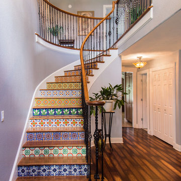
Example of a large tuscan wooden curved staircase design in Tampa with tile risers
 Fireclay Tile
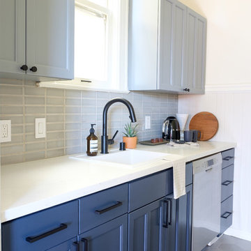
This refreshed kichen by Gina Rachelle Design shows us how a shorter tile backsplash can make a big difference.
Photos by Max Maloney
Small trendy single-wall ceramic tile and gray floor eat-in kitchen photo in San Francisco with an undermount sink, shaker cabinets, blue cabinets, quartz countertops, gray backsplash, ceramic backsplash, stainless steel appliances, no island and white countertops
Small trendy single-wall ceramic tile and gray floor eat-in kitchen photo in San Francisco with an undermount sink, shaker cabinets, blue cabinets, quartz countertops, gray backsplash, ceramic backsplash, stainless steel appliances, no island and white countertops

 Windhill+Co.
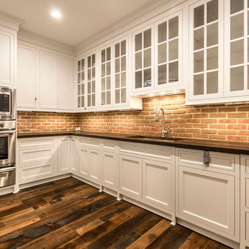
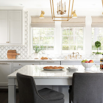
Kitchen cabinets Benjamin Moore light pewter with white trim Ben Moore America's Cup
Backsplash Stone Impressions Oyster on Arctic White
Countertop Tahiti Quartzite
Benjamin Moore Ballet White
 Restructure Studio
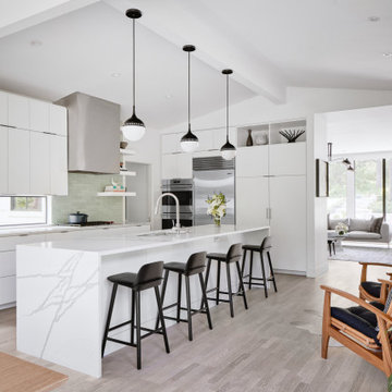
Restructure Studio's Brookhaven Remodel updated the entrance and completely reconfigured the living, dining and kitchen areas, expanding the laundry room and adding a new powder bath. Guests now enter the home into the newly-assigned living space, while an open kitchen occupies the center of the home.
 All Marble Tiles
Carrara Marble Tiles and Bathroom Tiles
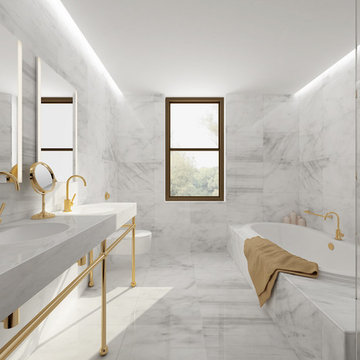
We all love a bathroom backdrop that creates the most serene ambience in which we can soak ourselves after a long day of work. Nothing gives your bathroom that posh look like snow white Carrara marble tiles. It is sold in different textures and density in the market; you have the option of making the selection that suits your style.
There are so many ways to carpet your bathroom with Carrara marble tile. Since the bathroom tiles are non-porous in nature, they cannot soak in water. This makes them perfect to cover your walls with them and provide that warm ambience as you take a shower. Carrara stone does not retain odors as well thus you are perfectly safe using your shampoo or liquid body wash however you want without worrying.
Carrara marble tile bathroom walls offer a perfect white backdrop in which you can add details like silvery faucets, flower vases or candelabras when having romantic moments with your spouse. Because stone can be polished to a glimmer, using Carrara bathroom tiles on the walls reflects light off making the entire room look illuminated and fresh. And the plush white look doesn’t have to end with the walls; your own drop-in tab can also be decorated with Carrara marble tiles to complete the sophisticated hotel-style look.
Marble is also perfect on floors especially when you want to do away with the rugs. Bathroom rugs tend to soak and look ugly on the floor or get dump and give off nauseating odors. Polished Carrara marble is all you do to make the floor neat and shiny. And because they don’t get dump, they maintain their temperatures and feel warm whenever you walk on them.
Installing these tiles is a smooth job and stone can easily be cut using hand-held tile cutters. Laying the tiles yourself also gives you the freedom to try different patterns on the walls and floor. Moreover, you can also try out mosaic formats to achieve a different look but you have to consult someone if you are not sure about mosaics. Make sure you use non-slippery grout sealers so your Carrara bathroom design remains safe even when walking bare foot.
Investing in Carrara marble tiles is a one-time opportunity that will last for as long as possible. There is little maintenance on the stone marble and it cleans up easily and doesn’t corrode either. If you are tired of your current bathroom look, invest in this option for a change.
http://AllMarbleTiles.com
 TKS Design Group
Free ebook, Creating the Ideal Kitchen. DOWNLOAD NOW
This project started out as a kitchen remodel but ended up as so much more. As the original plan started to take shape, some water damage provided the impetus to remodel a small upstairs hall bath. Once this bath was complete, the homeowners enjoyed the result so much that they decided to set aside the kitchen and complete a large master bath remodel. Once that was completed, we started planning for the kitchen!
The original kitchen was just large enough to accommodate an island and a separate pantry but felt a little cramped, especially during the weekends when the couple likes to entertain. The primary goal was to maintain the functionality of the current space, but to add some breathing room as well as to provide a view to the homeowner’s side yard and substantial Hosta garden.
The solution was to bump out the space about 10 feet which provided ample room for large pro appliances, a large island for gathering and an upgraded pantry space. It was important to the homeowners to create a space that felt like it belonged in their historic 1866 home. Details such as matching new trim to the existing large custom profiles in the original home and re-purposing an existing door to be used for the new pantry, provided these touches. A large window at the main sink provides that view into the yard and a beautiful focal point for the room.
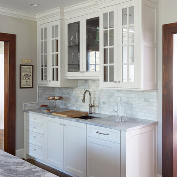
A mix of painted wood and stained cabinetry gives the new kitchen a sense of belonging in the older home, as do the Super White quartzite that has the look of marble, subway tile backsplash, polished nickel lanterns and glass and mirrored doors. The large pantry, filled with custom shelving built to the homeowner’s specifications, stainless steel appliances and the two Galley Workstations – sinks that do double duty as prep space – ensure that not only does the kitchen look great, but also functions in a personalized manner that works perfectly for the occupants.
Doing the bump out also allowed the opportunity for a small mudroom and powder room right off the kitchen as well as re-arranging some openings to allow for better traffic flow throughout the entire first floor. The result is a comfortable up-to-date home that feels both steeped in history yet allows for today’s style of living.
Designed by: Susan Klimala, CKD, CBD
Photography by: Michael Alan Kaskel
For more information on kitchen and bath design ideas go to: www.kitchenstudio-ge.com
 Joy Street Design
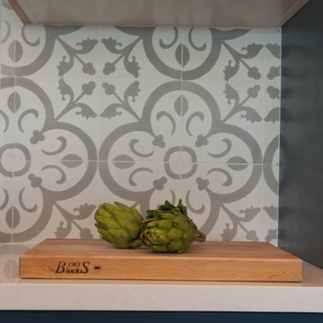
Navy blue kitchen with brass hardware and Moroccan tile backsplash. This kitchen features all new appliances, newly built kitchen island, separate pantry, and wide opening to the family room and dining room.
Designed by Joy Street Design serving Oakland, Berkeley, San Francisco, and the whole of the East Bay.
For more about Joy Street Design, click here: https://www.joystreetdesign.com/
To learn more about this project, click here: https://www.joystreetdesign.com/portfolio/don-jose-drive
 Fireclay Tile
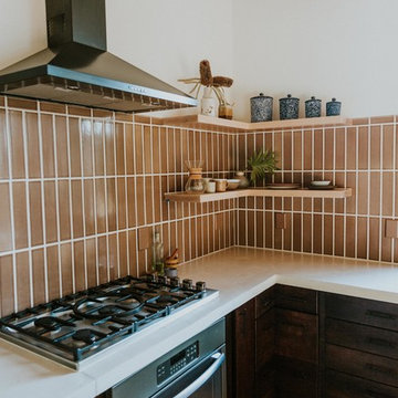
Fireclay's handmade brown kitchen tiles in a toasty Nutmeg glaze offer an earthy anchor for this eclectic kitchen. Sample neutral kitchen tiles at FireclayTIle.com
FIRECLAY TILE SHOWN
3x12 Tiles in Nutmeg
2x6 Tile Trim in Nutmeg
DESIGN
Tanya Val + Carson Baldiviez
PHOTOS
Tanya Val + Carson Baldiviez

 Twelve Stones Designs, LLC
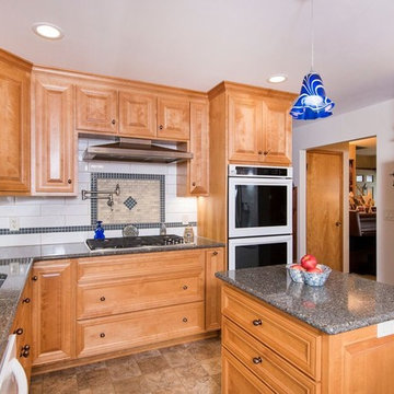
The owners of this kitchen had spent the money to upgrade the finishes in their kitchen upon building the home 12 years ago, but after living in the space for several years they realized how nonfunctional the layout really was. The (then) two preschool aged children had grown into busy, hungry teenagers with many friends who also liked to hang out at the house. So the family needed a more functional kitchen with better traffic flow, space for daily activities revolving around the kitchen at different times of day, and a kitchen that could accommodate cooking for and serving large groups. Furthermore, the dark, traditional finishes no longer reflected the homeowners’ style. They requested a brighter, more relaxed, coastal style that reflected their love of the seaside cities they like to visit.
Originally, the kitchen was U-shaped with a narrow island in the middle. The island created narrow aisles that bottle-necked at the dishwasher, refrigerator, and cooktop areas. There was a pass-through from the foyer into the kitchen, but the owners never liked that the pass-through was also located so close to the powder room. The awkward proximity was unappealing and made guests feel uncomfortable.
The kitchen’s storage was made up of lots of narrow cabinets, apothecary drawers, clipped corner units, and very few drawers. It lacked useful storage for the larger items the family used on a daily basis. And the kitchen’s only pantry was small closet that had only builder-grade, narrow shelving with no illumination to be able to see the contents inside.
Overall, the kitchen’s lighting plan was poorly executed. Only six recessed cans illuminated the entire kitchen and nook areas. The under cabinet lighting was not evenly distributed either. In fact, the builder had mis-placed the under cabinet lighting around the decorative pilasters which made for choppy, dark cubbies. Further, the builder didn’t include any lighting over the sink or the bar area, which meant whoever was doing the dishes was always in their own shadow. That, coupled with the steep overhang of the game room above made the bar area feel like a dim, cavernous space that wasn’t inviting or task oriented. The kitchen looked out into the main living space, but the raised bar and a narrow wall (which held the only large cabinet in the kitchen) created more of a barrier than a relationship to the living room or breakfast nook. In fact, one couldn’t even see the breakfast nook from the cooktop or sink areas due to its orientation. The raised bar top was too narrow to comfortably sit to either dine at or chat from due to the lack of knee space. The the homeowners confided that the kitchen felt more like a dark, dirty prison than place where the family, or their guests, wanted to gather and commune.
The clients' needs and desires were:
➢ to create a kitchen that would be a space the family loved to be in; to relate to the adjacent spaces all around, and to have better flow for entertaining large groups
➢ to remove the walls between the breakfast nook and living area and to be able to utilize the natural light from the windows in both those areas
➢ to incorporate a functional chopping block for prepping fresh food for home cooked meals, an island with a large sink and drain board, 2 pull out trash cans, and seating for at least the 2 teens to eat or do homework
➢ to design a kitchen and breakfast nook with an airy, coastal, relaxed vibe that blended with the rest of the house's coastal theme
➢ to integrate a layered lighting plan which would include ample general illumination, specific task lighting, decorative lighting, and lots of illuminated storage
➢ to design a kitchen with not only more storage for all the husband’s kitchen gadgets and collection of oils and spices, but smart storage, including a coffee/breakfast bar and a place to store and conceal the toaster oven and microwave
➢ to find a way to utilize the large open space between the kitchen, pantry area, and breakfast nook
Twelve Stones Designs achieved the owner's goals by:
➢ removing the walls between the kitchen and living room to allow the natural light to filter in from the adjacent rooms and to create a connection between the kitchen, nook, and living spaces for a sense of unity and communion
➢ removing the existing pantry and designing 3 large pantry style cabinets with LED tape lights and rollout drawers to house lots of kitchen appliances, gadgets, and tons of groceries. We also took the cabinets all the way up to the 9’ ceiling for additional storage for seasonal items and bulk storage.
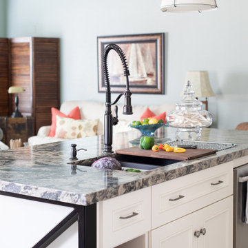
➢ designing 2 islands - 1 with a gorgeous black walnut chopping block that houses a drawer for chopping and carving knives and a custom double pull out trash unit for point of use utilization - and 1 that houses the dishwasher, a large Blanco Gourmet sink with integrated drain board, woven baskets for fresh root vegetables and kitchen towels, plenty of drawer storage for kitchen items, and bar seating for up to 4 diners.
➢ closing off the space between the kitchen and the powder room to create a beautiful new private alcove for the powder room as well as adding some decorative storage. This also gave us space to include more tall storage near the new range for precision placement of the husband’s extensive oil and spice collection as well as a location for a combo-steam oven the wife wanted for baking and cooking healthy meals.
The project is enhanced functionally by:
➢ incorporated USB and standard receptacles for the kids’ laptops and phone charging in the large island
➢ designing the small island to include additional open shelving for items used on a daily basis such as a variety of bowls, plates, and colanders. This set up also works well for the husband who prefers to “plate” his dinners in restaurant-style fashion before presenting them to the table.
➢ the integration of specific storage units, such as double stacked cutlery drawers, a custom spice pull-out, a Kuerig coffee and tea pod drawer, and custom double stacked utensil drawers
➢ moving the refrigerator to the old oven location - this eliminated the bottle neck as well as created a better relationship to the eating table. It also utilizes the floor space between the pantry, nook, and kitchen
➢ creating a banquet style breakfast nook - this banquette seating not only doubles the amount of seating for large gatherings but it better utilizes the odd space between the kitchen and the previous nook area. It also helps to create a distinct pathway from the mudroom room through the pantry area, kitchen, nook, and living room.
➢ the coffee/breakfast bar area which includes the perfect location for the concealed microwave and toaster oven, convenient storage for the coffee pods and tea accoutrements. Roll-out drawers below also house the smoothie maker, hot water kettle, and a plethora of smoothie-making ingredients such as protein powders, smoothie additives, etc. Furthermore, the drawers below the Keurig house measuring utensil, cutlery, baking supplies and tupperware storage.
➢ incorporating lots of wide drawers and pullouts to accommodate large cookware.
➢ utilizing as much vertical space as possible by building storage to the ceiling which accommodates the family’s abundant amount of serving platters, baking sheets, bakeware, casserole dishes, and additional cutting boards.
The project is enhanced aesthetically by:
➢ new 5-piece Versailles pattern porcelain tile that now seamlessly joins the entire down stairs area together creating a bright, cohesiveness feeling instead of choppy separated spaces - it also adds a coastal feeling
➢ designing a cabinet to conceal the microwave and toaster oven
➢ the coastal influenced light fixtures over the nook table and island
➢ the sandy colors of the Langdon Cambria countertops. The swirling pattern and sparkling quartz pieces remind the homeowner of black-and-tan sandy beaches
➢ the striped banquet seating whose creamy white background and blue-green stripes were the inspiration for the cabinet and wall colors.
➢ All the interior doors were painted black to coordinate with the blacks and grays in the backsplash tile and countertop. This also adds a hint of tailored formality to an otherwise casual space.
➢ the use of WAC's Oculux small aperture LED units for the overhead lighting complimented with Diode LED strips for task lighting under the cabinets and inside the pantry and glass wall cabinets. All of the lighting applications are on separate dimmer switches.
Innovative uses of materials or construction methods by Realty Restoration LLC:
➢ Each 1-1/2” x 3” block of reclaimed end-grain black walnut that makes up the center island chopping block was hand milled and built in the shop. It was designed to look substantial and proportional to the surrounding elements, executed by creating the 4 inch tall top with a solid wood chamfered edge band.
➢ The metal doors on either side of the vent hood were also custom designed for this project and built in the Realty Restoration LLC shop. They are made 1x2, 11-gauge mild steel with ribbed glass. Weighing 60 lbs a piece, heavy duty cabinet hinges were added to support the weight of the door and keep them from sagging.
➢ Under-cabinet receptacles were added along the range wall in order to have a clean, uninterrupted backsplash.
Design obstacles to overcome:
➢ Because we were removing the demising walls between the kitchen and living room, we had to find a way to plumb and vent the new island. We did this by tunneling through the slab (the slab had post tension cables which prevented us from just trenching) to run a new wet vent through a nearby structural wall. We pulled the existing hot and cold lines between upper floor joists and ran them down the structural wall as well and up through a conduit in the tunnel.
➢ Since we were converting from wall overs to a gas range it allowed us to utilize the 220 feed for the wall ovens to provide a new sub panel for all the new kitchen circuits
➢ Due to framing deficiencies inherited from the original build there was a 1-1/2” differential in the floor-to-ceiling height over a 20 foot span; by utilizing the process of cutting and furring coupled with the crown moulding details on the cabinet elevations we were able to mask the problem and provide seamless transitions between the cabinet components.
Evidence of superior craftsmanship:
➢ uniquely designed, one-of-a-kind metal “X” end panels on the large island. The end panels were custom made in the Realty Restoration LLC shop and fitted to the exact dimensions of the island. The welding seams are completely indistinguishable - the posts look like they are cut from a single sheet of metal
➢ square metal posts on the small island were also custom made and designed to compliment and carry through the metal element s throughout the kitchen
➢ the beautiful, oversized end panels on the pantry cabinets which give the breakfast nook a tailored look
➢ integrating a large format 5 piece Versailles tile pattern to seamlessly flow from the existing spaces into the new kitchen space
➢ By constructing a custom cabinet that jogged around a corner we could not remodel (housing the entry way coat closet) we were able to camouflage the adjacent wall offset within the upper and lower cabinets. By designing around the existing jog in the structural walls we accomplished a few things: we were able to find the space to house, and hide, the microwave and toaster oven yet still have a clean cohesive appearance from the kitchen side. Additionally, the owners were able to keep their much needed coat closet and we didn’t have to increase the budget with unnecessary structural work.
 Northland Design & Build
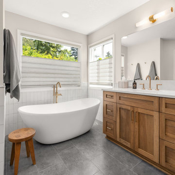
The room's centerpiece is a sleek freestanding oval bathtub with a stylish floor-mounted brass tub filler, which adds a touch of sophistication and warmth. The tile surrounding the tub is laid vertically, offering a fresh take on a classic pattern and drawing the eye upward. Across the room, a warm wood double vanity provides ample storage with a mix of cabinets and drawers, complementing the natural light that fills the space. Above the vanity, a simple brass light fixture and a large, frameless mirror complete the modern aesthetic. The floor is a large-format gray tile, which provides a neutral and grounding foundation for the space.
 Anthony Wilder Design/Build, Inc.
Morgan Howarth
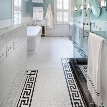
Example of a mid-sized classic master multicolored tile and mosaic tile bathroom design in DC Metro with a console sink, recessed-panel cabinets, white cabinets, a two-piece toilet and green walls
Example of a mid-sized classic master multicolored tile and mosaic tile bathroom design in DC Metro with a console sink, recessed-panel cabinets, white cabinets, a two-piece toilet and green walls
 Plain & Posh
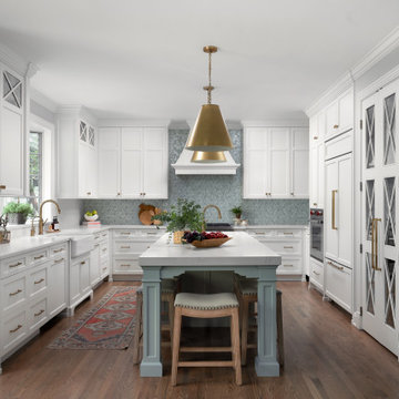
This young family wanted to update their kitchen and loved getting away to the coast. We tried to bring a little of the coast to their suburban Chicago home. The statement pantry doors with antique mirror add a wonderful element to the space. The large island gives the family a wonderful space to hang out, The custom "hutch' area is actual full of hidden outlets to allow for all of the electronics a place to charge.
Warm brass details and the stunning tile complete the area.

 Studio G+S Architects
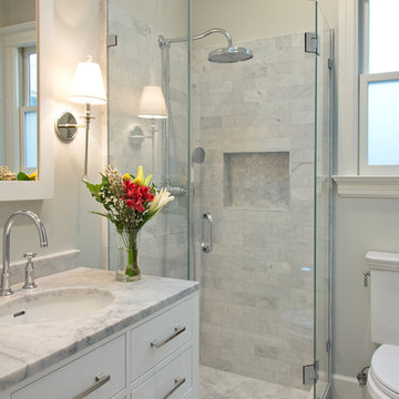
5'6" × 7'-0" room with Restoration Hardware "Hutton" vanity (36"w x 24"d) and "Hutton" mirror, sconces by Waterworks "Newel", shower size 36" x 36" with 22" door, HansGrohe "Axor Montreux" shower set. Wall paint is "pearl white" by Pratt & Lambert and wood trim is "white dove" eggshell from Benjamin Moore. Wall tiles are 3"x6" honed, carrara marble with inset hexagonals for the niche. Coved ceiling - walls are curved into a flat ceiling.
 White Birch Design
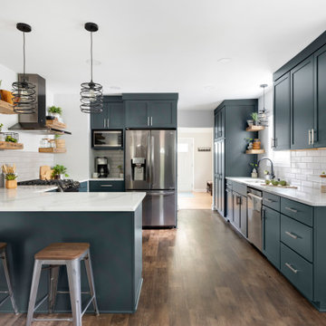
When the clients for this 1940's Minneapolis home came to us with their kitchen, they wanted to really make a kitchen they could be proud to come home to and entertain friends and family. With a Scandinavian focus in mind, we played with a number of different elements to bring the whole design together. The cabinets are painted a blue/gray color and the tops are a marble-like quartz. The backsplash is a simple, yet elegant, gray elongated subway tile that tucks up right under the floating shelves and upper cabinets. The floors are a wood-looking luxury vinyl plank. Finally the open shelves are made of reclaimed barn wood sourced from Minnesota. One of the focuses in this kitchen was to create a space for coffee. The coffee nook was specifically designed to accommodate the specific coffee maker the homeowners selected. Overall, we are completely in love with this look and how beautiful it turned out!
 JRP Design & Remodel
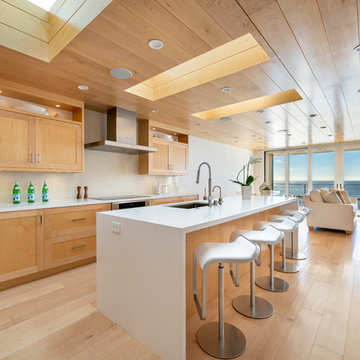
Our clients are seasoned home renovators. Their Malibu oceanside property was the second project JRP had undertaken for them. After years of renting and the age of the home, it was becoming prevalent the waterfront beach house, needed a facelift. Our clients expressed their desire for a clean and contemporary aesthetic with the need for more functionality. After a thorough design process, a new spatial plan was essential to meet the couple’s request. This included developing a larger master suite, a grander kitchen with seating at an island, natural light, and a warm, comfortable feel to blend with the coastal setting.
Demolition revealed an unfortunate surprise on the second level of the home: Settlement and subpar construction had allowed the hillside to slide and cover structural framing members causing dangerous living conditions. Our design team was now faced with the challenge of creating a fix for the sagging hillside. After thorough evaluation of site conditions and careful planning, a new 10’ high retaining wall was contrived to be strategically placed into the hillside to prevent any future movements.
With the wall design and build completed — additional square footage allowed for a new laundry room, a walk-in closet at the master suite. Once small and tucked away, the kitchen now boasts a golden warmth of natural maple cabinetry complimented by a striking center island complete with white quartz countertops and stunning waterfall edge details. The open floor plan encourages entertaining with an organic flow between the kitchen, dining, and living rooms. New skylights flood the space with natural light, creating a tranquil seaside ambiance. New custom maple flooring and ceiling paneling finish out the first floor.
Downstairs, the ocean facing Master Suite is luminous with breathtaking views and an enviable bathroom oasis. The master bath is modern and serene, woodgrain tile flooring and stunning onyx mosaic tile channel the golden sandy Malibu beaches. The minimalist bathroom includes a generous walk-in closet, his & her sinks, a spacious steam shower, and a luxurious soaking tub. Defined by an airy and spacious floor plan, clean lines, natural light, and endless ocean views, this home is the perfect rendition of a contemporary coastal sanctuary.
PROJECT DETAILS:
• Style: Contemporary
• Colors: White, Beige, Yellow Hues
• Countertops: White Ceasarstone Quartz
• Cabinets: Bellmont Natural finish maple; Shaker style
• Hardware/Plumbing Fixture Finish: Polished Chrome
• Lighting Fixtures: Pendent lighting in Master bedroom, all else recessed
• Flooring:
Hardwood - Natural Maple
Tile – Ann Sacks, Porcelain in Yellow Birch
• Tile/Backsplash: Glass mosaic in kitchen
• Other Details: Bellevue Stand Alone Tub
Photographer: Andrew, Open House VC
109