
Search results for "Like new condition" in Home Design Ideas
 Klopf Architecture
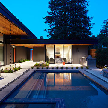
Klopf Architecture, Arterra Landscape Architects and Henry Calvert of Calvert Ventures Designed and built a new warm, modern, Eichler-inspired, open, indoor-outdoor home on a deeper-than-usual San Mateo Highlands property where an original Eichler house had burned to the ground.
The owners wanted multi-generational living and larger spaces than the original home offered, but all parties agreed that the house should respect the neighborhood and blend in stylistically with the other Eichlers. At first the Klopf team considered re-using what little was left of the original home and expanding on it. But after discussions with the owner and builder, all parties agreed that the last few remaining elements of the house were not practical to re-use, so Klopf Architecture designed a new home that pushes the Eichler approach in new directions.
One disadvantage of Eichler production homes is that the house designs were not optimized for each specific lot. A new custom home offered the team a chance to start over. In this case, a longer house that opens up sideways to the south fit the lot better than the original square-ish house that used to open to the rear (west). Accordingly, the Klopf team designed an L-shaped “bar” house with a large glass wall with large sliding glass doors that faces sideways instead of to the rear like a typical Eichler. This glass wall opens to a pool and landscaped yard designed by Arterra Landscape Architects.
Driving by the house, one might assume at first glance it is an Eichler because of the horizontality, the overhanging flat roof eaves, the dark gray vertical siding, and orange solid panel front door, but the house is designed for the 21st Century and is not meant to be a “Likeler.” You won't see any posts and beams in this home. Instead, the ceiling decking is a western red cedar that covers over all the beams. Like Eichlers, this cedar runs continuously from inside to out, enhancing the indoor / outdoor feeling of the house, but unlike Eichlers it conceals a cavity for lighting, wiring, and insulation. Ceilings are higher, rooms are larger and more open, the master bathroom is light-filled and more generous, with a separate tub and shower and a separate toilet compartment, and there is plenty of storage. The garage even easily fits two of today's vehicles with room to spare.
A massive 49-foot by 12-foot wall of glass and the continuity of materials from inside to outside enhance the inside-outside living concept, so the owners and their guests can flow freely from house to pool deck to BBQ to pool and back.
During construction in the rough framing stage, Klopf thought the front of the house appeared too tall even though the house had looked right in the design renderings (probably because the house is uphill from the street). So Klopf Architecture paid the framer to change the roofline from how we had designed it to be lower along the front, allowing the home to blend in better with the neighborhood. One project goal was for people driving up the street to pass the home without immediately noticing there is an "imposter" on this lot, and making that change was essential to achieve that goal.
This 2,606 square foot, 3 bedroom, 3 bathroom Eichler-inspired new house is located in San Mateo in the heart of the Silicon Valley.
Klopf Architecture Project Team: John Klopf, AIA, Klara Kevane
Landscape Architect: Arterra Landscape Architects
Contractor: Henry Calvert of Calvert Ventures
Photography ©2016 Mariko Reed
Location: San Mateo, CA
Year completed: 2016

 Tamara Rosenbloom Design LLC
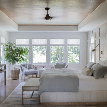
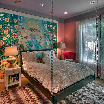
My clients had outgrown their builder’s basic home and had plenty of room to expand on their 10 acres. Working with a local architect and a talented contractor, we designed an addition to create 3 new bedrooms, a bathroom scaled for all 3 girls, a playroom and a master retreat including 3 fireplaces, sauna, steam shower, office or “creative room”, and large bedroom with folding glass wall to capitalize on their view. The master suite, gym, pool and tennis courts are still under construction, but the girls’ suite and living room space are complete and dust free. Each child’s room was designed around their preference of color scheme and each girl has a unique feature that makes their room truly their own. The oldest daughter has a secret passage hidden behind what looks like built in cabinetry. The youngest daughter wanted to “swing”, so we outfitted her with a hanging bed set in front of a custom mural created by a Spanish artist. The middle daughter is an elite gymnast, so we added monkey bars so she can cruise her room in style. The girls’ bathroom suite has 3 identical “stations” with abundant storage. Cabinetry in black walnut and peacock blue and white quartz counters with white marble backsplash are durable and beautiful. Two shower stalls, designed with a colorful and intricate tile design, prevent bathroom wait times and a custom wall mural brings a little of the outdoors in.
Photos by Mike Martin www.martinvisualtours.com
Find the right local pro for your project
 National Association of the Remodeling Industry
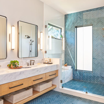
This West Austin couple was halfway through a re-design on their home when their dream house popped up for sale. Without hesitation they bought it and a new project was hatched. While the new house was in better shape, it needed several improvements including a new primary bathroom. Now this contemporary spa-like retreat features a vanity with a floating cabinet with large storage drawers, basket storage and a thick marble countertop, black mirrors and hardware. Accent tile runs from the floor up the shower wall. Set in a herringbone pattern, the tile adds color, texture and is the focal point of the room.
 Advance Design Studio, Ltd.
Jennifer and Dan have lived in their Deer Park Illinois home for 15 years, slowly making minor fixes like painting and decorating; but they had a new plan for their kitchen the entire time. An awkwardly placed garage door, and an island cooktop with a terrible downdraft made a full-scale kitchen remodel an absolute must. Jennifer had many ideas in mind and wanted to work with a company that could provide high-end work, while partnering with a designer that would tailor the kitchen to her ideas.
She was intrigued by the phrase “Common Sense Remodeling” in Advance Design’s feature she discovered while perusing an issue of the community’s Quintessential Barrington Magazine. Doing further research on the company’s website, as she looked through project profiles and read about Advance Design’s “Common Sense Remodeling” philosophy, she promptly scheduled an appointment to see if the people and ideas she read about were truly who they said they were. The more she read, the more she knew that the “Common Sense” approach to remodeling they described was exactly the type of company she was looking for.
The partnership was sealed after an initial consultation with Owner Todd Jurs and Project Designer Michelle Lecinski. They displayed a combination of friendliness, professionalism and respect that was unmatched by any of the other companies Jennifer talked to. She knew that with Advance Design, she would be able to retain the vision that she had in mind with high-quality craftsmanship.
“I reached out to Advance Design because of the ‘Common Sense Remodeling’ tagline,” Jennifer said. “That’s what lingered for me”. “Advance Design was the most respectful- of the house and of my design ideas, and the most professional of the handful of companies that looked at my project”.
Soon after the meeting Jennifer began working with Michelle on the project design. They quickly developed chemistry. Jennifer loved how Michelle researched and located every detail that Jennifer wanted for the kitchen. Between the two of them, every concept and idea was worked through and perfected. “Jennifer had definite ideas about what she wanted the new kitchen to look like, she just didn’t know how to bring it all together. We worked together really well to make her ideas into the practical reality necessary for a well-functioning kitchen, with the look and feel that she had envisioned”, says Michelle.
“Michelle was wonderful in using the CAD system she would show me new drawings every time we changed the layout while working through the design,” Jennifer said. “She was a really wonderful partner in execution, she made sure everything happened quickly and easily.”
The finished design drew out elements of Jennifer’s style and personality. The pair call the look “sophisticated farmhouse” to describe the kitchen renovation to family and friends. The result was a beautifully crafted, authentic-feeling space that satisfied Jennifer’s dreams 15 years in the making. The whole project consisted of a kitchen remodel, mudroom upgrade with powder room, and garage entry relocation. “The projects I personally like the best, are the ones that put the client’s dreams on display,” Project Designer Michelle said. “And this is one of those projects.”
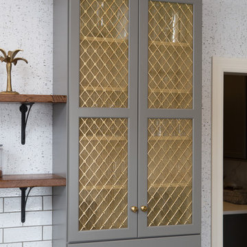
The main focal point of the kitchen is custom zinc and brass ventilation hood with a vintage sheen, which was hand made to order by a small company in Indiana named Vogler Metalworking. “It’s like sculpture, a true work of art”, says Jennifer. Your eye is immediately drawn towards this elegant yet practical hood that eliminated the home’s downdraft problem and added a striking conversation piece at the same time. The carpenters had to use special gloves when transporting and installing it, so they didn’t smudge it with fingerprints. The beautiful hood centers proudly over the stunning black enamel and brass LaCornue Range. “I had a friend who had a LaCornue range and after learning how easy it was to cook perfect meals, I was convinced I wanted to have one”, says Jennifer. This unique, breathtaking combination anchors the entire kitchen and is apparent immediately as you walk into the great room the surrounds the space.
DuraSupreme Crestwood cabinets with a Kendall Panel add function and sophistication. A custom gray paint color paired with a storm blue was developed so that the new kitchen looked like it belonged to the existing space. Unlacquered brass faucets and hardware were important to Jennifer because she wanted the living finishes to age over time. Remarkable brass diamond mesh cabinet door inserts imported from the UK continue to add this one-of-a-kind kitchen renovation; giving it a “you won’t see this everywhere” quality. The use of old railcar flooring for the coffee bar countertop and reclaimed oak for the open shelving gives an authenticity to the space uncommon in kitchens today.
Jennifer and Michelle fell in love with the Limestone Grey Stone while they were investigating unique island countertop ideas. They liked the fact that the limestone as a living finish will age and change over time. Calcutta Miel Quartz countertops made for an excellent pairing around the perimeter, as it’s durable and perfect for cooking preparations. A textured white subway tile backsplash that runs to the ceiling keeps your eye moving towards the open shelving, and to the main focal point of the stunning range hood combination.
“The kitchen functions beautifully, and it’s gorgeous,” beams Jennifer as she gestures with both hands while smiling ear to ear. “The most important thing was I wanted a kitchen that had a wonderful flow, cooked beautiful meals and was a great gathering place for family and friends, and this space does that perfectly! Beauty wise, it turned out exactly how I had envisioned. I felt the function part was the hardest part, and that was nailed”!
Relocating the garage entry to the new mudroom was a huge priority and has finally separated the family’s arriving home functions from their kitchen. Now coats and shoes and bags have their own area for dropping once members arrive home. Matching gray DuraSupreme cabinetry helped create gorgeous, purposeful lockers for the family. A reclaimed vintage sink and custom wall paper were added to the tiny powder room to beautify the once previously only functional space. Advance Design was even able to create a custom space for their dog to sleep while the family is away.
“It was unbelievable that a project of this size was completed in such a short time, and I think that’s because of the large amount of planning and preparation that went into it,” Jennifer marveled, “When we started, we were ready, and everything was prepared”.
When it came to execution, Project Manager Justin Davis and his crew were quick, accessible, and organized. Projects like this kitchen are typically completed in as little as 8-10 weeks. Jennifer’s kitchen however despite the relocation of some challenging HVAC in a soffit and moving of an exterior door was completed remarkably fast in part because the team was working with an existing tile floor that ran throughout the first floor that the client really loved.
“You get to know these people really well because they’re living in your house while you’re living in your house. They were so fast and really good, it didn’t take as long as even planned” reported Jennifer. “I would text Justin and he always responded almost immediately. I got to know all the guys who were working in our house and they were all wonderful people”.
Details in a customized kitchen like this one require skill and care from the people who install it. “All the guys on the job were skilled at what the did. I wanted small details like little feet to look like furniture, that is where their carpentry skill came in to make these all perfect”, said Jennifer. “The tile guys were wonderful. They even let me determine how I wanted the texture with the grout to appear for a salt and pepper look; now that is a very skilled trade person making it custom”.
In Jennifer’s interview, she continued to reference Advance Design’s “Common Sense Remodeling”, so I took a minute to ask her exactly what that phrase meant to her and how it played out in her experience with her project and the Advance Design team. Here is what she said: “I was intrigued about Common Sense Remodeling and in my head that there would be clear costs and prices, great communication between the design team, the execution team and me”, said Jennifer. They did deliver on that, it was so clear about the cost breakdown, what I could expect from everyone who came to my house, and everything that we had ordered. That to me is the Common Sense”!
It’s great to see a client take literally our assertion that a well-planned remodeling project is simply “Common Sense”! She anticipated each step of the way would be clear, concise, and predictable, all the while protecting the outcome due to the careful upfront planning. “Advance Design delivered on their ‘Common Sense Remodeling’ promise,” Jennifer said. “From the design team, to the execution team - everything was straight forward like I imagined. The project turned out exactly how I envisioned, I enjoyed this process and absolutely would recommend Advance Design Studio to anyone.”
 emma delon
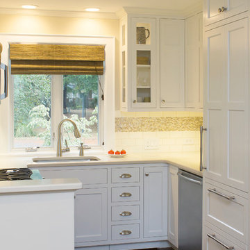
Maximizing the functionality of this space, and coordinating the new kitchen with the beautiful remodel completed previously by the client were the two most important aspects of this project. The existing spaces are elegantly decorated with an open plan, dark hardwood floors, and natural stone accents. The new, lighter, more open kitchen flows beautifully into the client’s existing dining room space. Satin nickel hardware blends with the stainless steel appliances and matches the satin nickel details throughout the home. The fully integrated refrigerator next to the narrow pull-out pantry cabinet, take up less visual weight than a traditional stainless steel appliance and the two combine to provide fantastic storage. The glass cabinet doors and decorative lighting beautifully highlight the client’s glassware and dishes. Finished with white subway tile, Dreamy Marfil quartz countertops, and a warm natural wood blind; the space warm, inviting, elegant, and extremely functional.
copyright 2013 marilyn peryer photography
 Castle Building & Remodeling
This growing family needed more living space in their 1926 St. Paul, MN Bungalow, and had great potential in their unfinished attic for a new master suite.
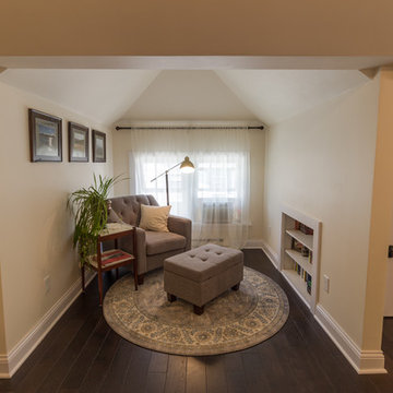
Castle began working with the city to grandfather some existing conditions in, like the steeper stairs and lower ceiling height to comply with building codes. New insulation, interior walls, electrical, heating, and a full interior finish was planned. The finished space incorporates traditional millwork matching the lower level of the home, a custom built-in bookshelf, new white doors, and pre-finished white oak hardwood floors in a rich Licorice stain. The dark floors and oil-bronze accents throughout the space really anchors the room and completes an overall bright color pallet with high contrast.
In the new bathroom, a cement tile floor was selected to tie in the homeowner’s classy flair. Switching the finishes to polished brass inside the bathroom really brings a lux and regal feel to the space. Paired with traditional subway tile, white vanity, refurbished vintage medicine cabinet, and neutral walls, the new bathroom is elegant, yet understated. One of our favorite features is the use of the two existing dormers. One dormer was converted into a new walk-in closet with custom glass closet doors, so the light can still shine into the bedroom. The 2nd dormer, we left open for a quaint sitting and reading nook.
See full details (including before photos) at http://www.castlebri.com/attics/project-3299-1/
Designed by: Emily Blonigen
Sponsored
Westerville, OH

Custom Home Works
Franklin County's Award-Winning Design, Build and Remodeling Expert
 TKS Design Group
Free ebook, Creating the Ideal Kitchen. DOWNLOAD NOW
The Klimala’s and their three kids are no strangers to moving, this being their fifth house in the same town over the 20-year period they have lived there. “It must be the 7-year itch, because every seven years, we seem to find ourselves antsy for a new project or a new environment. I think part of it is being a designer, I see my own taste evolve and I want my environment to reflect that. Having easy access to wonderful tradesmen and a knowledge of the process makes it that much easier”.
This time, Klimala’s fell in love with a somewhat unlikely candidate. The 1950’s ranch turned cape cod was a bit of a mutt, but it’s location 5 minutes from their design studio and backing up to the high school where their kids can roll out of bed and walk to school, coupled with the charm of its location on a private road and lush landscaping made it an appealing choice for them.
“The bones of the house were really charming. It was typical 1,500 square foot ranch that at some point someone added a second floor to. Its sloped roofline and dormered bedrooms gave it some charm.” With the help of architect Maureen McHugh, Klimala’s gutted and reworked the layout to make the house work for them. An open concept kitchen and dining room allows for more frequent casual family dinners and dinner parties that linger. A dingy 3-season room off the back of the original house was insulated, given a vaulted ceiling with skylights and now opens up to the kitchen. This room now houses an 8’ raw edge white oak dining table and functions as an informal dining room. “One of the challenges with these mid-century homes is the 8’ ceilings. I had to have at least one room that had a higher ceiling so that’s how we did it” states Klimala.
The kitchen features a 10’ island which houses a 5’0” Galley Sink. The Galley features two faucets, and double tiered rail system to which accessories such as cutting boards and stainless steel bowls can be added for ease of cooking. Across from the large sink is an induction cooktop. “My two teen daughters and I enjoy cooking, and the Galley and induction cooktop make it so easy.” A wall of tall cabinets features a full size refrigerator, freezer, double oven and built in coffeemaker. The area on the opposite end of the kitchen features a pantry with mirrored glass doors and a beverage center below.
The rest of the first floor features an entry way, a living room with views to the front yard’s lush landscaping, a family room where the family hangs out to watch TV, a back entry from the garage with a laundry room and mudroom area, one of the home’s four bedrooms and a full bath. There is a double sided fireplace between the family room and living room. The home features pops of color from the living room’s peach grass cloth to purple painted wall in the family room. “I’m definitely a traditionalist at heart but because of the home’s Midcentury roots, I wanted to incorporate some of those elements into the furniture, lighting and accessories which also ended up being really fun. We are not formal people so I wanted a house that my kids would enjoy, have their friends over and feel comfortable.”
The second floor houses the master bedroom suite, two of the kids’ bedrooms and a back room nicknamed “the library” because it has turned into a quiet get away area where the girls can study or take a break from the rest of the family. The area was originally unfinished attic, and because the home was short on closet space, this Jack and Jill area off the girls’ bedrooms houses two large walk-in closets and a small sitting area with a makeup vanity. “The girls really wanted to keep the exposed brick of the fireplace that runs up the through the space, so that’s what we did, and I think they feel like they are in their own little loft space in the city when they are up there” says Klimala.
Designed by: Susan Klimala, CKD, CBD
Photography by: Carlos Vergara
For more information on kitchen and bath design ideas go to: www.kitchenstudio-ge.com

 Twelve Stones Designs, LLC
The owners of this kitchen had spent the money to upgrade the finishes in their kitchen upon building the home 12 years ago, but after living in the space for several years they realized how nonfunctional the layout really was. The (then) two preschool aged children had grown into busy, hungry teenagers with many friends who also liked to hang out at the house. So the family needed a more functional kitchen with better traffic flow, space for daily activities revolving around the kitchen at different times of day, and a kitchen that could accommodate cooking for and serving large groups. Furthermore, the dark, traditional finishes no longer reflected the homeowners’ style. They requested a brighter, more relaxed, coastal style that reflected their love of the seaside cities they like to visit.
Originally, the kitchen was U-shaped with a narrow island in the middle. The island created narrow aisles that bottle-necked at the dishwasher, refrigerator, and cooktop areas. There was a pass-through from the foyer into the kitchen, but the owners never liked that the pass-through was also located so close to the powder room. The awkward proximity was unappealing and made guests feel uncomfortable.
The kitchen’s storage was made up of lots of narrow cabinets, apothecary drawers, clipped corner units, and very few drawers. It lacked useful storage for the larger items the family used on a daily basis. And the kitchen’s only pantry was small closet that had only builder-grade, narrow shelving with no illumination to be able to see the contents inside.
Overall, the kitchen’s lighting plan was poorly executed. Only six recessed cans illuminated the entire kitchen and nook areas. The under cabinet lighting was not evenly distributed either. In fact, the builder had mis-placed the under cabinet lighting around the decorative pilasters which made for choppy, dark cubbies. Further, the builder didn’t include any lighting over the sink or the bar area, which meant whoever was doing the dishes was always in their own shadow. That, coupled with the steep overhang of the game room above made the bar area feel like a dim, cavernous space that wasn’t inviting or task oriented. The kitchen looked out into the main living space, but the raised bar and a narrow wall (which held the only large cabinet in the kitchen) created more of a barrier than a relationship to the living room or breakfast nook. In fact, one couldn’t even see the breakfast nook from the cooktop or sink areas due to its orientation. The raised bar top was too narrow to comfortably sit to either dine at or chat from due to the lack of knee space. The the homeowners confided that the kitchen felt more like a dark, dirty prison than place where the family, or their guests, wanted to gather and commune.
The clients' needs and desires were:
➢ to create a kitchen that would be a space the family loved to be in; to relate to the adjacent spaces all around, and to have better flow for entertaining large groups
➢ to remove the walls between the breakfast nook and living area and to be able to utilize the natural light from the windows in both those areas
➢ to incorporate a functional chopping block for prepping fresh food for home cooked meals, an island with a large sink and drain board, 2 pull out trash cans, and seating for at least the 2 teens to eat or do homework
➢ to design a kitchen and breakfast nook with an airy, coastal, relaxed vibe that blended with the rest of the house's coastal theme
➢ to integrate a layered lighting plan which would include ample general illumination, specific task lighting, decorative lighting, and lots of illuminated storage
➢ to design a kitchen with not only more storage for all the husband’s kitchen gadgets and collection of oils and spices, but smart storage, including a coffee/breakfast bar and a place to store and conceal the toaster oven and microwave
➢ to find a way to utilize the large open space between the kitchen, pantry area, and breakfast nook
Twelve Stones Designs achieved the owner's goals by:
➢ removing the walls between the kitchen and living room to allow the natural light to filter in from the adjacent rooms and to create a connection between the kitchen, nook, and living spaces for a sense of unity and communion
➢ removing the existing pantry and designing 3 large pantry style cabinets with LED tape lights and rollout drawers to house lots of kitchen appliances, gadgets, and tons of groceries. We also took the cabinets all the way up to the 9’ ceiling for additional storage for seasonal items and bulk storage.
➢ designing 2 islands - 1 with a gorgeous black walnut chopping block that houses a drawer for chopping and carving knives and a custom double pull out trash unit for point of use utilization - and 1 that houses the dishwasher, a large Blanco Gourmet sink with integrated drain board, woven baskets for fresh root vegetables and kitchen towels, plenty of drawer storage for kitchen items, and bar seating for up to 4 diners.
➢ closing off the space between the kitchen and the powder room to create a beautiful new private alcove for the powder room as well as adding some decorative storage. This also gave us space to include more tall storage near the new range for precision placement of the husband’s extensive oil and spice collection as well as a location for a combo-steam oven the wife wanted for baking and cooking healthy meals.
The project is enhanced functionally by:
➢ incorporated USB and standard receptacles for the kids’ laptops and phone charging in the large island
➢ designing the small island to include additional open shelving for items used on a daily basis such as a variety of bowls, plates, and colanders. This set up also works well for the husband who prefers to “plate” his dinners in restaurant-style fashion before presenting them to the table.
➢ the integration of specific storage units, such as double stacked cutlery drawers, a custom spice pull-out, a Kuerig coffee and tea pod drawer, and custom double stacked utensil drawers
➢ moving the refrigerator to the old oven location - this eliminated the bottle neck as well as created a better relationship to the eating table. It also utilizes the floor space between the pantry, nook, and kitchen
➢ creating a banquet style breakfast nook - this banquette seating not only doubles the amount of seating for large gatherings but it better utilizes the odd space between the kitchen and the previous nook area. It also helps to create a distinct pathway from the mudroom room through the pantry area, kitchen, nook, and living room.
➢ the coffee/breakfast bar area which includes the perfect location for the concealed microwave and toaster oven, convenient storage for the coffee pods and tea accoutrements. Roll-out drawers below also house the smoothie maker, hot water kettle, and a plethora of smoothie-making ingredients such as protein powders, smoothie additives, etc. Furthermore, the drawers below the Keurig house measuring utensil, cutlery, baking supplies and tupperware storage.
➢ incorporating lots of wide drawers and pullouts to accommodate large cookware.
➢ utilizing as much vertical space as possible by building storage to the ceiling which accommodates the family’s abundant amount of serving platters, baking sheets, bakeware, casserole dishes, and additional cutting boards.
The project is enhanced aesthetically by:
➢ new 5-piece Versailles pattern porcelain tile that now seamlessly joins the entire down stairs area together creating a bright, cohesiveness feeling instead of choppy separated spaces - it also adds a coastal feeling
➢ designing a cabinet to conceal the microwave and toaster oven
➢ the coastal influenced light fixtures over the nook table and island
➢ the sandy colors of the Langdon Cambria countertops. The swirling pattern and sparkling quartz pieces remind the homeowner of black-and-tan sandy beaches
➢ the striped banquet seating whose creamy white background and blue-green stripes were the inspiration for the cabinet and wall colors.
➢ All the interior doors were painted black to coordinate with the blacks and grays in the backsplash tile and countertop. This also adds a hint of tailored formality to an otherwise casual space.
➢ the use of WAC's Oculux small aperture LED units for the overhead lighting complimented with Diode LED strips for task lighting under the cabinets and inside the pantry and glass wall cabinets. All of the lighting applications are on separate dimmer switches.
Innovative uses of materials or construction methods by Realty Restoration LLC:
➢ Each 1-1/2” x 3” block of reclaimed end-grain black walnut that makes up the center island chopping block was hand milled and built in the shop. It was designed to look substantial and proportional to the surrounding elements, executed by creating the 4 inch tall top with a solid wood chamfered edge band.
➢ The metal doors on either side of the vent hood were also custom designed for this project and built in the Realty Restoration LLC shop. They are made 1x2, 11-gauge mild steel with ribbed glass. Weighing 60 lbs a piece, heavy duty cabinet hinges were added to support the weight of the door and keep them from sagging.
➢ Under-cabinet receptacles were added along the range wall in order to have a clean, uninterrupted backsplash.
Design obstacles to overcome:
➢ Because we were removing the demising walls between the kitchen and living room, we had to find a way to plumb and vent the new island. We did this by tunneling through the slab (the slab had post tension cables which prevented us from just trenching) to run a new wet vent through a nearby structural wall. We pulled the existing hot and cold lines between upper floor joists and ran them down the structural wall as well and up through a conduit in the tunnel.
➢ Since we were converting from wall overs to a gas range it allowed us to utilize the 220 feed for the wall ovens to provide a new sub panel for all the new kitchen circuits
➢ Due to framing deficiencies inherited from the original build there was a 1-1/2” differential in the floor-to-ceiling height over a 20 foot span; by utilizing the process of cutting and furring coupled with the crown moulding details on the cabinet elevations we were able to mask the problem and provide seamless transitions between the cabinet components.
Evidence of superior craftsmanship:
➢ uniquely designed, one-of-a-kind metal “X” end panels on the large island. The end panels were custom made in the Realty Restoration LLC shop and fitted to the exact dimensions of the island. The welding seams are completely indistinguishable - the posts look like they are cut from a single sheet of metal
➢ square metal posts on the small island were also custom made and designed to compliment and carry through the metal element s throughout the kitchen
➢ the beautiful, oversized end panels on the pantry cabinets which give the breakfast nook a tailored look
➢ integrating a large format 5 piece Versailles tile pattern to seamlessly flow from the existing spaces into the new kitchen space
➢ By constructing a custom cabinet that jogged around a corner we could not remodel (housing the entry way coat closet) we were able to camouflage the adjacent wall offset within the upper and lower cabinets. By designing around the existing jog in the structural walls we accomplished a few things: we were able to find the space to house, and hide, the microwave and toaster oven yet still have a clean cohesive appearance from the kitchen side. Additionally, the owners were able to keep their much needed coat closet and we didn’t have to increase the budget with unnecessary structural work.
 Dura Supreme Cabinetry
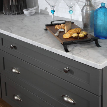
This gray and transitional kitchen remodel bridges the gap between contemporary style and traditional style. The dark gray cabinetry, light gray walls, and white subway tile backsplash make for a beautiful, neutral canvas for the bold teal blue and yellow décor accented throughout the design.
Designer Gwen Adair of Cabinet Supreme by Adair did a fabulous job at using grays to create a neutral backdrop to bring out the bright, vibrant colors that the homeowners love so much.
This Milwaukee, WI kitchen is the perfect example of Dura Supreme's recent launch of gray paint finishes, it has been interesting to see these new cabinetry colors suddenly flowing across our manufacturing floor, destined for homes around the country. We've already seen an enthusiastic acceptance of these new colors as homeowners started immediately selecting our various shades of gray paints, like this example of “Storm Gray”, for their new homes and remodeling projects!
Dura Supreme’s “Storm Gray” is the darkest of our new gray painted finishes (although our current “Graphite” paint finish is a charcoal gray that is almost black). For those that like the popular contrast between light and dark finishes, Storm Gray pairs beautifully with lighter painted and stained finishes.
Request a FREE Dura Supreme Brochure Packet:
http://www.durasupreme.com/request-brochure
 Cummings Architecture + Interiors
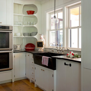
When Cummings Architects first met with the owners of this understated country farmhouse, the building’s layout and design was an incoherent jumble. The original bones of the building were almost unrecognizable. All of the original windows, doors, flooring, and trims – even the country kitchen – had been removed. Mathew and his team began a thorough design discovery process to find the design solution that would enable them to breathe life back into the old farmhouse in a way that acknowledged the building’s venerable history while also providing for a modern living by a growing family.
The redesign included the addition of a new eat-in kitchen, bedrooms, bathrooms, wrap around porch, and stone fireplaces. To begin the transforming restoration, the team designed a generous, twenty-four square foot kitchen addition with custom, farmers-style cabinetry and timber framing. The team walked the homeowners through each detail the cabinetry layout, materials, and finishes. Salvaged materials were used and authentic craftsmanship lent a sense of place and history to the fabric of the space.
The new master suite included a cathedral ceiling showcasing beautifully worn salvaged timbers. The team continued with the farm theme, using sliding barn doors to separate the custom-designed master bath and closet. The new second-floor hallway features a bold, red floor while new transoms in each bedroom let in plenty of light. A summer stair, detailed and crafted with authentic details, was added for additional access and charm.
Finally, a welcoming farmer’s porch wraps around the side entry, connecting to the rear yard via a gracefully engineered grade. This large outdoor space provides seating for large groups of people to visit and dine next to the beautiful outdoor landscape and the new exterior stone fireplace.
Though it had temporarily lost its identity, with the help of the team at Cummings Architects, this lovely farmhouse has regained not only its former charm but also a new life through beautifully integrated modern features designed for today’s family.
Photo by Eric Roth
 MOTIF Design Solutions, LLC
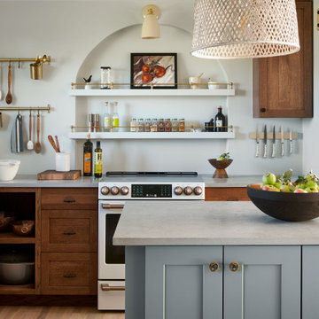
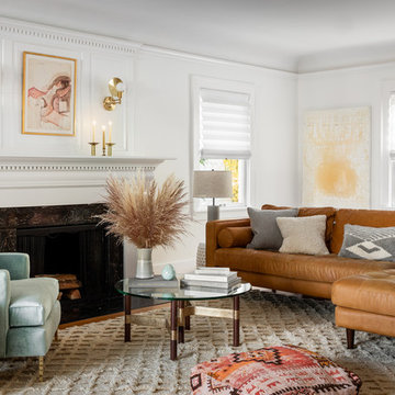
Once a galley kitchen with a garage door at the end of it, MOTIF reconfigured the layout and moved the garage door, removed a wall and opened the kitchen to the adjacent living space, The couple who lives in this cottage-like home has a great place to cook and entertain friends. These very social homeowners can now host parties and entertain their friends and family well with the newly designed layout. A love for cooking inspired the design of the wall above the range. The cabinets were built by hand by the previous owner who was a professional carpenter. In the interest of honoring his life, we kept the boxes and reconfigured the layout while adding some new custom touches that look like they were always there.
 Casework Inter Design
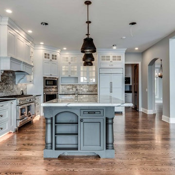
When the homeowners first purchased the 1925 house, it was compartmentalized, outdated, and completely unfunctional for their growing family. Casework designed the owner's previous kitchen and family room and was brought in to lead up the creative direction for the project. Casework teamed up with architect Paul Crowther and brother sister team Ainslie Davis on the addition and remodel of the Colonial.
The existing kitchen and powder bath were demoed and walls expanded to create a new footprint for the home. This created a much larger, more open kitchen and breakfast nook with mudroom, pantry and more private half bath. In the spacious kitchen, a large walnut island perfectly compliments the homes existing oak floors without feeling too heavy. Paired with brass accents, Calcutta Carrera marble countertops, and clean white cabinets and tile, the kitchen feels bright and open - the perfect spot for a glass of wine with friends or dinner with the whole family.
There was no official master prior to the renovations. The existing four bedrooms and one separate bathroom became two smaller bedrooms perfectly suited for the client’s two daughters, while the third became the true master complete with walk-in closet and master bath. There are future plans for a second story addition that would transform the current master into a guest suite and build out a master bedroom and bath complete with walk in shower and free standing tub.
Overall, a light, neutral palette was incorporated to draw attention to the existing colonial details of the home, like coved ceilings and leaded glass windows, that the homeowners fell in love with. Modern furnishings and art were mixed in to make this space an eclectic haven.
Sponsored
Fredericksburg, OH

High Point Cabinets
Columbus' Experienced Custom Cabinet Builder | 4x Best of Houzz Winner
 123 Remodeling Inc.
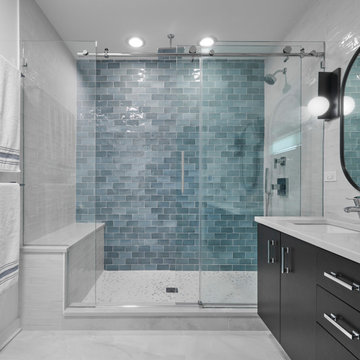
123 Remodeling’s design-build team gave this bathroom in Bucktown (Chicago, IL) a facelift by installing new tile, mirrors, light fixtures, and a new countertop. We reused the existing vanity, shower fixtures, faucets, and toilet that were all in good condition. We incorporated a beautiful blue blended tile as an accent wall to pop against the rest of the neutral tiles. Lastly, we added a shower bench and a sliding glass shower door giving this client the coastal bathroom of their dreams.
 Darci Hether
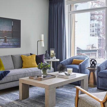
Our client for this project has a beautiful home in the suburbs but wanted a second home in NYC. He's a financier and spends 2-4 nights per week in the city, so he came to our New York City design studio to design his new build pied-à-terre in Tribeca. He wanted an upscale, family-friendly apartment as his college-age children might use the apartment, too. Our goal was to create a soothing, moody, textural, comfortable, and contemporary home. The entryway welcomes you with dark gray, deeply textured wallpaper and statement pieces like the angular mirror and black metal table that are an ode to NYC industrial style. The open kitchen and dining are sleek and flaunt statement metal lights, while the living room features textured contemporary furniture and a stylish bar cart. The bedroom is an oasis of calm and relaxation, with the textured wallpaper playing the design focal point. The luxury extends to the powder room with modern brass pendants, warm-toned natural stone, deep-toned walls, and organic-inspired artwork.
 Illusions Vinyl Fence
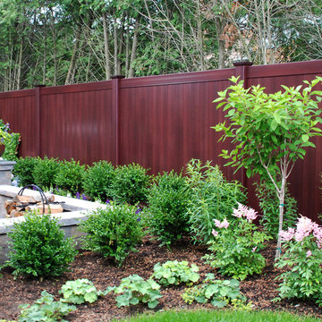
Beautiful new fence idea from Illusions Vinyl Fence. Grand Illusions Vinyl WoodBond Mahogany (W101) PVC vinyl fencing panels. They look like beautiful stained mahogany wood fence without the maintenance. This is a "neighbor-friendly" privacy fence style known as the V300-6W101. Tongue and Groove boards create the non-see through look. Available in 35 colors and 6 wood grains that can be mix and matched. This is simply the best new landscaping idea out there.
 Adrienne DeRosa
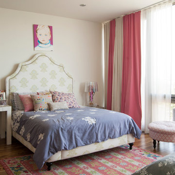
Out of seven children, twin daughters Bellamy and Tallulah hold their own as the only girls in the bunch. When recent renovations included installing the elevator, all rooms needed to be slightly reconfigured. "Our girls are getting older so we were happy to bring in something new and redecorate", says Cortney. Now into their teens, the girls have redone their bedroom to reflect their growing sense of style and independence.
Above Tallulah's bed hangs a childhood portrait of her by Linda Mason. The upholstered bed frames are a recent purchase that add a decidedly feminine air to the space, while a brightly painted chair and striped draperies maintain a youthful punch.
Even with two designer parents, the girls are free to weigh in on what goes into their room. "It is definitely a collaboration", Cortney explains. "[Our daughter] Bellamy really enjoys designing and has a natural talent for it. All of our kids bring their own artistic sense into their spaces, after all, we want their spaces to reflect them, too."
Bed frames: Pondicherry Bed in Celery Jaipur, Serena and Lily
Photo: Adrienne DeRosa Photography © 2014 Houzz
Design: Cortney and Robert Novogratz



 Snell Precision Cooling, Inc.
Stay cool and comfortable with the premium air conditioning systems and Naples air conditioner services provided by the expert Naples air conditioning contractors at Snell Precision Cooling, Inc. Not sure if you should repair or replace your Southwest Florida air conditioning system? Well, consider this: if you're operating an inefficient air conditioning system that breaks down a lot, it is likely that it will break down again. That means more expensive emergency air conditioning repair service calls or possible damage to the other components of your Naples HVAC system.
Also consider the ongoing cost factor. You could save up to 60% on your energy bills with new high-efficiency air conditioning systems. Even if your Naples air conditioner is only a few years old, it could be terribly inefficient by today's energy efficiency standards. Installing a new, high-efficiency air conditioning system can actually pay for itself in energy savings within a relatively short time.
 Save home
There are a lot of different materials used in making a roof. In the past, roofs were made out of wood and shingles. Now, they are made out of a variety of different materials like steel and plastic. But, no matter what material your roof uses, it needs to be durable and waterproof. The new roof system that was developed by GM Systems Inc. combines different materials to make a sturdy and durable roof that is also very easy to install.
This new roof is designed to keep the elements away from your home. It will also protect you from the heat of the sun. This means that you won't have to worry about the roof causing you problems. You will be able to enjoy the comfort of your home while using a product that works great. This is something that you can't say for many other products. The roof that GM Systems Inc. created has been tested and approved by many experts in the industry. So, you can rest assured that you are using a quality product.
1. What is GM Systems Inc.?
GM Systems Inc. is a company that is dedicated to providing top-quality roofing systems. They provide quality roofing materials and services that exceed all expectations. They offer an extensive line of products that are durable and energy-efficient. In fact, the company was able to produce a great product because it invested heavily in research and development. The company invested thousands of dollars to create a unique product. It is because of this that the company can claim that it has the best product on the market.
2. Features of GM Systems Inc. Roof system
GM Systems Inc. Roof system is a new type of material that can protect the roof of your home. It is very versatile, and you can use it for any type of roof, including flat and curved roofs. If you need a new roof, GM Systems Inc. can help you to replace the old one. You can either repair the old roof or completely replace it with this new roof. The new roof is a great solution because it protects your home. It will keep the rain and wind out. It will also reduce your monthly bills. In addition, it helps you to reduce the chances of your home getting damaged by the weather. The new roof can help you to get a longer lifespan for your roof. You can also use the roof to save energy. It will help you to lower your utility bills.
3. Types of roofing system
Many companies make roofing systems. They provide different types of roofs. They can be categorized into three types: flat roofs, sloped roofs, and steel roofs.
Flat roofs: A flat roof has a smooth surface. This is because the roof is made of asphalt or tar. They are easy to maintain. They can last for a long time and they are usually affordable. They are usually found in houses.
Slope roofs: A sloping roof has a steep incline. They can be made of clay tiles, cement tiles, or a combination of materials. They can withstand heavy winds.
Steel roofs: Steel roofs are available in different sizes. The size is dependent on the amount of space you need to be covered. The larger the size, the more you pay for the roof. Steel roofs are also easy to repair. They are very simple to put together and take apart. They have an open structure and they don't require any kind of insulation. A steel roof doesn't require much maintenance either. The main issue with steel roofs is that they can get too hot in certain weather conditions.
4. How is it different from the conventional roofing system?
You can buy a steel roof for many reasons. It is easier to install than a conventional roof and it is also less expensive to install. It's a durable roof that lasts for years. It requires less maintenance than conventional roofs and is easy to repair.
5. GM Systems Inc. Roofing material
GM Systems Inc.. is used to protect building materials and it keeps the rain away. Steel roofs are made of metal and aluminum. They are lightweight and durable. They can withstand wind and rain. They don't rust. Steel roofs can be bought in many colors. They can also be designed according to your taste. Steel roofs are known to be one of the best roofing systems.
6. The installation process of the new roof system
The installation process of the new roof system is simple. It is the best way to ensure that your roof lasts for a long time. You should hire the best roof installation company to install the new roof system. Steel roofs are the best for you if you want to protect your house from the elements. They will also protect your house from moisture and snow. These roofs can last a lifetime. It is recommended to buy steel roofs because they can withstand extreme weather conditions.
7. What are the benefits of the new roof system from GM Systems Inc.?
The benefits of the new roof system from GM Systems Inc. include being able to install the new roof easily. You can just call them and ask for a quote. You will get a price estimate immediately. There is no need to pay for an installation person first. It's time-consuming, and you may have to wait around for them. You will not have to go through the hassle of having to hire a different contractor for the roof repair. If you are not sure about your options, then you can always call the company. They will provide you with the right information. It is also easy to find the new roof system. It is located in the roofing section.
 Interiors by Steven G
Barry Grossman Photography
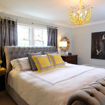
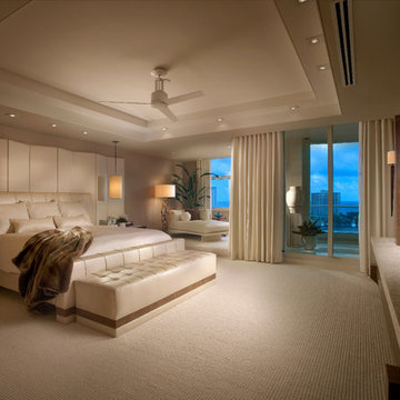
Trendy master carpeted bedroom photo in Miami with no fireplace and gray walls
Trendy master carpeted bedroom photo in Miami with no fireplace and gray walls
15