
Search results for "Remaining" in Home Design Ideas

 Amy Pearson Design
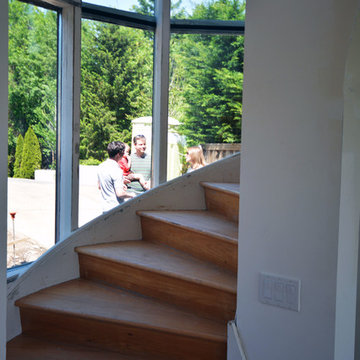
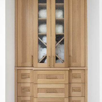
APD was hired to update the kitchen, living room, primary bathroom and bedroom, and laundry room in this suburban townhome. The design brought an aesthetic that incorporated a fresh updated and current take on traditional while remaining timeless and classic. The kitchen layout moved cooking to the exterior wall providing a beautiful range and hood moment. Removing an existing peninsula and re-orienting the island orientation provided a functional floorplan while adding extra storage in the same square footage. A specific design request from the client was bar cabinetry integrated into the stair railing, and we could not be more thrilled with how it came together!
The primary bathroom experienced a major overhaul by relocating both the shower and double vanities and removing an un-used soaker tub. The design added linen storage and seated beauty vanity while expanding the shower to a luxurious size. Dimensional tile at the shower accent wall relates to the dimensional tile at the kitchen backsplash without matching the two spaces to each other while tones of cream, taupe, and warm woods with touches of gray are a cohesive thread throughout.

 The Cornice Company, Inc.
John Potter Photography
Deck - contemporary deck idea in Cleveland with decking and no cover
Deck - contemporary deck idea in Cleveland with decking and no cover
Find the right local pro for your project

 Studio 76 Kitchens and Baths
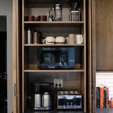
This cabinet column could be used also be used as a small pantry. It features pocket doors to store a coffee station and small microwave, mugs and coffee accessories.
This cabinetry features a Shaker style door with "eagle rock" stain on maple; the countertop is honed, absolute black granite. The "ash gray" cabinet pulls are from Top Knobs. The backsplash is a white 2 x 8.5 inch field tile by Market Collection.
 ODS Architecture
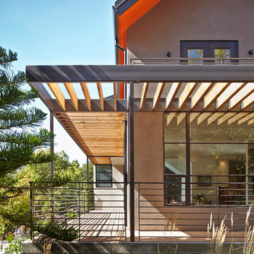
Originally a nearly three-story tall 1920’s European-styled home was turned into a modern villa for work and home. A series of low concrete retaining wall planters and steps gradually takes you up to the second level entry, grounding or anchoring the house into the site, as does a new wrap around veranda and trellis. Large eave overhangs on the upper roof were designed to give the home presence and were accented with a Mid-century orange color. The new master bedroom addition white box creates a better sense of entry and opens to the wrap around veranda at the opposite side. Inside the owners live on the lower floor and work on the upper floor with the garage basement for storage, archives and a ceramics studio. New windows and open spaces were created for the graphic designer owners; displaying their mid-century modern furnishings collection.
A lot of effort went into attempting to lower the house visually by bringing the ground plane higher with the concrete retaining wall planters, steps, wrap around veranda and trellis, and the prominent roof with exaggerated overhangs. That the eaves were painted orange is a cool reflection of the owner’s Dutch heritage. Budget was a driver for the project and it was determined that the footprint of the home should have minimal extensions and that the new windows remain in the same relative locations as the old ones. Wall removal was utilized versus moving and building new walls where possible.
Photo Credit: John Sutton Photography.
 Sarah Greenman
Photo: Sarah Greenman © 2013 Houzz
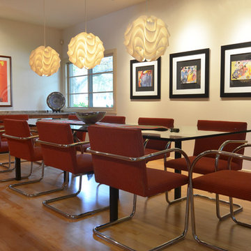
Dining room - 1960s medium tone wood floor dining room idea in Dallas with white walls
Dining room - 1960s medium tone wood floor dining room idea in Dallas with white walls

Sponsored
Delaware, OH

Buckeye Basements, Inc.
Central Ohio's Basement Finishing ExpertsBest Of Houzz '13-'21

 Regenesis Ecological Design
A modern steel mesh fence contrasts with spring growth of Cotoneaster multiflorus
http://annacaitlinphotography.com/
 KGA Studio Architects, PC
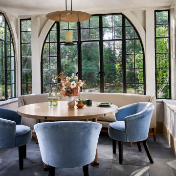
The tea room windows served as the inspiration for the black steel windows throughout the home, and are the only original windows remaining.
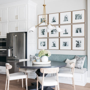
Breakfast nook - small transitional gray floor breakfast nook idea in Denver
Breakfast nook - small transitional gray floor breakfast nook idea in Denver

 Bliss Garden Design, LLC
Bliss Garden Design
Inspiration for a coastal full sun front yard landscaping in Seattle.
Inspiration for a coastal full sun front yard landscaping in Seattle.
 Bilotta Kitchen & Home
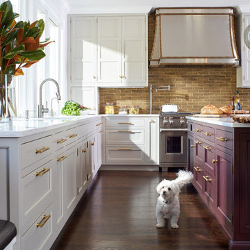
For this expansive kitchen renovation, Designer, Randy O’Kane of Bilotta Kitchens worked with interior designer Gina Eastman and architect Clark Neuringer. The backyard was the client’s favorite space, with a pool and beautiful landscaping; from where it’s situated it’s the sunniest part of the house. They wanted to be able to enjoy the view and natural light all year long, so the space was opened up and a wall of windows was added. Randy laid out the kitchen to complement their desired view. She selected colors and materials that were fresh, natural, and unique – a soft greenish-grey with a contrasting deep purple, Benjamin Moore’s Caponata for the Bilotta Collection Cabinetry and LG Viatera Minuet for the countertops. Gina coordinated all fabrics and finishes to complement the palette in the kitchen. The most unique feature is the table off the island. Custom-made by Brooks Custom, the top is a burled wood slice from a large tree with a natural stain and live edge; the base is hand-made from real tree limbs. They wanted it to remain completely natural, with the look and feel of the tree, so they didn’t add any sort of sealant. The client also wanted touches of antique gold which the team integrated into the Armac Martin hardware, Rangecraft hood detailing, the Ann Sacks backsplash, and in the Bendheim glass inserts in the butler’s pantry which is glass with glittery gold fabric sandwiched in between. The appliances are a mix of Subzero, Wolf and Miele. The faucet and pot filler are from Waterstone. The sinks are Franke. With the kitchen and living room essentially one large open space, Randy and Gina worked together to continue the palette throughout, from the color of the cabinets, to the banquette pillows, to the fireplace stone. The family room’s old built-in around the fireplace was removed and the floor-to-ceiling stone enclosure was added with a gas fireplace and flat screen TV, flanked by contemporary artwork.
Designer: Bilotta’s Randy O’Kane with Gina Eastman of Gina Eastman Design & Clark Neuringer, Architect posthumously
Photo Credit: Phillip Ennis


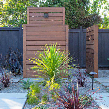
 Landwell Design + Build Co.
This spacious, multi-level backyard in San Luis Obispo, CA, once completely underutilized and overtaken by weeds, was converted into the ultimate outdoor entertainment space with a custom pool and spa as the centerpiece. A cabana with a built-in storage bench, outdoor TV and wet bar provide a protected place to chill during hot pool days, and a screened outdoor shower nearby is perfect for rinsing off after a dip. A hammock attached to the master deck and the adjacent pool deck are ideal for relaxing and soaking up some rays. The stone veneer-faced water feature wall acts as a backdrop for the pool area, and transitions into a retaining wall dividing the upper and lower levels. An outdoor sectional surrounds a gas fire bowl to create a cozy spot to entertain in the evenings, with string lights overhead for ambiance. A Belgard paver patio connects the lounge area to the outdoor kitchen with a Bull gas grill and cabinetry, polished concrete counter tops, and a wood bar top with seating. The outdoor kitchen is tucked in next to the main deck, one of the only existing elements that remain from the previous space, which now functions as an outdoor dining area overlooking the entire yard. Finishing touches included low-voltage LED landscape lighting, pea gravel mulch, and lush planting areas and outdoor decor.
 The Brooklyn Studio
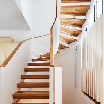
This residence was a complete gut renovation of a 4-story row house in Park Slope, and included a new rear extension and penthouse addition. The owners wished to create a warm, family home using a modern language that would act as a clean canvas to feature rich textiles and items from their world travels. As with most Brooklyn row houses, the existing house suffered from a lack of natural light and connection to exterior spaces, an issue that Principal Brendan Coburn is acutely aware of from his experience re-imagining historic structures in the New York area. The resulting architecture is designed around moments featuring natural light and views to the exterior, of both the private garden and the sky, throughout the house, and a stripped-down language of detailing and finishes allows for the concept of the modern-natural to shine.
Upon entering the home, the kitchen and dining space draw you in with views beyond through the large glazed opening at the rear of the house. An extension was built to allow for a large sunken living room that provides a family gathering space connected to the kitchen and dining room, but remains distinctly separate, with a strong visual connection to the rear garden. The open sculptural stair tower was designed to function like that of a traditional row house stair, but with a smaller footprint. By extending it up past the original roof level into the new penthouse, the stair becomes an atmospheric shaft for the spaces surrounding the core. All types of weather – sunshine, rain, lightning, can be sensed throughout the home through this unifying vertical environment. The stair space also strives to foster family communication, making open living spaces visible between floors. At the upper-most level, a free-form bench sits suspended over the stair, just by the new roof deck, which provides at-ease entertaining. Oak was used throughout the home as a unifying material element. As one travels upwards within the house, the oak finishes are bleached to further degrees as a nod to how light enters the home.
The owners worked with CWB to add their own personality to the project. The meter of a white oak and blackened steel stair screen was designed by the family to read “I love you” in Morse Code, and tile was selected throughout to reference places that hold special significance to the family. To support the owners’ comfort, the architectural design engages passive house technologies to reduce energy use, while increasing air quality within the home – a strategy which aims to respect the environment while providing a refuge from the harsh elements of urban living.
This project was published by Wendy Goodman as her Space of the Week, part of New York Magazine’s Design Hunting on The Cut.
Photography by Kevin Kunstadt
 studio D
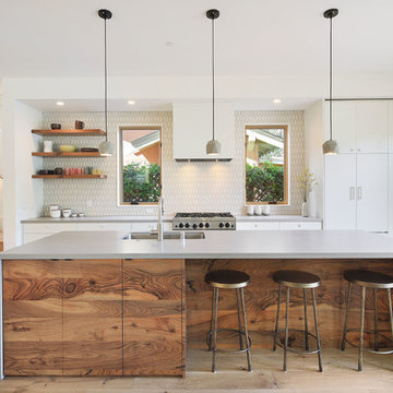
Example of a trendy galley medium tone wood floor and brown floor kitchen design in San Francisco with an undermount sink, flat-panel cabinets, white cabinets, stainless steel appliances, an island and white countertops
 Potter Construction Inc
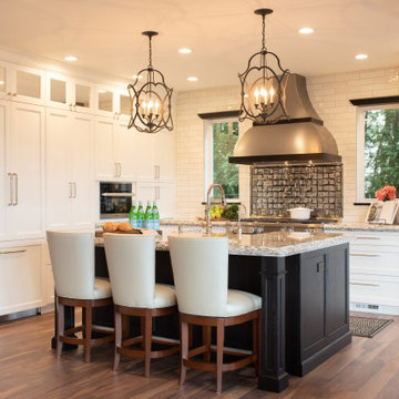
A timeless kitchen combines classic design elements with enduring functionality, creating a space that remains stylish and relevant for years to come. It's not just a kitchen—it's the heart of the home.
 Donald Lococo Architects
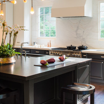
Likened to the reshuffling of a parliamentary cabinet at the start of a new term, we transformed this kitchen by repurposing the existing cabinetry into a seemingly all-new composition. Accenting the refinished and relocated cabinetry exists a new clean-lined wall of built-ins that bridges the space effortlessly to the modern facelift of the remaining home.
Interior Design: Ella Scott Design, LLC
*This is a sampling of the home in its entirety. Additional photographs will be available upon publication of this project.
 SGDI - Sarah Gallop Design Inc.
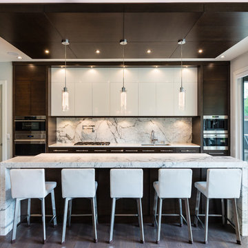
The objective was to create a warm neutral space to later customize to a specific colour palate/preference of the end user for this new construction home being built to sell. A high-end contemporary feel was requested to attract buyers in the area. An impressive kitchen that exuded high class and made an impact on guests as they entered the home, without being overbearing. The space offers an appealing open floorplan conducive to entertaining with indoor-outdoor flow.
Due to the spec nature of this house, the home had to remain appealing to the builder, while keeping a broad audience of potential buyers in mind. The challenge lay in creating a unique look, with visually interesting materials and finishes, while not being so unique that potential owners couldn’t envision making it their own. The focus on key elements elevates the look, while other features blend and offer support to these striking components. As the home was built for sale, profitability was important; materials were sourced at best value, while retaining high-end appeal. Adaptations to the home’s original design plan improve flow and usability within the kitchen-greatroom. The client desired a rich dark finish. The chosen colours tie the kitchen to the rest of the home (creating unity as combination, colours and materials, is repeated throughout).
Photos- Paul Grdina
 Visbeen Architects
Photographer: Ashley Avila Photography
Builder: Colonial Builders - Tim Schollart
Interior Designer: Laura Davidson
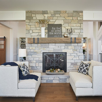
This large estate house was carefully crafted to compliment the rolling hillsides of the Midwest. Horizontal board & batten facades are sheltered by long runs of hipped roofs and are divided down the middle by the homes singular gabled wall. At the foyer, this gable takes the form of a classic three-part archway.
Going through the archway and into the interior, reveals a stunning see-through fireplace surround with raised natural stone hearth and rustic mantel beams. Subtle earth-toned wall colors, white trim, and natural wood floors serve as a perfect canvas to showcase patterned upholstery, black hardware, and colorful paintings. The kitchen and dining room occupies the space to the left of the foyer and living room and is connected to two garages through a more secluded mudroom and half bath. Off to the rear and adjacent to the kitchen is a screened porch that features a stone fireplace and stunning sunset views.
Occupying the space to the right of the living room and foyer is an understated master suite and spacious study featuring custom cabinets with diagonal bracing. The master bedroom’s en suite has a herringbone patterned marble floor, crisp white custom vanities, and access to a his and hers dressing area.
The four upstairs bedrooms are divided into pairs on either side of the living room balcony. Downstairs, the terraced landscaping exposes the family room and refreshment area to stunning views of the rear yard. The two remaining bedrooms in the lower level each have access to an en suite bathroom.
 EFE Creative Lab
Interior Design by EFE Creative Lab, Inc.
Photography by Gabriel Volpi
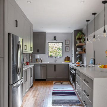
Eat-in kitchen - mid-sized transitional galley medium tone wood floor eat-in kitchen idea in Miami with an undermount sink, shaker cabinets, gray cabinets, quartz countertops, white backsplash, subway tile backsplash, stainless steel appliances, a peninsula and white countertops
Eat-in kitchen - mid-sized transitional galley medium tone wood floor eat-in kitchen idea in Miami with an undermount sink, shaker cabinets, gray cabinets, quartz countertops, white backsplash, subway tile backsplash, stainless steel appliances, a peninsula and white countertops
67