
Search results for "Removing unused" in Home Design Ideas
 Murphy Bros. Design | Build | Remodel
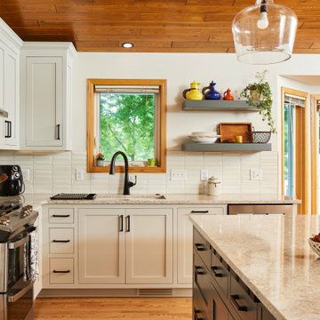
Inspiration for a mid-sized contemporary l-shaped medium tone wood floor and brown floor open concept kitchen remodel in Minneapolis with an undermount sink, shaker cabinets, beige cabinets, quartz countertops, white backsplash, ceramic backsplash, stainless steel appliances, an island and white countertops
 Waterworks Pools & Spas
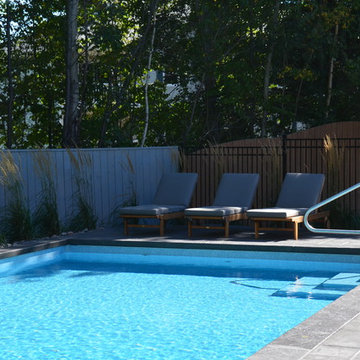
This backyard used to be a steeply sloped forest of unusable space. We removed some of the trees and then installed the pool into the existing slope. We re-graded around the pool, creating several new living spaces and a new lawn area.
 Waterworks Pools & Spas
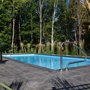
This backyard used to be a steeply sloped forest of unusable space. We removed some of the trees and then installed the pool into the existing slope. We re-graded around the pool, creating several new living spaces and a new lawn area.
Find the right local pro for your project
 Robertson Kitchens
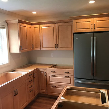
This job is still waiting for the countertops and finishing touches. We removed the soffits and made a better use of space of the area where an unused desk was located. Brookhaven cabinets were used with a light maple stain.
 Studio Sage Interiors
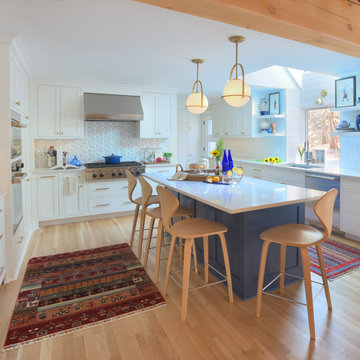
The original kitchen, although generous in size, was out of touch with our clients personal style. When a plumbing mishap caused significant damage to the space, the homeowners seized the opportunity to create the culinary workspace of their dreams.
At the top of their wish list was a well designed kitchen, both aesthetically and functionally. State of the art appliances were selected based on the client's functional requirements and the optimal layout was tailored to family dinners and occasional entertaining. At the heart of the existing kitchen was a large and highly utilized island, keeping this was a high priority. An unused audio cabinet with outdated components was removed to create a much needed dry bar. The large refrigerator, and beverage fridge drawers were concealed behind custom made cabinetry panels and were positioned adjacent to the family seating area for easy access. Attributes such as spice storage, silver dividers and a tall pantry storage ensured everything had its place.
Sherwin Williams, indigo batik (as seen on the island) was carried through the home allowing a visual connection throughout the home while the bright white perimeter cabinets created lightness and dramatic contrast. Brass hardware and decorative lighting gave the space a hint of understated glamour while pulling the warm tones found in the lattice of veining in the cambria quartz countertop.
It is hard not to notice, however, the dramatic impact of the large ceramic, three dimensional, hexagon tiles that highlight the range wall. Companion subway tiles created continuity throughout the expansive kitchen, adorning the backsplash through the rest of the space.
 ZeroEnergy Design
This LEED Platinum certified house reflects the homeowner's desire for an exceptionally healthy and comfortable living environment, within a traditional neighborhood.
INFILL SITE. The family, who moved from another area of Wellesley, sought out this property to be within walking distance of the high school and downtown area. An existing structure on the tight lot was removed to make way for the new home. 84% of the construction waste, from both the previous structure and the new home, was diverted from a landfill. ZED designed to preserve the existing mature trees on the perimeter of the property to minimize site impacts, and to maintain the character of the neighborhood as well as privacy on the site.
EXTERIOR EXPRESSION. The street facade of the home relates to the local New England vernacular. The rear uses contemporary language, a nod to the family’s Californian roots, to incorporate a roof deck, solar panels, outdoor living space, and the backyard swimming pool. ZED’s careful planning avoided to the need to face the garage doors towards the street, a common syndrome of a narrow lot.
THOUGHTFUL SPACE. Homes with dual entries can often result in duplicate and unused spaces. In this home, the everyday and formal entry areas are one and the same; the front and garage doors share the entry program of coat closets, mudroom storage with bench for removing your shoes, and a laundry room with generous closets for the children's sporting equipment. The entry area leads directly to the living space, encompassing the kitchen, dining and sitting area areas in an L-shaped open plan arrangement. The kitchen is placed at the south-west corner of the space to allow for a strong connection to the dining, sitting and outdoor living spaces. A fire pit on the deck satisfies the family’s desire for an open flame while a sealed gas fireplace is used indoors - ZED’s preference after omitting gas burning appliances completely from an airtight home. A small study, with a window seat, is conveniently located just off of the living space. A first floor guest bedroom includes an accessible bathroom for aging visitors and can be used as a master suite to accommodate aging in place.
HEALTHY LIVING. The client requested a home that was easy to clean and would provide a respite from seasonal allergies and common contaminants that are found in many indoor spaces. ZED selected easy to clean solid surface flooring throughout, provided ample space for cleaning supplies on each floor, and designed a mechanical system with ventilation that provides a constant supply of fresh outdoor air. ZED selected durable materials, finishes, cabinetry, and casework with low or no volatile organic compounds (VOCs) and no added urea formaldehyde.
YEAR-ROUND COMFORT. The home is super insulated and air-tight, paired with high performance triple-paned windows, to ensure it is draft-free throughout the winter (even when in front of the large windows and doors). ZED designed a right-sized heating and cooling system to pair with the thermally improved building enclosure to ensure year-round comfort. The glazing on the home maximizes passive solar gains, and facilitates cross ventilation and daylighting.
ENERGY EFFICIENT. As one of the most energy efficient houses built to date in Wellesley, the home highlights a practical solution for Massachusetts. First, the building enclosure reduces the largest energy requirement for typical houses (heating). Super-insulation, exceptional air sealing, a thermally broken wall assembly, triple pane windows, and passive solar gain combine for a sizable heating load reduction. Second, within the house only efficient systems consume energy. These include an air source heat pump for heating & cooling, a heat pump hot water heater, LED lighting, energy recovery ventilation, and high efficiency appliances. Lastly, photovoltaics provide renewable energy help offset energy consumption. The result is an 89% reduction in energy use compared to a similar brand new home built to code requirements.
RESILIENT. The home will fare well in extreme weather events. During a winter power outage, heat loss will be very slow due to the super-insulated and airtight envelope– taking multiple days to drop to 60 degrees even with no heat source. An engineered drainage system, paired with careful the detailing of the foundation, will help to keep the finished basement dry. A generator will provide full operation of the all-electric house during a power outage.
OVERALL. The home is a reflection of the family goals and an expression of their values, beautifully enabling health, comfort, safety, resilience, and utility, all while respecting the planet.
ZED - Architect & Mechanical Designer
Bevilacqua Builders Inc - Contractor
Creative Land & Water Engineering - Civil Engineering
Barbara Peterson Landscape - Landscape Design
Nest & Company - Interior Furnishings
Eric Roth Photography - Photography
 Synergy Design & Construction
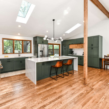
After. We opened the Kitchen right up! We removed the two walls that previously separated the Kitchen from the formal Sitting and Dining Rooms. By closing the entrance into the Kitchen from the Hallway and Family Room area, we were able to create the perfect wall for a large gas range and hood. Adelphi frameless cabinets painted in the Benjamin Moore color “Dakota Shadow” add a modern touch that is right on trend!


 Creating Space, Inc.
Todd DiFiore
Inspiration for a large cottage look-out medium tone wood floor and brown floor basement remodel in Atlanta with beige walls
Inspiration for a large cottage look-out medium tone wood floor and brown floor basement remodel in Atlanta with beige walls
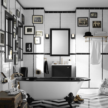
 Kohler
Here’s an ideal space for the traditionalists among us – the ritual and routine lovers, the cup and brush shavers, and the Saturday afternoon soakers.
Kohler Co.
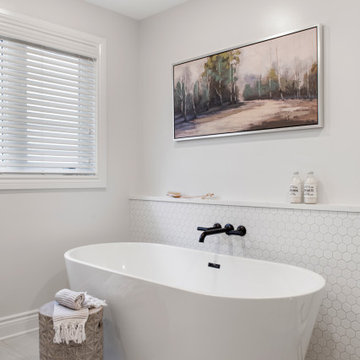
 ARTium Design Build
In the Ensuite, an unused corner tub was removed to add a more desirable freestanding tub, while maintaining a modern aesthetic. The aesthetics lends itself to a neutral palette paired with a calming blue.
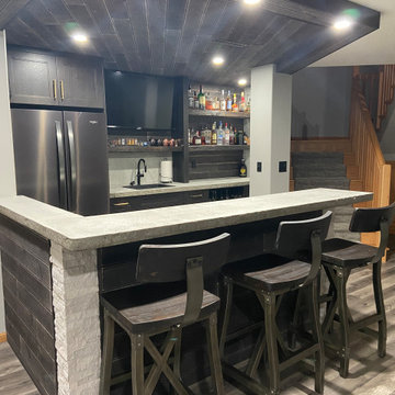
 Riegis Design Co. LLC
The client wanted to add in a basement bar to the living room space, so we took some unused space in the storage area and gained the bar space. We updated all of the flooring, paint and removed the living room built-ins. We also added stone to the fireplace and a mantle.
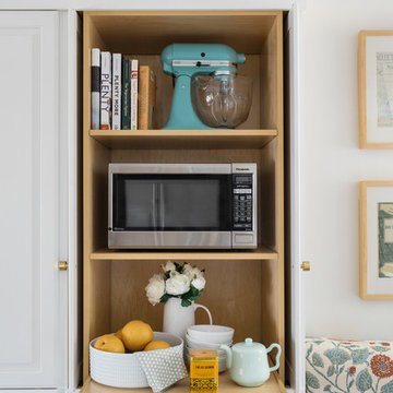
 Twelve Chairs Interiors
Photo: Joyelle West
Example of a mid-sized classic l-shaped medium tone wood floor and brown floor eat-in kitchen design in Boston with an undermount sink, raised-panel cabinets, blue cabinets, quartz countertops, multicolored backsplash, terra-cotta backsplash, stainless steel appliances and an island
Example of a mid-sized classic l-shaped medium tone wood floor and brown floor eat-in kitchen design in Boston with an undermount sink, raised-panel cabinets, blue cabinets, quartz countertops, multicolored backsplash, terra-cotta backsplash, stainless steel appliances and an island
 Feuerbach Design, L.L.C.
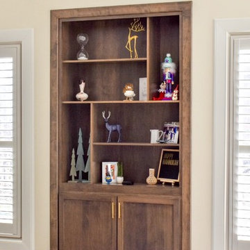
An unused fireplace was removed in this off the kitchen hearth room in favor of this large built-in bookcase with bottom cabinet for storage. Custom stain color to match the kitchen cabinets.

 Robertson Kitchens
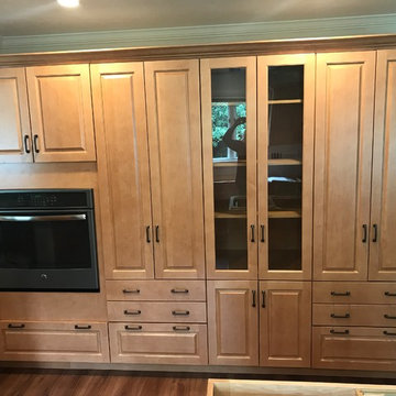
This job is still waiting for the countertops and finishing touches. We removed the soffits and made a better use of space of the area where an unused desk was located. Brookhaven cabinets were used with a light maple stain.
 User
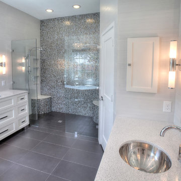
UserTop-Notch Renovations opened up the customers bathroom by removing walls and utilizing previous unused areas.
Doorless shower - modern master white tile and ceramic tile ceramic tile and gray floor doorless shower idea in Austin with shaker cabinets, white cabinets, an undermount sink and granite countertops
Doorless shower - modern master white tile and ceramic tile ceramic tile and gray floor doorless shower idea in Austin with shaker cabinets, white cabinets, an undermount sink and granite countertops
 Kreative Kitchens & Baths
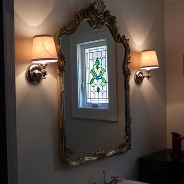
Complete bathroom renovation. Removed all existing walls and enlarge bathroom into unused closet space. Moved window in bathroom to center of the space. Removed bathtub and replaced it with a full size shower.
Used marble on the floors and walls and incorporated the customers mural that he had purchased in Tunisia.
 TKS Design Group
Free ebook, CREATING THE IDEAL KITCHEN
Download now → http://bit.ly/idealkitchen
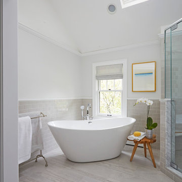
After having remodeled their kitchen, and two other baths in the home, the master bathroom was the last on the list of rooms to update for this couple. The existing bath had a small sink area with his and hers sinks and then a pocket door into the main bath which housed the tub, shower and commode. The main problem was the outdated look of the space, which was rather dark and dreary, and the giant unused whirlpool tub which took up more than its fair share of the footprint.
To brighten the space, we used a pallet of soft gray porcelain tile on the floor and ceramic subway tiles on the walls. Carrera marble and nickel plumbing brighten the room and help amplify the sunlight streaming in through the existing skylight and vaulted ceiling.
We first placed the new freestanding tub on an angle near the window so that users can take advantage of the view and light while soaking in the tub. A new, much larger shower takes up the other corner and delivers some symmetry to the room and is now a luxurious, useable and comfortable size. The commode was relocated to the right of the new shower, so it is visually tucked away. The existing opening between the sink area and the main area was widened and the door removed so that the homeowners can enjoy the light from the larger room while using the sinks each morning.
A step up into the tub/shower area provides additional interest and was a happy accident and solution required to accommodate running the plumbing through the existing floor joists. Because the existing room felt quite contemporary with the vaulted ceiling, we added a run of crown molding around the top and a chair rail to the top of the tile to provide some traditional touches to the room. We think this space is lovely, relaxing and serene and are so honored to have been chosen by these wonderful homeowners to help provide them with a relaxing master bath sanctuary!
Designer: Susan Klimala
Assistant Designer: Keri Rogers
 Terra Studio
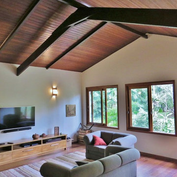
Removal of an unused stairway and the addition of more generous windows allowed for the creation of a comfortable and airy family room.
Family room - 1960s family room idea in Philadelphia
Family room - 1960s family room idea in Philadelphia
 Spaces Designed, Interior Design Studio, LLC
“We could never have envisioned what could be” – Steiner Ranch Homeowner and Client
It is an especially fulfilling Project for an Interior Designer when the outcome exceeds Client expectations, and imagination. This remodeling project required instilling modern sensibilities, openness, styles and textures into a dated house that was past its prime. Strategically, the goal was to tear down where it made sense without doing a complete teardown.
Starting with the soul of the home, the kitchen, we expanded out room by room to create a cohesiveness and flow that invites, supports and provides the warmth and relaxation that only a home can.
In the Kitchen, we started by removing the wooden beams and adding bright recessed lighting. We removed the old limestone accent wall and moved the sink and cooktop from the island on to the countertop – the key goal was to create room for the family to gather around the kitchen. We replaced all appliances with modern Energy Star ones, along with adding a wine rack.
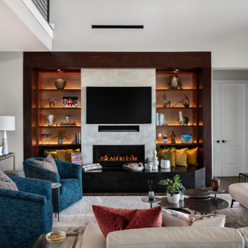
The first order of business for the Living Room was to brighten it up by adding more lighting and replacing an unused section with a glass door to the backyard. Multi-section windows were replaced with large no-split glass overlooking the backyard. Once more, the limestone accent was removed to create a clean, modern look. Replacing the dated wooden staircase with the clean lines of a metal, wire and wooded staircase added interest and freshness. An odd bend in the staircase was removed to clean things up.
The Master Bedroom went from what looked like a motel room with green carpet and cheap blinds to an oasis of luxury and charm. A section of the wraparound doors were closed off to increase privacy, accentuate the best view from the bedroom and to add usable space. Artwork, rug, contemporary bed and other accent pieces brought together the seamless look across the home.
The Master Bathroom remodel started by replacing the standard windows with a single glass pane that enhanced the view of the outdoors. The dated shower was replaced by a walk-in shower and soaking tub to create the ultimate at-home spa experience. Lighted LED mirrors frame His & Hers sinks and bathe them in a soft light.
The flooring was upgraded throughout the house to reflect the contemporary color scheme.
Each of the smaller bedrooms were similarly upgraded to match the clean and modern décor of the rest of the house.
After such a transformation inside, it was only appropriate that the exterior needed an upgrade as well. All of the legacy limestone accents were replaced by stucco and the color scheme extended from the interior of the house to the gorgeous wrap around balconies, trim, garage doors etc. to complete the inside outside transformation.
 Robertson Kitchens
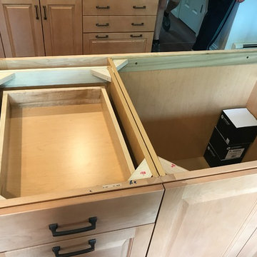
This job is still waiting for the countertops and finishing touches. We removed the soffits and made a better use of space of the area where an unused desk was located. Brookhaven cabinets were used with a light maple stain.
6