
Search results for "Segment" in Home Design Ideas
 Brick Industry Association - Southeast Region
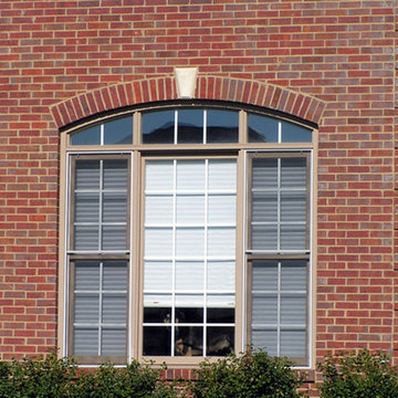
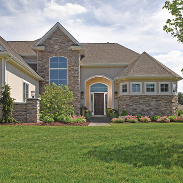
Brick offers unlimited style options. Add a segmental arch with a keystone and brick quoins for a sophisticated look. http://insistonbrick.com/
 MeadowGreen Group
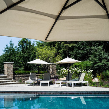
HOLLAND RESIDENCE
Location: Holland, MI
Scope: Design | Build | Furniture Layout & Sourcing
Features: Rectilinear Pool at 45 Degree Angle to House | Auto Cover | Handmade Glass Tile | Sun Shelf & Swimout w/ Glass Tile Inlays | Pebble Finish | Paver Pool Deck with Area Patterning and Decorative Accents | Segmental Retaining Wall with Integrated Fencing & Pillars | Limestone Pillar Caps | Grand Staircase with Integrated Lighting | Landscape Lighting | Fieldstone Retaining Walls & Outcropping
 Sosna Inc
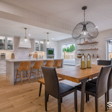
Our clients, a vibrant young family with two energetic kids and a playful dog, were feeling the constraints of their outdated, cramped house. The Main Floor was divided by walls, fragmenting the Kitchen, Dining Room, and living areas, making family time and entertaining a bit of a struggle.
The Kitchen was small and dim, lacking counter space and storage. The kids' study/play table was squeezed into a tight corner, emphasizing the lack of space. The dark hardwood floors were scratched and worn, and the foyer felt cramped and uninviting. The powder room was also
The idea of a major renovation brought both excitement and a bit of anxiety. The couple was unsure about design decisions and worried about the challenges of dealing with structural columns and beams.
Collaborating with Sosna designer Camila, the family embarked on a journey to transform their outdated house into a bright, functional home.
To open up the space, walls were removed, creating a seamless flow between the foyer, living room, dining room, and kitchen.
The kitchen was relocated and expanded to include generous counter space and a large island, providing the ideal spot for the kids to help prepare meals—a task they’ve come to enjoy since the renovation—or work on their homework. Additionally, the addition of a cozy window bench offers extra seating for hanging out with the family. It’s also the perfect place to curl up with a good book.
The once dark and gloomy powder room was completely refreshed with new fixtures, a white oak vanity, and beautiful floor tiles, which significantly brightened it up.
Additionally, the dark hardwood floors were replaced with a lighter, more modern option, brightening the entire main floor.
The renovation wasn't without its hiccups. A mix-up with the hardwood flooring led to a last-minute scramble for a replacement. But in the end, the family fell in love with the new flooring, proving that sometimes unexpected changes can lead to even better outcomes.
The renovation completely transformed the home. What was once a cramped and segmented main floor is now a bright, open space perfectly suited to the family's lifestyle. The new kitchen island became the heart of the home, providing a place for the kids to do homework while their parents cooked, fostering a sense of togetherness. The open layout also made hosting gatherings effortless.
Throughout the renovation, the kids and their dog brought a playful energy to the construction site, forming a special bond with the crew. Despite the challenges of living through a renovation, the family managed to maintain a sense of normalcy, working from home when possible and appreciating the crew's efforts to keep things tidy.
What started as a simple update turned into a full-scale transformation that reflects the family’s needs and personal style. Their willingness to embrace bold design choices, such as blush pink tiles and bright floral patterns, adds a unique touch to the space. And that hardwood flooring mix-up? It turned out to be a happy accident, resulting in a floor they love even more.
In the end, this renovation was more than just a home makeover; it was about creating a space that truly feels like home, nurturing family connections, and bringing joy to everyday life.
Find the right local pro for your project
 Contact Renovations & Custom Homes Ltd.
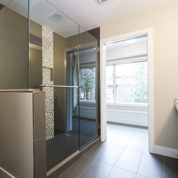
Inspiration for a contemporary cement tile floor, black floor and double-sink corner shower remodel in Edmonton with shaker cabinets, white cabinets, a two-piece toilet, white walls, an undermount sink, granite countertops, a hinged shower door, gray countertops and a built-in vanity
 Hammer & Hand
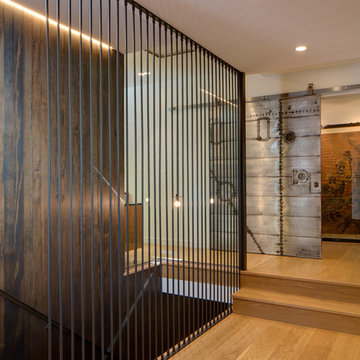
“Whole house remodel” is a pale description of this home’s complete re-imagining collectively achieved by architect Marty Buckenmeyer, interior designers at bright designlab, and builder Hammer & Hand. After clearing out the segmented living room walls and design stylings hailing from the 70s and 80s, H&H built a modern dwelling with an addition, open living and kitchen area, and eclectic details throughout. All new double-paned windows running the length of the common area wall brighten the space with treetop-framed views of Portland beyond.
Hammer & Hand’s carpenters flexed their skills with many fine carpentry details including a custom metal bomber door produced by our woodshop, wood-panel wall with grain-matched hidden pop-out doors, and a steel and concrete fireplace hearth with built-in cabinets.
Photography by Jeff Amram Photography.
 Architecture Office
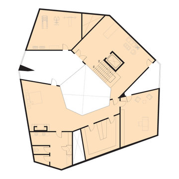
The Potrero Residence is the archetype for Architecture Office’s iterative process. Nestled in the Santa Monica mountains and surrounded by avocado farms, our client asked us to design a monumental hilltop home with views facing every direction and an underground ten car garage. We developed three concepts, choosing one developed by modelling a floorplate and populating it with cube forms. Using modelling software, we “sliced” the cubes at different points and rotated them across the plate. Via the interplay of these segmented cubes, this process created unique trapezoidal forms on each floorplate.
Each floor in the Potrero residence functions as a unique relationship of forms and voids. In this building, each exterior-facing void—the spaces between the rotated cubes—is either walled with glass to create a floor to ceiling window, or subtracted to create a balcony. These punctures provide each exterior facing room in the house with a panoramic view over a different area of the property. The balconies give this home a variety of lighting conditions throughout the day, sometimes dark and sometimes light, reminiscent of cave dwellings.
This design process creates a unique exterior wall across every face of the building. The driveway-facing facade is sculpted to resemble a traditional gable roofed house. Working around the house reveals a much more complex and digitally derived form. In the center of the house, a gem-shaped courtyard offers light within the relatively deep floor plates.
Following the form building process, we developed a material solution using cast-in-place, board formed concrete—giving the house a weighty appearance and reinforcing its cave-like volumes. The rotated cube forms create diverse atmospheres within the interior, and singular aesthetic relationships to the exterior environment. Though grand in scale, our design process creates a fundamentally simple form, while the interior’s spatial conditions evoke the comforts of home.
 New Angle Design
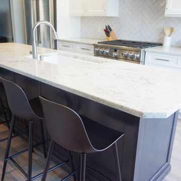
This beautiful Aspinwall home had a very small and segmented first floor. The design flipped the kitchen and dining room so that the rooms were more proportional to their needs and functions. An opening was created on each side of the wall between the two rooms, and the brick chimney between that could not be removed acted as the division of space without the two rooms being closed off to one another.
The house shared one main bathroom on the second floor, so a master bathroom was added to the master bedroom upstairs in what was originally a closet space. This created a fully functional suite.

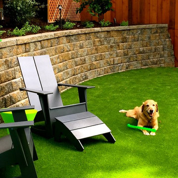
 Garden Lights Landscape and Pool Development Inc.
Burnet
Our Client is a volunteer for Guide dogs for the blind, She needed to transform her lower landscape into a Haven for 2 retired Labrador,
I think we nailed it! Using Pet grass from Syn-lawn. The project was 85 steps down from the front yard which made for a very difficult project.
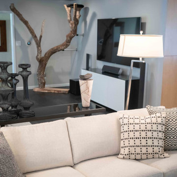
 GMI Design Group
This 1950's home was chopped up with the segmented rooms of the period. The front of the house had two living spaces, separated by a wall with a door opening, and the long-skinny hearth area was difficult to arrange. The kitchen had been remodeled at some point, but was still dated. The homeowners wanted more space, more light, and more MODERN. So we delivered.
We knocked out the walls and added a beam to open up the three spaces. Luxury vinyl tile in a warm, matte black set the base for the space, with light grey walls and a mid-grey ceiling. The fireplace was totally revamped and clad in cut-face black stone.
Cabinetry and built-ins in clear-coated maple add the mid-century vibe, as does the furnishings. And the geometric backsplash was the starting inspiration for everything.
We'll let you just peruse the photos, with before photos at the end, to see just how dramatic the results were!
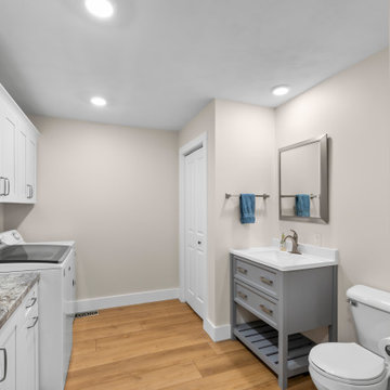
 Unique Ambiance LLC
This transformative interior design project evolved from a previously dark and segmented space into a well-lit and open environment with fresh, modern finishes. Although the overall floorplan was preserved, significant structural changes were implemented to enhance the flow and brightness of the space.
Key modifications included the removal of ceiling-mounted kitchen cabinets and the peninsula beneath them, along with a freestanding China hutch. Most of the walls between the dining room and foyer were taken down, and French doors into the living room were opened up. These changes allowed us to maintain distinct room definitions while dramatically increasing natural light and creating a more open feel.
Throughout the project, optional floor plans were discussed, narrowed down, and finalized in collaboration with the client. Cabinetry details were chosen not only for their aesthetic appeal but also for their functional storage capabilities. A lighting layout was meticulously developed based on the new floor plan and cabinetry arrangement, tailored to achieve the desired levels of illumination specified by the client.
The color palette was carefully selected to enhance the newly brightened space. A light, warm wide LVT wood plank was used throughout, paired with soft and light neutral tones on the walls. Crisp, clean whites were chosen for the trim and cabinetry, providing a fresh contrast. Additionally, pops of blue and grays in the countertops, backsplash, interior and exterior doors, and accent quilts added subtle yet impactful color accents, completing the serene and inviting atmosphere of the home.
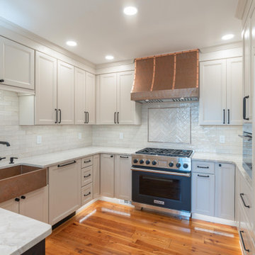
 LBK Design Build
This kitchen was reimagined to improve flow, increase usable storage, and create a cleaner, more cohesive layout while maintaining the existing footprint. The original space felt segmented with a closed-off pantry, heavy stone elements, and inconsistent cabinetry that limited function. The new design removes visual and physical barriers, introduces a more efficient working layout, and incorporates a warm, neutral palette with layered textures. A mix of painted cabinetry, natural wood tones, and copper accents creates contrast while still feeling cohesive. The addition of a peninsula adds prep space and casual seating, while improved lighting and a taller window bring more light into the space.

 Suburban Landscape Management
Segmental retaining wall block provides drainage and erosion solutions. Incorporating a paver patio creates a space for sunning, entertaining or just a great place to hangout!
 LBK Design Build
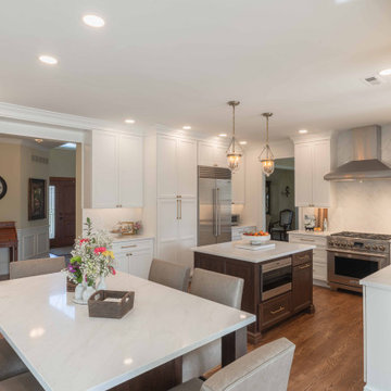
This kitchen renovation was designed to transform a previously segmented and dated space into a refined, highly functional centerpiece of the home. The concept balances classic architectural detailing with modern performance, creating a timeless aesthetic grounded in warmth and contrast. Perimeter cabinetry in a soft painted finish establishes a bright and elegant backdrop, while the richly stained island anchors the space with depth and visual weight. Layered lighting, warm metallic accents, and subtle stone movement introduce texture and sophistication. The overall design prioritizes symmetry, clean lines, and a seamless connection to adjacent living spaces, resulting in a kitchen that supports both everyday living and entertaining.

 Berneche2 Architecture PC
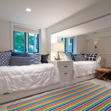
Half-basement bedroom, egress windows added for code compliuance. Ceilings were low and built-in beds help utilize the lower ceiling areas.
PGP Creative Photography
 That Design Place - Mary T Maurey
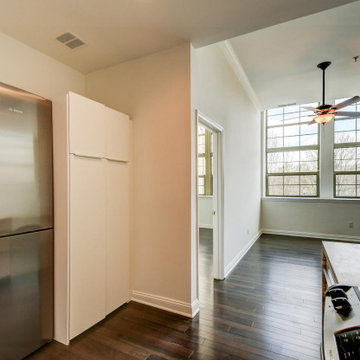
Carrara marble bathroom include in another segment. Contemporary cabinets with lift up doors on wall cabinets. 10' high ceiling in living space. Note the small drawers outside of kitchen to catch all the small things we bring home, keys, etc. . Laundry equipment installed in tall cabinet next to refrigerator.
 Creative Environments
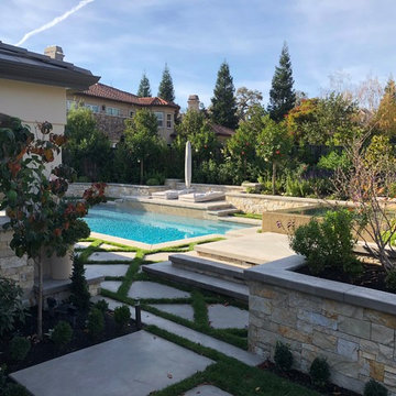
This is an extreme pool make over. We were blessed with a wonderful client that had great vision and taste in materials, a great designer (Peter Koenig Designs) and a wonderful collection of artisans that were true craftsmen to their scope of work.
 LBK Design Build
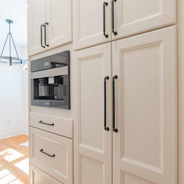
This kitchen was reimagined to improve flow, increase usable storage, and create a cleaner, more cohesive layout while maintaining the existing footprint. The original space felt segmented with a closed-off pantry, heavy stone elements, and inconsistent cabinetry that limited function. The new design removes visual and physical barriers, introduces a more efficient working layout, and incorporates a warm, neutral palette with layered textures. A mix of painted cabinetry, natural wood tones, and copper accents creates contrast while still feeling cohesive. The addition of a peninsula adds prep space and casual seating, while improved lighting and a taller window bring more light into the space.
 Vicki Simon Interior Design
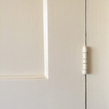
The exposed segmented cylindrical hinges are a sign of the era of the house. They were maintained, though previously painted.
Home design - 1950s home design idea in Portland
Home design - 1950s home design idea in Portland
64