
Search results for "Sense ads" in Home Design Ideas
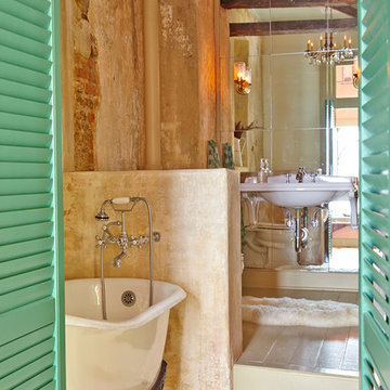

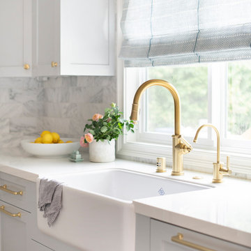
 White Sands Coastal Development
In Southern California there are pockets of darling cottages built in the early 20th century that we like to call jewelry boxes. They are quaint, full of charm and usually a bit cramped. Our clients have a growing family and needed a modern, functional home. They opted for a renovation that directly addressed their concerns.
When we first saw this 2,170 square-foot 3-bedroom beach cottage, the front door opened directly into a staircase and a dead-end hallway. The kitchen was cramped, the living room was claustrophobic and everything felt dark and dated.
The big picture items included pitching the living room ceiling to create space and taking down a kitchen wall. We added a French oven and luxury range that the wife had always dreamed about, a custom vent hood, and custom-paneled appliances.
We added a downstairs half-bath for guests (entirely designed around its whimsical wallpaper) and converted one of the existing bathrooms into a Jack-and-Jill, connecting the kids’ bedrooms, with double sinks and a closed-off toilet and shower for privacy.
In the bathrooms, we added white marble floors and wainscoting. We created storage throughout the home with custom-cabinets, new closets and built-ins, such as bookcases, desks and shelving.
White Sands Design/Build furnished the entire cottage mostly with commissioned pieces, including a custom dining table and upholstered chairs. We updated light fixtures and added brass hardware throughout, to create a vintage, bo-ho vibe.
The best thing about this cottage is the charming backyard accessory dwelling unit (ADU), designed in the same style as the larger structure. In order to keep the ADU it was necessary to renovate less than 50% of the main home, which took some serious strategy, otherwise the non-conforming ADU would need to be torn out. We renovated the bathroom with white walls and pine flooring, transforming it into a get-away that will grow with the girls.
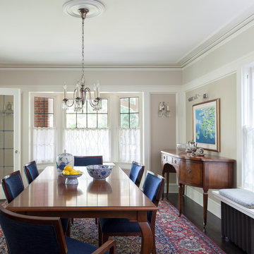
 Stock & Associates, Inc.
Sitting in one of Capital Hill’s beautiful neighborhoods, the exterior of this residence portrays a
bungalow style home as from the Arts and Craft era. By adding a large dormer to east side of the house,
the street appeal was maintained which allowed for a large master suite to be added to the second
floor. As a result, the two guest bedrooms and bathroom were relocated to give to master suite the
space it needs. Although much renovation was done to the Federalist interior, the original charm was
kept by continuing the formal molding and other architectural details throughout the house. In addition
to opening up the stair to the entry and floor above, the sense of gained space was furthered by opening
up the kitchen to the dining room and remodeling the space to provide updated finishes and appliances
as well as custom cabinetry and a hutch. The main level also features an added powder room with a
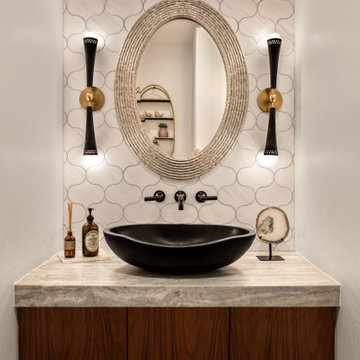
beautiful black walnut vanity.
Find the right local pro for your project
 Klopf Architecture
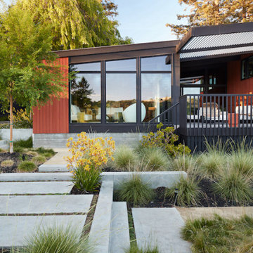
The Roger Lee designed house from 1962 was purchased by the current homeowners in almost original condition, as the previous owners elected to defer most maintenance projects over the years. The clients were able to see beyond the dated materials and finishes, single-paned glass and uninsulated walls and they approached Klopf Architecture to help them expand and update the entire home, one the family could settle into and enjoy for years to come. It was important that the new designs were aligned with Lee's original intent not only because of the client's appreciation for mid-century modern architecture, but also because the house was deemed historical. The Stanford Real Estate Office requires a stringent design review which safeguards the integrity of the community, which Klopf Architecture was happy to oblige going into their updated designs.
As with many original mid-century modern homes, the house was scaled to the 1960s lifestyle where rooms were smaller and openings to views were limited and tightly framed. The original conditions defined the direction the family of four would take in updating the house and making it comfortable for their modern lifestyle. Klopf designed a full gut remodel and major addition to bring the house into the 21st century and provide the living area needed for the client's family. The newly expanded house added just about 1,100 sf to create an airy, comfortable and family friendly house, taking full advantage of the beautiful southwestern views that extend out to the hills beyond. The enclosed garage created an additional 240 sf of covered space for long-term storage.
A cracked swimming pool created an eyesore taking up a majority of the backyard landscape, so it was one of the first elements to go during the transformation. Working with Outer Space Landscape Architects, the family asked for a mix of relaxing outdoor patio spaces that eventually blend into the native landscaping, extending their views outward toward the natural greenery of the trees beyond their property. Filling in the old pool was a smart way to expand the living spaces outward. The orientation of the house was designed to enjoy the views, but the original architecture provided the first homeowners with mere glimpses of the landscape outside.
Klopf was able to broaden those views, continuing and extending on the original architecture to take full advantage of the unobstructed natural views across the rear facade of the house. Small horizontal openings in the primary bedroom and office were replaced with much taller windows that now follow the angled roof line upward, extending across almost all of the facade. We worked with Western Windows, whose designs included an oblique-shaped, operable casement that allowed our design to rise with the slope. A new corner office added to the primary suite, offers a bright and functional work-from-home solution that looks out at the distant views and added natural light from the expanded window configuration that now wraps around the corner.
The existing lower level was designed by Lee as a utilitarian space, serving as a wet pool room with a drain in the center of the floor, bathroom, laundry and storage areas. Without the need for a pool room, Klopf was able to convert the area into a much more comfortable and functional living space with a new family room and guest suite. The new spaces enjoy easy access to a new outdoor patio through floor to ceiling, full-width glass sliders.
Continuing along the rear facade, a previously exposed deck extending from the living room and hallway provided access to the backyard through a single set of stairs leading toward the side of the house which made sense when the pool was in place. The new deck was re-envisioned as an extension of the main living room and now serves as a second outdoor living room. A new slatted pergola above provides the homeowners welcome relief from the hot afternoon sun. A second set of stairs now creates a better connection to the redesigned lower level. Klopf was able to reconfigure the spaces, extending the living room outward toward the views, where the family now claims it as the heart of the home, spending a large majority of their time outdoors.
Back inside, the original wood-burning Malm fireplace was beautifully restored and a gas burner installed to comply with California's strict air standards. It now rests in front of a wall of Heath accent tiles where a dated red brick wall used to stand. A new taller window brings more light and views into the refreshed interior living room. The original glass doors opposite the fireplace were replaced by larger sliders that when fully opened, create a seamless transition to the new outdoor living area so the two spaces feel like one connected space. The original utilitarian kitchen was needlessly tucked into the far back corner and closed-off, out of sight from the living room, so the clients asked Klopf to open it up and expand the kitchen forward so it felt more connected. Today the much larger kitchen is connected to the living area where a short wall with a cutout offers a visual glimpse into the kitchen and a handy pass-through counter for serving guests. A new breakfast nook was also added to create another spot where the family can gather for casual meals. Just outside, a new built-in outdoor grill and prep area extends the kitchen outside and connects to a new outdoor dining spot nestled amongst the trees, taking advantage of the views out back.
Klopf was able to expand the other two bedrooms, add a new laundry room and half-bath and convert the carport to an enclosed garage to add more storage areas which was lost when the pool house was converted to the family and guest room.
To maintain a historical connection to the original designs, the exterior siding was repeated on all exterior walls, a full-height stained glass window at the front entryway restored, and an interior slatted screen element repeated outside at the exterior entry courtyard and over the new outdoor living room to create a shade trellis. The new house stands proudly and shines against it's new landscaping features, while respecting and expanding on the original intent of Roger Lee's designs epitomizing the comforts of indoor-outdoor living in Northern California.
Completion year: 2020
Klopf Architecture project team: John Klopf, Klara Kevane, Noel Andrade
Contractor: ORB Construction, Brendan O'Reilly
Structural engineer: Sezen and Moon
Landscape architect: Outer space
Furnishings and decoration: Urbanism Designs
Photographer: Mariko Reed
 Dura Supreme Cabinetry
Add some class and cleanse the clutter in your bathroom by selecting a coordinated collection of bath furniture with spare sensibility. These two individual bathroom vanities are separated by the tall, free-standing linen cabinet provide each spouse their own divided space to organize their personal bath supplies, while the linen cabinet provides universal storage for items the couple with both uses.
This master bathroom features Dura Supreme’s “Style Six” furniture series. This style is designed to create sleek, minimalist appeal. Bookended on both sides and across the top, a set of doors and/or drawers are suspended beneath the countertop. If preferred, a floating shelf can be added (like shown on these two vanities) for additional and attractive storage underneath.
Style Six offers 10 different configurations (for single sink vanities, double sink vanities, or offset sinks), and an optional floating shelf (vanity floor). Any combination of Dura Supreme’s many door styles, wood species, and finishes can be selected to create a one-of-a-kind bath furniture collection.
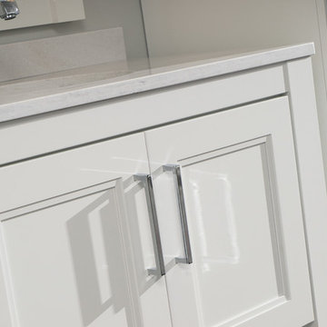
This white on white transitional styled bathroom showcases a beautiful Chrome framed cabinet door from Dura Supreme, sleek solid surface vanity countertops, polished chrome Kohler faucets, round under-mount sinks, 2 Dura Supreme mirrors that match the vanities, polished chrome hardware, gray painted walls, and classic wood floors. The combination of all of these design elements come together to create one incredible master bath!
The bathroom has evolved from its purist utilitarian roots to a more intimate and reflective sanctuary in which to relax and reconnect. A refreshing spa-like environment offers a brisk welcome at the dawning of a new day or a soothing interlude as your day concludes.
Our busy and hectic lifestyles leave us yearning for a private place where we can truly relax and indulge. With amenities that pamper the senses and design elements inspired by luxury spas, bathroom environments are being transformed from the mundane and utilitarian to the extravagant and luxurious.
Bath cabinetry from Dura Supreme offers myriad design directions to create the personal harmony and beauty that are a hallmark of the bath sanctuary. Immerse yourself in our expansive palette of finishes and wood species to discover the look that calms your senses and soothes your soul. Your Dura Supreme designer will guide you through the selections and transform your bath into a beautiful retreat.
Request a FREE Dura Supreme Brochure Packet:
http://www.durasupreme.com/request-brochure
Find a Dura Supreme Showroom near you today:
http://www.durasupreme.com/dealer-locator

 Progressive Design Build
Transforming a Master Bathroom
When our clients purchased their beautiful home in South Fort Myers, FL they fell in love with the expansive, sweeping space. It wasn’t long, however, before they realized the master bathroom just didn’t suit their taste. The large walk-in shower was practically cave-like. Consequentially, it completely dwarfed the bathroom. Along with bland colors, outdated finishes, and a dividing wall in the middle of the room, the whole space felt smaller than its ample dimensions implied. There was no question about it – the bathroom needed an update.
Making Room for More
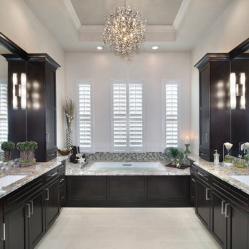
First, we demolished the existing finishes and cut the concrete slab for new underground plumbing. We minimized the imposing shower and moved it to the other side of the room. Moving the shower also allowed for the installation of our Dura Supreme Alectra style cabinetry in cocoa brown. For increased functionality, we created split his-and-hers vanities. Then we added towers to match the cabinets. With interior outlets, the towers added smart storage for bathroom appliances, helping to keep the counters clutter-free. For a finishing touch, we outlined the large mirrors with crown molding trim in a complimentary finish – an essential detail to tie all the cabinetry together.
The Spa
To bring the feel of the spa to this gorgeous home, we installed our luxurious drop-in 72”x42” Kohler Air Massage bathtub. We completely surrounded it with 3cm granite countertops in Delicatus green and added a tub deck with tile backsplashes for a sumptuous ambiance.
Lighting
On either side of the his-and-hers vanity, we installed George Kovach tube sconces. Vertical placement of the sconces provided ample lighting while enhancing the contemporary style of the space. To frame the room, we added a drop ceiling with recessed lighting and outlined the tray ceiling with crown molding to match the rest of the design. To complete the bath remodel, we installed the final element – a stunningly unique 10-light polished chrome chandelier from Maxim lighting.
A Complete Transformation
When we met with our clients, it was instantly clear to us why they were unhappy with their master bathroom. The cave-like shower and cumbersome dividing wall overpowered a room in dire need of a modernizing. Furthermore, with two small children and a busy lifestyle, we could sense our clients not only desired a bathroom renovation, they needed a relaxing retreat.
Ultimately, this project was nothing less than a complete transformation of space. In fact, by the time we had finished, the only original fixtures left were the windows! With beautifully updated finishes and an improved layout, we were able to achieve the functionality our clients craved along with a new, spa-like feel. The end result was nothing short of a haven at home – the perfect spot to recharge at the end of a long day.

Sponsored
Columbus, OH

Structural Remodeling
Franklin County's Heavy Timber Specialists | Best of Houzz 2020!
 Advance Design Studio, Ltd.
Curtis and Peggy had been thinking of a kitchen remodel for quite some time, but they knew their house would have a unique set of challenges. Their older Victorian house was built in 1891. The kitchen cabinetry was original, and they wanted to keep the authenticity of their period home while adding modern comforts that would improve their quality of life.
A friend recommended Advance Design Studio for their exceptional experience and quality of work. After meeting with designer Michelle Lecinski at Advance Design, they were confident they could partner with Advance to accomplish the unique kitchen renovation they’d been talking about for years. “We wanted to do the kitchen for a long, long time,” Curtis said. “(We asked ourselves) what are we actually going to do? How are we going to do this? And who are we going to find to do exactly what we want?”
The goal for the project was to keep the home renovation and new kitchen feeling authentic to the time in which it was built. They desperately wanted the modern comforts that come with a larger refrigerator and the dishwasher that they never had! The old home was also a bit drafty so adding a fireplace, wall insulation and new windows became a priority. They very much wanted to create a comfortable hearth room adjacent to the kitchen, complete with old world brick.
The original cabinetry had to go to make way for beautiful new kitchen cabinetry that appears as if it was a hundred years old, but with all the benefits of cutting-edge storage, self-closing drawers, and a brand-new look. “We just wanted to keep it old looking, but with some modern updates,” Peggy said.
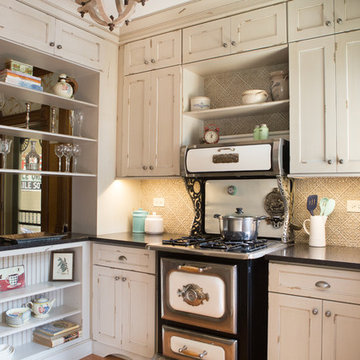
Dura Supreme Highland Cabinets with a Heritage Old World Painted Finish replaced the original 1891 cabinets. The hand-applied careful rubbed-off detailing makes these exquisite cabinets look as if they came from a far-gone era. Despite the small size of the kitchen, Peggy, Curtis and Michelle utilized every inch with custom cabinet sizes to increase storage capacity. The custom cabinets allowed for the addition of a 24” Fisher Paykel dishwasher with a concealing Dura Supreme door panel. Michelle was also able to work into the new design a larger 30” Fisher Paykel French refrigerator. “We made every ¼ inch count in this small space,” designer Michelle said. “Having the ability to custom size the cabinetry was the only way to achieve this.”
“The kitchen essentially was designed around the Heartland Vintage range and oven,” says Michelle. A classic appliance that combines nostalgic beauty and craftsmanship for modern cooking, with nickel plated trim and elegantly shaped handles and legs; the not to miss range is a striking focal point of the entire room and an engaging conversation piece.
Granite countertops in Kodiak Satin with subtle veining kept with the old-world style. The delicate porcelain La Vie Crackle Sonoma tile kitchen backsplash compliments the home’s style perfectly. A handcrafted passthrough designed to show off Peggy’s fine china was custom built by project carpenters Justin Davis and Jeff Dallain to physically and visually open the space. Additional storage was created in the custom panty room with Latte Edinburg cabinets, hand-made weathered wood shelving with authentic black iron brackets, and an intricate tin copper ceiling.
Peggy and Curtis loved the idea of adding a Vermont stove to make the hearth-room not only functional, but a truly beckoning place to be. A stunning Bordeaux red Vermont Castings Stove with crisp black ventilation was chosen and combined with the authentic reclaimed Chicago brick wall. Advance’s talented carpenters custom-built elegant weathered shelves to house family memorabilia, installed carefully chosen barn sconces, and made the hearth room an inviting place to relax with a cup of coffee and a good book.
“Peggy and Curtis’ project was so much fun to work on. Creating a space that looks and feels like it always belonged in this beautiful old Victorian home is a designer’s dream. To see the delight in their faces when they saw the design details coming together truly made it worth the time and effort that went into making the very compact kitchen space work”, said Michelle. “The result is an amazing custom kitchen, packed with functionality in every inch, nook and cranny!” exclaims Michelle.
The renovation didn’t end with the kitchen. New Pella windows were added to help lessen the drafts. The removal of the original windows and trim necessitated the re-creation of hand-made corbels and trim details no longer available today. The talented carpenter team came to the rescue, crafting new pieces and masterfully finishing them as if they were always there. New custom gutters were formed and installed with a front entry rework necessary to accommodate the changes.
The whole house functions better, but it still feels like the original 1891 home. “From start to finish it’s just a much better space than we used to have,” Peggy said. “Jeff and Justin were amazing.” Curtis added; “We were lucky to find Advance Design, because they really came through for us. I loved that they had everything in house, anything you needed to have done, they could do it”.

 Spaces Designed, Interior Design Studio, LLC
“We could never have envisioned what could be” – Steiner Ranch Homeowner and Client
It is an especially fulfilling Project for an Interior Designer when the outcome exceeds Client expectations, and imagination. This remodeling project required instilling modern sensibilities, openness, styles and textures into a dated house that was past its prime. Strategically, the goal was to tear down where it made sense without doing a complete teardown.
Starting with the soul of the home, the kitchen, we expanded out room by room to create a cohesiveness and flow that invites, supports and provides the warmth and relaxation that only a home can.
In the Kitchen, we started by removing the wooden beams and adding bright recessed lighting. We removed the old limestone accent wall and moved the sink and cooktop from the island on to the countertop – the key goal was to create room for the family to gather around the kitchen. We replaced all appliances with modern Energy Star ones, along with adding a wine rack.
The first order of business for the Living Room was to brighten it up by adding more lighting and replacing an unused section with a glass door to the backyard. Multi-section windows were replaced with large no-split glass overlooking the backyard. Once more, the limestone accent was removed to create a clean, modern look. Replacing the dated wooden staircase with the clean lines of a metal, wire and wooded staircase added interest and freshness. An odd bend in the staircase was removed to clean things up.
The Master Bedroom went from what looked like a motel room with green carpet and cheap blinds to an oasis of luxury and charm. A section of the wraparound doors were closed off to increase privacy, accentuate the best view from the bedroom and to add usable space. Artwork, rug, contemporary bed and other accent pieces brought together the seamless look across the home.
The Master Bathroom remodel started by replacing the standard windows with a single glass pane that enhanced the view of the outdoors. The dated shower was replaced by a walk-in shower and soaking tub to create the ultimate at-home spa experience. Lighted LED mirrors frame His & Hers sinks and bathe them in a soft light.
The flooring was upgraded throughout the house to reflect the contemporary color scheme.
Each of the smaller bedrooms were similarly upgraded to match the clean and modern décor of the rest of the house.
After such a transformation inside, it was only appropriate that the exterior needed an upgrade as well. All of the legacy limestone accents were replaced by stucco and the color scheme extended from the interior of the house to the gorgeous wrap around balconies, trim, garage doors etc. to complete the inside outside transformation.
 Moss Building & Design
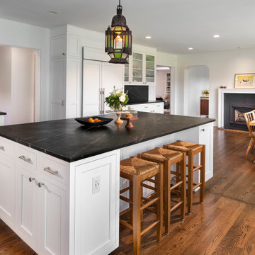
Upon entering the home from the screened porch, MOSS installed floor to ceiling semi-custom cabinetry to be used as a sort of butler’s pantry to store kitchen items, additional entertainment ware, guests’ coats, cleaning equipment and supplies, and more. The use of the unique green tone was a beautiful touch as the color green is used throughout the home’s updated décor and brings a sense of unity to the overall space. Immediately off the long hallway is the home’s kitchen, which was completely updated. Square footage was not affected but MOSS re-designed the space so that it could be used in a more functional manner. A massive kitchen island with a beautiful soapstone countertop dominates the room. Semi-custom white cabinetry lines the perimeters. New large windows provide an incredible view of the yard. Finally, a seating area with built-ins was added to supply more space for seating and for the dining room table to be moved from the center of the kitchen, previously, to the side. The kitchen also features a beautiful fireplace which had its wooden surround updated. The home’s sunroom, located next to the kitchen, was previously a few feet lower than the rest of the home. To bring a better flow to the space, MOSS raised the entire floor of the room up to meet the rest of the main level. Stunningly, the hardwood floor matches to a “T”. In the home’s living room and office, full wall built-ins were added, allowing the homeowners to display their favorite books on topics ranging from art to history, as well as showcasing statues and art sculptures and other items that are meaningful to their family. The living room fireplace’s stone and wooden surrounds were updated by MOSS as well.
 Décor Aid
With a restrained hand, out interior designer set about bringing a new life in our clients petite apartment while also introducing easy to maintain, durable surfaces and furnishings as they love to entertain and have a lively St. Bernard. And as they had an extensive book collection and a single three-foot wide closet, the key challenge here was to make the best use of the entire space while injecting it with charming whimsy.
After falling in love with our designer’s presentation, our clients went for a complete apartment overhaul and started from scratch. Since the space is small, our designer Anna S. wanted to create an urgent sense of vibrancy without coming off as too heavy handed. So she worked in expressive colors and decorative extras in small doses for subtle impact.
Starting the project by changing several of the unit’s light fixtures for brighter, more minimal styles, Anna surveyed the apartment room to room to devise clever storage solutions that are easy on the eye.
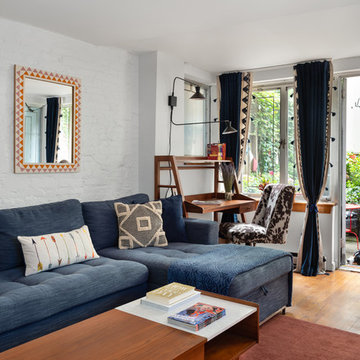
As they have friends over often, Anna created a warm and inviting living room boasting a slightly feminine take on mid-century modern layered with colorful pillows, patterned rugs, and eclectic art that doesn’t take over the apartment.
In the kitchen, she added a strong yet gender neutral burlap wallpaper, floating wooden shelves, and new plumbing fixtures that were more sophisticated than the original, standard ones in place.
However, our favorite part of the apartment is the moody, statement-making foyer. Though it was a long and narrow barely used, neglected space, Anna brought in wallpaper from Tempaper that features a matte black background covered with gold bird and floral illustrations, and added a long row of black glass cabinets and several large gold mirrors for an added sense of glamorous drama and an extra amount of storage space to boot.
 Corynne Pless
Photo: Corynne Pless Photography © 2017 Houzz
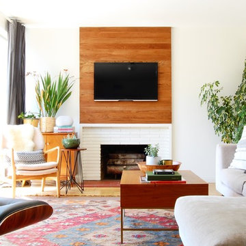
Example of an eclectic living room design in Los Angeles
Example of an eclectic living room design in Los Angeles

Sponsored
Columbus, OH

Hope Restoration & General Contracting
Columbus Design-Build, Kitchen & Bath Remodeling, Historic Renovations
 Jules Duffy Designs
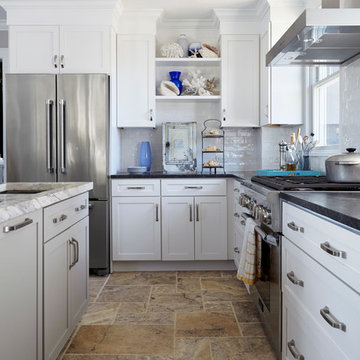
Design: Jules Duffy Design; This kitchen was gutted to the studs and renovated TWICE after 2 burst pipe events! It's finally complete! With windows and doors on 3 sides, the kitchen is flooded with amazing light and beautiful breezes. The finishes were selected from a driftwood palate as a nod to the beach one block away, The limestone floor (beyond practical) dares all to find the sand traveling in on kids' feet. Tons of storage and seating make this kitchen a hub for entertaining. Photography: Laura Moss
 Klopf Architecture
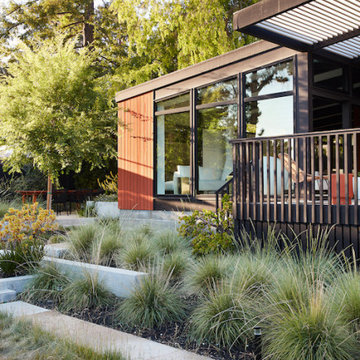
The Roger Lee designed house from 1962 was purchased by the current homeowners in almost original condition, as the previous owners elected to defer most maintenance projects over the years. The clients were able to see beyond the dated materials and finishes, single-paned glass and uninsulated walls and they approached Klopf Architecture to help them expand and update the entire home, one the family could settle into and enjoy for years to come. It was important that the new designs were aligned with Lee's original intent not only because of the client's appreciation for mid-century modern architecture, but also because the house was deemed historical. The Stanford Real Estate Office requires a stringent design review which safeguards the integrity of the community, which Klopf Architecture was happy to oblige going into their updated designs.
As with many original mid-century modern homes, the house was scaled to the 1960s lifestyle where rooms were smaller and openings to views were limited and tightly framed. The original conditions defined the direction the family of four would take in updating the house and making it comfortable for their modern lifestyle. Klopf designed a full gut remodel and major addition to bring the house into the 21st century and provide the living area needed for the client's family. The newly expanded house added just about 1,100 sf to create an airy, comfortable and family friendly house, taking full advantage of the beautiful southwestern views that extend out to the hills beyond. The enclosed garage created an additional 240 sf of covered space for long-term storage.
A cracked swimming pool created an eyesore taking up a majority of the backyard landscape, so it was one of the first elements to go during the transformation. Working with Outer Space Landscape Architects, the family asked for a mix of relaxing outdoor patio spaces that eventually blend into the native landscaping, extending their views outward toward the natural greenery of the trees beyond their property. Filling in the old pool was a smart way to expand the living spaces outward. The orientation of the house was designed to enjoy the views, but the original architecture provided the first homeowners with mere glimpses of the landscape outside.
Klopf was able to broaden those views, continuing and extending on the original architecture to take full advantage of the unobstructed natural views across the rear facade of the house. Small horizontal openings in the primary bedroom and office were replaced with much taller windows that now follow the angled roof line upward, extending across almost all of the facade. We worked with Western Windows, whose designs included an oblique-shaped, operable casement that allowed our design to rise with the slope. A new corner office added to the primary suite, offers a bright and functional work-from-home solution that looks out at the distant views and added natural light from the expanded window configuration that now wraps around the corner.
The existing lower level was designed by Lee as a utilitarian space, serving as a wet pool room with a drain in the center of the floor, bathroom, laundry and storage areas. Without the need for a pool room, Klopf was able to convert the area into a much more comfortable and functional living space with a new family room and guest suite. The new spaces enjoy easy access to a new outdoor patio through floor to ceiling, full-width glass sliders.
Continuing along the rear facade, a previously exposed deck extending from the living room and hallway provided access to the backyard through a single set of stairs leading toward the side of the house which made sense when the pool was in place. The new deck was re-envisioned as an extension of the main living room and now serves as a second outdoor living room. A new slatted pergola above provides the homeowners welcome relief from the hot afternoon sun. A second set of stairs now creates a better connection to the redesigned lower level. Klopf was able to reconfigure the spaces, extending the living room outward toward the views, where the family now claims it as the heart of the home, spending a large majority of their time outdoors.
Back inside, the original wood-burning Malm fireplace was beautifully restored and a gas burner installed to comply with California's strict air standards. It now rests in front of a wall of Heath accent tiles where a dated red brick wall used to stand. A new taller window brings more light and views into the refreshed interior living room. The original glass doors opposite the fireplace were replaced by larger sliders that when fully opened, create a seamless transition to the new outdoor living area so the two spaces feel like one connected space. The original utilitarian kitchen was needlessly tucked into the far back corner and closed-off, out of sight from the living room, so the clients asked Klopf to open it up and expand the kitchen forward so it felt more connected. Today the much larger kitchen is connected to the living area where a short wall with a cutout offers a visual glimpse into the kitchen and a handy pass-through counter for serving guests. A new breakfast nook was also added to create another spot where the family can gather for casual meals. Just outside, a new built-in outdoor grill and prep area extends the kitchen outside and connects to a new outdoor dining spot nestled amongst the trees, taking advantage of the views out back.
Klopf was able to expand the other two bedrooms, add a new laundry room and half-bath and convert the carport to an enclosed garage to add more storage areas which was lost when the pool house was converted to the family and guest room.
To maintain a historical connection to the original designs, the exterior siding was repeated on all exterior walls, a full-height stained glass window at the front entryway restored, and an interior slatted screen element repeated outside at the exterior entry courtyard and over the new outdoor living room to create a shade trellis. The new house stands proudly and shines against it's new landscaping features, while respecting and expanding on the original intent of Roger Lee's designs epitomizing the comforts of indoor-outdoor living in Northern California.
Completion year: 2020
Klopf Architecture project team: John Klopf, Klara Kevane, Noel Andrade
Contractor: ORB Construction, Brendan O'Reilly
Structural engineer: Sezen and Moon
Landscape architect: Outer space
Furnishings and decoration: Urbanism Designs
Photographer: Mariko Reed

 TKS Design Group
Download our free ebook, Creating the Ideal Kitchen. DOWNLOAD NOW
For many, extra time at home during COVID left them wanting more from their homes. Whether you realized the shortcomings of your space or simply wanted to combat boredom, a well-designed and functional home was no longer a want, it became a need. Tina found herself wanting more from her Old Irving Park home and reached out to The Kitchen Studio about adding function to her kitchen to make the most of the available real estate.
At the end of the day, there is nothing better than returning home to a bright and happy space you love. And this kitchen wasn’t that for Tina. Dark and dated, with a palette from the past and features that didn’t make the most of the available square footage, this remodel required vision and a fresh approach to the space. Lead designer, Stephanie Cole’s main design goal was better flow, while adding greater functionality with organized storage, accessible open shelving, and an overall sense of cohesion with the adjoining family room.
The original kitchen featured a large pizza oven, which was rarely used, yet its footprint limited storage space. The nearby pantry had become a catch-all, lacking the organization needed in the home. The initial plan was to keep the pizza oven, but eventually Tina realized she preferred the design possibilities that came from removing this cumbersome feature, with the goal of adding function throughout the upgraded and elevated space. Eliminating the pantry added square footage and length to the kitchen for greater function and more storage. This redesigned space reflects how she lives and uses her home, as well as her love for entertaining.
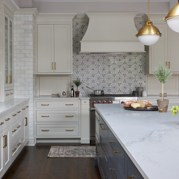
The kitchen features a classic, clean, and timeless palette. White cabinetry, with brass and bronze finishes, contrasts with rich wood flooring, and lets the large, deep blue island in Woodland’s custom color Harbor – a neutral, yet statement color – draw your eye.
The kitchen was the main priority. In addition to updating and elevating this space, Tina wanted to maximize what her home had to offer. From moving the location of the patio door and eliminating a window to removing an existing closet in the mudroom and the cluttered pantry, the kitchen footprint grew. Once the floorplan was set, it was time to bring cohesion to her home, creating connection between the kitchen and surrounding spaces.
The color palette carries into the mudroom, where we added beautiful new cabinetry, practical bench seating, and accessible hooks, perfect for guests and everyday living. The nearby bar continues the aesthetic, with stunning Carrara marble subway tile, hints of brass and bronze, and a design that further captures the vibe of the kitchen.
Every home has its unique design challenges. But with a fresh perspective and a bit of creativity, there is always a way to give the client exactly what they want [and need]. In this particular kitchen, the existing soffits and high slanted ceilings added a layer of complexity to the lighting layout and upper perimeter cabinets.
While a space needs to look good, it also needs to function well. This meant making the most of the height of the room and accounting for the varied ceiling features, while also giving Tina everything she wanted and more. Pendants and task lighting paired with an abundance of natural light amplify the bright aesthetic. The cabinetry layout and design compliments the soffits with subtle profile details that bring everything together. The tile selections add visual interest, drawing the eye to the focal area above the range. Glass-doored cabinets further customize the space and give the illusion of even more height within the room.
While her family may be grown and out of the house, Tina was focused on adding function without sacrificing a stunning aesthetic and dreamy finishes that make the kitchen the gathering place of any home. It was time to love her kitchen again, and if you’re wondering what she loves most, it’s the niche with glass door cabinetry and open shelving for display paired with the marble mosaic backsplash over the range and complimenting hood. Each of these features is a stunning point of interest within the kitchen – both brag-worthy additions to a perimeter layout that previously felt limited and lacking.
Whether your remodel is the result of special needs in your home or simply the excitement of focusing your energy on creating a fun new aesthetic, we are here for it. We love a good challenge because there is always a way to make a space better – adding function and beauty simultaneously.

Sponsored
Columbus, OH
Hope Restoration & General Contracting
Columbus Design-Build, Kitchen & Bath Remodeling, Historic Renovations
 Hsu McCullough
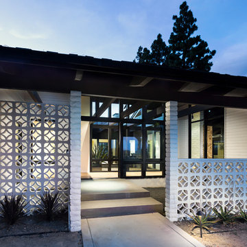
Front door Entry open to courtyard atrium with Dining Room and Family Room beyond. Photo by Clark Dugger
Inspiration for a large 1960s light wood floor and beige floor entryway remodel in Orange County with white walls and a black front door
Inspiration for a large 1960s light wood floor and beige floor entryway remodel in Orange County with white walls and a black front door
 Advance Design Studio, Ltd.
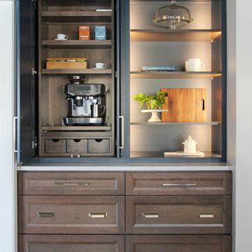
Our clients in Tower Lakes, IL, needed more storage and functionality from their kitchen. They were primarily focused on finding the right combination of cabinets, shelves, and drawers that fit all their cookware, flatware, and appliances. They wanted a brighter, bigger space with a natural cooking flow and plenty of storage. Soffits and crown molding needed to be removed to make the kitchen feel larger. Redesign elements included: relocating the fridge, adding a baking station and coffee bar, and placing the microwave in the kitchen island.
Advance Design Studio’s Claudia Pop offered functional, creative, and unique solutions to the homeowners’ problems. Our clients wanted a unique kitchen that was not completely white, a balance of design and function. Claudia offered functional, creative, and unique solutions to Chad and Karen’s kitchen design challenges. The first thing to go was soffits. Today, most kitchens can benefit from the added height and space; removing soffits is nearly always step one. Steely gray-blue was the color of choice for a freshly unique look bringing a sophisticated-looking space to wrap around the fresh new kitchen. Cherry cabinetry in a true brown stain compliments the stormy accents with sharp contrasting white Cambria quartz top balancing out the space with a dramatic flair.
“We wanted something unique and special in this space, something none of the neighbors would have,” said Claudia.
The dramatic veined Cambria countertops continue upward into a backsplash behind three complimentary open shelves. These countertops provide visual texture and movement in the kitchen. The kitchen includes two larder cabinets for both the coffee bar and baking station. The kitchen is now functional and unique in design.
“When we design a new kitchen space, as designers, we are always looking for ways to balance interesting design elements with practical functionality,” Claudia said. “This kitchen’s new design is not only way more functional but is stunning in a way a piece of art can catch one’s attention.”
Decorative mullions with mirrored inserts sit atop dual sentinel pantries flanking the new refrigerator, while a 48″ dual fuel Wolf range replaced the island cooktop and double oven. The new microwave is cleverly hidden within the island, eliminating the cluttered counter and attention-grabbing wall of stainless steel from the previous space.
The family room was completely renovated, including a beautifully functional entertainment bar with the same combination of woods and stone as the kitchen and coffee bar. Mesh inserts instead of plain glass add visual texture while revealing pristine glassware. Handcrafted built-ins surround the fireplace.
The beautiful and efficient design created by designer Claudia transitioned directly to the installation team seamlessly, much like the basement project experience Chad and Karen enjoyed previously.
“We definitely will and have recommended Advance Design Studio to friends who are looking to embark on a project small or large,” Karen said.
“Everything that was designed and built exactly how we envisioned it, and we are really enjoying it to its full potential,” Karen said.
Our award-winning design team would love to create a beautiful, functional, and spacious place for you and your family. With our “Common Sense Remodeling” approach, the process of renovating your home has never been easier. Contact us today at 847-665-1711 or schedule an appointment.
 Maya Axt Interiors
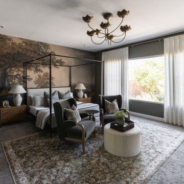
For this primary bedroom redesign, the client envisioned a retreat that would provide a sense of escape and tranquility. The room was designed with a moody atmosphere, blending deep, rich colors that envelop the space in a cocoon of comfort. Color drenching was used on the walls, creating a seamless flow of hues that added depth and warmth. A stunning mural wallpaper became a focal point, its intricate design bringing an artistic, yet serene element to the room. To elevate the ambiance, a statement light fixture was carefully selected, adding a touch of luxury and drawing attention upward. Every element was thoughtfully curated to transform the space into a peaceful sanctuary, offering both beauty and relaxation in equal measure.
11