
Search results for "Space related challenges" in Home Design Ideas
 Specialty Home Improvement
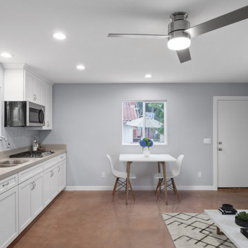
This Escondido area homeowner came to Specialty Home Improvement looking to build a living space for an aging relative. ADUs, also often known as “granny flats” or “in-law suites” are perfect for aging-in-place, short or long-term rentals, or for extra space on your property to increase the value of your home.
The Challenge: Design an Accessory Dwelling Unit (ADU) and living space for an elderly relative on a fixed budget. The space is needed to provide as much complete independence and privacy for the relative as possible. The ADU also needed to fit a specific area in the backyard that did not impede on the existing outdoor entertainment area or pool. Since the area of the build is located in a warmer area of San Diego’s North County, summertime power consumption and indoor temperature were a concern.
The Solution: For budget purposes, the shape of the unit was kept as a basic rectangle, since odd shapes and angles present challenges and additional costs to engineer and build. Since there was the possibility of guests or perhaps more than one person at a time using the ADU, the bathroom was given an independent entry. A closet was placed between the bathroom and the bedroom to help provide a sound buffer.
Floors were designed as polished concrete to help maintain a cooler ambient temperature during the summer months. Light colors on the cabinets, walls, and ceilings along with dual paned vinyl windows provide ample light, temperature control, and ventilation.
 Zieba Builders, Inc.
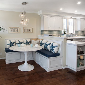
Our clients loved the location of their duplex home with its peak-a-boo ocean view, but their existing kitchen was not suited for their growing family. They wanted a kitchen with a coastal vibe, plenty of storage space, and an eat-in area.
We started by bringing the far wall into the kitchen space to accommodate a large panty and communication center for the family. Doing this allowed us to move the refrigerator out of the main traffic area and doubled the amount of storage space. Several new windows were added to bring in natural light. A half wall was moved to allow more countertop area and open up sight lines. The previously awkwardly shaped island was slimmed down to create better flow.
There were a few venting challenges to overcome; gas lines and plumbing had to be re-routed without disturbing the unit below. To open up sight lines, soffits were eliminated which allowed the extension of cabinets to the ceiling. To stay within the homeowner’s budget, we match existing scraped flooring by lacing in and repairing patches.
The old dining area was too small for table, so we designed and built a custom banquette to maximize the space and take advantage of the outdoor views. The overall space works for family meals as well as entertaining.
A light summer palette was used to reflect the shades of the sand, sea and sky. Even though the new kitchen is actually smaller than the original space, its now far more functional and open.
 TVL Creative Ltd.
This project was such an incredible design opportunity, and instilled inspiration and excitement at every turn! Our amazing clients came to us with the challenge of converting their beloved family home into a welcoming haven for all members of the family. At the time that we met our clients, they were struggling with the difficult personal decision of the fate of the home. Their father/father-in-law had passed away and their mother/mother-in-law had recently been admitted into a nursing facility and was fighting Alzheimer’s. Resistant to loss of the home now that both parents were out of it, our clients purchased the home to keep in in the family. Despite their permanent home currently being in New Jersey, these clients dedicated themselves to keeping and revitalizing the house. We were moved by the story and became immediately passionate about bringing this dream to life.
The home was built by the parents of our clients and was only ever owned by them, making this a truly special space to the family. Our goal was to revitalize the home and to bring new energy into every room without losing the special characteristics that were original to the home when it was built. In this way, we were able to develop a house that maintains its own unique personality while offering a space of welcoming neutrality for all members of the family to enjoy over time.
The renovation touched every part of the home: the exterior, foyer, kitchen, living room, sun room, garage, six bedrooms, three bathrooms, the laundry room, and everything in between. The focus was to develop a style that carried consistently from space to space, but allowed for unique expression in the small details in every room.
Starting at the entry, we renovated the front door and entry point to offer more presence and to bring more of the mid-century vibe to the home’s exterior. We integrated a new modern front door, cedar shingle accents, new exterior paint, and gorgeous contemporary house numbers that really allow the home to stand out. Just inside the entry, we renovated the foyer to create a playful entry point worthy of attention. Cement look tile adorns the foyer floor, and we’ve added new lighting and upgraded the entry coat storage.
Upon entering the home, one will immediately be captivated by the stunning kitchen just off the entry. We transformed this space in just about every way. While the footprint of the home ultimately remained almost identical, the aesthetics were completely turned on their head. We re-worked the kitchen to maximize storage and to create an informal dining area that is great for casual hosting or morning coffee.
We removed the entry to the garage that was once in the informal dining, and created a peninsula in its place that offers a unique division between the kitchen/informal dining and the formal dining and living areas. The simple light warm light gray cabinetry offers a bit of traditional elegance, along with the marble backsplash and quartz countertops. We extended the original wood flooring into the kitchen and stained all floors to match for a warmth that truly resonates through all spaces. We upgraded appliances, added lighting everywhere, and finished the space with some gorgeous mid century furniture pieces.
In the formal dining and living room, we really focused on maintaining the original marble fireplace as a focal point. We cleaned the marble, repaired the mortar, and refinished the original fireplace screen to give a new sleek look in black. We then integrated a new gas insert for modern heating and painted the upper portion in a rich navy blue; an accent that is carried through the home consistently as a nod to our client’s love of the color.
The former entry into the old covered porch is now an elegant glass door leading to a stunning finished sunroom. This room was completely upgraded as well. We wrapped the entire space in cozy white shiplap to keep a casual feel with brightness. We tiled the floor with large format concrete look tile, and painted the old brick fireplace a bright white. We installed a new gas burning unit, and integrated transitional style lighting to bring warmth and elegance into the space. The new black-frame windows are adorned with decorative shades that feature hand-sketched bird prints, and we’ve created a dedicated garden-ware “nook” for our client who loves to work in the yard. The far end of this space is completed with two oversized chaise loungers and overhead lights…the most perfect little reading nook!
Just off the dining room, we created an entirely new space to the home: a mudroom. The clients lacked this space and desperately needed a landing spot upon entering the home from the garage. We uniquely planned existing space in the garage to utilize for this purpose, and were able to create a small but functional entry point without losing the ability to park cars in the garage. This new space features cement-look tile, gorgeous deep brown cabinetry, and plenty of storage for all the small items one might need to store while moving in and out of the home.
The remainder of the upstairs level includes massive renovations to the guest hall bathroom and guest bedroom, upstairs master bed/bath suite, and a third bedroom that we converted into a home office for the client.
Some of the largest transformations were made in the basement, where unfinished space and lack of light were converted into gloriously lit, cozy, finished spaces. Our first task was to convert the massive basement living room into the new master bedroom for our clients. We removed existing built-ins, created an entirely new walk-in closet, painted the old brick fireplace, installed a new gas unit, added carpet, introduced new lighting, replaced windows, and upgraded every part of the aesthetic appearance. One of the most incredible features of this space is the custom double sliding barn door made by a Denver artisan. This space is truly a retreat for our clients!
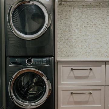
We also completely transformed the laundry room, back storage room, basement master bathroom, and two bedrooms.
This home’s massive scope and ever-evolving challenges were thrilling and exciting to work with, and the result is absolutely amazing. At the end of the day, this home offers a look and feel that the clients love. Above all, though, the clients feel the spirit of their family home and have a welcoming environment for all members of the family to enjoy for years to come.
Find the right local pro for your project

 SGDI - Sarah Gallop Design Inc.
The objective was to create a warm neutral space to later customize to a specific colour palate/preference of the end user for this new construction home being built to sell. A high-end contemporary feel was requested to attract buyers in the area. An impressive kitchen that exuded high class and made an impact on guests as they entered the home, without being overbearing. The space offers an appealing open floorplan conducive to entertaining with indoor-outdoor flow.
Due to the spec nature of this house, the home had to remain appealing to the builder, while keeping a broad audience of potential buyers in mind. The challenge lay in creating a unique look, with visually interesting materials and finishes, while not being so unique that potential owners couldn’t envision making it their own. The focus on key elements elevates the look, while other features blend and offer support to these striking components. As the home was built for sale, profitability was important; materials were sourced at best value, while retaining high-end appeal. Adaptations to the home’s original design plan improve flow and usability within the kitchen-greatroom. The client desired a rich dark finish. The chosen colours tie the kitchen to the rest of the home (creating unity as combination, colours and materials, is repeated throughout).
Photos- Paul Grdina
 The Brooklyn Studio
This Cobble Hill Brownstone for a family of five is a fun and captivating design, the perfect blend of the wife’s love of English country style and the husband’s preference for modern. The young power couple, her the co-founder of Maisonette and him an investor, have three children and a dog, requiring that all the surfaces, finishes and, materials used throughout the home are both beautiful and durable to make every room a carefree space the whole family can enjoy.
The primary design challenge for this project was creating both distinct places for the family to live their day to day lives and also a whole floor dedicated to formal entertainment. The clients entertain large dinners on a monthly basis as part of their profession. We solved this by adding an extension on the Garden and Parlor levels. This allowed the Garden level to function as the daily family operations center and the Parlor level to be party central. The kitchen on the garden level is large enough to dine in and accommodate a large catering crew.
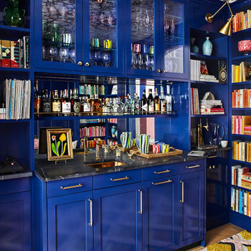
On the parlor level, we created a large double parlor in the front of the house; this space is dedicated to cocktail hour and after-dinner drinks. The rear of the parlor is a spacious formal dining room that can seat up to 14 guests. The middle "library" space contains a bar and facilitates access to both the front and rear rooms; in this way, it can double as a staging area for the parties.
The remaining three floors are sleeping quarters for the family and frequent out of town guests. Designing a row house for private and public functions programmatically returns the building to a configuration in line with its original design.
This project was published in Architectural Digest.
Photography by Sam Frost
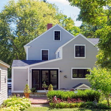
 Cummings Architecture + Interiors
Blending contemporary and historic styles requires innovative design and a well-balanced aesthetic. That was the challenge we faced in creating a modern kitchen for this historic home in Lynnfield, MA. The final design retained the classically beautiful spatial and structural elements of the home while introducing a sleek sophistication. We mixed the two design palettes carefully. For instance, juxtaposing the warm, distressed wood of an original door with the smooth, brightness of non-paneled, maple cabinetry. A cork floor and accent cabinets of white metal add texture while a seated, step-down peninsula and built in bookcase create an open transition from the kitchen proper to an inviting dining space. This is truly a space where the past and present can coexist harmoniously.
Photo Credit: Eric Roth
 Montgomery Robbins, Inc.
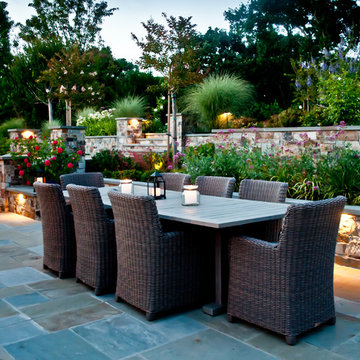
We were asked to create something really special for one of our most admired clients. This home has been a labor of love for both of us as we finally made it exactly what she wanted it to be. After many concept ideas we landed on a design that is stunning! All of the elements on her wish list are incorporated in this challenging, multi-level landscape: A front yard to match the modern traditional-style home while creating privacy from the street; a side yard that proudly connects the front and back; and a lower level with plantings in lush greens, whites, purples and pinks and plentiful lawn space for kids and dogs. Her outdoor living space includes an outdoor kitchen with bar, outdoor living room with fireplace, dining patio, a bedroom-adjacent lounging patio with modern fountain, enclosed vegetable garden, rose garden walk with European-style fountain and meditation bench, and a fire pit with sitting area on the upper level to take in the panoramic views of the sunset over the wooded ridge. Outdoor lighting brings it alive at night, and for parties you can’t beat the killer sound system!
Sponsored
Columbus, OH
Free consultation for landscape design!

Peabody Landscape Group
Franklin County's Reliable Landscape Design & Contracting
 Vetter Architects
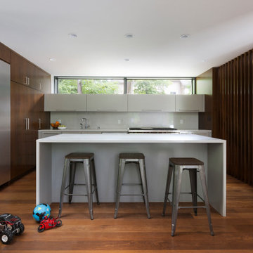
The client’s request was quite common - a typical 2800 sf builder home with 3 bedrooms, 2 baths, living space, and den. However, their desire was for this to be “anything but common.” The result is an innovative update on the production home for the modern era, and serves as a direct counterpoint to the neighborhood and its more conventional suburban housing stock, which focus views to the backyard and seeks to nullify the unique qualities and challenges of topography and the natural environment.
The Terraced House cautiously steps down the site’s steep topography, resulting in a more nuanced approach to site development than cutting and filling that is so common in the builder homes of the area. The compact house opens up in very focused views that capture the natural wooded setting, while masking the sounds and views of the directly adjacent roadway. The main living spaces face this major roadway, effectively flipping the typical orientation of a suburban home, and the main entrance pulls visitors up to the second floor and halfway through the site, providing a sense of procession and privacy absent in the typical suburban home.
Clad in a custom rain screen that reflects the wood of the surrounding landscape - while providing a glimpse into the interior tones that are used. The stepping “wood boxes” rest on a series of concrete walls that organize the site, retain the earth, and - in conjunction with the wood veneer panels - provide a subtle organic texture to the composition.
The interior spaces wrap around an interior knuckle that houses public zones and vertical circulation - allowing more private spaces to exist at the edges of the building. The windows get larger and more frequent as they ascend the building, culminating in the upstairs bedrooms that occupy the site like a tree house - giving views in all directions.
The Terraced House imports urban qualities to the suburban neighborhood and seeks to elevate the typical approach to production home construction, while being more in tune with modern family living patterns.
Overview:
Elm Grove
Size:
2,800 sf,
3 bedrooms, 2 bathrooms
Completion Date:
September 2014
Services:
Architecture, Landscape Architecture
Interior Consultants: Amy Carman Design
 Designs by BSB
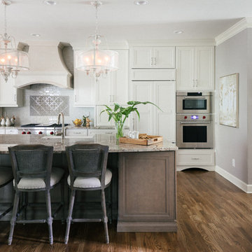
The clients believed the peninsula footprint was required due to the unique entry points from the hallway leading to the dining room and the foyer. The new island increases storage, counters and a more pleasant flow of traffic from all directions.
The biggest challenge was trying to make the structural beam that ran perpendicular to the space work in a new design; it was off center and difficult to balance the cabinetry and functional spaces to work with it. In the end it was decided to increase the budget and invest in moving the header in the ceiling to achieve the best design, esthetically and funcationlly.
Specific storage designed to meet the clients requests include:
- pocket doors at counter tops for everyday appliances
- deep drawers for pots, pans and Tupperware
- island includes designated zone for baking supplies
- tall and shallow pantry/food storage for easy access near island
- pull out spice near cooking
- tray dividers for assorted baking pans/sheets, cutting boards and numerous other serving trays
- cutlery and knife inserts and built in trash/recycle bins to keep things organized and convenient to use, out of sight
- custom design hutch to hold various, yet special dishes and silverware
Elements of design chosen to meet the clients wishes include:
- painted cabinetry to lighten up the room that lacks windows and give relief/contrast to the expansive wood floors
- monochromatic colors throughout give peaceful yet elegant atmosphere
o stained island provides interest and warmth with wood, but still unique in having a different stain than the wood floors – this is repeated in the tile mosaic backsplash behind the rangetop
- punch of fun color used on hutch for a unique, furniture feel
- carefully chosen detailed embellishments like the tile mosaic, valance toe boards, furniture base board around island, and island pendants are traditional details to not only the architecture of the home, but also the client’s furniture and décor.
- Paneled refrigerator minimizes the large appliance, help keeping an elegant feel
Superior cooking equipment includes a combi-steam oven, convection wall ovens paired with a built-in refrigerator with interior air filtration to better preserve fresh foods.
Photography by Gregg Willett
 Kimberlee Marie Interiors
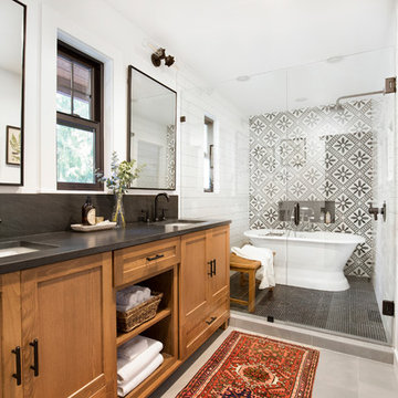
It’s always a blessing when your clients become friends - and that’s exactly what blossomed out of this two-phase remodel (along with three transformed spaces!). These clients were such a joy to work with and made what, at times, was a challenging job feel seamless. This project consisted of two phases, the first being a reconfiguration and update of their master bathroom, guest bathroom, and hallway closets, and the second a kitchen remodel.
In keeping with the style of the home, we decided to run with what we called “traditional with farmhouse charm” – warm wood tones, cement tile, traditional patterns, and you can’t forget the pops of color! The master bathroom airs on the masculine side with a mostly black, white, and wood color palette, while the powder room is very feminine with pastel colors.
When the bathroom projects were wrapped, it didn’t take long before we moved on to the kitchen. The kitchen already had a nice flow, so we didn’t need to move any plumbing or appliances. Instead, we just gave it the facelift it deserved! We wanted to continue the farmhouse charm and landed on a gorgeous terracotta and ceramic hand-painted tile for the backsplash, concrete look-alike quartz countertops, and two-toned cabinets while keeping the existing hardwood floors. We also removed some upper cabinets that blocked the view from the kitchen into the dining and living room area, resulting in a coveted open concept floor plan.
Our clients have always loved to entertain, but now with the remodel complete, they are hosting more than ever, enjoying every second they have in their home.
 Advance Design Studio, Ltd.
Jennifer and Dan have lived in their Deer Park Illinois home for 15 years, slowly making minor fixes like painting and decorating; but they had a new plan for their kitchen the entire time. An awkwardly placed garage door, and an island cooktop with a terrible downdraft made a full-scale kitchen remodel an absolute must. Jennifer had many ideas in mind and wanted to work with a company that could provide high-end work, while partnering with a designer that would tailor the kitchen to her ideas.
She was intrigued by the phrase “Common Sense Remodeling” in Advance Design’s feature she discovered while perusing an issue of the community’s Quintessential Barrington Magazine. Doing further research on the company’s website, as she looked through project profiles and read about Advance Design’s “Common Sense Remodeling” philosophy, she promptly scheduled an appointment to see if the people and ideas she read about were truly who they said they were. The more she read, the more she knew that the “Common Sense” approach to remodeling they described was exactly the type of company she was looking for.
The partnership was sealed after an initial consultation with Owner Todd Jurs and Project Designer Michelle Lecinski. They displayed a combination of friendliness, professionalism and respect that was unmatched by any of the other companies Jennifer talked to. She knew that with Advance Design, she would be able to retain the vision that she had in mind with high-quality craftsmanship.
“I reached out to Advance Design because of the ‘Common Sense Remodeling’ tagline,” Jennifer said. “That’s what lingered for me”. “Advance Design was the most respectful- of the house and of my design ideas, and the most professional of the handful of companies that looked at my project”.
Soon after the meeting Jennifer began working with Michelle on the project design. They quickly developed chemistry. Jennifer loved how Michelle researched and located every detail that Jennifer wanted for the kitchen. Between the two of them, every concept and idea was worked through and perfected. “Jennifer had definite ideas about what she wanted the new kitchen to look like, she just didn’t know how to bring it all together. We worked together really well to make her ideas into the practical reality necessary for a well-functioning kitchen, with the look and feel that she had envisioned”, says Michelle.
“Michelle was wonderful in using the CAD system she would show me new drawings every time we changed the layout while working through the design,” Jennifer said. “She was a really wonderful partner in execution, she made sure everything happened quickly and easily.”
The finished design drew out elements of Jennifer’s style and personality. The pair call the look “sophisticated farmhouse” to describe the kitchen renovation to family and friends. The result was a beautifully crafted, authentic-feeling space that satisfied Jennifer’s dreams 15 years in the making. The whole project consisted of a kitchen remodel, mudroom upgrade with powder room, and garage entry relocation. “The projects I personally like the best, are the ones that put the client’s dreams on display,” Project Designer Michelle said. “And this is one of those projects.”
The main focal point of the kitchen is custom zinc and brass ventilation hood with a vintage sheen, which was hand made to order by a small company in Indiana named Vogler Metalworking. “It’s like sculpture, a true work of art”, says Jennifer. Your eye is immediately drawn towards this elegant yet practical hood that eliminated the home’s downdraft problem and added a striking conversation piece at the same time. The carpenters had to use special gloves when transporting and installing it, so they didn’t smudge it with fingerprints. The beautiful hood centers proudly over the stunning black enamel and brass LaCornue Range. “I had a friend who had a LaCornue range and after learning how easy it was to cook perfect meals, I was convinced I wanted to have one”, says Jennifer. This unique, breathtaking combination anchors the entire kitchen and is apparent immediately as you walk into the great room the surrounds the space.
DuraSupreme Crestwood cabinets with a Kendall Panel add function and sophistication. A custom gray paint color paired with a storm blue was developed so that the new kitchen looked like it belonged to the existing space. Unlacquered brass faucets and hardware were important to Jennifer because she wanted the living finishes to age over time. Remarkable brass diamond mesh cabinet door inserts imported from the UK continue to add this one-of-a-kind kitchen renovation; giving it a “you won’t see this everywhere” quality. The use of old railcar flooring for the coffee bar countertop and reclaimed oak for the open shelving gives an authenticity to the space uncommon in kitchens today.
Jennifer and Michelle fell in love with the Limestone Grey Stone while they were investigating unique island countertop ideas. They liked the fact that the limestone as a living finish will age and change over time. Calcutta Miel Quartz countertops made for an excellent pairing around the perimeter, as it’s durable and perfect for cooking preparations. A textured white subway tile backsplash that runs to the ceiling keeps your eye moving towards the open shelving, and to the main focal point of the stunning range hood combination.
“The kitchen functions beautifully, and it’s gorgeous,” beams Jennifer as she gestures with both hands while smiling ear to ear. “The most important thing was I wanted a kitchen that had a wonderful flow, cooked beautiful meals and was a great gathering place for family and friends, and this space does that perfectly! Beauty wise, it turned out exactly how I had envisioned. I felt the function part was the hardest part, and that was nailed”!
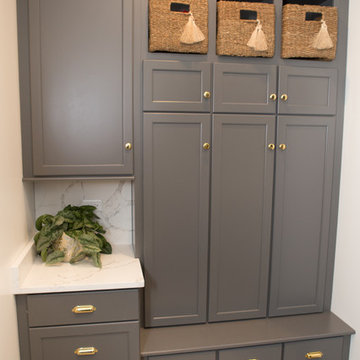
Relocating the garage entry to the new mudroom was a huge priority and has finally separated the family’s arriving home functions from their kitchen. Now coats and shoes and bags have their own area for dropping once members arrive home. Matching gray DuraSupreme cabinetry helped create gorgeous, purposeful lockers for the family. A reclaimed vintage sink and custom wall paper were added to the tiny powder room to beautify the once previously only functional space. Advance Design was even able to create a custom space for their dog to sleep while the family is away.
“It was unbelievable that a project of this size was completed in such a short time, and I think that’s because of the large amount of planning and preparation that went into it,” Jennifer marveled, “When we started, we were ready, and everything was prepared”.
When it came to execution, Project Manager Justin Davis and his crew were quick, accessible, and organized. Projects like this kitchen are typically completed in as little as 8-10 weeks. Jennifer’s kitchen however despite the relocation of some challenging HVAC in a soffit and moving of an exterior door was completed remarkably fast in part because the team was working with an existing tile floor that ran throughout the first floor that the client really loved.
“You get to know these people really well because they’re living in your house while you’re living in your house. They were so fast and really good, it didn’t take as long as even planned” reported Jennifer. “I would text Justin and he always responded almost immediately. I got to know all the guys who were working in our house and they were all wonderful people”.
Details in a customized kitchen like this one require skill and care from the people who install it. “All the guys on the job were skilled at what the did. I wanted small details like little feet to look like furniture, that is where their carpentry skill came in to make these all perfect”, said Jennifer. “The tile guys were wonderful. They even let me determine how I wanted the texture with the grout to appear for a salt and pepper look; now that is a very skilled trade person making it custom”.
In Jennifer’s interview, she continued to reference Advance Design’s “Common Sense Remodeling”, so I took a minute to ask her exactly what that phrase meant to her and how it played out in her experience with her project and the Advance Design team. Here is what she said: “I was intrigued about Common Sense Remodeling and in my head that there would be clear costs and prices, great communication between the design team, the execution team and me”, said Jennifer. They did deliver on that, it was so clear about the cost breakdown, what I could expect from everyone who came to my house, and everything that we had ordered. That to me is the Common Sense”!
It’s great to see a client take literally our assertion that a well-planned remodeling project is simply “Common Sense”! She anticipated each step of the way would be clear, concise, and predictable, all the while protecting the outcome due to the careful upfront planning. “Advance Design delivered on their ‘Common Sense Remodeling’ promise,” Jennifer said. “From the design team, to the execution team - everything was straight forward like I imagined. The project turned out exactly how I envisioned, I enjoyed this process and absolutely would recommend Advance Design Studio to anyone.”
 Ulrich Inc
Ulrich Designer: Julia Kleyman
Photography by Peter Rymwid
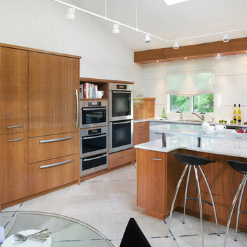
The design challenge in this kitchen was to combine sleek materials to make the space look modern – in fitting with the overall character of the home – and also to achieve a warm and inviting living space. Some special touches for the homeowners include the peninsula counter top that was dropped down to a more comfortable height for mixing and dough rolling. Above the peninsula a bean-shaped frosted glass snack counter sits on metal posts, creating an eating/snacking area. White porcelain tile with two chrome liners running around the perimeter create a clean backdrop for the focal point of the kitchen, a clear glass hood by Miele. A blue acrylic cabinetry finish gives the space a dash of color, while the cherry finish on the appliances side of the kitchen and on the sitting side of the peninsula makes the kitchen warm and inviting.
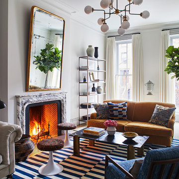 The Brooklyn Studio
This Cobble Hill Brownstone for a family of five is a fun and captivating design, the perfect blend of the wife’s love of English country style and the husband’s preference for modern. The young power couple, her the co-founder of Maisonette and him an investor, have three children and a dog, requiring that all the surfaces, finishes and, materials used throughout the home are both beautiful and durable to make every room a carefree space the whole family can enjoy.
The primary design challenge for this project was creating both distinct places for the family to live their day to day lives and also a whole floor dedicated to formal entertainment. The clients entertain large dinners on a monthly basis as part of their profession. We solved this by adding an extension on the Garden and Parlor levels. This allowed the Garden level to function as the daily family operations center and the Parlor level to be party central. The kitchen on the garden level is large enough to dine in and accommodate a large catering crew.
On the parlor level, we created a large double parlor in the front of the house; this space is dedicated to cocktail hour and after-dinner drinks. The rear of the parlor is a spacious formal dining room that can seat up to 14 guests. The middle "library" space contains a bar and facilitates access to both the front and rear rooms; in this way, it can double as a staging area for the parties.
The remaining three floors are sleeping quarters for the family and frequent out of town guests. Designing a row house for private and public functions programmatically returns the building to a configuration in line with its original design.
This project was published in Architectural Digest.
Photography by Sam Frost

Sponsored
Columbus, OH
Free consultation for landscape design!
Peabody Landscape Group
Franklin County's Reliable Landscape Design & Contracting
 DEANE Inc | Distinctive Design & Cabinetry
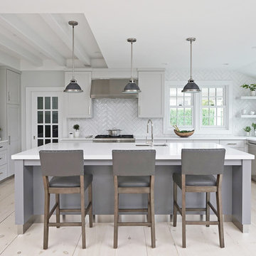
This was a complete interior renovation project of a client’s second home. DEANE collaborated with the client on the design of 5 bathrooms and all the built-ins in addition to the kitchen. The home had an open floor plan with wide pine, bleached flooring throughout but was a challenge because of the various ceiling heights and support beams that needed to be accommodated.The homeowner wanted to able to casually host large gatherings without worrying about maintenance or upkeep. The kitchen cabinetry, featuring chamfer style doors, is painted a pale grey, with a darker, charcoal grey selected for the center island to accent the space. All appliances are stainless steel, with the dishwasher and trash/recycling drawers faced in the same material to mimic the dishwasher. The countertops are an engineered quartz in white, while the cooktop backsplash is a white ceramic tile in a soothing herringbone pattern. The counter cabinet with its glass front for dish storage and floating shelves that anchor two corners of the room are the designer’s favorite things about the space.
Photographer – Kit Noble Photography
Builder – Todd Burns Building and Restoration Inc.
Nantucket, MA
 Kelly Rogers Interiors
Eric Roth Photography
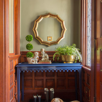
Elegant medium tone wood floor vestibule photo in Boston with green walls and a medium wood front door
Elegant medium tone wood floor vestibule photo in Boston with green walls and a medium wood front door
 Décor Aid
When a family living in Singapore decided to purchase a New York City pied-à-terre, they settled on the historic Langham Place, a 60-floor building along 5th Ave which features a mixture of permanent residencies and 5-star hotel suites. Immediately after purchasing the condo, they reached out to Decor Aid, and tasked us with designing a home that would reflect their jet-setting lifestyle and chic sensibility.
Book Your Free In-Home Consultation
Connecting to the historic Tiffany Building at 404 5th Ave, the exterior of Langham Place is a combination of highly contemporary architecture and 1920’s art deco design. And with this highly unique architecture, came highly angular, outward leaning floor-to-ceiling windows, which would prove to be our biggest design challenge.
One of the apartment’s quirks was negotiating an uneven balance of natural light throughout the space. Parts of the apartment, such one of the kids’ bedrooms, feature floor-to-ceiling windows and an abundance of natural light, while other areas, such as one corner of the living room, receive little natural light.
By sourcing a combination of contemporary, low-profile furniture pieces and metallic accents, we were able to compensate for apartment’s pockets of darkness. A low-profile beige sectional from Room & Board was an obvious choice, which we complemented with a lucite console and a bronze Riverstone coffee table from Mitchell Gold+Bob Williams.
Circular tables were placed throughout the apartment in order to establish a design scheme that would be easy to walk through. A marble tulip table from Sit Down New York provides an opulent dining room space, without crowding the floor plan. The finishing touches include a sumptuous swivel chair from Safavieh, to create a sleek, welcoming vacation home for this international client.
 Isaman design, Inc.
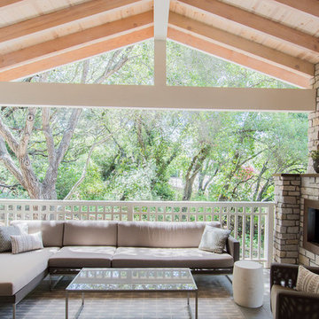
On a quiet cul-de-sac not too far from downtown San Luis Obispo lies the contemporary craftsman styled Clausen Residence. The challenges that accompanied this project were what, in the end, made it so interesting. The buildable area of the site is very small due to the fact that almost half of the property is occupied by a biological open space easement, established to protect the creek that runs behind the lot. In addition to this, the site is incredibly steep, which lent itself well to a stair stepped 3-story floor plan. Strict height restrictions set by the local jurisdiction governed the decision to bury the garage in the hill, and set the main living space on top of it, accompanied by the children’s bedrooms and game room further back on the site. The 3rd floor is occupied fully by the master suite, which looks down on the back yard below. Off of the great room is a vast deck, with built in barbecue, fire place and heaters, ideal for outdoor entertaining year round.
The house, adorned in lap siding and true craftsman details is flanked by gorgeous oak trees and the creek beyond.


 Haus Interior Design
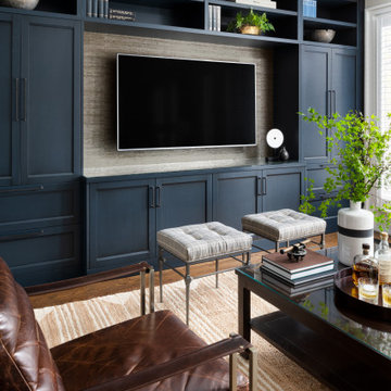
Empty nesters take on a new life and new home in Northwest DC. Downsizing has its monumental challenges, and that was definitely the case with this project. The clients wanted a very narrow, partially below-ground, and slightly sterile space to feel like home. Ralph Lauren was our inspiration - both the clients and I love rich plaids, warm textures and touches of leather mixed with interesting metals. Because the rowhouse is so narrow, we added an entire wall of navy blue built-ins to the living space to create the illusion of more depth while adding much-needed storage. We wanted this home to convey the feeling of a favorite cashmere sweater, worn jeans and Gucci loafers.
 DesignARC
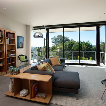
The Tice Residences replace a run-down and aging duplex with two separate, modern, Santa Barbara homes. Although the unique creek-side site (which the client’s original home looked toward across a small ravine) proposed significant challenges, the clients were certain they wanted to live on the lush “Riviera” hillside.
The challenges presented were ultimately overcome through a thorough and careful study of site conditions. With an extremely efficient use of space and strategic placement of windows and decks, privacy is maintained while affording expansive views from each home to the creek, downtown Santa Barbara and Pacific Ocean beyond. Both homes appear to have far more openness than their compact lots afford.
The solution strikes a balance between enclosure and openness. Walls and landscape elements divide and protect two private domains, and are in turn, carefully penetrated to reveal views.
Both homes are variations on one consistent theme: elegant composition of contemporary, “warm” materials; strong roof planes punctuated by vertical masses; and floating decks. The project forms an intimate connection with its setting by using site-excavated stone, terracing landscape planters with native plantings, and utilizing the shade provided by its ancient Riviera Oak trees.
2012 AIA Santa Barbara Chapter Merit Award
Jim Bartsch Photography
 Isaman design, Inc.
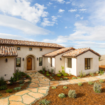
Designed for a family who is relocating back to California, this contemporary residence sits atop a severely steep site in the community of Las Ventanas. Working with the topography led to some creative design solutions, structurally and aesthetically, to accommodate all of the family’s programatic needs. The 4127 s.f. home fits into the relatively small building footprint while an infinity edge pool cantilevers 22′ above grade. With spectacular views of the Arroyo Grande foothills and farms, this main pool deck becomes a major feature of the home. All living spaces, including the great room and kitchen open up to this deck, ideal for relaxation and entertainment. Given that the owners have five golden retrievers, this outdoor space also serves as an area for the dogs. The design includes multiple water features and even a dog pond.
To further emphasize the views, a third story mitered glass reading room gives one the impression of sitting above the treetops. The use of warm IPE hardwood siding and stone cladding blend the structure into the surrounding landscape while still offering a clean and contemporary aesthetic.
15