
Search results for "Strategic" in Home Design Ideas
 Nicole Arnold Interiors
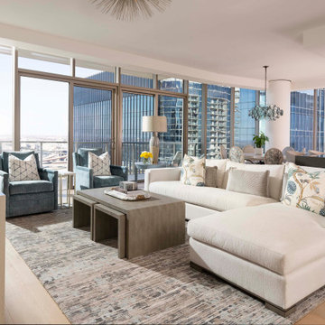
An exhilarating shift from a suburban traditional family home to a modern, high-rise condominium. We were excited to start with a clean slate and designed this 3,500sf space, transitioning this client into their next chapter. The overall color palette embraces a calm and serene aesthetic, while the furnishings and appointments ensure inviting spaces throughout the unit. Special details were strategically infused such as contrast chair back fabric, accent wall coverings, designer light fixtures, unique sculptures and no shortage of custom details on the furnishings, uniquely tailored to the customer. This luxury, high-rise condo now feels like home.

 Golden State Gardens
Strategically placed bunch grasses add movement, color, and texture to the garden. Contrasting colors provide accent and year-round interest. Contrasting colors provide accent and year-round interest.

 Lehnhoff's Landscaping, LLC.
Completed pavilion, custom copper water tables with copper gutter and downspouts, cedar shake gable in-lay, custom made cedar columns. The fence is constructed with cedar spindles and strategically placed granite columns to create a timeless aesthetic.
Find the right local pro for your project

 Jacob Lilley Architects
Location: Lexington, MA, USA
A new garage, kids play room above and a mudroom met the need for more space. A renovated kitchen, bedroom and other living spaces created a refreshed sense of home.
The strategic location of the mudroom as an intermediary connector solved problems with this 19th-century home siting seven feet above the ground with limited access to the rear yard.
The connector between the garage and existing house is a stair that unifies the various levels and develops a strong connection to the yard.
Photographed by: Eric Roth

 Orren Pickell Building Group
**Project Overview**
This new construction home is built next to a picturesque lake, and the bar adjacent to the kitchen and living areas is designed to frame the breathtaking view. This custom, curved bar creatively echoes many of the lines and finishes used in other areas of the first floor, but interprets them in a new way.
**What Makes This Project Unique?**
The bar connects visually to other areas of the home custom columns with leaded glass. The same design is used in the mullion detail in the furniture piece across the room. The bar is a flowing curve that lets guests face one another. Curved wainscot panels follow the same line as the stone bartop, as does the custom-designed, strategically implemented upper platform and crown that conceal recessed lighting.
**Design Challenges**
Designing a curved bar with rectangular cabinets is always a challenge, but the greater challenge was to incorporate a large wishlist into a compact space, including an under-counter refrigerator, sink, glassware and liquor storage, and more. The glass columns take on much of the storage, but had to be engineered to support the upper crown and provide space for lighting and wiring that would not be seen on the interior of the cabinet. Our team worked tirelessly with the trim carpenters to ensure that this was successful aesthetically and functionally. Another challenge we created for ourselves was designing the columns to be three sided glass, and the 4th side to be mirrored. Though it accomplishes our aesthetic goal and allows light to be reflected back into the space this had to be carefully engineered to be structurally sound.
Photo by MIke Kaskel

 Chicago Green Design Inc.
This garage rooftop project is located in Red Hot Chicago's Lincoln Square area. A 360 degree rotating tv, Lush Softscape strategically placed. This project sports one of our 10' fire-tables with offset 6' linear burner. 20 outdoor speakers with separate amp driven subwoofer. These fireproof retractable Deep Gray shades pillow from the pergolas roof. Alley side Privacy panels are frosted giving you the privacy but still allow filtered light to come in. Massive cantilever Tuuci umbrella mast coming out of the bench.
A full kitchen and 12 seater dining area are just a few things on this bucket list!

 Studio MMA Architecture + Design
This house is set on a sunny natural plateau, sheltered from the wind and enjoys magnificent views of Sutton Mounts and Echo. The layout of the house integrates harmoniously with the surrounding forest, opening to nature through large expanses of glass and terraces that connect the living spaces to the forest. A long roof shelters the house, its deep eaves acting as a sunshade and defining protected outside spaces. The wide south and east terraces, close to ground level, bring the house into contact with its site and enjoy lots of sunshine. A screen porch is strategically located to avoid blocking the primary views and provides access to the forest. The living living spaces are arranged in an open layout under a ceiling ceiling that reaches 12 feet in height, yet more intimate spaces such as the fireplace alcove modulate the spaces between the higher volumes. The construction will achieve Novoclimat certification and integrates among other things a radiant floor fed by a geothermal heating system. This project was completed in collaboration with engineers and Construction Boivin.

 Kat Nelson Designs
Lisa Konz Photography
This was such a fun project working with these clients who wanted to take an old school, traditional lake house and update it. We moved the kitchen from the previous location to the breakfast area to create a more open space floor plan. We also added ship lap strategically to some feature walls and columns. The color palette we went with was navy, black, tan and cream. The decorative and central feature of the kitchen tile and family room rug really drove the direction of this project. With plenty of light once we moved the kitchen and white walls, we were able to go with dramatic black cabinets. The solid brass pulls added a little drama, but the light reclaimed open shelves and cross detail on the island kept it from getting too fussy and clean white Quartz countertops keep the kitchen from feeling too dark.
There previously wasn't a fireplace so added one for cozy winter lake days with a herringbone tile surround and reclaimed beam mantle.
To ensure this family friendly lake house can withstand the traffic, we added sunbrella slipcovers to all the upholstery in the family room.
The back screened porch overlooks the lake and dock and is ready for an abundance of extended family and friends to enjoy this beautiful updated and classic lake home.

 J Hill Interiors
These particular clients are from San Francisco and hired us to decorate their second home in Mission Beach. The goal of this project was to decorate in such a way that accommodated the family for their uses, and also renters while they are away. Window treatments, decor, bedding and furniture were strategically procured with both users in mind. Enjoy the pictures!

 Betz Pools Limited
After dark, the entire backyard takes on a magic glow thanks to a strategically placed array of LED garden lights. Each of the landscaped areas feature dramatic lighting to define the shape of the plantings, trees and signature elements. This backyard is an entertaining showpiece where the hospitality is a perfect match to the beautiful environment.
 Made To Last Custom Homes Ltd.
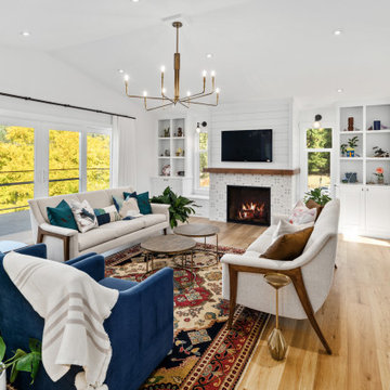
This modern farmhouse is a complete custom renovation to transform an existing rural Duncan house into a home that was suitable for our clients’ growing family and lifestyle. The original farmhouse was too small and dark. The layout for this house was also ineffective for a family with parents who work from home.
The new design was carefully done to meet the clients’ needs. As a result, the layout of the home was completely flipped. The kitchen was switched to the opposite corner of the house from its original location. In addition, Made to Last constructed multiple additions to increase the size.
An important feature to the design was to capture the surrounding views of the Cowichan Valley countryside with strategically placed windows.

 Wesley-Wayne Interiors, LLC
The ensuite for this guest master bedroom continues to bring nature inside with the gorgeous stone tile work in the shower and vanity. The movement and unique quality of each tile is relaxing and inviting. Natural light pours into the shower from the strategically placed window.
Design: Wesley-Wayne Interiors
Photo: Stephen Karlisch

 Tetrachrome Design, LLC
With one of the most limited resources in San Francisco being space, it was critically important to make the most of this studio space. We started with a galley kitchen was enclosed with a dividing wall and a small pass-through to the dining area. We ended with an open concept U-shaped kitchen, twice the size and capacity of the original! Being an enclosed space, careful thought was taken to make the space feel as open as possible, including strategic placement of the canned lights, open shelving and white upper cabinets with a white subway tile backsplash.

 LS3P Living
Interior finishes feature clean reductively detailed surfaces. Stone, concrete, wood paneling, ironwork, timber beams and trusses blend rural and industrial elements, and strategic lighting enhances the dramatic qualities of each space.
Kitchen | Custom home Studio of LS3P ASSOCIATES LTD. | Photo by Inspiro8 Studio.

 Medford Design-Build
From this view, you can see how removing the angular walls and reducing the size of the linen cabinet has created a sense of balance, as well as a linear feel across the remodeled room. The white walls and flooring coupled with the strategically placed can lights creates a much lighter, brighter feel than before. Even with the same skylight and glass block window, the original bathroom felt significantly darker and more crowded. It’s amazing what a difference an updated color scheme and some streamlined structural changes can make!
Final photos by www.impressia.net

 Thompson Remodeling
The owners of this farmhouse were tempted to sell their home and move to Florida. They decided they would stay if they could remodel to accommodate main floor living with a new master suite and an enlarged family room. A design with three additions enabled us to make all the changes they requested.
One addition created the master suite, the second was a five-foot bump out in the family room, and the third is a breezeway addition connecting the garage to the main house.
Special features include a master bath with a no-threshold shower and floating vanity. Windows are strategically placed throughout to allow views to the outdoor swimming pool.
 Medford Design-Build
Additional features of this kitchen that contribute to a larger, sleeker appearance are the large 24×24” polished Daltile flooring tiles with 4×4” black Granite detail and narrow grout lines, clear glass pendant lights that provide an airy feel, and strategically placed LED can lights. The neutral taupe wall paint and dark cabinetry really tie this room together, creating a modern, cohesive aesthetic.
Final Photos by www.impressia.net
 Tetrachrome Design, LLC
With one of the most limited resources in San Francisco being space, it was critically important to make the most of this studio space. We started with a galley kitchen was enclosed with a dividing wall and a small pass-through to the dining area. We ended with an open concept U-shaped kitchen, twice the size and capacity of the original! Being an enclosed space, careful thought was taken to make the space feel as open as possible, including strategic placement of the canned lights, open shelving and white upper cabinets with a white subway tile backsplash.
 Jacob Lilley Architects
Location: Lexington, MA, USA
A new garage, kids play room above and a mudroom met the need for more space. A renovated kitchen, bedroom and other living spaces created a refreshed sense of home.
The strategic location of the mudroom as an intermediary connector solved problems with this 19th-century home siting seven feet above the ground with limited access to the rear yard.
The connector between the garage and existing house is a stair that unifies the various levels and develops a strong connection to the yard.
Photographed by: Eric Roth

 Ernesto Santalla PLLC
Ernesto Santalla was approached to create a new home for two Washington, DC lawyers wishing to downsize their living space. The move took them from a row house in Washington's historic Dupont Circle neighborhood to a two bedroom apartment in the vibrant, up-and-coming U Street Corridor. Our task was to transform a rather plain and generic apartment into a custom, sophisticated space in a few strategic moves. Ceiling details serve to define functional areas of the living space without creating divisions. Changing some doors from wood to frosted glass, creates a sense of continuity between spaces, and allows light to travel between spaces. Lighting was inserted strategically, to enhance certain functions of the home. The kitchen was partially enclosed with a plane of frosted glass to create visual separation from the main living space while still allowing natural light to filter in from the expansive wall of floor-to-ceiling windows. Color was used to reinforce the architectural intent and simplify spaces, such as the entry, which as many doors and frames. Furniture was selected to blend with the client's collection of heirloom pieces, creating a sophisticated juxtaposition. Statement pieces like a ceiling light from Viabizzuno create impact while maintaining the visual simplicity of our minimal approach.
This project was featured in DC Modern Luxury. https://www.modernluxury.com/washington-dc/story/grand-nest
Photography by Geoffrey Hodgdon
133