
Search results for "Untouched" in Home Design Ideas
 Transitions Designs
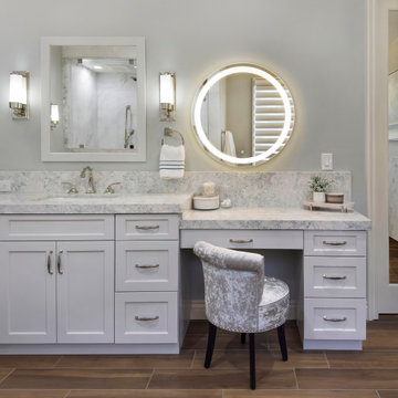
This magnificent primary bath is a coastal chic spa paradise complete with steam shower and soaking tub. With ample storage, makeup area, steam shower and large soaking tub, no detail is left untouched. Reconfiguring the room created a much better layout with extra large shower, closet & tub areas. Upscale finishes feature engineered quartz, polished nickel faucets, custom marble shower walls and wood look non-slip porcelain tile flooring for easy maintenance.
 Mariano & Co., LLC
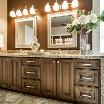
Master and Guest Bathroom Remodels in Gilbert, AZ. In the Master, the only thing left untouched was the main area flooring. We removed the vanities and tub shower to create a beautiful zero threshold, walk in shower! The new vanity is topped with a beautiful granite with a waterfall edge. Inside the shower, you'll find basket weave tile on the floor, inlay and inside the soap niche's. Finally, this shower is complete with not one, but THREE shower heads. The guest bathroom complements the Master with a new vanity and new tub shower.
 LS Winston Building Corp.
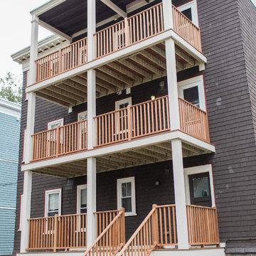
Brand new, from the footing on up to the roof. The roof was the only thing left untouched.
Elegant deck photo in Boston
Elegant deck photo in Boston
Find the right local pro for your project
 HouseHome
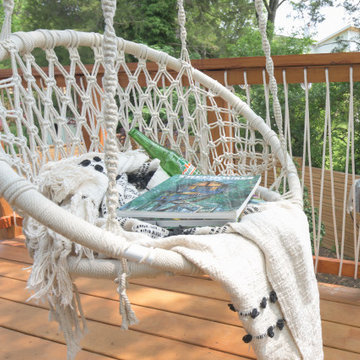
A colorful yet relaxing retreat in the heart of Olde Town Arvada that is inviting to everyone! From the adventurous outdoorsmen to the traveling city nurse. This is a restful space for guests to unwind and recharge after a long day exploring Colorado. It was a joy to transform this previously untouched 70’s space into something modern and warm while keeping the home's architectural details intact. Rich texture, clean metal lines, and other elemental touches make this AirBnB luxurious and unforgettable!
 Erica Peale Design
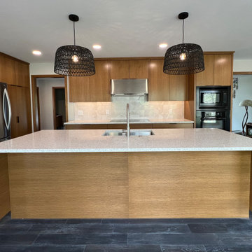
This modern custom home is a beautiful blend of thoughtful design and comfortable living. No detail was left untouched during the design and build process. Taking inspiration from the Pacific Northwest, this home in the Washington D.C suburbs features a black exterior with warm natural woods. The home combines natural elements with modern architecture and features clean lines, open floor plans with a focus on functional living.
 Design Q&A
This home's owners are reverse snowbirds who love birding. They bought this home for the wooded lot but unfortunately couldn't see much from the inside. The home was dated throughout so there wasn’t a surface in this house left untouched. Besides all walls, ceilings, and floors being addressed, projects included three bath remodels and stairway railing replacement. But, the story became the kitchen where we combined it with the formal dining room and changed the orientation to add large windows towards the trees. Now the house feels like a tree house.
 Klopf Architecture
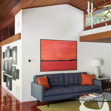
Nestled in the hills of Orinda, California, this 1951 residence is one of only seven extant homes, now known as “The Magnificent Seven”, designed by architect Olof Dahlstrand, a protégé of Frank Lloyd Wright. With its low-slung rooflines, natural materials, and deep integration with the sloping landscape, the home is a pristine example of mid-century modern design inspired by Wright’s organic principles. Over the years, prior homeowners have emphasized preservation, ensuring that the house remained relatively untouched. Each owner has respected the original architecture and stayed true to Dahlstrand’s intent. When a family of five—two college-aged sons and a middle school-aged daughter—acquired the property, they were captivated by its history, legacy of care, and architectural significance. While they appreciated Dahlstrand’s original vision, they also recognized the need to adapt the home for contemporary living while preserving its design integrity.
The remodel was conceived as a thoughtful response to the past—an effort to bring the house into the 21st century without compromising its soul. The primary mandate was to maintain architectural continuity while improving the functionality, comfort, and livability for a modern family. The design team—architects and contractor alike—worked with a shared reverence for the original architecture, allowing that mindset to guide even the most technical or pragmatic decisions.
A key objective was to increase natural light in the kitchen—a departure from Wrightian principles of enclosed, intimate cooking spaces—while maintaining the home’s architectural language. The kitchen was reconfigured to foster a stronger connection to adjacent living spaces while retaining the underlying concept of spatial separation. One of the most transformative architectural changes was the removal of a ridge beam that was originally planned to remain visible through the kitchen. During construction, the team collaborated on a better solution: a wide-flanged steel beam concealed within the roof envelope. This subtle move preserved the clean lines and ceiling continuity, a modern update carried out with utmost respect for the existing framework.
The home’s original powder room, previously accessible only through the kitchen, was relocated for better flow and privacy. A new powder room was carved out of former kitchen cabinetry—a narrow, interior space that could have felt dark and enclosed. To avoid this, the design extended the line of original transom windows into the new powder room and added a skylight above the vanity. The result is a bright and airy space that feels consistent with the rest of the home. Other updates included the installation of new solid-core interior doors with veneers carefully matched to the original mahogany, enhancing the continuity of the interiors. Even smaller decisions, such as placing the door knobs at 42 inches high, mirrored the original proportions. Every choice reflected a shared belief between the architect, contractor, and client: that new work should serve the integrity of the old.
The home’s extensive interior redwood millwork and paneling was meticulously restored. Where new materials were introduced—such as the replacement redwood soffit paneling—the contractor took pains to find finish nails that matched the original, rather than using modern equivalents. This level of craftsmanship and collaboration defined the project. It extended even to the detailing of a blind door to the new powder room, which had to disappear into the existing redwood board-and-batten wall. It was a team effort: the owner found a suitable handle, the architects devised the custom in-swing mechanism, and the contractor executed it so the door aligned precisely with the battens. Throughout, the homeowners were deeply engaged in the design process. One, a meticulous design enthusiast, focused on aesthetic integrity and historic detail. The other brought a practical and function-driven perspective, ensuring that new fixtures and materials would be durable and require minimal maintenance.
While the home’s location posed no major site challenges, sustainability was a key concern. The team upgraded the roof insulation, installed solar panels with battery storage, and added ductless mini-split cooling systems. Lighting was another area where modern technology was woven into a historic framework: new square LED fixtures echo the original custom perimeter soffit lights, maintaining the design language while offering advanced performance.
A planned expansion of a bedroom into suite with a bathroom had to be shelved due to budget constraints and the high cost of below-grade foundation work. Still, the team focused their efforts on making the most of the existing footprint, resolving constraints through design ingenuity rather than adding square footage. This renovation represents a collaborative achievement in preserving and evolving a historically significant home. Every decision was shaped by a shared ethos among clients, architects, and contractor: to maintain the home’s architectural soul while updating it for contemporary life. The result is a timeless modernist residence that continues Olof Dahlstrand’s legacy, remaining grounded in nature, craftsmanship, and human-scale design.
Klopf Architecture Team: John Klopf, AIA, Klara Kevane, Fernanda Bernardes
Interior Architectural Design: Klopf Architecture
Structural Engineer: Daniel Bastiao
Contractor: Don Larwood, Larwood Construction
Photography: Mariko Reed
Year Completed: 2022
 Bilotta Kitchen & Home
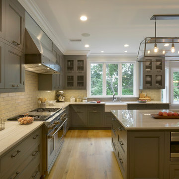
This expansive traditional kitchen by senior designer, Randy O'Kane and Architect, Clark Neuringer, features Bilotta Collection cabinet in a custom color. Randy says, the best part about working with this client was that she loves design – and not just interior but she also loves holiday decorating and she has a beautiful sense of aesthetic (and does everything to the nines). For her kitchen she wanted a barn-like feel and it absolutely had to be functional because she both bakes and cooks for her family and neighbors every day. And as the mother of four teenage girls she has a lot of people coming in and out of her home all the time. She wanted her kitchen to be comfortable – not untouchable and not too “done”. When she first met with Bilotta senior designer Randy O’Kane, her #1 comment was: “I’m experiencing white kitchen fatigue”. So right from the start finding the perfect color was the prime focus. The challenge was infusing a center hall colonial with a sense of warmth, comfort and that barn aesthetic without being too rustic which is why they went with a straight greenish grey paint vs. something distressed. The flooring, by Artisan Wood floors, looks reclaimed with its wider long planks and fumed finish. The barn door separating the laundry room and the kitchen was made from hand selected barn wood, made custom according to the client’s detailed specifications, and hung with sliding hardware. The kitchen hardware was really a window sash pull from Rocky Mountain that was repurposed as handles in a living bronze finish mounted horizontally. Glazed brick tile, by Ann Sacks, really helped to embrace the overall concept. Since a lot of parties are hosted out of that space, the kitchen, and butler’s pantry off to the side, needed a good flow as well as areas to bake and stage the creations. Double ovens were a must as well as a 48” Wolf Range and a Rangecraft hood – four ovens are going all the time. Beverage drawers were added to allow others to flow through the kitchen without disturbing the cook. Lots of storage was added for a well-stocked kitchen. A unique detail is double door wall cabinets, some with wire mesh to allow to see their dishes for easy access. In the butler’s pantry, instead of mesh they opted for antique mirror glass fronts. Countertops are a natural quartzite for care free use and a solid wood table, by Brooks Custom, extends of the island, removable for flexibility, making the kitchen and dining area very functional. One of the client’s antique pieces (a hutch) was incorporated into the kitchen to give it a more authentic look as well as another surface to decorate and provide storage. The lighting over the island and breakfast table has exposed Edison bulbs which hearkens to that “barn” lighting. For the sinks, they used a fireclay Herbeau farmhouse on the perimeter and an undermount Rohl sink on the island. Faucets are by Waterworks. Standing back and taking it all in it’s a wonderful collaboration of carefully designed working space and a warm gathering space for family and guests. Bilotta Designer: Randy O’Kane, Architect: Clark Neuringer Architects, posthumously. Photo Credit: Peter Krupenye
 Teague Hunziker Photography
©Teague Hunziker.
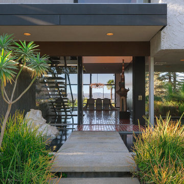
With just one owner, this mid-century masterpiece is largely untouched and remains much as it originally looked in 1972.
Entryway - mid-century modern entryway idea in Los Angeles
Entryway - mid-century modern entryway idea in Los Angeles
 TVL Creative Ltd.
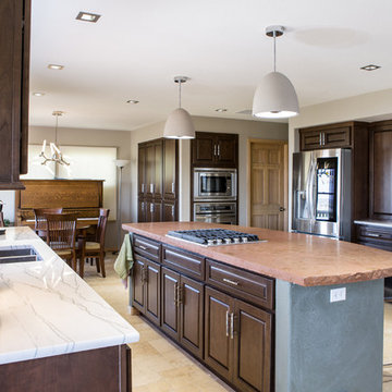
This project is one of the most extensive TVL scopes to date! This house sits in a phenomenal site location in Golden and features a number of incredible and original architectural details. However, years of shifting had caused massive structural damage to the home on both the main and basement levels, resulting in shifting door frames, split drywall, and sinking floors. These shifts prompted the clients to seek remodeling assistance in the beginning of their renovation adventure. At first, the scope involved a new paint and lighting scheme with a focus on wall repair and structural improvement. However, the scope eventually evolved into a re-design of the entire home. Few spaces in this house were left untouched, with the remodeling scope eventually including the kitchen, living room, pantry, entryway and staircase, master bedroom, master bathroom, full basement, and basement bedrooms and bathrooms. Expanding the scope in this way allowed for a design that is cohesive space to space, and creates an environment that captures the essence of the family's persona at every turn. There are many stunning elements to this renovation, but a few favorites include the insanely gorgeous custom steel elements at the front entry, Tharp custom cabinetry in the kitchen and pantry, and unique stone in just about every room of the house. Our clients for this project are both geologists. This alone opened an entire world of unique interest in material that we have never explored before. From natural quartzite countertops that mimic mountain ranges to silky metallic accent tiles behind the bathtub, this project does not shy away from unique stone finds and accents. Conceptually, the clients' love for stone and natural elements is present just about everywhere: the dining room chandelier conceptually takes the form of stalactite, the island pendants are formed concrete, stacked stone adorns the large back wall of the shower, and a back-lit onyx art piece sits in a dramatic niche at the home's entry. We love the dramatic result of this renovation and are so thrilled that our clients can enjoy a home that truly reflects their passions for years to come!
 Living with Lolo
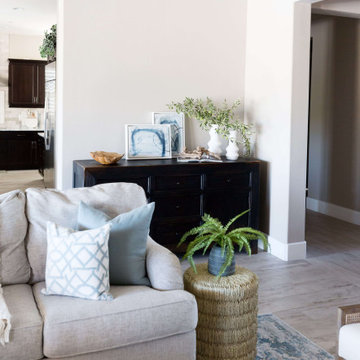
Family Room in Rolling Hills Dr | Transitional New Build in Cave Creek, AZ |
Room Type: Whole Home Furnishings |
Project Name: Rolling Hills Dr |
Key Feature: A fully furnished transitional home designed to feel sophisticated and collected without being precious, so the clients could actually live in it and have their grandkids over without a second thought.
Challenge: The clients had just completed a new build and needed a home that reflected their taste and life stage. They wanted something that felt elevated and intentional but not stiff or untouchable. The risk with transitional design at this level is that it can tip too far in either direction, ending up either too formal to live in or too casual to feel designed. Finding that balance in a brand new home with no existing character to work from is harder than it sounds.
Solution: Living with Lolo furnished the entire home with pieces that layered sophistication with genuine comfort. Every selection was made with real life in mind, durable enough for grandkids, beautiful enough for entertaining, and cohesive enough to feel like a designer put it together rather than a furniture showroom. The transitional direction gave the home warmth and timelessness without leaning on trends that would feel dated in a few years.
Materials: Transitional furnishings with a mix of natural textures, comfortable upholstery, layered rugs and textiles, and curated accessories sourced through Living with Lolo's trade relationships.
Budget: $75,000 to $200,000 |
Timeline: Approximately 3 to 6 months from design through installation.
 JRP Design & Remodel
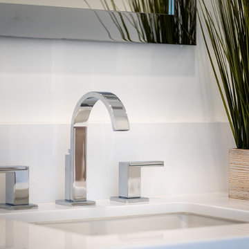
Untouched since 1974, our clients knew the JRP team were the ones to call and help them bring their renovation dreams to fruition. With an awkward closet inside the bathroom, it was determined that a new spatial layout was a must. Moving the closet to a new location and with a rearrangement of the plumbing fixtures, this dull and dated bathroom now has a clean contemporary and spa-like feel designed for relaxation.
This bathroom renovation features wall-mounted cabinetry and an exaggerated countertop detail that really creates a statement. Robern mirrored cabinets, with integrated lights, are not only beautiful but add much need storage. A linear shower drain provides the appropriate slope for the large wood-like porcelain tile throughout the shower pan, add in a solar tube, and you now have a bright, clean-lined, and serene aesthetic.
PROJECT DETAILS:
• Style: Transitional
• Colors: White
• Countertops: Vadara Quartz, Absolute Blanc
• Cabinets: DeWils, Shaker, White
• Hardware/Plumbing Fixture Finish: Polished Chrome
• Lighting Fixtures: Sconces
• Flooring: Porcelain Wood Look Tile
• Tile/Backsplash: Ceramic White Gloss
Photographer: Andrew (Open House VC)
 Duffy and Associates Design Build Ltd
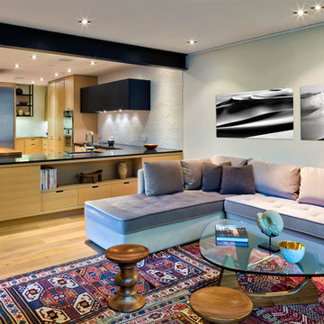
Sited in a well-treed urban neighbourhood, the early 20th century yellow-brick structure was completely stripped down and refitted with steel sash windows, bleached oak floors and cabinetry, and elements in steel, oak and glass. The front facade was completely restored but untouched in its original design because of the houses designation as an Ontario Heritage Property
 FTC - Final Touch Construction of Colorado
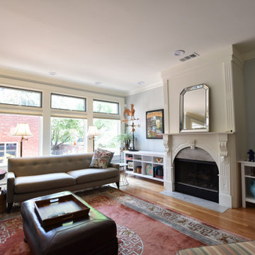
Not a room went untouched in this century old Denver Square. From refacing fireplaces, beautifying the exterior to painting the "parlour," each room was updated from front to back, top to bottom and inside and out. Photos by Jett Moore, Moore House Photos.
 River Woodcraft
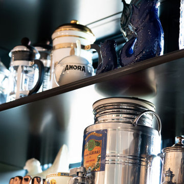
This kitchen was designed for the MAXIMALIST in mind. A homeowner who enjoys displaying all their antiques and chosen novelties from all over the world. No space was to be left untouched. Special attention was designed around custom detail beaded inset cabinetry, walnut countertops, polished lacquered bar with a tribute to their Naval background. Even the refrigerator is to be displayed through the glass
 Simply Home Decorating
There are not many things better than a room full of your favourite people. As you gather you smell dinner cooking in the kitchen and music playing in the background, as joyful conversation and laughter fill the room. I feel so grateful that we are inching our way back to these days. How about you?
The project I’m sharing with you today has beautiful moments like these at its heart. Spaces that invite people in, foster connection, and make everyday living so simple that it’s impossible not to enjoy...
Meet our Delightful Clients:
The family behind this 1950s North Vancouver home transformation enjoy entertaining friends just as much as cosying up to watch a movie together. A professional couple (I'll call them Jon and Anna) with two elementary school-aged sons, Anna and Jon approached us with the task of furnishing the main floor living spaces and the basement of their family home.
Anna is a busy lawyer who is now working almost full time from home, and Jon works in the film industry. With full careers, two active boys, and a love of gathering, they craved a home that could support their everyday lifestyle.
Design and Lifestyle Goals:
Our central goal for this project was simple: to uncover the hidden potential in their home and create a family-friendly space that functioned well and flowed seamlessly.
On the main floor, our clients tasked us with creating an area for the family to relax and entertain, along with crafting a work and play space for the boys. They also dreamed of a more functional and bright basement, which they envisioned as a dual purpose family room and home office for Anna.
Reveal: Comfortable and Welcoming Entryway & Living Room:
Imagine you are coming home, and you walk through a bright, sunny front door like this one. You are met by this entryway of calming earth and sea tones, paired with warm, natural wood flooring. You feel instantly welcomed and eager to venture further inside... The same is now true for our clients!
The simple details in their entryway are thoughtfully arranged with clean lines and colourful art as the focal point, achieving a timeless and friendly aesthetic. Dried wheat brings movement into the space and plays up the beauty of nature, while the vibrant yet warm colours and textures evoke feelings of comfort and homecoming.
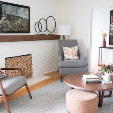
The entry flows seamlessly into this connected living area, which is adorned with ample seating strategically arranged to host and accommodate joyful conversations. With the fireplace and wood mantel as the focal point, these natural elements and hues warm up the room to make it feel beautifully lived-in (not like an untouchable museum).
Another colourful work of art graces the space above Jon’s and Anna’s sofa, and we used decorative pillows and a throw blanket to tempt those colours into the rest of the room. A simply styled coffee table keeps the space feeling open and engaged. Reading material, anyone?
Just beyond this living area, you get a glimpse of the second space our clients requested on their main floor...
A Collected Space for Children to Work + Play:
When Jon and Anna realised that their formal dining area wasn’t being used to its full potential, they imagined creating a work and play space for their boys instead. We came up with a plan to create a shared desk area with plentiful storage.
This timeless natural wood desk was the perfect way to maximise surface area and give the boys plenty of space to do homework during the school year, or spend time crafting or building LEGOs during the summers. The drawers provide storage for all the wonderful items that fuel their productivity or creativity. Or both.
I also love how the white floating shelves display a collection of nostalgic toys, providing just the right amount of childhood endearment to this sophisticated and functional space. This workspace now has endless possibilities for the boys, and it helps Jon and Anna keep their minds and spaces clear, too. Which brings us to...
Basement Family Room & Home Office:
In general, we knew we had to maximise surface area in this ‘50s home, and this was especially true for our clients’ basement. I’m happy to say that we designed an effortlessly comfortable space that focuses on family and makes it simple to settle in and work… or leave the workday behind.
Welcome to this dual-function office and family room. Toward the back of the room, we strategically positioned Anna’s wraparound desk facing out into the room and gave her a wallpaper-and-art backdrop for stunning Zoom calls (she has already received glowing compliments). There is plenty of storage for easy organization including a space to store the family’s shared printer near the door… so they don’t have to interrupt “Mom” to get to it.
Anna also wanted the freedom to be able to relax in this space with her family and turn her back on the work day — quite literally! The sofa is perfectly positioned backing onto the desk allowing her to do just that.
We relocated an existing mustard yellow chair and used pops of the same colour to integrate it into the overall scheme. The wood armrests on this modular sectional provide surfaces for snacks and drinks where there was no room for an end table. The walnut finish carries the theme of natural comfort from the upstairs spaces down into the family room.
The view from the sectional is less business and more pleasure, featuring cosy seating and throw pillows in cheerful colours and patterns.
The highlight of this space? A wallpapered accent wall where we were able to achieve the high-end feel of custom built-in shelving with a simple IKEA hack. The shelves and cabinetry around the television offer plenty of much needed storage space to house family games and movies at a budget price point.
This fun room is the perfect balance of work and play, accommodating and supporting our clients’ daily family adventures.
What Our Clients Had to Say...
Our clients could not be happier with their warm yet functional new rooms. With thoughtful consideration and a plan of action, we were able to transform two areas of their home into spaces that function well and feel good. In fact, they had this to say:
“Lori and her team were everything we were looking for: great listeners, wonderfully creative and highly professional. We couldn't be happier with our interior makeover.” — Clients
That is why we do what we do. If you're ready to start your redesign project, we would love to help. Reach out to us here, and let's get to know more about each other.
 BLDG Workshop Inc.
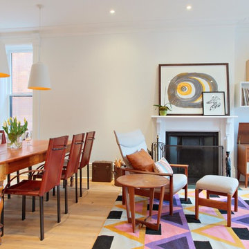
Our client wanted an open concept space in a long narrow home that left original textures and details untouched. A brick wall was exposed as a walnut kitchen, mid-century modern furnishings and industrial style floor-to-ceiling glazing were added. In this photo a beautiful rug from Aelfie in Brooklyn ties the whole mid-century modern aesthetic together.
Construction by Greening Homes
 Ancient Surfaces
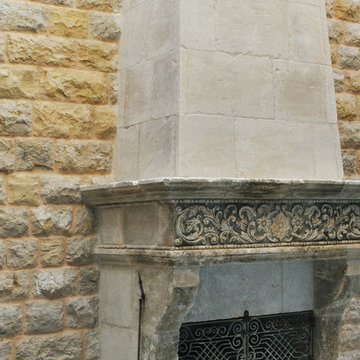
Wall Cladding Stone by 'Ancient Surfaces'
Product: 'Atlantis' Wall Cladding Stone
Contacts: (212) 461-0245
Email: Sales@ancientsurfaces.com
Website: www.AncientSurfaces.com
The 'Atlantis' Limestone Wall Cladding selection is unique golden blend limestone, rare in it's hardness and beauty.
This stone put you right on the shores of the Adriatic coast gives you a feel of timelessness allowing you to travel back in time into the untouched North Mediterranean domains of fallen Empires and ancient bustling coastal trading villages, where a mercantile class have built some of the most luxurious estates out of the breath taking local stone blocks all along the shoreline of Southern Europe.
This exclusive 'Ancient Surfaces' stone wall cladding blend might just be the missing link needed to transform your home from a logging space to your dream space...
 River Woodcraft
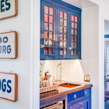
This kitchen was designed for the MAXIMALIST in mind. A homeowner who enjoys displaying all their antiques and chosen novelties from all over the world. No space was to be left untouched. Special attention was designed around custom detail beaded inset cabinetry, walnut countertops, polished lacquered bar with a tribute to their Naval background. Even the refrigerator is to be displayed through the glass
 River Woodcraft
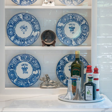
This kitchen was designed for the MAXIMALIST in mind. A homeowner who enjoys displaying all their antiques and chosen novelties from all over the world. No space was to be left untouched. Special attention was designed around custom detail beaded inset cabinetry, walnut countertops, polished lacquered bar with a tribute to their Naval background. Even the refrigerator is to be displayed through the glass
38