
Search results for "Absence" in Home Design Ideas
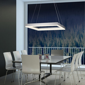
 sonnemanlighting
Corona is a precise profile that defines the presence and absence of volume within its crisp rectilinear space. Its interior glow of perfectly balanced and uniquely internally focused warm LED illumination is echoed in the subtly illuminated edge of its external perimeter.

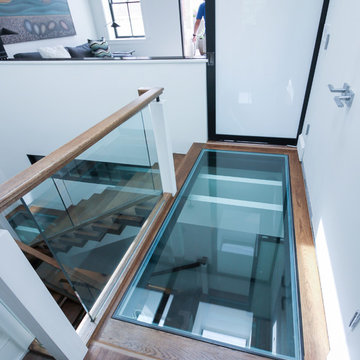
 Century Stair Company
This innovative three-story staircase showcases engineering and design in perfect harmony. Each level cantilevers from two central spine beams, creating a floating effect that spans the entire vertical space. Thick dark-stained oak treads appear to hover without visible support, while the absence of risers maintains complete transparency.
The defining feature is the glass landings at each level. Combined with the open-riser design, these transparent platforms allow natural light to cascade freely through the stairwell and into adjacent living areas. The result is an ultra-modern staircase that transforms vertical circulation into a study of light and space.
1976-2026 © Century Stair Company
Find the right local pro for your project
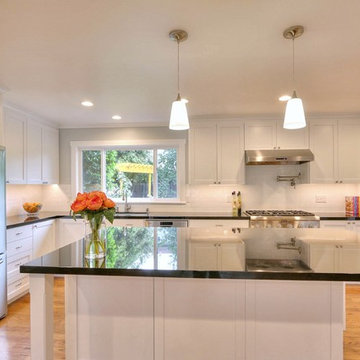
 Acton ADU
This single family home came with an awkward and cramped room arrangement, which was easily solved by knocking down walls. With a new open floor plan, we were able to open up the shared living space between the kitchen and living room and bring the chefs out into the open, no longer isolated from their guests or family while cooking in the kitchen.
With the absence of interior walls, more natural light was filtered into the home, creating a bright, cheery atmosphere; and ventilation was designed to flow more freely and efficiently throughout the space.
Particular features in this kitchen remodel include a white ceramic tile backsplash, absolute black granite countertops, white shaker-style cabinets, stainless steel appliances, and medium hardwood floors.
 CITYDESKSTUDIO, Inc.
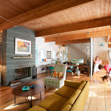
Drawing on utility farm buildings, the design of this house is direct in it’s form and organization. Located in a dense St. Paul neighborhood on a narrow 39’ wide lot, the house draws equally from it’s turn of the century neighbors for scale and materiality.
The 20’ wide shotgun structure allowed the house to be pushed to the east, opening up the west wall for large windows and the opportunity for an outdoor room. This changed what is normally “nowhere” space between houses into an active extension of the home used to BBQ, play catch, and afford pleasant transition from front to back.
Life plays out in the home within three space, the living/dining, the kitchen/breakfast, and the porch/outdoor room. All three are used daily either actively or borrowed. Each is clearly defined and connected to the others through the careful placement or absence of walls or corners, and made more expansive by increased height, defined sightlines, and exposed structure
Architect:
Ben Awes AIA
 Sustainable Sedona
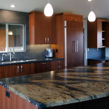
Sedona is home to people from around the world because of it's beautiful red rock mountain scenery, high desert climate, good weather and diverse community. Most residents have made a conscience choice to be here. Good buildable land is scarce so may people purchase older homes and update them in style and performance before moving in. The industry often calls these project "whole house remodels".
This home was originally built in the 70's and is located in a prestigious neighborhood beautiful views that overlook mountains and City of Sedona. It was in need of a total makeover, inside and out. The exterior of the home was transformed by removing the outdated wood and brick cladding and replacing it stucco and stone. The roof was repaired to extend it life. Windows were replaced with an energy efficient wood clad system.
Every room of the home was preplanned and remodeled to make it flow better for a modern lifestyle. A guest suite was added to the back of the existing garage to make a total of three guest suites and a master bedroom suite. The existing enclosed kitchen was opened up to create a true "great room" with access to the deck and the views. The windows and doors to the view were raised up to capture more light and scenery. An outdated brick fireplace was covered with mahogany panels and porcelain tiles to update the style. All floors were replaced with durable ceramic flooring. Outdated plumbing, appliances, lighting fixtures, cabinets and hand rails were replaced. The home was completely refurnished and decorated by the home owner in a style the fits the architectural intent.
The scope for a "whole house remodel" is much like the design of a custom home. It takes a full team of professionals to do it properly. The home owners have a second home out of state and split their time away. They were able to assemble a team that included Sustainable Sedona Residentail Design, Biermann Construction as the General Contractor, a landscape designer, and structural engineer to take charge in thier absence. The collaboration worked well!
 Seaside Premium Cabinets
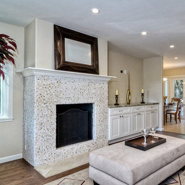
Living room - mid-sized traditional open concept medium tone wood floor and brown floor living room idea in Miami with beige walls, a standard fireplace and a tile fireplace
 McKinney York Architects
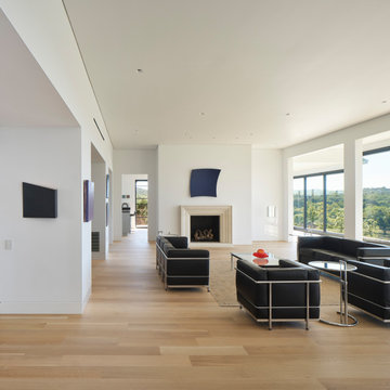
This extensive remodel overlooking Lake Austin is a paean to the powerful art it enfolds. Rigorous editing of every distracting, inconsequential element of the original house was critical. So too was the insertion of new complementary components that provide artful ways to move through both interior and exterior rooms. The collection of modern art is arresting. Ranging from a Turrell hologram to a pair of Agnes Martins, the art is framed by the architecture and lighting so that it is experienced in a choreographed, curated way that encourages wandering and an intimate connection to each piece. The mood is set in the entry courtyard. A floating walkway curves down and around a brilliant spiraling blue Clement sculpture. It pauses once, at a moment of surprise, when the first view through the house is filled with the blue water of the lake beyond. Inside, the saturated color of many of the pieces of art are balanced by an absence of other visual clutter in the color palette, furniture, and architecture. A new interior plaster, steel, and bronze stair carves through a space occupied by two small Clement sculptures in niches, a McKay Otto sculpture on a landing and a glass cylinder elevator. This is a very specific place, designed for specific art and for a collector who has a close relationship with each piece.
 MEBELNEWLOOK
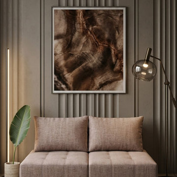
Modular Aesthetics: Seamless Interior Solutions by MebelnewLook
At MebelNewLook, we’ve developed a modular furniture series designed to function as an architectural element rather than just a standalone piece.
Key benefits for your projects:
Seamless Silhouette: A flush wall-side fit and the absence of bulky backrests maintain clean, architectural lines.
Compact Ergonomics: 750 \times 750 mm modules with a lounge-height seating (320 mm) — a perfect fit for modern minimalist spaces.
MCS System: Our proprietary hidden connector system allows for creating a solid, monolithic composition of any length in seconds.
We value professional feedback: how well do these dimensions and the "clean horizon" concept align with your current design projects?
I’d be happy to send over our technical catalog for your review.
Best regards,
Pavel Nechmirov
Founder & CEO at MebelNewLook
www.mebelnewlook.com/en
 Artist's Proof
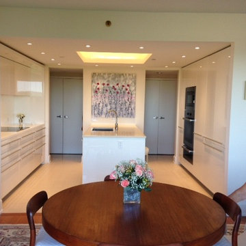
This tricolor piece gives this minimalistic kitchen a warm and more lived-in mood. The black within the stems creates a synergy with the inserted black appliances , and blends the contrasting white and black together with the grey tone from the Chinese ink. The absence of a frame forces the onlooker to distinguish a difference between the sleek white kitchen, and this textured piece. The red flowers and horizon line bring in the red heavy dining room, which is more traditional. It weakens the boundary from the bamboo to the medium-dark hardwood , causing a more natural and seamless transition to an unwanted barrier . It also being a centerpiece, it gives the kitchen a balanced look; a must have in any modern kitchen. Great placement.
 Neumann & Rudy Architecture
## I. Spatial Composition & Architectural Volume
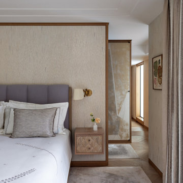
This bedroom operates as an exercise in controlled asymmetry, its plan organized around a freestanding headboard wall that reads less as partition than as inhabited architecture. Framed in a crisp oak reveal that traces its full perimeter, the wall detaches from the ceiling plane and terminates short of the right-hand elevation, generating a threshold that draws the eye into a secondary corridor volume beyond. This device — the *poché* wall as spatial pivot — establishes a layered enfilade: the intimate sleeping zone in the foreground, a transitional dressing passage in the middle distance, and a slot of daylight at the terminus. The ceiling is articulated with a shallow recessed tray and delicate stepped cornice, a restrained gesture toward classical Parisian *moulure* that regulates the room's proportion without ornamental excess. Sightlines are deliberately choreographed: the bed sits low and horizontal, the joinery plinth of the nightstand cantilevers from the wall to preserve floor-plane continuity, and the herringbone parquet visible beyond the threshold introduces a directional pull that animates what would otherwise be a static rectilinear volume. The result is a composition of nested frames — millwork within millwork — that lends considerable depth to a comparatively compact footprint.
## II. Materiality, Color & Texture
The palette is tonal rather than chromatic, calibrated within a narrow band of oatmeal, greige, and pale putty, and enlivened almost entirely through surface incident. The dominant wallcovering — a vertically striated, marquetry-like textile of tessellated ivory and taupe fibers — supplies a subtle warp-and-weft rhythm that shifts under raking light, functioning as texture masquerading as pattern. Against this, rift-sawn white oak framing introduces a honeyed, gently reddish undertone, while the bespoke bedside cabinet deploys a radiating sunburst veneer in a blush-tinged walnut or eucalyptus, its book-matched geometry providing the room's single moment of overt figuration. Textiles carry the tonal counterweight: the channel-tufted headboard in a muted heather-aubergine linen offers the deepest saturation in the frame, cooling the prevailing warmth, while cotton percale with contrast tape borders, a slubbed lumbar cushion, and a hand-stitched matelassé coverlet with tambour scrollwork build a gradient of tactility from crisp to plush. The doorway's parchment-and-verdigris art panel — appearing as a gilded, oxidized *gessoed* screen — supplies a patinated, almost frescoed counterpoint, while unlacquered brass at the sconce introduces the only metallic warmth, deliberately restrained.
## III. Lighting, Atmosphere & Style Profile
Illumination is handled with notable discretion. Natural light enters obliquely from an off-frame source at right, filtered through a floor-to-ceiling striated linen drapery that diffuses rather than admits, producing an even, shadowless wash consistent with northern European daylight. A secondary aperture — the narrow vertical slot glimpsed down the corridor — acts as a luminous punctuation mark, terminating the sightline with a slender bar of brightness that draws the occupant forward. Artificial lighting is intentionally sparse and task-oriented: a brass scissor-arm sconce with an unbleached linen shade, adjustable and near-vernacular in its mechanism, provides articulated reading light while contributing a note of atelier informality against the otherwise refined joinery. The absence of visible downlights or decorative pendants reinforces the room's quietude. Stylistically, the scheme resolves into a sophisticated **Soft Minimalism** inflected with contemporary Parisian classicism — the restraint and tonal discipline of the former, the millwork rigor and proportional literacy of the latter, warmed by a *wabi*-adjacent appreciation for patina and handwork. It is a room that eschews statement in favor of atmosphere, achieving luxury through material intelligence and the calibrated withholding of contrast.
 D'CASSA
Sleek Elegance
Full Matte Lacquer Kitchen Project
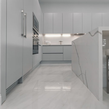
Our latest addition to the portfolio is nothing short of a modern masterpiece. The full matte lacquer kitchen project combines cutting-edge design with seamless functionality. Featuring hidden acute handles that merge seamlessly with the sleek cabinet surfaces, this project redefines contemporary aesthetics.
In this project, we embraced the timeless allure of matte lacquer finishes, showcasing its ability to create a sophisticated, velvety texture that exudes luxury. The absence of visible handles not only enhances the minimalist appeal but also ensures a smooth and uninterrupted visual flow throughout the kitchen space.
The choice of matte lacquer not only provides a stunning visual impact but also offers practical benefits, such as easy maintenance and durability. Its resistance to fingerprints and stains makes it an ideal choice for those who value both aesthetics and functionality.
This kitchen project is a testament to our commitment to delivering innovative and visually stunning designs that elevate living spaces. Explore the gallery below to immerse yourself in the modern elegance and meticulous craftsmanship that define this project. We invite you to experience the future of kitchen design with our full matte lacquer creation.
 Field Architecture
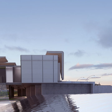
Our ambition for Bodega Bauer was to create an architecture that was informed by the same particularities of the earth which are embodied in the wine of the region. Siting and materiality are guided by the subtleties of sun and wind exposure, climate, the unexpected nuances of each season, and the presence and absence of water and shade.
The Incan irrigation technology that made the region habitable since pre-Columbian times by channeling snow melt from the Andes, was a powerful source of inspiration. Extending this system of ancient waterways, a central channel connects the house to the winery, and becomes a collector for water harvested from the building’s rooftops for irrigation. The new channel guides visitors along a sensuous journey through which one encounters the elements – sun, wind, soil, and water – which make the wine unique. What emerges is an architecture that accentuates its environment, and is at one with the raw, bold spirit of Mendoza.
Along the irrigation channel, two linear forms – one descending, the other rising out of the ground – evoke the correspondence of architecture and wine. The descending structure is the wine-making facility which follows the gravity fed wine making process into the barrel aging vault below. The ascending structure allows the visitor to see how the wine is made, and culminates with a tasting room overlooking the vineyards and landscape. The forms of the winery create a playful interplay of sloping planes that allow the subtle topography of the ground to be perceived.
 United Porte Inc
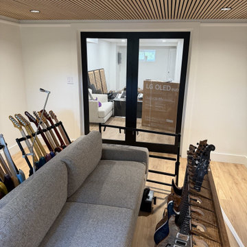
Lucia 2166 Matte Black Concealed Metal Frame 64" x 80" (2* 32x80) Left-hand Outswing Description
Set includes:
Pre-drilled door slab.
Metal invisible frame (3 pcs) made of cold-rolled galvanized steel, with connectors and screws.
3D-adjustable concealed hinges.
American style or European style handle and lock (per your choice).
Door model – 2166
Coating – eco-veneer
Door thickness – 1 1/2"
Door core – solid wood.
Modern frameless design makes this door a perfect solution for stylish interiors. Thanks to the minimalist look and absence of visible trims, it visually expands the space and blends seamlessly into any room.
The eco-veneer coating is durable, scratch-resistant, easy to maintain, and designed for long-lasting performance. The engineered solid wood core provides strength, stability, sound reduction, and helps preserve heat inside the room.
Door can be chosen with inswing or outswing direction. Flush design is available from one side only to achieve a clean invisible frame look.
The invisible frame is resistant to mechanical damage and corrosion. Extensions are available to cover a wall up to 7".
Frame should be spackled and painted after installation to achieve a seamless invisible frame finish that integrates perfectly with the wall surface.
 Century Stair Company
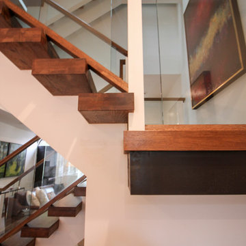
This innovative three-story staircase showcases engineering and design in perfect harmony. Each level cantilevers from two central spine beams, creating a floating effect that spans the entire vertical space. Thick dark-stained oak treads appear to hover without visible support, while the absence of risers maintains complete transparency.
The defining feature is the glass landings at each level. Combined with the open-riser design, these transparent platforms allow natural light to cascade freely through the stairwell and into adjacent living areas. The result is an ultra-modern staircase that transforms vertical circulation into a study of light and space.
1976-2026 © Century Stair Company
 Century Stair Company
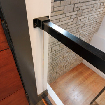
This contemporary staircase serves as a striking focal point in the home's sun-filled entryway. Black mono-beam stringers support thick natural-stained oak treads, creating a bold structural framework. The absence of risers maintains complete openness, allowing natural light from the surrounding private forest to flow freely through the space. Glass panel railings echo the foyer's numerous windows, maintaining visual continuity throughout, while the black metal cap rail reinforces the industrial aesthetic of the stringers. Together, these elements create an anchoring stair system that enhances the contemporary home's connection to light and landscape.
1976-2026 © Century Stair Company
 Century Stair Company
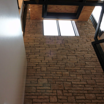
This contemporary staircase serves as a striking focal point in the home's sun-filled entryway. Black mono-beam stringers support thick natural-stained oak treads, creating a bold structural framework. The absence of risers maintains complete openness, allowing natural light from the surrounding private forest to flow freely through the space. Glass panel railings echo the foyer's numerous windows, maintaining visual continuity throughout, while the black metal cap rail reinforces the industrial aesthetic of the stringers. Together, these elements create an anchoring stair system that enhances the contemporary home's connection to light and landscape.
1976-2026 © Century Stair Company
 MAKHNO studio
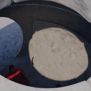
This temple design embodies an ultra-modern, sculptural form, focusing on curvilinear shapes and a minimalist aesthetic. The use of concrete in various textures provides a sense of solidity and permanence, while the clever play of light and shadow through circular openings adds a dynamic quality to the tranquil space. The interior's stark simplicity and the absence of ornamentation draw attention to the meditative atmosphere, encouraging introspection and peace.
 Century Stair Company
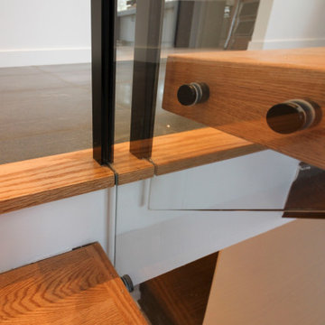
This contemporary staircase serves as a striking focal point in the home's sun-filled entryway. Black mono-beam stringers support thick natural-stained oak treads, creating a bold structural framework. The absence of risers maintains complete openness, allowing natural light from the surrounding private forest to flow freely through the space. Glass panel railings echo the foyer's numerous windows, maintaining visual continuity throughout, while the black metal cap rail reinforces the industrial aesthetic of the stringers. Together, these elements create an anchoring stair system that enhances the contemporary home's connection to light and landscape.
1976-2026 © Century Stair Company
 Alenia Kitchens + Interiors
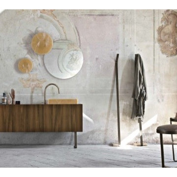
A NEW IDEA TAKES SHAPE. A SENSUAL, UNIQUE AND EXCLUSIVE CONCEPT: THE ATTENTION TO DETAIL COMBINED TO EMBRACING MATERIALS CREATE A TIMELESS SPACE; WHERE THE ABSENCE OF GRAVITY AND A FEELING OF LIGHTNESS GENERATE UNIQUE EMOTIONS. VISUALIZING THE EVANESCENT COLOUR SHADES, TOUCHING THE PRECIOUS MARBLES, BEING INSPIRED BY HARMONY AND PROPORTIONS: THIS IS MUST: THE STYLE OF A PROJECT ABLE TO GO BEYOND THE DEFINITIONS TO BECOME PURE LUXURY AND PLEASURE.
ALTAMAREA
17