
Search results for "Brightener" in Home Design Ideas
 SHKS Architects
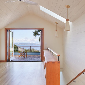
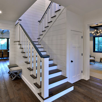
Whitewashed structure and horizontal boards brighten the space while adding texture and visual interest, creating a cabin feel upstairs with the same durability of the materials downstairs.
All images © Benjamin Benschneider Photography


 Hardwood Bargains
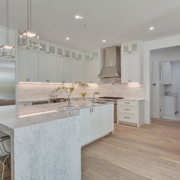
Walk on sunshine with Skyline Floorscapes' Ivory White Oak. This smooth operator of floors adds charm to any room. Its delightfully light tones will have you whistling while you work, play, or relax at home.
This amazing reclaimed wood style is a perfect environmentally-friendly statement for a modern space, or it will match the design of an older house with its vintage style. The ivory color will brighten up any room.
This engineered wood is extremely strong with nine layers and a 3mm wear layer of White Oak on top. The wood is handscraped, adding to the lived-in quality of the wood. This will make it look like it has been in your home all along.
Each piece is 7.5-in. wide by 71-in. long by 5/8-in. thick in size. It comes with a 35-year finish warranty and a lifetime structural warranty.
This is a real wood engineered flooring product made from white oak. It has a beautiful ivory color with hand scraped, reclaimed planks that are finished in oil. The planks have a tongue & groove construction that can be floated, glued or nailed down.
Find the right local pro for your project
 Paradise Tiny Homes LLC
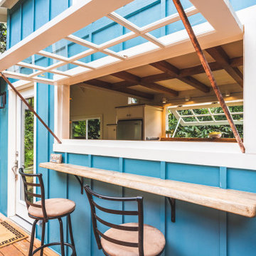
The awning windows in the kitchen blend the inside with the outside; a welcome feature where it sits in Hawaii.
An awning/pass-through kitchen window leads out to an attached outdoor mango wood bar with seating on the deck.
This tropical modern coastal Tiny Home is built on a trailer and is 8x24x14 feet. The blue exterior paint color is called cabana blue. The large circular window is quite the statement focal point for this how adding a ton of curb appeal. The round window is actually two round half-moon windows stuck together to form a circle. There is an indoor bar between the two windows to make the space more interactive and useful- important in a tiny home. There is also another interactive pass-through bar window on the deck leading to the kitchen making it essentially a wet bar. This window is mirrored with a second on the other side of the kitchen and the are actually repurposed french doors turned sideways. Even the front door is glass allowing for the maximum amount of light to brighten up this tiny home and make it feel spacious and open. This tiny home features a unique architectural design with curved ceiling beams and roofing, high vaulted ceilings, a tiled in shower with a skylight that points out over the tongue of the trailer saving space in the bathroom, and of course, the large bump-out circle window and awning window that provides dining spaces.
 Downtown Tile Centre
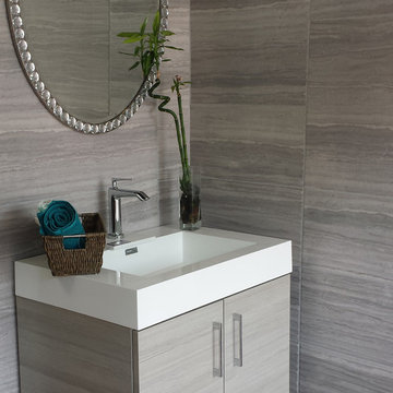
Finesse glazed ceramic wall tile brings a fresh, clean look to brighten any space. Suitable for interior applications throughout the home including kitchen counters, backsplashes and bathroom walls, this tile will provide the perfect complement to a variety of design styles.
Classic white ceramic tile with a unique wave pattern in a contemporary 10”x26” size. Add interest and dimension with this wave tile. Excellent for wall and backslash usage. Glazed ceramic with an easy to clean surface. Vanity was designed by us and made by our custom mill-worker. Designed by Joana Carreira
 DiGiacomo Homes & Renovation
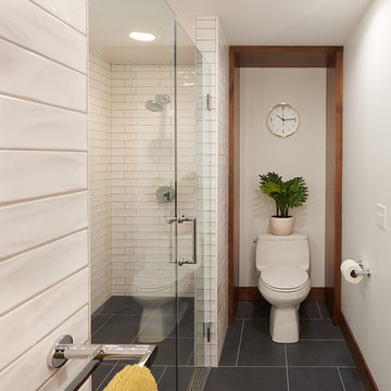
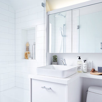
With no windows or natural light, we used a combination of artificial light, open space, and white walls to brighten this master bath remodel. Over the white, we layered a sophisticated palette of finishes that embrace color, pattern, and texture: 1) long hex accent tile in “lemongrass” gold from Walker Zanger (mounted vertically for a new take on mid-century aesthetics); 2) large format slate gray floor tile to ground the room; 3) textured 2X10 glossy white shower field tile (can’t resist touching it); 4) rich walnut wraps with heavy graining to define task areas; and 5) dirty blue accessories to provide contrast and interest.
Photographer: Markert Photo, Inc.
 Maria Causey Interior Design
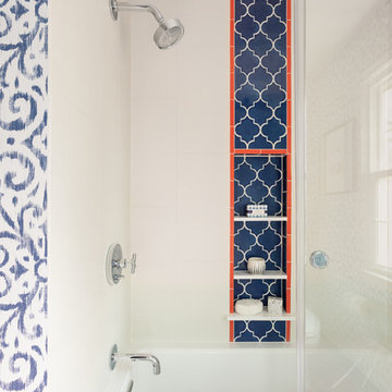
Sophisticated and fun were the themes in this design. This bathroom is used by three young children. The parents wanted a bathroom whose decor would be fun for the children, but "not a kiddy bathroom". This family travels to the beach quite often, so they wanted a beach resort (emphasis on resort) influence in the design. Storage of toiletries & medications, as well as a place to hang a multitude of towels, were the primary goals. Besides meeting the storage goals, the bathroom needed to be brightened and needed better lighting. Ocean-inspired blue & white wallpaper was paired with bright orange, Moroccan-inspired floor & accent tiles from Fireclay Tile to give the "resort" look the clients were looking for. Light fixtures with industrial style accents add additional interest, while a seagrass mirror adds texture & warmth.
Photos: Christy Kosnic
 Andrew Mikhael Architect
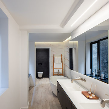
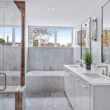
Approaching the master bathroom - first the vanities, then a freestanding tub that faces a window to a private courtyard. The toilet and shower (out of frame) are at the end.



 Advance Design Studio, Ltd.
After six years of living in their Huntley IL home, Chris and Meghan were tired of their dark, dingy, outdated kitchen and it was finally time for a long-anticipated change. “The kitchen is the place where we live, it’s where we do everything,” Meghan said. “It was important that it be a space where we wanted to be.” Meghan loves cooking and enjoys including their girls in healthy meal prepping, this led them to want a brighter, more enjoyable kitchen with increased functionality and improved storage.
For Chris especially, the laundry room was an entirely dysfunctional eyesore. “We had a washer and a dryer, but it was all kind-of cobbled together!” Chris said. “There were always laundry piles everywhere, we weren’t really sure what we wanted to do in there, but it was time for us to make a change.” The mess of the space was stressful every time they walked in the door from the garage each day. Kids’ backpacks and shoes piled up haphazardly in the makeshift boot-bench closet left the family feeling disorganized and stressed. They needed space for folding clothes and locker cubbies to help keep the family organized.
Having known Christine and Todd in the Huntley community for years, Chris and Meghan were familiar with their work. “We already trusted them personally and having seen their projects for years we knew they did top notch work. After we reviewed the initial round of designs, we knew that hiring them was definitely the right choice,” Meghan and Chris said. Although Chris had done a lot of work in their home himself, the kitchen and laundry room renovation was such a large undertaking that he didn’t want to steal time away from his family to spend what would surely be many long weekends doing the job himself. “That would not have been a wise choice for us,” Chris laughed.
“Our designer, Michelle was very, very, easy to work with; anything we wanted to see or weren’t sure about, she went above and beyond to make this easy for us. She was easy to get hold of and always quick to respond,” the couple said. Michelle pulled ideas that mirrored the couple’s taste and style and was adept at directing the couple to limited choices that didn’t overwhelm them and kept the process moving. “I have a hard time making decisions. Michelle made the decision-making process so easy. I loved how she listened to what I liked and then presented three great options for me to choose from,” Meghan said.
The main objectives for the kitchen were better storage solutions, they wanted the space to reflect their lifestyle and taste, and they wanted it to last for years with low maintenance. One of the first steps in creating a more functional kitchen was relocating the refrigerator, creating an improved workflow for the busy family.
“We didn’t know that we could even move the refrigerator to a new location where it is now, that was something that we never would have thought of,” Chris said. “The new refrigerator location makes the kitchen feel so much bigger. We didn’t add any space, but our whole kitchen with the new design just seems like it’s so much larger than before!” Meghan said.
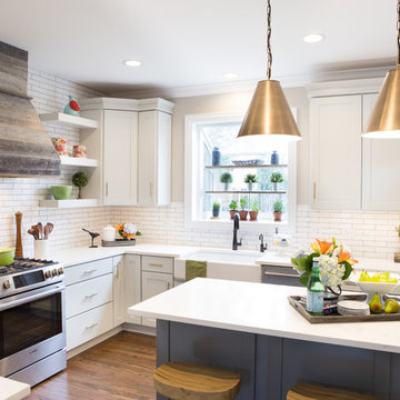
The perimeter mist colored cabinets helped warm and brighten the entire room, while the graphite colored cabinets on the island added contrast. Using this fresh, clean color palette satisfied the couple’s desire for a bright space that was the exact opposite of what they had before. Organization accessories were also added to the cabinets such as a spice drawer tray and roll outs to create hidden convenience.
“I absolutely love the hidden spices – it makes cooking so much more enjoyable!” Chris said. “And all the pull outs, and the double trash bin, who would think you could get so excited about organization!” the couple said in unison.
One thing they hated in their original kitchen was how dark the space felt. Added lighting on the ceiling with the new light fixtures combined with the lighter cabinetry colors throughout solved this problem. “Our new kitchen has this warm, almost cozy feeling that our old kitchen never had, it’s just a space that I love spending my time in now,” Meghan said. The light airy feeling was accentuated with the use of floating white shelves on either side of the decorative range hood. “We have so much cabinetry space, the new design is amazing we actually have more storage space than we will ever need,” Meghan said.
The island was extended to create more work surface and added space for stool seating. “The new island changes how we live. Now the kids can be in the kitchen with us, doing homework, eating breakfast, and the three of us have special dinners there when Chris is working late,” Meghan said.
The Carrara Marmi Quartz countertops were chosen because they are, not only beautiful, but are made from hard-working material that doesn’t require maintenance. The white subway tile backsplash that wraps to the ceiling behind the focal point cooktop range/hood compliments the crisp white countertops perfectly, while brushed brass hardware and light fixtures keep the design fresh and new.
The couple had a few fears at the beginning of the project, as most homeowners do. Their biggest fear was being out of their kitchen and laundry room for an extended time. The crew made it very easy for the family to work in a limited space keeping the washer and dryer hooked up the majority of the time, and also getting appliances working with minimal downtime.
“They above and beyond accommodated us to get us through the process,” Meghan said. “They did a great job making sure we were as comfortable as possible throughout the process,” Chris added.
“Our project manager DJ did a great job. He was very good at updating us on schedule changes, getting guys in as quickly as possible. Everyone that stepped in the house was nice and did great work,” said Chris. They thought Advance’s carpenter was phenomenal and were impressed when he took a conceptual idea from a photograph and worked with designer Michelle to create a one of a kind range/hood that has become the topic of conversation with friends and family who visit the new kitchen. “He was in our house literally every day for several weeks. He was easy to work with and good at what he did,” Meghan and Chris said.
The focal point of the kitchen; a hand-crafted, custom-built ventilation hood was clad with handpicked reclaimed barnwood. Advance Design’s carpenter built the framework and the cladding to create a one-of-a-kind design element that the couple loves.
“I think it was especially fun for him to create something unique from scratch, showcasing his talent in this area,” Meghan said. “I love that my kitchen is not like everyone else’s. I got to pick out the wood on my hood and watch it being built and was able to choose what pieces of wood went where on it. It’s totally unique.”
Red Oak flooring was toothed-in throughout the kitchen and the rest of the first floor anywhere changes were made. Then the whole floor was refinished to tone down the orange undertones in the existing floor stain, ultimately changing the color complexion of the entire first floor. The result is a completely new feeling to the entire home.
Renovating the laundry room was extremely important to Meghan and Chris, but they had trouble visualizing what the possibilities were for the seemingly small space. Michelle produced beautiful 3D illustrations that helped them envision the space in a whole new way.
“I must have told Michelle 100 times that I am a visual person, seeing the designs in 3D made it so easy to make decisions and see what we could really do with our space,” Meghan said.
A dividing wall and doorway were removed between the existing laundry room and hallway formerly containing a coat closet, providing space to design specialized graphite colored cabinetry matching the kitchen island to house custom storage cubbies for each family member. Adding the tall utility cabinetry in the new laundry area helped solve the storage issue, tucking away cleaning supplies, household items, and even the cat got its own cubby.
“I love how everything is now hidden in its own space. I can’t tell you how much I hated coming home and seeing everything sitting around on counters,” Chris said.
Electrical outlets were planned for the inside of utility cabinets, so devices could charge in hidden locations. Stacking the washer and dryer allowed for wider countertop space to provide a folding area and a special space for clothes to hang. “The way I do laundry has been completely transformed! I can actually fold clothes and hang them now right out of the washer and dryer,” Meghan said.
“The end result in the kitchen and the laundry/mud room was an updated light and bright space, with a smarter work flow that better meets the needs of this family,” Michelle said.
“I would totally recommend Advance Design,” Meghan said. “Sometimes I sit and just look at my kitchen and laundry room and think ‘Wow, I can’t believe I get to live here!’ It’s an understatement to say we love our new space.”
 User
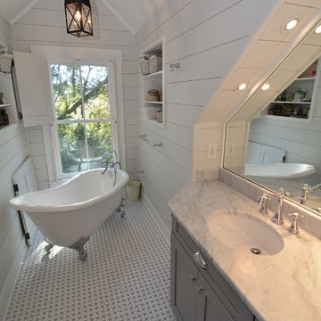
UserThe upstairs area in this home was converted to be a master retreat spanning over the whole area. This bathroom was created to showcase the claw foot tub to give a spa like feel to the master retreat. The bathroom was fitted into the space right up to the exterior wall giving the ceiling lines a unique shape. The double vanity was fitted to sit into the wall to give the bathroom a little more space as well as all the built in shelving to leave more room for the gorgeous claw foot tub. The tub was positioned to be over looking the grounds behind the home which was build butting up to a 2 acre lake. Recessed lighting was installed over the vanity to brighten up the space and another lantern style chandelier was chosen to match the rustic style of the home. Gray and white granite to match the kitchen was used in the bathroom to create a good design flow.
 Alair Homes Plano
Our clients house was built in 2012, so it was not that outdated, it was just dark. The clients wanted to lighten the kitchen and create something that was their own, using more unique products. The master bath needed to be updated and they wanted the upstairs game room to be more functional for their family.
The original kitchen was very dark and all brown. The cabinets were stained dark brown, the countertops were a dark brown and black granite, with a beige backsplash. We kept the dark cabinets but lightened everything else. A new translucent frosted glass pantry door was installed to soften the feel of the kitchen. The main architecture in the kitchen stayed the same but the clients wanted to change the coffee bar into a wine bar, so we removed the upper cabinet door above a small cabinet and installed two X-style wine storage shelves instead. An undermount farm sink was installed with a 23” tall main faucet for more functionality. We replaced the chandelier over the island with a beautiful Arhaus Poppy large antique brass chandelier. Two new pendants were installed over the sink from West Elm with a much more modern feel than before, not to mention much brighter. The once dark backsplash was now a bright ocean honed marble mosaic 2”x4” a top the QM Calacatta Miel quartz countertops. We installed undercabinet lighting and added over-cabinet LED tape strip lighting to add even more light into the kitchen.
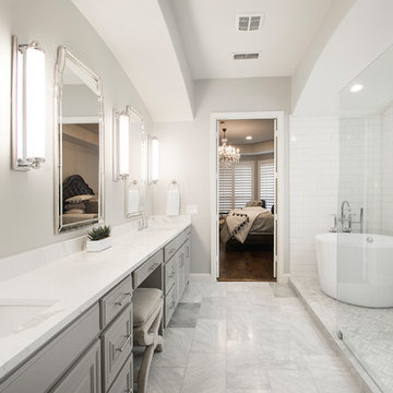
We basically gutted the Master bathroom and started from scratch. We demoed the shower walls, ceiling over tub/shower, demoed the countertops, plumbing fixtures, shutters over the tub and the wall tile and flooring. We reframed the vaulted ceiling over the shower and added an access panel in the water closet for a digital shower valve. A raised platform was added under the tub/shower for a shower slope to existing drain. The shower floor was Carrara Herringbone tile, accented with Bianco Venatino Honed marble and Metro White glossy ceramic 4”x16” tile on the walls. We then added a bench and a Kohler 8” rain showerhead to finish off the shower. The walk-in shower was sectioned off with a frameless clear anti-spot treated glass. The tub was not important to the clients, although they wanted to keep one for resale value. A Japanese soaker tub was installed, which the kids love! To finish off the master bath, the walls were painted with SW Agreeable Gray and the existing cabinets were painted SW Mega Greige for an updated look. Four Pottery Barn Mercer wall sconces were added between the new beautiful Distressed Silver leaf mirrors instead of the three existing over-mirror vanity bars that were originally there. QM Calacatta Miel countertops were installed which definitely brightened up the room!
Originally, the upstairs game room had nothing but a built-in bar in one corner. The clients wanted this to be more of a media room but still wanted to have a kitchenette upstairs. We had to remove the original plumbing and electrical and move it to where the new cabinets were. We installed 16’ of cabinets between the windows on one wall. Plank and Mill reclaimed barn wood plank veneers were used on the accent wall in between the cabinets as a backing for the wall mounted TV above the QM Calacatta Miel countertops. A kitchenette was installed to one end, housing a sink and a beverage fridge, so the clients can still have the best of both worlds. LED tape lighting was added above the cabinets for additional lighting. The clients love their updated rooms and feel that house really works for their family now.
Design/Remodel by Hatfield Builders & Remodelers | Photography by Versatile Imaging
 New England Design Elements
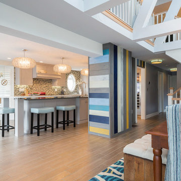
Example of a mid-sized beach style l-shaped medium tone wood floor and beige floor open concept kitchen design in Manchester with shaker cabinets, gray cabinets, granite countertops, multicolored backsplash, stainless steel appliances and an island
 Cronen Building Co.
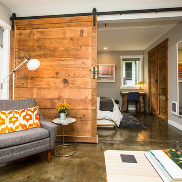
Inspiration for a mid-sized rustic master concrete floor and brown floor bedroom remodel in Portland with gray walls and no fireplace
 Corine Maggio Design
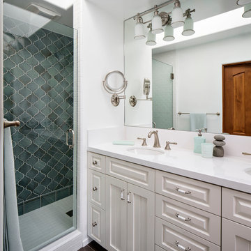
This adorable beach cottage is in the heart of the village of La Jolla in San Diego. The goals were to brighten up the space and be the perfect beach get-away for the client whose permanent residence is in Arizona. Some of the ways we achieved the goals was to place an extra high custom board and batten in the great room and by refinishing the kitchen cabinets (which were in excellent shape) white. We created interest through extreme proportions and contrast. Though there are a lot of white elements, they are all offset by a smaller portion of very dark elements. We also played with texture and pattern through wallpaper, natural reclaimed wood elements and rugs. This was all kept in balance by using a simplified color palate minimal layering.
I am so grateful for this client as they were extremely trusting and open to ideas. To see what the space looked like before the remodel you can go to the gallery page of the website www.cmnaturaldesigns.com
Photography by: Chipper Hatter
 Builders Source Appliance Gallery
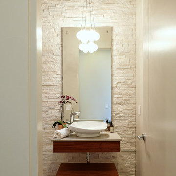
This 5 bedrooms, 3.4 baths, 3,359 sq. ft. Contemporary home with stunning floor-to-ceiling glass throughout, wows with abundant natural light. The open concept is built for entertaining, and the counter-to-ceiling kitchen backsplashes provide a multi-textured visual effect that works playfully with the monolithic linear fireplace. The spa-like master bath also intrigues with a 3-dimensional tile and free standing tub. Photos by Etherdox Photography.


92