
Search results for "Decides" in Home Design Ideas

 Melissa Hill Home Design
Hartley Hill Design
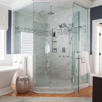
When our clients moved into their already built home they decided to live in it for a while before making any changes. Once they were settled they decided to hire us as their interior designers to renovate and redesign various spaces of their home. As they selected the spaces to be renovated they expressed a strong need for storage and customization. They allowed us to design every detail as well as oversee the entire construction process directing our team of skilled craftsmen. The home is a traditional home so it was important for us to retain some of the traditional elements while incorporating our clients style preferences.
Custom designed by Hartley and Hill Design.
All materials and furnishings in this space are available through Hartley and Hill Design. www.hartleyandhilldesign.com
888-639-0639
Neil Landino Photography
 Interior Creations
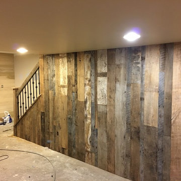
Love the different colors and textures of the barn lumber. I decided to do the rail and newel post out of barn lumber as well. It will be sealed and sanded smooth to touch with a matte polyurethane.
Find the right local pro for your project
 Dura Supreme Cabinetry
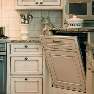
A decidedly painterly palette of cabinet finishes from Dura Supreme Cabinetry pleases the most discerning of color connoisseurs. A painter’s palette could not be more abundantly appointed with the nearly limitless color selections available from Dura Supreme. The rich, hand-wiped stains and color saturated paints are beautiful on their own or enhanced with layers of glaze and hand-detailing to create an antiqued appearance. Many of Dura Supreme's glazed finishes reveal the soft brush strokes and subtle variations of the artisan (craftsman) that created the finish. And if you still can’t find the exact shade of your heart’s desire, Dura Supreme will create the perfect color just for you with our Custom Color-Match Program AND our Personal Paint Match Program.
Request a FREE Dura Supreme Brochure Packet:
http://www.durasupreme.com/request-brochure
Find a Dura Supreme Showroom near you today:
http://www.durasupreme.com/dealer-locator
 Interior Creations
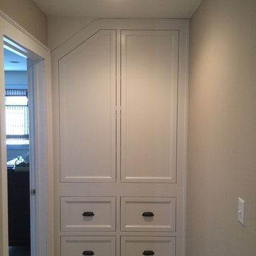
This client needed additional storage so we decided to make use of the dead space at the end of her hallway. 24" deep with inset doors and drawers.
Elegant closet photo in Columbus
Elegant closet photo in Columbus
 BST Design and Build
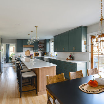
By combining green cabinets with wooden island cabinet, we saved the kitchen from mediocrity and blended it with gold fixtures, giving your kitchen a brand-new look and vitality.
 TKS Design Group
Free ebook, Creating the Ideal Kitchen. DOWNLOAD NOW
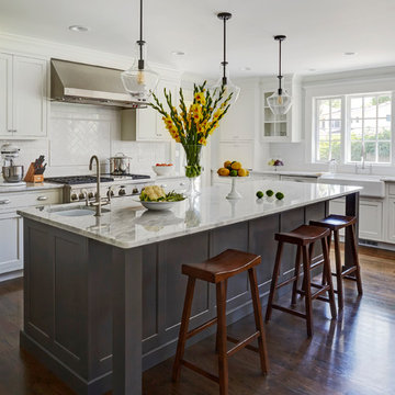
Our clients and their three teenage kids had outgrown the footprint of their existing home and felt they needed some space to spread out. They came in with a couple of sets of drawings from different architects that were not quite what they were looking for, so we set out to really listen and try to provide a design that would meet their objectives given what the space could offer.
We started by agreeing that a bump out was the best way to go and then decided on the size and the floor plan locations of the mudroom, powder room and butler pantry which were all part of the project. We also planned for an eat-in banquette that is neatly tucked into the corner and surrounded by windows providing a lovely spot for daily meals.
The kitchen itself is L-shaped with the refrigerator and range along one wall, and the new sink along the exterior wall with a large window overlooking the backyard. A large island, with seating for five, houses a prep sink and microwave. A new opening space between the kitchen and dining room includes a butler pantry/bar in one section and a large kitchen pantry in the other. Through the door to the left of the main sink is access to the new mudroom and powder room and existing attached garage.
White inset cabinets, quartzite countertops, subway tile and nickel accents provide a traditional feel. The gray island is a needed contrast to the dark wood flooring. Last but not least, professional appliances provide the tools of the trade needed to make this one hardworking kitchen.
Designed by: Susan Klimala, CKD, CBD
Photography by: Mike Kaskel
For more information on kitchen and bath design ideas go to: www.kitchenstudio-ge.com
Sponsored
Columbus, OH

Hope Restoration & General Contracting
Columbus Design-Build, Kitchen & Bath Remodeling, Historic Renovations
 ULAH Interiors + Design
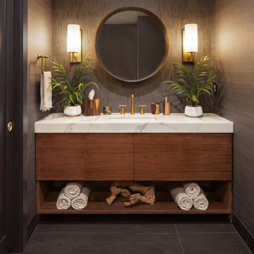
Our clients wanted to renovate and update their guest bathroom to be more appealing to guests and their gatherings. We decided to go dark and moody with a hint of rustic and a touch of glam. We picked white calacatta quartz to add a point of contrast against the charcoal vertical mosaic backdrop. Gold accents and a custom solid walnut vanity cabinet designed by Buck Wimberly at ULAH Interiors + Design add warmth to this modern design. Wall sconces, chandelier, and round mirror are by Arteriors. Charcoal grasscloth wallpaper is by Schumacher.
 Kimberlee Marie Interiors
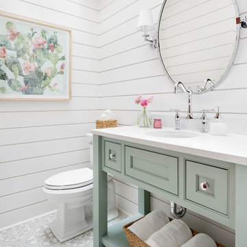
It’s always a blessing when your clients become friends - and that’s exactly what blossomed out of this two-phase remodel (along with three transformed spaces!). These clients were such a joy to work with and made what, at times, was a challenging job feel seamless. This project consisted of two phases, the first being a reconfiguration and update of their master bathroom, guest bathroom, and hallway closets, and the second a kitchen remodel.
In keeping with the style of the home, we decided to run with what we called “traditional with farmhouse charm” – warm wood tones, cement tile, traditional patterns, and you can’t forget the pops of color! The master bathroom airs on the masculine side with a mostly black, white, and wood color palette, while the powder room is very feminine with pastel colors.
When the bathroom projects were wrapped, it didn’t take long before we moved on to the kitchen. The kitchen already had a nice flow, so we didn’t need to move any plumbing or appliances. Instead, we just gave it the facelift it deserved! We wanted to continue the farmhouse charm and landed on a gorgeous terracotta and ceramic hand-painted tile for the backsplash, concrete look-alike quartz countertops, and two-toned cabinets while keeping the existing hardwood floors. We also removed some upper cabinets that blocked the view from the kitchen into the dining and living room area, resulting in a coveted open concept floor plan.
Our clients have always loved to entertain, but now with the remodel complete, they are hosting more than ever, enjoying every second they have in their home.
 Neat Method San Diego
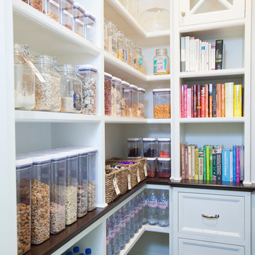
Example of a mid-sized classic kitchen pantry design in San Diego with open cabinets and white cabinets
 MainStreet Design Build
This beautiful Birmingham, MI home had been renovated prior to our clients purchase, but the style and overall design was not a fit for their family. They really wanted to have a kitchen with a large “eat-in” island where their three growing children could gather, eat meals and enjoy time together. Additionally, they needed storage, lots of storage! We decided to create a completely new space.
The original kitchen was a small “L” shaped workspace with the nook visible from the front entry. It was completely closed off to the large vaulted family room. Our team at MSDB re-designed and gutted the entire space. We removed the wall between the kitchen and family room and eliminated existing closet spaces and then added a small cantilevered addition toward the backyard. With the expanded open space, we were able to flip the kitchen into the old nook area and add an extra-large island. The new kitchen includes oversized built in Subzero refrigeration, a 48” Wolf dual fuel double oven range along with a large apron front sink overlooking the patio and a 2nd prep sink in the island.
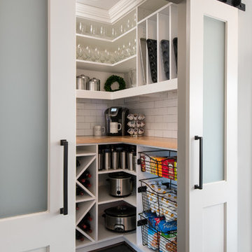
Additionally, we used hallway and closet storage to create a gorgeous walk-in pantry with beautiful frosted glass barn doors. As you slide the doors open the lights go on and you enter a completely new space with butcher block countertops for baking preparation and a coffee bar, subway tile backsplash and room for any kind of storage needed. The homeowners love the ability to display some of the wine they’ve purchased during their travels to Italy!
We did not stop with the kitchen; a small bar was added in the new nook area with additional refrigeration. A brand-new mud room was created between the nook and garage with 12” x 24”, easy to clean, porcelain gray tile floor. The finishing touches were the new custom living room fireplace with marble mosaic tile surround and marble hearth and stunning extra wide plank hand scraped oak flooring throughout the entire first floor.
 Advance Design Studio, Ltd.
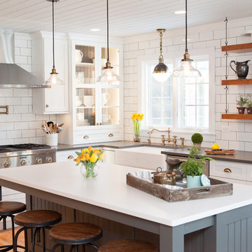
When this suburban family decided to renovate their kitchen, they knew that they wanted a little more space. Advance Design worked together with the homeowner to design a kitchen that would work for a large family who loved to gather regularly and always ended up in the kitchen! So the project began with extending out an exterior wall to accommodate a larger island and more moving-around space between the island and the perimeter cabinetry.
Style was important to the cook, who began collecting accessories and photos of the look she loved for months prior to the project design. She was drawn to the brightness of whites and grays, and the design accentuated this color palette brilliantly with the incorporation of a warm shade of brown woods that originated from a dining room table that was a family favorite. Classic gray and white cabinetry from Dura Supreme hits the mark creating a perfect balance between bright and subdued. Hints of gray appear in the bead board detail peeking just behind glass doors, and in the application of the handsome floating wood shelves between cabinets. White subway tile is made extra interesting with the application of dark gray grout lines causing it to be a subtle but noticeable detail worthy of attention.
Suede quartz Silestone graces the countertops with a soft matte hint of color that contrasts nicely with the presence of white painted cabinetry finished smartly with the brightness of a milky white farm sink. Old melds nicely with new, as antique bronze accents are sprinkled throughout hardware and fixtures, and work together unassumingly with the sleekness of stainless steel appliances.
The grace and timelessness of this sparkling new kitchen maintains the charm and character of a space that has seen generations past. And now this family will enjoy this new space for many more generations to come in the future with the help of the team at Advance Design Studio.
Photographer: Joe Nowak
Dura Supreme Cabinetry
 Kimberlee Marie Interiors
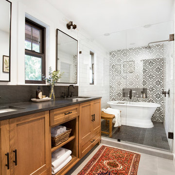
It’s always a blessing when your clients become friends - and that’s exactly what blossomed out of this two-phase remodel (along with three transformed spaces!). These clients were such a joy to work with and made what, at times, was a challenging job feel seamless. This project consisted of two phases, the first being a reconfiguration and update of their master bathroom, guest bathroom, and hallway closets, and the second a kitchen remodel.
In keeping with the style of the home, we decided to run with what we called “traditional with farmhouse charm” – warm wood tones, cement tile, traditional patterns, and you can’t forget the pops of color! The master bathroom airs on the masculine side with a mostly black, white, and wood color palette, while the powder room is very feminine with pastel colors.
When the bathroom projects were wrapped, it didn’t take long before we moved on to the kitchen. The kitchen already had a nice flow, so we didn’t need to move any plumbing or appliances. Instead, we just gave it the facelift it deserved! We wanted to continue the farmhouse charm and landed on a gorgeous terracotta and ceramic hand-painted tile for the backsplash, concrete look-alike quartz countertops, and two-toned cabinets while keeping the existing hardwood floors. We also removed some upper cabinets that blocked the view from the kitchen into the dining and living room area, resulting in a coveted open concept floor plan.
Our clients have always loved to entertain, but now with the remodel complete, they are hosting more than ever, enjoying every second they have in their home.
Sponsored
Columbus, OH
Hope Restoration & General Contracting
Columbus Design-Build, Kitchen & Bath Remodeling, Historic Renovations
 Regan Baker Design Inc.
Stylish brewery owners with airline miles that match George Clooney’s decided to hire Regan Baker Design to transform their beloved Duboce Park second home into an organic modern oasis reflecting their modern aesthetic and sustainable, green conscience lifestyle. From hops to floors, we worked extensively with our design savvy clients to provide a new footprint for their kitchen, dining and living room area, redesigned three bathrooms, reconfigured and designed the master suite, and replaced an existing spiral staircase with a new modern, steel staircase. We collaborated with an architect to expedite the permit process, as well as hired a structural engineer to help with the new loads from removing the stairs and load bearing walls in the kitchen and Master bedroom. We also used LED light fixtures, FSC certified cabinetry and low VOC paint finishes.
Regan Baker Design was responsible for the overall schematics, design development, construction documentation, construction administration, as well as the selection and procurement of all fixtures, cabinets, equipment, furniture,and accessories.
Key Contributors: Green Home Construction; Photography: Sarah Hebenstreit / Modern Kids Co.
In this photo:
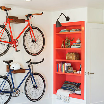
We added a pop of color on the built-in bookshelf, and used CB2 space saving wall-racks for bikes as decor.
 Melissa Hill Home Design
When our clients moved into their already built home they decided to live in it for a while before making any changes. Once they were settled they decided to hire us as their interior designers to renovate and redesign various spaces of their home. As they selected the spaces to be renovated they expressed a strong need for storage and customization. They allowed us to design every detail as well as oversee the entire construction process directing our team of skilled craftsmen. The home is a traditional home so it was important for us to retain some of the traditional elements while incorporating our clients style preferences.
Custom designed by Hartley and Hill Design
All materials and furnishings in this space are available through Hartley and Hill Design. www.hartleyandhilldesign.com
888-639-0639
Neil Landino Photography
 Décor Aid
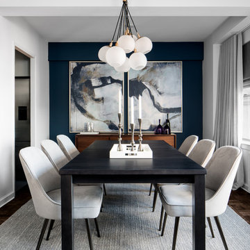
New Yorkers are always on the prowl for innovative ways to make the most of the space they have. An upper east side couple, challenged with a slightly narrow L shaped apartment sought out Decor Aid’s help to make the most of their Manhattan condo. Paired with one of our senior designer, Kimberly P., we learned that the clients wanted a space that looked beautiful, comfortable and also packed with functionality for everyday living.
“Immediately upon seeing the space, I knew that we needed to create a narrative that allowed the design to control how you moved through the space,” reports Kimberly, senior interior designer.
After surveying each room and learning a bit more about their personal style, we started with the living room remodel. It was clear that the couple wanted to infuse mid-century modern into the design plan. Sourcing the Room & Board Jasper Sofa with its narrow arms and tapered legs, it offered the mid-century look, with the modern comfort the clients are used to. Velvet accent pillows from West Elm and Crate & Barrel add pops of colors but also a subtle touch of luxury, while framed pictures from the couple’s honeymoon personalize the space.
Moving to the dining room next, Kimberly decided to add a blue accent wall to emphasize the Horchow two piece Percussion framed art that was to be the focal point of the dining area. The Seno sideboard from Article perfectly accentuated the mid-century style the clients loved while providing much-needed storage space. The palette used throughout both rooms were very New York style, grays, blues, beiges, and whites, to add depth, Kimberly sourced decorative pieces in a mixture of different metals.
“The artwork above their bureau in the bedroom is photographs that her father took,”
Moving into the bedroom renovation, our designer made sure to continue to stick to the client’s style preference while once again creating a personalized, warm and comforting space by including the photographs taken by the client’s father. The Avery bed added texture and complimented the other colors in the room, while a hidden drawer at the foot pulls out for attached storage, which thrilled the clients. A deco-inspired Faceted mirror from West Elm was a perfect addition to the bedroom due to the illusion of space it provides. The result was a bedroom that was full of mid-century design, personality, and area so they can freely move around.
The project resulted in the form of a layered mid-century modern design with touches of luxury but a space that can not only be lived in but serves as an extension of the people who live there. Our designer was able to take a very narrowly shaped Manhattan apartment and revamp it into a spacious home that is great for sophisticated entertaining or comfortably lazy nights in.
 Cabinets & Designs
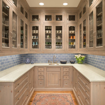
Large butler's pantry approximately 8 ft wide. This space features a ton of storage from both recessed and glass panel cabinets. The cabinets have a lightwood finish and is accented very well with a blue tile backsplash.
 Interiors by Natasha
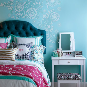
I was hired by the parents of a soon-to-be teenage girl turning 13 years-old. They wanted to remodel her bedroom from a young girls room to a teenage room. This project was a joy and a dream to work on! I got the opportunity to channel my inner child. I wanted to design a space that she would love to sleep in, entertain, hangout, do homework, and lounge in.
The first step was to interview her so that she would feel like she was a part of the process and the decision making. I asked her what was her favorite color, what was her favorite print, her favorite hobbies, if there was anything in her room she wanted to keep, and her style.
The second step was to go shopping with her and once that process started she was thrilled. One of the challenges for me was making sure I was able to give her everything she wanted. The other challenge was incorporating her favorite pattern-- zebra print. I decided to bring it into the room in small accent pieces where it was previously the dominant pattern throughout her room. The color palette went from light pink to her favorite color teal with pops of fuchsia. I wanted to make the ceiling a part of the design so I painted it a deep teal and added a beautiful teal glass and crystal chandelier to highlight it. Her room became a private oasis away from her parents where she could escape to. In the end we gave her everything she wanted.
Photography by Haigwood Studios
 Interiors by Natasha
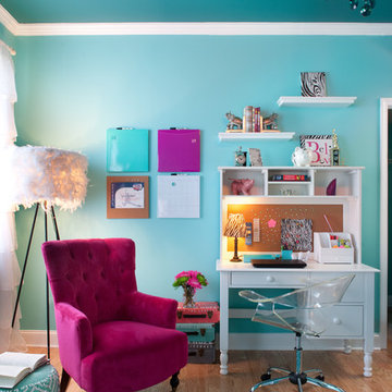
I was hired by the parents of a soon-to-be teenage girl turning 13 years-old. They wanted to remodel her bedroom from a young girls room to a teenage room. This project was a joy and a dream to work on! I got the opportunity to channel my inner child. I wanted to design a space that she would love to sleep in, entertain, hangout, do homework, and lounge in.
The first step was to interview her so that she would feel like she was a part of the process and the decision making. I asked her what was her favorite color, what was her favorite print, her favorite hobbies, if there was anything in her room she wanted to keep, and her style.
The second step was to go shopping with her and once that process started she was thrilled. One of the challenges for me was making sure I was able to give her everything she wanted. The other challenge was incorporating her favorite pattern-- zebra print. I decided to bring it into the room in small accent pieces where it was previously the dominant pattern throughout her room. The color palette went from light pink to her favorite color teal with pops of fuchsia. I wanted to make the ceiling a part of the design so I painted it a deep teal and added a beautiful teal glass and crystal chandelier to highlight it. Her room became a private oasis away from her parents where she could escape to. In the end we gave her everything she wanted.
Photography by Haigwood Studios

 Liz Schupanitz Designs
Cooking for Two
Location: Plymouth, MN, United States
When this couple’s last child graduated from college they began the process of looking for a new home. After a lengthy search they decided to stay with the neighborhood they loved, saving money by remodeling rather than starting over.
The top priorities on their wish list were adding character to their 1990’s era home with a classic white kitchen and a larger island while keeping within the existing footprint. With the intention of honing their cooking skills, they were also considering better appliances and two ovens.
Challenges and Solutions
Design a larger island with seating for at least two. The existing island was small and the area behind the seating was less than recommended clearances.
To solve this challenge, the seating area of the island was extended out into the open area of the kitchen. This created a larger island with seating for three, extra storage and a bookshelf across from the range.
The original kitchen had a range with microwave above, so adding another oven was a challenge with limited wall space.
Because the adjoining dining room is used infrequently, the homeowner was open to placing the second oven and microwave in the walkway. This made room for the small buffet between the built in refrigerator and ovens, creating one of her favorite areas.
The client requested a white painted kitchen but wanted to make sure it had warmth and character. To achieve this the following elements were chosen:
1) Cabinets painted with Benjamin Moore Capitol White, a luminous and warm shade of white.
2) The Range hood was painted with warm metallic shades to reflect the bronze of the Ashley Norton hardware.
3) Black Aqua Grantique granite was chosen for countertops because it looks like soapstone and adds contrast.
4) Walker Zanger Café tile in Latte was chosen for it’s handmade look with uneven edges.
5) The to-the-counter-cabinet with glass door shows off serving dishes and lends sophisticated charm.
The result is a welcoming classic kitchen, where this couple enjoys cooking more often and sharpening their skills with gourmet appliances.
Liz Schupanitz Designs
Photographed by: Andrea Rugg Photography
2