
Search results for "Odd angles" in Home Design Ideas
 Studio Dearborn
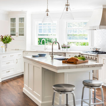
A young colonial in the heart of Rye New York had everything going for it, except a dark and poorly laid out kitchen. The clients tapped Sarah Robertson of Studio Dearborn to help them layout a new kitchen in their challenging, dog leg shaped room. A small breakfast peninsula and working island helped pull together the oddly shaped kitchen into a streamlined, light filled space with all the storage amenities typical of a Studio Dearborn kitchen. The bar area, with undercounter refrigeration for wine and beverages, also features a locking cabinet for liquor and open wine storage. Desk area has file drawer and Docking Drawer charging drawer. Countertops: White Macauba, Rye Marble and Stone, Rye NY. Hardware: Studio Pulls from Hickory Hardware. Sinks: Kraus. Lighting: Currey & Co. Faucet: Kohler Artifacts Backsplash tile: Casablanca Tile and Stone, Harrison NY. Photography: Adam Kane Macchia
 J. Wright Building Company
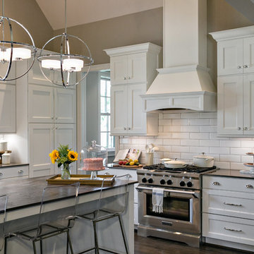
Inspiration for a large transitional l-shaped dark wood floor kitchen remodel in Birmingham with a farmhouse sink, shaker cabinets, white cabinets, quartzite countertops, white backsplash, stainless steel appliances, an island and subway tile backsplash

Find the right local pro for your project
 Roth Design + Build
Brand new kitchen, new cabinets, new appliances, new island, new hardwood flooring and in roof lighting.
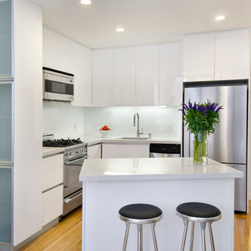
Inspiration for a small contemporary l-shaped light wood floor eat-in kitchen remodel in New York with white cabinets, marble countertops, white backsplash, ceramic backsplash, stainless steel appliances and an island
Inspiration for a small contemporary l-shaped light wood floor eat-in kitchen remodel in New York with white cabinets, marble countertops, white backsplash, ceramic backsplash, stainless steel appliances and an island
 Susan Yeley Homes
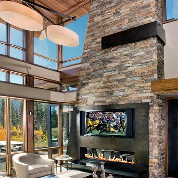
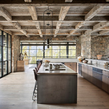
A departure from the ordinary box, this angular home is nestled in a forest-like setting. This young professional couple fell for its big open living space and good bones, and made the house theirs when they moved to Bloomington in 2015. Though the space was defined by interesting angles and a soaring ceiling, natural light and that beautiful tall stone fireplace, it was outdated. Some spaces were oddly chopped off and others were too open to use well.In the end, SYI did what we don't usually do: put up walls instead of taking them down. (Well, to be fair, we put up some and took down others.) A brand new kitchen anchors the space for these avid cooks, while new walls define a walk-in pantry, office nook and reading space. The new walls also help define the home’s private spaces—they tuck a powder room and guest room away down a hall, so they aren't awkwardly right off the living space. Unifying floor and finishes but breaking up the palette with punches of color, SYI transformed the lofty room to a space that is timeless in both style and layout.

 Chester County Kitchen & Bath
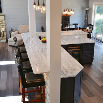
Awesome Norristown PA bi-level home remodel. We gutted the whole first level of this home down to the bare bones. We redesigned the space to an open floorplan. New structural framing, insulation, windows and doors, and all mechanicals were relocated and improved. Lighting! Lighting! Lighting! everywhere and it makes all the difference. Led lighting and smart switches were used for up lighting above cabinetry, task lighting under cabinetry, general room lighting, accent lighting under bar top, and all decorative fixtures as well. The kitchen was designed around a central island with elevated seating that is designed around the new structural columns required to open the whole area. Fabuwood cabinetry in Galaxy Horizon finish make up the perimeter cabinets accented by Galaxy Cobblestone finish used for the island cabinetry. Both cabinetry tones coordinate perfect with the new Luxury vinyl plank flooring in Uptown Chic Forever Friends. I’ve said it before and I’ll say it again, luxury vinyl is Awesome! It looks great its ultra durable and even water proof as well as less expensive than true hardwood. New stair treads, railings, and posts were installed stained to match by us; giving the steps new life. An accent wall of nickel gap boards was installed on the fireplace wall giving it some interest along with being a great clean look. The recessed niche behind the range, the dry stacked stone tile at the islands seating area, the new tile entry in a herringbone pattern just add to all the great details of this project. The New River White granite countertops are a show stopper as well; not only is it a beautiful stone the installation and seaming is excellent considering the pattern of the stone. I could go on forever we did so much. The clients were terrific and a pleasure to work with. I am glad we were able to be involved in making this dream come true.
Sponsored
Columbus, OH

Trish Takacs Design
Award Winning & Highly Skilled Kitchen & Bath Designer in Columbus
 LoneStar Design Build
Sonja Quintero
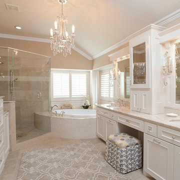
Drop-in bathtub - large transitional master beige tile and stone slab limestone floor drop-in bathtub idea in Dallas with an integrated sink, recessed-panel cabinets, white cabinets, marble countertops, a one-piece toilet and beige walls
Drop-in bathtub - large transitional master beige tile and stone slab limestone floor drop-in bathtub idea in Dallas with an integrated sink, recessed-panel cabinets, white cabinets, marble countertops, a one-piece toilet and beige walls
 Mangan Group Architects
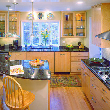
Different angle of Kitchen with view of concealed dishwasher and pendant lighting.
Inspiration for a mid-sized contemporary l-shaped light wood floor eat-in kitchen remodel in DC Metro with granite countertops, beige backsplash, an island, an undermount sink, flat-panel cabinets, light wood cabinets, stone tile backsplash and stainless steel appliances
Inspiration for a mid-sized contemporary l-shaped light wood floor eat-in kitchen remodel in DC Metro with granite countertops, beige backsplash, an island, an undermount sink, flat-panel cabinets, light wood cabinets, stone tile backsplash and stainless steel appliances
 MD Eggers
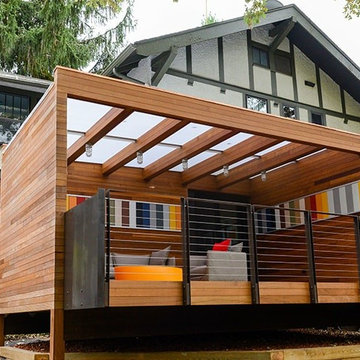
This angle shows the transparent roof to allow natural light into the space
Inspiration for a mid-sized contemporary white backyard and one-story wood flat roof remodel with decking
Inspiration for a mid-sized contemporary white backyard and one-story wood flat roof remodel with decking
 TKS Design Group
Download our free ebook, Creating the Ideal Kitchen. DOWNLOAD NOW
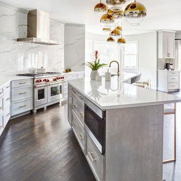
This client was referred to us from a past client. They are a busy 2-career household with young children and enjoy entertaining friends and family in their home. They have a beautiful open concept home but unfortunately the kitchen was not fitting for the rest of the home. They were not quite sure what to do with the space. We talked about trying to refresh it or do more of a minor remodel, but in the end they decided a full gut would get them to where they wanted to be.
One problem was there was no place for guests to hang out other than the large and awkward banquette area. The brick wall and tiled hood area were feeling a bit dated and tired. The space was just not functional for their lifestyle. There was no prep space near the cooktop and no landing area for items coming out of the ovens or refrigerator, plus a big dead zone in the center of the room.
Banquettes, like the one they previously had in the space, are great for small spaces, but when they get really large like this one, it makes getting in and out of the seating area awkward and uncomfortable. Plus, there was room for a large table, so we eliminated the awkward built in.
We started by removing the faux brick wall between the kitchen and back entry. We relocated the entry to the garage over a couple feet in order to get every last inch out of the new kitchen. We also made the decision to close up the primary window that faced the pretty ho hum brick wall of the neighbor’s house. There was plenty of light coming in from the seating area, so we just didn’t feel the window was adding much to the room.
Construction went smoothy. There was a bit of rework with electrical, flooring and HVAC, but in the end, we think it was well worth it.
The clients really wanted a sleek contemporary look, and we originally had planned for a full height slab backsplash, but due to it’s size, it was a budget buster. Instead, we got creative and settled on large format porcelain tiles that have a similar feel but were a fraction of the cost. We made sure the wall was plumb and level so that the fit and finish would mimic that of slab material.
The final space was quite a change. A large prep sink sits directly across from the new pro-style range with plenty additional prep space on the large island. The refrigerator and ovens now have miles of landing space, and a nice tight work triangle makes cooking a breeze.
Since we wanted a more contemporary feel, not many wall cabinets were included. Instead, we outfitted some of the drawers for dish storage with a peg system. Two large pantries flanking the refrigerator hold baking supplies and small appliances. Large drawers by the cooktop hold pots and pans, and an appliance garage tucked away to the left of the range hides away miscellaneous items. The large island also houses a microwave drawer and tons of storage, most of which is drawers offering maximum convenience.
The island now seats 5-6 people comfortably along with the new table in the seating area which can seat up to 8. Entertaining will be a breeze in this space. With such a clean backdrop, we knew we would need some drama with the lighting, so we chose two sets of staggered pendants, which we adjusted for the right visual balance above the island.
We also included a small coffee station to the right of the main kitchen, which helps keep the coffee clutter out of the kitchen proper. Two tones of complimentary gray are featured in this kitchen. The perimeter is a light gray that reads almost white. The island is a gray stain that adds some depth and interest with the visible wood texture. The countertops are clean white quartz, and the hardware, barstools and light fixtures add warm brass tones. I see lots of cooking and entertaining with family and friends in the near future in this bright and airy new space.
Designed by: Susan Klimala, CKD, CBD
Photography by: Michael Kaskel
For more information on kitchen and bath design ideas go to: www.kitchenstudio-ge.com
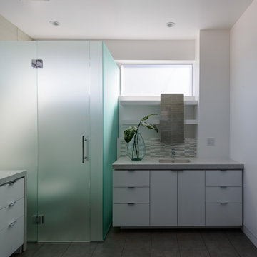
 LeMaster Architects
New construction, completed in 2013
Photograph by Geoff Captain Studios
Inspiration for a contemporary bathroom remodel in Los Angeles
Inspiration for a contemporary bathroom remodel in Los Angeles
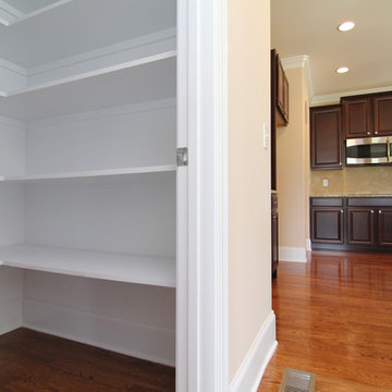
 Stanton Homes
The most popular floor plans for North Carolina new home buyers are designed with ample kitchen storage - without sacrificing open square footage. One of the best ways to offer lots of shelf room is with a "Costco" style pantry.
A U shaped pantry is great for "at a glance" storage.
U shaped pantries, which are actually more in the shape of a square, require more depth (and less width) than an L shaped pantry - so your selection may depend on the overall kitchen floor plan.
Design Build Chapel Hill Custom Homes by Stanton Homes.

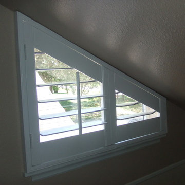
 Blinds.com
Triangle windows are often found in attics or stairwells. They can be covered with custom shutters or cellular shades.
Living room - traditional living room idea in Houston
Living room - traditional living room idea in Houston
 Martha Stewart Living
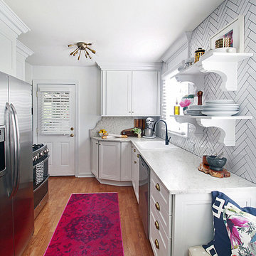
AFTER: The Hunted Interior small kitchen makeover
Eclectic kitchen photo in New York
Eclectic kitchen photo in New York
 User
UserI have previously worked in every level of this home – project images can be viewed on Riverdale Top to Bottom Renovation – the Third Floor was the final frontier and the transformation is quite spectacular (even if I say so myself!). Before and after pictures can be found on our website. My client’s twin boys were rapidly outgrowing their little nursery on the second floor and so plans were drawn up to renovate the third floor….
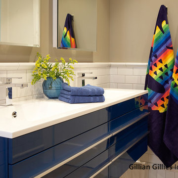
All of this work was done with my clients / kids / pets living at home. We erected a scaffolding tower at the side of the home and this was how all the trades got in and out throughout the project – the scaffolding stairs were actually wider and provided easier access than the original staircase. The original footprint comprised of 3 bedrooms (one generous sized guest bedroom at the front of the house that we retained and two smaller oddly shaped rooms with cove ceilings and angles that really prevented them being useful) plus an internal powder room. We pushed the rear internal wall of the powder room back to the exterior wall so that we could build a generous sized bathroom that will see the boys through the years. The walls and floors are neutral and we added a pop of blue with the vanity. One of my favourite elements is the river rock tile inset mat that is great for little feet to walk on – especially when the underfloor heating is on!
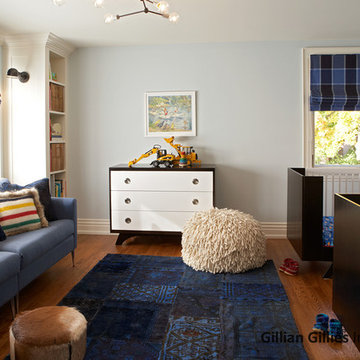
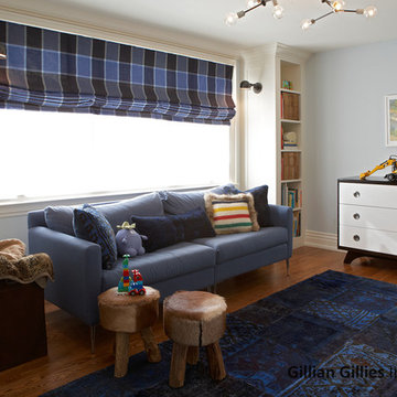
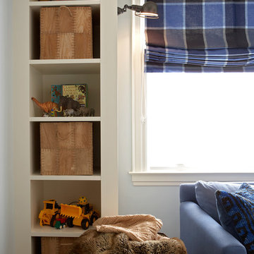
The twin bedroom is breathtaking – the previous rooms were so small it was really hard to photograph them but if you check out the before and after section below it paints a pretty good picture. A 12’ wide dormer makes this floor feel like a treehouse and the light is amazing. We incorporated some gorgeous lighting in this room – 2 styles of sconces and a custom pendant. I love the second life carpet and the checked roman blind fabric. It’s a space that is large and comfortable enough for the whole family to sit in and enjoy.
The third floor hallway was transformed by straightening the walls and levelling the ceiling. The custom light fixture / art installation guarantees you pause at the foot of the stairs.
Photography by Tim McGhie
 User
UserI have previously worked in every level of this home – project images can be viewed on Riverdale Top to Bottom Renovation – the Third Floor was the final frontier and the transformation is quite spectacular (even if I say so myself!). Before and after pictures can be found on our website. My client’s twin boys were rapidly outgrowing their little nursery on the second floor and so plans were drawn up to renovate the third floor….
All of this work was done with my clients / kids / pets living at home. We erected a scaffolding tower at the side of the home and this was how all the trades got in and out throughout the project – the scaffolding stairs were actually wider and provided easier access than the original staircase. The original footprint comprised of 3 bedrooms (one generous sized guest bedroom at the front of the house that we retained and two smaller oddly shaped rooms with cove ceilings and angles that really prevented them being useful) plus an internal powder room. We pushed the rear internal wall of the powder room back to the exterior wall so that we could build a generous sized bathroom that will see the boys through the years. The walls and floors are neutral and we added a pop of blue with the vanity. One of my favourite elements is the river rock tile inset mat that is great for little feet to walk on – especially when the underfloor heating is on!
The twin bedroom is breathtaking – the previous rooms were so small it was really hard to photograph them but if you check out the before and after section below it paints a pretty good picture. A 12’ wide dormer makes this floor feel like a treehouse and the light is amazing. We incorporated some gorgeous lighting in this room – 2 styles of sconces and a custom pendant. I love the second life carpet and the checked roman blind fabric. It’s a space that is large and comfortable enough for the whole family to sit in and enjoy.
The third floor hallway was transformed by straightening the walls and levelling the ceiling. The custom light fixture / art installation guarantees you pause at the foot of the stairs.
Photography by Tim McGhie
 User
UserI have previously worked in every level of this home – project images can be viewed on Riverdale Top to Bottom Renovation – the Third Floor was the final frontier and the transformation is quite spectacular (even if I say so myself!). Before and after pictures can be found on our website. My client’s twin boys were rapidly outgrowing their little nursery on the second floor and so plans were drawn up to renovate the third floor….
All of this work was done with my clients / kids / pets living at home. We erected a scaffolding tower at the side of the home and this was how all the trades got in and out throughout the project – the scaffolding stairs were actually wider and provided easier access than the original staircase. The original footprint comprised of 3 bedrooms (one generous sized guest bedroom at the front of the house that we retained and two smaller oddly shaped rooms with cove ceilings and angles that really prevented them being useful) plus an internal powder room. We pushed the rear internal wall of the powder room back to the exterior wall so that we could build a generous sized bathroom that will see the boys through the years. The walls and floors are neutral and we added a pop of blue with the vanity. One of my favourite elements is the river rock tile inset mat that is great for little feet to walk on – especially when the underfloor heating is on!
The twin bedroom is breathtaking – the previous rooms were so small it was really hard to photograph them but if you check out the before and after section below it paints a pretty good picture. A 12’ wide dormer makes this floor feel like a treehouse and the light is amazing. We incorporated some gorgeous lighting in this room – 2 styles of sconces and a custom pendant. I love the second life carpet and the checked roman blind fabric. It’s a space that is large and comfortable enough for the whole family to sit in and enjoy.
The third floor hallway was transformed by straightening the walls and levelling the ceiling. The custom light fixture / art installation guarantees you pause at the foot of the stairs.
Photography by Tim McGhie
 User
UserI have previously worked in every level of this home – project images can be viewed on Riverdale Top to Bottom Renovation – the Third Floor was the final frontier and the transformation is quite spectacular (even if I say so myself!). Before and after pictures can be found on our website. My client’s twin boys were rapidly outgrowing their little nursery on the second floor and so plans were drawn up to renovate the third floor….
All of this work was done with my clients / kids / pets living at home. We erected a scaffolding tower at the side of the home and this was how all the trades got in and out throughout the project – the scaffolding stairs were actually wider and provided easier access than the original staircase. The original footprint comprised of 3 bedrooms (one generous sized guest bedroom at the front of the house that we retained and two smaller oddly shaped rooms with cove ceilings and angles that really prevented them being useful) plus an internal powder room. We pushed the rear internal wall of the powder room back to the exterior wall so that we could build a generous sized bathroom that will see the boys through the years. The walls and floors are neutral and we added a pop of blue with the vanity. One of my favourite elements is the river rock tile inset mat that is great for little feet to walk on – especially when the underfloor heating is on!
The twin bedroom is breathtaking – the previous rooms were so small it was really hard to photograph them but if you check out the before and after section below it paints a pretty good picture. A 12’ wide dormer makes this floor feel like a treehouse and the light is amazing. We incorporated some gorgeous lighting in this room – 2 styles of sconces and a custom pendant. I love the second life carpet and the checked roman blind fabric. It’s a space that is large and comfortable enough for the whole family to sit in and enjoy.
The third floor hallway was transformed by straightening the walls and levelling the ceiling. The custom light fixture / art installation guarantees you pause at the foot of the stairs.
Photography by Tim McGhie
18