
Search results for "Underutilized" in Home Design Ideas
 TVL Creative Ltd.
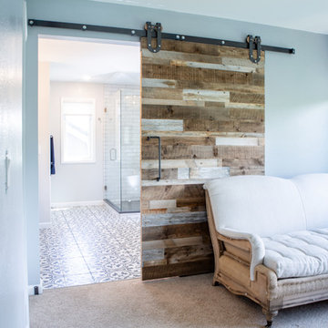
This project is an incredible transformation and the perfect example of successful style mixing! This client, and now a good friend of TVL (as they all become), is a wonderfully eclectic and adventurous one with immense interest in texture play, pops of color, and unique applications. Our scope in this home included a full kitchen renovation, main level powder room renovation, and a master bathroom overhaul. Taking just over a year to complete from the first design phases to final photos, this project was so insanely fun and packs an amazing amount of fun details and lively surprises. The original kitchen was large and fairly functional. However, the cabinetry was dated, the lighting was inefficient and frankly ugly, and the space was lacking personality in general. Our client desired maximized storage and a more personalized aesthetic. The existing cabinets were short and left the nice height of the space under-utilized. We integrated new gray shaker cabinets from Waypoint Living Spaces and ran them to the ceiling to really exaggerate the height of the space and to maximize usable storage as much as possible. The upper cabinets are glass and lit from within, offering display space or functional storage as the client needs. The central feature of this space is the large cobalt blue range from Viking as well as the custom made reclaimed wood range hood floating above. The backsplash along this entire wall is vertical slab of marble look quartz from Pental Surfaces. This matches the expanse of the same countertop that wraps the room. Flanking the range, we installed cobalt blue lantern penny tile from Merola Tile for a playful texture that adds visual interest and class to the entire room. We upgraded the lighting in the ceiling, under the cabinets, and within cabinets--we also installed accent sconces over each window on the sink wall to create cozy and functional illumination. The deep, textured front Whitehaven apron sink is a dramatic nod to the farmhouse aesthetic from KOHLER, and it's paired with the bold and industrial inspired Tournant faucet, also from Kohler. We finalized this space with other gorgeous appliances, a super sexy dining table and chair set from Room & Board, the Paxton dining light from Pottery Barn and a small bar area and pantry on the far end of the space. In the small powder room on the main level, we converted a drab builder-grade space into a super cute, rustic-inspired washroom. We utilized the Bonner vanity from Signature Hardware and paired this with the cute Ashfield faucet from Pfister. The most unique statements in this room include the water-drop light over the vanity from Shades Of Light, the copper-look porcelain floor tile from Pental Surfaces and the gorgeous Cashmere colored Tresham toilet from Kohler. Up in the master bathroom, elegance abounds. Using the same footprint, we upgraded everything in this space to reflect the client's desire for a more bright, patterned and pretty space. Starting at the entry, we installed a custom reclaimed plank barn door with bold large format hardware from Rustica Hardware. In the bathroom, the custom slate blue vanity from Tharp Cabinet Company is an eye catching statement piece. This is paired with gorgeous hardware from Amerock, vessel sinks from Kohler, and Purist faucets also from Kohler. We replaced the old built-in bathtub with a new freestanding soaker from Signature Hardware. The floor tile is a bold, graphic porcelain tile with a classic color scheme. The shower was upgraded with new tile and fixtures throughout: new clear glass, gorgeous distressed subway tile from the Castle line from TileBar, and a sophisticated shower panel from Vigo. We finalized the space with a small crystal chandelier and soft gray paint. This project is a stunning conversion and we are so thrilled that our client can enjoy these personalized spaces for years to come. Special thanks to the amazing Ian Burks of Burks Wurks Construction for bringing this to life!
 Lori Ramsay Design
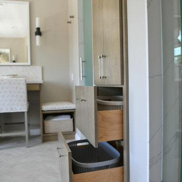
We designed a linen cabinet with 2 drawer pull outs for laundry baskets.
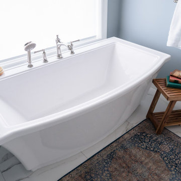
A large bath felt crowded and underutilized the space available. By removing a large framed in tub and replacing it with a stunning freestanding tub with a wall mounted tub filler we freed up floor space both physically and visually. Stained wood vanities with beaded top drawers anchor the room.
 JPL Creative Design Solutions
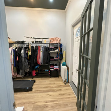
This primary bedroom and walk-in closet renovation transformed a previously dated and underutilized space into a tranquil and stylish retreat. The design focuses on creating a sense of calm, balance, and elegance, achieved through careful selection of materials, colors, and furnishings that evoke a cozy yet modern ambiance.
The goal of this project was to transform the room into a serene and sophisticated space that serves as both a sanctuary for rest and a functional area for daily use. At the core of this design is the philosophy of blending modern functionality with an organic connection to nature through color, texture, and spatial harmony.
The walk-in closet features custom open shelving and a clean, minimalist layout that maximizes storage space while maintaining an organized, airy feel. A combination of sleek black storage units and open racks ensures ample room for hanging clothes, accessories, and storing workout equipment. The neutral, white walls with the dark ceiling keep the closet feeling light and fresh, while still visually connecting to the bedroom's bold color palette.
This newly designed primary bedroom evokes feelings of peace and luxury. The deep, moody greens make the room feel cozy and inviting, while the light wood floors and white accents provide a sense of brightness and balance. It’s a space where one can truly relax, escape the demands of everyday life, and enjoy quiet moments of reflection or rejuvenation.
In contrast, the walk-in closet is functional and efficient, yet equally sophisticated. The open shelving creates a sense of organization without clutter, making the space feel larger and more user-friendly.
Find the right local pro for your project
 Amy Pearson Design
A classic Portland foursquare, lovingly owned by an active and lively family of four, had undergone some unfortunate previous renovations that were in desperate need of updating. A cramped kitchen layout, lacking countertop work space, non-functional appliance locations (the range was floating on it’s own!), cramped kitchen nook not large enough for eat-in space and therefor left underutilized, and a general lack of storage all needed to be addressed.
To increase functional space, we enclosed a small back porch and re-built the adjacent nook, folding in the square footage to create an expansive kitchen footprint. We relocated the back door and added a back deck while creating space for a mud bench for littles to tuck away their gear! The enlarged kitchen now boasts a extensive natural light thanks to the addition of several windows.
An easy work flow was created within the new kitchen layout featuring an in-island sink with range and hood flanked by matching windows. Custom cabinet accessories make storage a breeze and provide a space for all the necessities to be right at the homeowner’s fingertips. The eat-in kitchen space allows not only for lingering family chats, but homework and craft projects to be done while dinner simmers on the stove. This kitchen truly is the heart of this home!
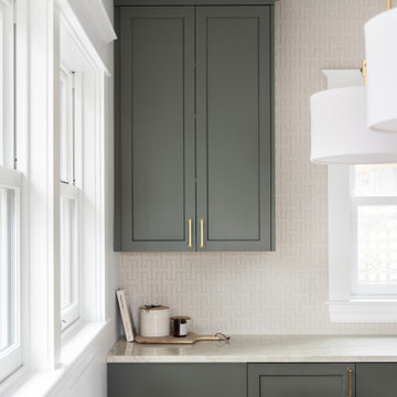
All of the updates were completed with the home’s original foursquare architecture in mind. with a focus on classic architectural molding styles, traditional window details, and clean-lined classic fixtures. Youthfulness and modernity are infused into the space with the contemporary handmade tile backsplash, rich and timeless green cabinets, and artistic wallpaper with a whimsical floral print and subtle European nod. The custom range in cream and brass is a stunning showstopper and a testament that even the most functional of elements in a kitchen can still be beautiful! Which one is the star of the show? How do we pick just one?!
 Aslan Design & Build
The original home featured a dramatic two-story great room, but the layout no longer supported the family’s needs. With too few bedrooms and an undersized, outdated second-floor bathroom, the homeowners wanted a solution that would improve functionality, privacy, and comfort—without expanding the home’s footprint.
Our design approach focused on reclaiming underutilized vertical space while creating a refined, highly functional primary suite and enhancing key living areas throughout the home.
 Anne Grice Interiors
KITCHEN AFTER
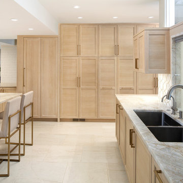
The homeowner's primary goal was to be able to host large dinner parties easily and efficiently. However, it was important that the space not feel like a commercial kitchen (even though it has three dishwashers!) in order to blend with the Mid-century Modern style of the home. We incorporated an underutilized adjacent area in order to increase the size of the kitchen by 150% to create designated space for everything, including the client's vast collection of china and serving pieces. The new floor plan feels as though it was original to the house. Cabinetry, countertops, and flooring also blend seamlessly with the rest of the home. Accents, such as the backsplash and island light fixture, add feminine elements and a touch of glamour.
Photo credit: Mitch Allen
 Designed with Grace & Joy
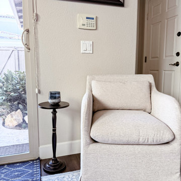
An underutilized dining area was transformed into a warm, multifunctional retreat featuring a cozy reading nook, a dedicated piano space, custom-styled built-in bookcases, statement lighting, and thoughtfully curated furnishings. Every detail was intentionally selected to create a space that feels inviting, functional, and timeless.
 Paintzen, Inc.
For many, professional interior design is a luxury. Whether your home’s design project is large or small, having the ability to transform your house, apartment or condo into a beautiful, unique space is a wonderful opportunity for self-expression. Even if it is a just simple accent wall painted in a color that speaks to you, or a complete renovation of your cabinets to achieve the kitchen of your dreams, interior design allows you to create an environment that is both personal and comfortable.
That is exactly how interior designer and founder of Design Exchange Sean Carlson Perry feels about what he does for a living. “The reason that I love designing spaces, and value the impact of space design on people, is the way the spaces make us feel, the visceral appeal of good design. Good design should stimulate the senses and generate an emotionally engaging experience. As a designer, I get to massage and sculpt people’s experience of space!” Perry shared with us.
In late 2017, the Paintzen team connected with Perry regarding a very special design project he was working on. Design Exchange was renovating, redesigning and re-furnishing The Ali Forney Center. The Ali Forney Center, based in New York City, is the largest and most comprehensive organization dedicated to housing homeless LGBTQ youth. Nearly 40% of the homeless youth population is LGBTQ. Homeless LGBTQ youth are eight times more likely to experience violence, discrimination, and suicide. AFC houses 124 youths each night and provides services to over 1,400 homeless young people per year.
Although the organization does an incredible job to provide safety and shelter to homeless youth, Perry and his team felt the space itself could use some updating and could feel more welcoming. Rooms were dark, cold, and lacked proper storage. Furniture was in poor shape and didn’t work. The rooms were being under-utilized; overall, there was so much more that could be done within the walls of the AFC that could be improved using interior design & paint!
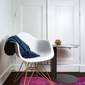
We at Paintzen were excited to partner with Design Exchange to do our part in this transformation. The dark, paneled walls were re-painted white. This entirely opened up the space, making it brighter, warmer and more welcoming. The white walls also served as a much better backdrop for smart lighting, as well as for the furniture, wall decor, and new flooring. Beyond painting, Perry and his team used FLOR carpet tiles for durability in a bright Fuchsia shade for a pop of color. They created a more functional layout to maximize the space and make better use of its architectural details and added new furniture including lamps, tables, throws, a sofa, a TV and a Roku to make the space beautiful, and even fun.
“Design increases connection and community,” Perry told us. “When we revamp a shelter space, history tells us that the residents spend more time in the space, more time with their peers, building connections and community; a greater sense of home.” Perry’s goal was to create an environment that set its residents up for success by improving their quality of life, outlook and self-esteem.
“This isn’t extreme home makeover (although I wish I had that budget!). It’s about improving the aesthetics of the space to create a better environment and experience for people who are going through challenging times. I’ve been lucky enough to have an amount of work that allows me to donate a portion of profits to Design Exchange Projects.”
Sean Carlson Perry founded Design Exchange as a way to use his talent, passion, and skills to help those who are struggling, or in a place of immediate need. He was searching to bring deeper meaning and a humanitarian component to his work. Perry has worked with clients in New York, San Francisco, and Los Angeles. “Good design—functionally, aesthetically and ergonomically—promotes a better quality of life.” This is a mantra that describes why Perry does what he does through Design Exchange, working to help the underserved of New York City and other cities across the country.
“I grew up gay in Nebraska, and have gone through some hard times when I was younger, but I can’t imagine going through what these kids go through – rejection from family, being kicked out of the house for being who they are, homeless and having nowhere else to turn,” said Perry. “Luckily, there is The Ali Forney Center. Doing these projects for AFC strikes close to home for me, so they are extra special and close to my heart.”
 J. Francis Company LLC
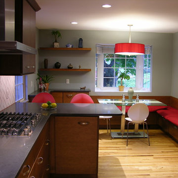
The new dining area. Reversing the peninsula allows a smoother transition from the foyer to the right in to the kitchen space, and still serves to create a nice separation between the dining area and main kitchen space. The built in banquette and bar area beyond tie the spaces together and the red touches throughout create a cohesive theme, adding a bright pop of color throughout the space.
 Kyra Construction
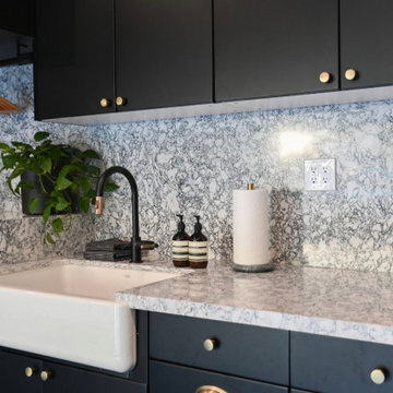
This garage conversion in La Crescenta transformed an underutilized space into a stylish and highly functional laundry room combined with a playroom. The goal was to create a practical, organized area that feels modern, durable, and welcoming for everyday use.
Cambria quartz countertops were selected for their durability and sleek finish—ideal for a high-use laundry space. Rich dark blue cabinetry adds depth and character, while black fixtures and dark gold hardware introduce a balanced, contemporary contrast.
The light gray epoxy flooring provides a seamless, durable surface that resists wear and stains, making it perfect for both laundry tasks and children’s activities. A modular storage system was installed to maximize organization and maintain a clean, clutter-free environment.
Through close collaboration with the homeowner, this garage remodel was thoughtfully designed to combine functionality, style, and flexibility creating a versatile space that serves the family’s daily needs.
 Hansen's Renovations
This basement renovation in Foxcroft was designed in partnership with Habitude Interiors to create a comfortable and highly functional extension of the home. The goal of the project was to transform the lower level into a warm, inviting living space that blends seamlessly with the rest of the house while adding practical everyday functionality.
The renovation included a custom bathroom, home bar, living room, bedroom, dining space, mudroom, updated staircase, and a thoughtfully designed under-stair built-in nook. Each area was carefully planned to maximize storage, improve flow, and create a cohesive design aesthetic throughout the basement.
By combining timeless finishes, custom millwork, and layered textures, this once underutilized basement was transformed into a beautifully finished living environment perfect for relaxing, entertaining, and hosting guests.
 Craftsman Design and Renovation
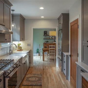
This 1928 kitchen was closed off and had underutilized storage potential. We opened up the entrance to the kitchen and reconfigured and extended the cabinetry the whole length of the kitchen to add much needed storage and work space. The natural wood cabinetry at the beverage station brings warmth to the space and contrasts the grey painted cabinets beautifully.
Photo Credit: Pete Eckert
 MMI Design
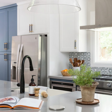
MMI Design was hired to assist our client with with an extensive kitchen, living room, and dining remodel. The original floor plan was overly compartmentalized and the kitchen may have been the tiniest kitchen on the planet! By taking out a wall which separated the spaces and stealing square footage from the under-utilized dining room, MMI was able to transform the space into a light, bright and open floor plan. The new kitchen has room for multiple cooks with all the bells and whistles of modern day kitchens, and the living spaces are large enough to entertain friends and family. We are especially proud of this project, as we believe it is not only beautiful but also transformative in terms of the new livability of the spaces.
 KCBR Design | Remodel
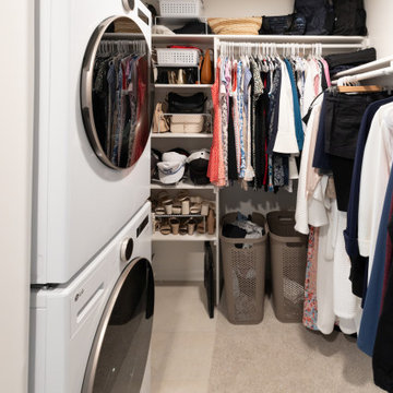
This Leawood, Kansas primary bathroom remodel was designed to support a growing family's changing needs while creating a more functional and timeless retreat. The existing layout was reimagined to improve daily routines, replacing an underutilized bathtub with a spacious walk-in shower featuring dual showerheads and a transom window that fills the space with natural light while maintaining privacy.
The renovation extended beyond the bathroom to enhance the adjoining closet. By reclaiming square footage from the former shower location, the design created additional storage and incorporated a dedicated washer and dryer for greater everyday convenience. Thoughtful planning and purposeful design decisions helped maximize functionality without sacrificing style.
Completed just before the homeowners welcomed their new baby, this remodel was designed to simplify daily life while providing a beautiful and enduring space that will serve the family for years to come.
 Ben Quie & Sons
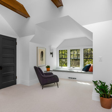
An attic can often be an overlooked, underutilized part of a home. However, with thoughtful design, it can be transformed into a comfortable and functional living space.
 Studio 1820
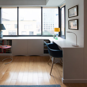
A custom built-in designed for a New York City apartment, transforming an underutilized window wall into a multifunctional, light-filled focal point. This bespoke millwork integrates a library, extra storage and a compact work-from-home desk, maximizing every inch of space while maintaining a clean, minimal aesthetic.
Finished in crisp white, the built-in enhances natural light and frames the city views, while open shelving adds warmth and personality through curated books and objects. Thoughtfully designed for modern urban living, this NYC custom cabinetry solution balances function and style, creating a seamless transition between workspace, storage and living area.
 Moss Building & Design
The MOSS design team sat down with the homeowners and went through every single option. With COVID and the distance from the job site to the MOSS office, most sessions were virtual and set to align with the clients’ work schedules. The homeowners felt all of their ideas were brought to life and the design team added interesting pieces and ideas they really liked.
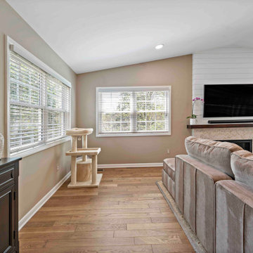
Early in the design process, they decided a focus wall would be amazing. The client loves shiplap but didn’t want anything that looked too country. Our designer and project manager worked together to create a fireplace wall that combined tile, shiplap and a custom mantel for a result that has become one of the most gorgeous parts of the remodel.
With young, active kids, the clients needed a space that could serve as a dump zone for backpacks and sports gear. Combining an underutilized carport shed and a low-functioning pantry resulted in a beautiful, very useful mudroom.
The homeowners expressed that one of the most exciting parts of the process was working with the designers and coming up with new ideas. For example, there was an odd area on one side of the kitchen and our designer suggested making it a double-door pantry. The client’s jaw dropped because she never envisioned having enough storage space to conceal all of her appliances and backstock. She said “It is one of those surprises that came through the design process that we were not expecting and is now one of our favorite parts of the kitchen. We wanted out-of-the-box thinking and that’s what we got.”
 Forward Design Build Remodel
Goals
While their home provided them with enough square footage, the original layout caused for many rooms to be underutilized. The closed off kitchen and dining room were disconnected from the other common spaces of the home causing problems with circulation and limited sight-lines. A tucked-away powder room was also inaccessible from the entryway and main living spaces in the house.
Our Design Solution
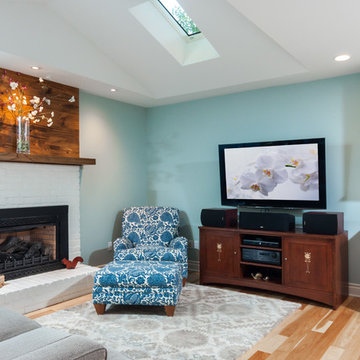
We sought out to improve the functionality of this home by opening up walls, relocating rooms, and connecting the entryway to the mudroom. By moving the kitchen into the formerly over-sized family room, it was able to really become the heart of the home with access from all of the other rooms in the house. Meanwhile, the adjacent family room was made into a cozy, comfortable space with updated fireplace and new cathedral style ceiling with skylights. The powder room was relocated to be off of the entry, making it more accessible for guests.
A transitional style with rustic accents was used throughout the remodel for a cohesive first floor design. White and black cabinets were complimented with brass hardware and custom wood features, including a hood top and accent wall over the fireplace. Between each room, walls were thickened and archway were put in place, providing the home with even more character.
 Construction by Meyer
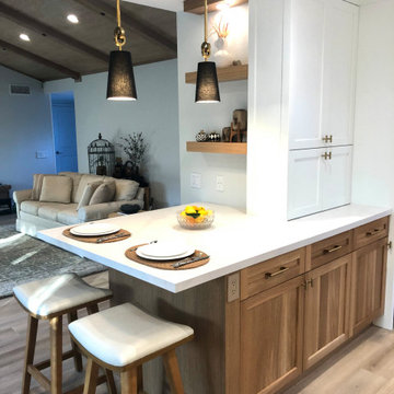
Our client had a dining room that had long been underutilized, and they yearned for a more practical and spacious kitchen. The decision was made to remove the traditional dining area and, in its place, create a peninsula that would redefine the concept of their kitchen space.
 SHARON Stone Design Build
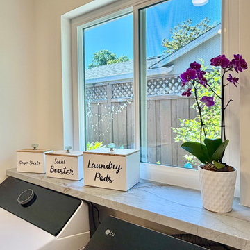
This custom kitchenette and laundry room transformation blends modern luxury with timeless functionality. Designed with warm light wood cabinetry, sleek flat-panel doors, and stunning full-height porcelain slab surfaces with soft veining, this space feels bright, elegant, and highly functional. The integrated floating shelf, under-cabinet LED lighting, and seamless countertop create a clean contemporary aesthetic while maximizing storage and workspace.
The custom workstation sink, minimalist faucet, and floor-to-ceiling slab backsplash bring a high-end designer feel to this compact space. Every detail was carefully planned to turn an underutilized area into a stylish and efficient kitchenette/laundry room perfect for modern living.
Designed & built by Sharon Stone Design Build in Silicon Valley, specializing in luxury custom remodeling, space planning, modern cabinetry, and high-end interior transformations.
52