
Search results for "Off white armband" in Home Design Ideas
 Davetta Moore Designs
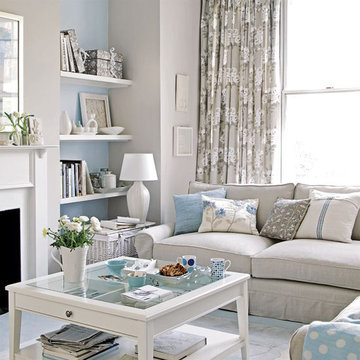
Cool Blue and Gray Undertones.
Beige off-whites have a pink undertone.
Brownish feeling off-whites have a warmer red undertone, or cooler green undertones.
Carmel feeling off-whites have yellow and orange undertones.
Grayish feeling off-whites can have blue, yellow or green undertones depending on whether you are leaning more towards the cool side or the warm side of the color wheel.
Image credit: http://www.simplydecorate.com/interior-design-blog/color-love-friday-greige.html
Join periodic email updates https://www.facebook.com/davettamooredesigns/app_141428856257
Connect at
Google Plus https://plus.google.com/+DavettaMooreDesignsConcord/posts
Facebook https://www.facebook.com/davettamooredesigns
Pinterest https://www.pinterest.com/davettamoore/
Twitter https://twitter.com/davettamoore
 Bilotta Kitchen & Home
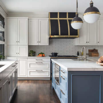
This clean and classic Northern Westchester kitchen features a mix of colors and finishes. The perimeter of the kitchen including the desk area is painted in Benjamin Moore’s Nordic White with satin chrome hardware. The island features Benjamin Moore’s Blue Toile with satin brass hardware. The focal point of the space is the Cornu Fe range and custom hood in satin black with brass and chrome trim. Crisp white subway tile covers the backwall behind the cooking area and all the way up the sink wall to the ceiling. In place of wall cabinets, the client opted for thick white open shelves on either side of the window above the sink to keep the space more open and airier. Countertops are a mix of Neolith’s Estatuario on the island and Ash Grey marble on the perimeter. Hanging above the island are Circa Lighting’s the “Hicks Large Pendants” by designer Thomas O’Brien; above the dining table is Tom Dixon’s “Fat Pendant”.
Just off of the kitchen is a wet bar conveniently located next to the living area, perfect for entertaining guests. They opted for a contemporary look in the space. The cabinetry is Yosemite Bronzato laminate in a high gloss finish coupled with open glass shelves and a mirrored backsplash. The mirror and the abundance of windows makes the room appear larger than it is.
Bilotta Senior Designer: Rita LuisaGarces
Architect: Hirshson Design & Architecture
Photographer: Stefan Radtke
 GMT Home Designs Inc.
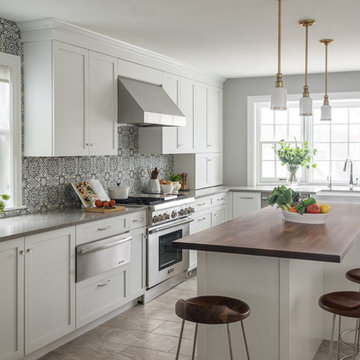
The original kitchen was dark and lacked storage space. It was cut off from the rest of the house and needed an update. We removed the wall between the dining room and kitchen and bumped the kitchen out in the rear of the house. We created lots of storage, a new island with seating and added windows bringing in much needed natural light. The kitchen is now a hub of activity for the whole family.
Find the right local pro for your project
 Atelier Armbruster
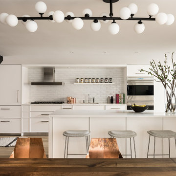
This kitchen is a study in white. White tiles with a textured surface, white minimally detailed cabinetry, a white waterfall countertop and off-white stools.
 Normandy Remodeling
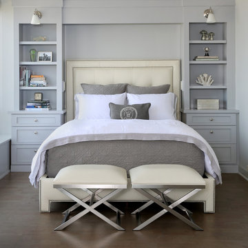
These floor to ceiling book shelves double as a storage and an eye- capturing focal point that surrounds the head board, making the bed in this master bedroom, the center of attention.
Learn more about Chris Ebert, the Normandy Remodeling Designer who created this space, and other projects that Chris has created: https://www.normandyremodeling.com/team/christopher-ebert
Photo Credit: Normandy Remodeling
 IDF Studio
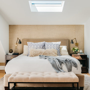
This calming primary bedroom is centered around a square skylight positioned above the bed, filling the space with soft natural light. Woven wallpaper behind the headboard adds texture and warmth, complemented by articulating arm wall sconces for a tailored, functional touch. Blue and white bedding is layered with a cozy fuzzy lumbar pillow, while a tufted off-white bench with a black frame sits at the foot of the bed. Wood floors and a traditional off-white rug complete the room, creating a serene and inviting retreat. Photo by Christopher Stark.
 TKS Design Group
Download our free ebook, Creating the Ideal Kitchen. DOWNLOAD NOW
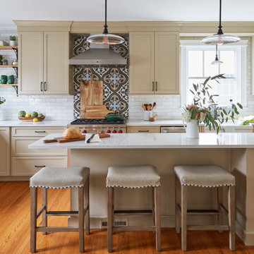
The homeowners came to us looking to update the kitchen in their historic 1897 home. The home had gone through an extensive renovation several years earlier that added a master bedroom suite and updates to the front façade. The kitchen however was not part of that update and a prior 1990’s update had left much to be desired. The client is an avid cook, and it was just not very functional for the family.
The original kitchen was very choppy and included a large eat in area that took up more than its fair share of the space. On the wish list was a place where the family could comfortably congregate, that was easy and to cook in, that feels lived in and in check with the rest of the home’s décor. They also wanted a space that was not cluttered and dark – a happy, light and airy room. A small powder room off the space also needed some attention so we set out to include that in the remodel as well.
See that arch in the neighboring dining room? The homeowner really wanted to make the opening to the dining room an arch to match, so we incorporated that into the design.
Another unfortunate eyesore was the state of the ceiling and soffits. Turns out it was just a series of shortcuts from the prior renovation, and we were surprised and delighted that we were easily able to flatten out almost the entire ceiling with a couple of little reworks.
Other changes we made were to add new windows that were appropriate to the new design, which included moving the sink window over slightly to give the work zone more breathing room. We also adjusted the height of the windows in what was previously the eat-in area that were too low for a countertop to work. We tried to keep an old island in the plan since it was a well-loved vintage find, but the tradeoff for the function of the new island was not worth it in the end. We hope the old found a new home, perhaps as a potting table.
Designed by: Susan Klimala, CKD, CBD
Photography by: Michael Kaskel
For more information on kitchen and bath design ideas go to: www.kitchenstudio-ge.com
Sponsored
Fredericksburg, OH

High Point Cabinets
Columbus' Experienced Custom Cabinet Builder | 4x Best of Houzz Winner
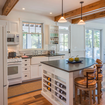
 John Cole Architect
Brian Vanden Brink
Country l-shaped kitchen photo in Portland Maine with a farmhouse sink, shaker cabinets, white cabinets, white backsplash, subway tile backsplash and white appliances
Country l-shaped kitchen photo in Portland Maine with a farmhouse sink, shaker cabinets, white cabinets, white backsplash, subway tile backsplash and white appliances
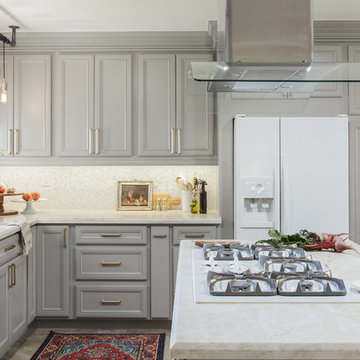
 DANIELLE Interior Design & Decor
Embark on a culinary crave with this classic gray and white family kitchen. We chose a warm neutral color for the cabinetry and enhanced this warmth with champagne gold cabinet hardware. These warm gray cabinets can be found at your neighborhood Lowes while the champagne hardware are designed by Atlas. Add another accent of shine to your kitchen and check out the mother of pearl diamond mosaic tile backsplash by Jeffrey Court, as seen here. Adding this hint of sparkle to your small space will allow your kitchen to stay bright and chic. Don't be afraid to mix metals or color. This island houses the glass cook top with a stainless steel hood above the island, and we added a matte black as our finish for the Edison lighting as well as black bar stool seating to tie it all together. The Taj Mahal white Quartzite counter tops are a beauty. The contrast in color creates dimension to your small kitchen layout and will continually catch your eye.
Designed by Dani Perkins @ DANIELLE Interior Design & Decor
Taylor Abeel Photography
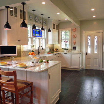
 Tina Colebrook Architect
The existing quirky floor plan of this 17 year old kitchen created 4 work areas and left no room for a proper laundry and utility room. We actually made this kitchen smaller to make it function better. We took the cramped u-shaped area that housed the stove and refrigerator and walled it off to create a new more generous laundry room with room for ironing & sewing. The now rectangular shaped kitchen was reoriented by installing new windows with higher sills we were able to line the exterior wall with cabinets and counter, giving the sink a nice view to the side yard. To create the Victorian look the owners desired in their 1920’s home, we used wall cabinets with inset doors and beaded panels, for economy the base cabinets are full overlay doors & drawers all in the same finish, Nordic White. The owner selected a gorgeous serene white river granite for the counters and we selected a taupe glass subway tile to pull the palette together. Another special feature of this kitchen is the custom pocket dog door. The owner’s had a salvaged door that we incorporated in a pocket in the peninsula to corale the dogs when the owner aren’t home. Tina Colebrook
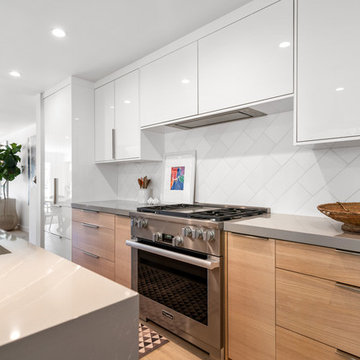
 JRP Design & Remodel
Our client had been living in her beautiful lakeside retreat for about 3 years. All around were stunning views of the lake and mountains, but the view from inside was minimal. It felt dark and closed off from the gorgeous waterfront mere feet away. She desired a bigger kitchen, natural light, and a contemporary look. Referred to JRP by a subcontractor our client walked into the showroom one day, took one look at the modern kitchen in our design center, and was inspired!
After talking about the frustrations of dark spaces and limitations when entertaining groups of friends, the homeowner and the JRP design team emerged with a new vision. Two walls between the living room and kitchen would be eliminated and structural revisions were needed for a common wall shared a wall with a neighbor. With the wall removals and the addition of multiple slider doors, the main level now has an open layout.
Everything in the home went from dark to luminous as sunlight could now bounce off white walls to illuminate both spaces. Our aim was to create a beautiful modern kitchen which fused the necessities of a functional space with the elegant form of the contemporary aesthetic. The kitchen playfully mixes frameless white upper with horizontal grain oak lower cabinets and a fun diagonal white tile backsplash. Gorgeous grey Cambria quartz with white veining meets them both in the middle. The large island with integrated barstool area makes it functional and a great entertaining space.
The master bedroom received a mini facelift as well. White never fails to give your bedroom a timeless look. The beautiful, bright marble shower shows what's possible when mixing tile shape, size, and color. The marble mosaic tiles in the shower pan are especially bold paired with black matte plumbing fixtures and gives the shower a striking visual.
Layers, light, consistent intention, and fun! - paired with beautiful, unique designs and a personal touch created this beautiful home that does not go unnoticed.
PROJECT DETAILS:
• Style: Contemporary
• Colors: Neutrals
• Countertops: Cambria Quartz, Luxury Series, Queen Anne
• Kitchen Cabinets: Slab, Overlay Frameless
Uppers: Blanco
Base: Horizontal Grain Oak
• Hardware/Plumbing Fixture Finish: Kitchen – Stainless Steel
• Lighting Fixtures:
• Flooring:
Hardwood: Siberian Oak with Fossil Stone finish
• Tile/Backsplash:
Kitchen Backsplash: White/Clear Glass
Master Bath Floor: Ann Sacks Benton Mosaics Marble
Master Bath Surround: Ann Sacks White Thassos Marble
Photographer: Andrew – Open House VC
 Tracy Herbert Interiors, LLC
Tracy Herbert Interiors, LLC
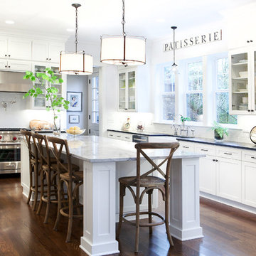
Elegant u-shaped eat-in kitchen photo in Portland with a farmhouse sink, shaker cabinets, white cabinets, quartzite countertops, white backsplash, subway tile backsplash and stainless steel appliances
Elegant u-shaped eat-in kitchen photo in Portland with a farmhouse sink, shaker cabinets, white cabinets, quartzite countertops, white backsplash, subway tile backsplash and stainless steel appliances
 Mary Cook
JE Evans Photography (Columbus, OH)
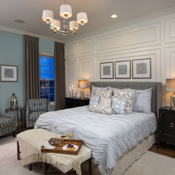
Example of a transitional guest dark wood floor bedroom design in Columbus with blue walls
Example of a transitional guest dark wood floor bedroom design in Columbus with blue walls
Sponsored
Fredericksburg, OH
High Point Cabinets
Columbus' Experienced Custom Cabinet Builder | 4x Best of Houzz Winner
 Marty Rhein, CKD, CBD - BAC Design Group
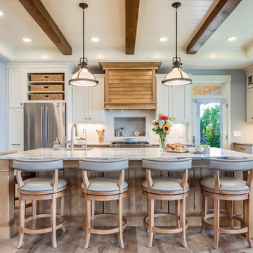
Inspiration for a coastal u-shaped medium tone wood floor and brown floor eat-in kitchen remodel in Other with an undermount sink, shaker cabinets, medium tone wood cabinets, white backsplash, stainless steel appliances, an island and white countertops
 MJK Homes, Inc.
Scott Hargis Photo
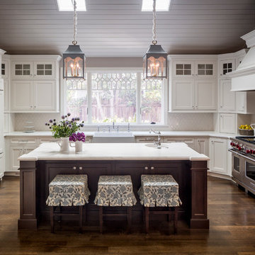
Farmhouse u-shaped dark wood floor enclosed kitchen photo in San Francisco with a farmhouse sink, beaded inset cabinets, white cabinets, white backsplash, an island and paneled appliances
Farmhouse u-shaped dark wood floor enclosed kitchen photo in San Francisco with a farmhouse sink, beaded inset cabinets, white cabinets, white backsplash, an island and paneled appliances
 Kitchen Design Concepts
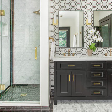
Black and white can never make a comeback, because it's always around. Such a classic combo that never gets old and we had lots of fun creating a fun and functional space in this jack and jill bathroom. Used by one of the client's sons as well as being the bathroom for overnight guests, this space needed to not only have enough foot space for two, but be "cool" enough for a teenage boy to appreciate and show off to his friends.
The vanity cabinet is a freestanding unit from WW Woods Shiloh collection in their Black paint color. A simple inset door style - Aspen - keeps it looking clean while really making it a furniture look. All of the tile is marble and sourced from Daltile, in Carrara White and Nero Marquina (black). The accent wall is the 6" hex black/white blend. All of the plumbing fixtures and hardware are from the Brizo Litze collection in a Luxe Gold finish. Countertop is Caesarstone Blizzard 3cm quartz.
 Lang's Kitchen & Bath
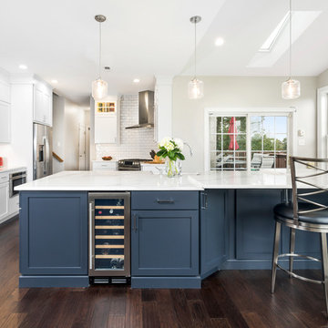
This spacious kitchen design in Yardley is a bright, open plan space bathed in natural light from the large windows, doors, and skylights. The white perimeter cabinets from Koch and Company are complemented by handmade subway tile and MSI Surfaces Calcatta Venice quartz countertop. The white color scheme is beautifully contrasted by blue island cabinetry with a bi-level countertop and barstool seating. The island also includes a Task Lighting angled power strip, a narrow wine refrigerator, and a white Blanco Siligranit apron front sink with a Riobel Edge faucet and chrome soap dispenser. The kitchen cabinets are accented by Top Knobs Lydia style pulls in chrome. Bosch stainless appliances feature throughout the kitchen, including a microwave drawer and a Bosch stainless chimney hood. Dark hardwood flooring from Meridian brings depth to the style. The natural lighting is complemented by pendant lights from Wage Lighting, undercabinet lighting, and upper glass front cabinets with in cabinet lighting.

 Custom Kitchens by John Wilkins, Inc.
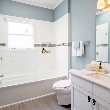
The layout of this bathroom was reconfigured by locating the new tub on the rear wall, and putting the toilet on the left of the vanity.
The wall on the left of the existing vanity was taken out.

 Liz Schupanitz Designs
Cooking for Two
Location: Plymouth, MN, United States
When this couple’s last child graduated from college they began the process of looking for a new home. After a lengthy search they decided to stay with the neighborhood they loved, saving money by remodeling rather than starting over.
The top priorities on their wish list were adding character to their 1990’s era home with a classic white kitchen and a larger island while keeping within the existing footprint. With the intention of honing their cooking skills, they were also considering better appliances and two ovens.
Challenges and Solutions
Design a larger island with seating for at least two. The existing island was small and the area behind the seating was less than recommended clearances.
To solve this challenge, the seating area of the island was extended out into the open area of the kitchen. This created a larger island with seating for three, extra storage and a bookshelf across from the range.
The original kitchen had a range with microwave above, so adding another oven was a challenge with limited wall space.
Because the adjoining dining room is used infrequently, the homeowner was open to placing the second oven and microwave in the walkway. This made room for the small buffet between the built in refrigerator and ovens, creating one of her favorite areas.
The client requested a white painted kitchen but wanted to make sure it had warmth and character. To achieve this the following elements were chosen:
1) Cabinets painted with Benjamin Moore Capitol White, a luminous and warm shade of white.
2) The Range hood was painted with warm metallic shades to reflect the bronze of the Ashley Norton hardware.
3) Black Aqua Grantique granite was chosen for countertops because it looks like soapstone and adds contrast.
4) Walker Zanger Café tile in Latte was chosen for it’s handmade look with uneven edges.
5) The to-the-counter-cabinet with glass door shows off serving dishes and lends sophisticated charm.
The result is a welcoming classic kitchen, where this couple enjoys cooking more often and sharpening their skills with gourmet appliances.
Liz Schupanitz Designs
Photographed by: Andrea Rugg Photography
 Johnston Home Interior Design
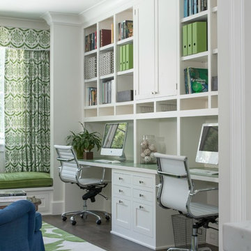
This study off the kitchen acts as a control center for the family. Kids work on computers in open spaces, not in their rooms. Green linoleum covers the desk for a durable and cleanable surface. The cabinets were custom built for the space. The chairs are from Overstock.com. photo: David Duncan Livingston
2