
Search results for "Slight adjustment" in Home Design Ideas
 MILIEU
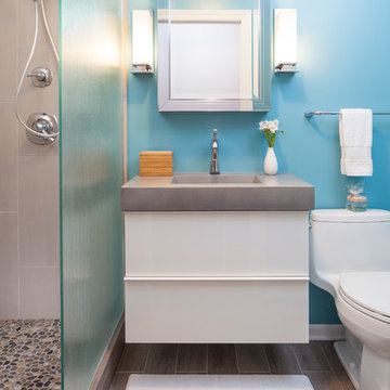
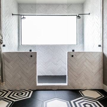
A tub shower transformed into a standing open shower. A concrete composite vanity top incorporates the sink and counter making it low maintenance.
Photography by
Jacob Hand
 Luther Paul Weber AIA, Architect
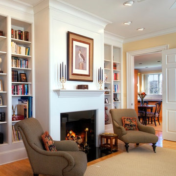
Interior millwork & Lighting by Luther Paul Weber, AIA.
Hoachlander Davis Photography
Example of a large country medium tone wood floor living room design in DC Metro with yellow walls and a standard fireplace
Example of a large country medium tone wood floor living room design in DC Metro with yellow walls and a standard fireplace
 KC Drafting & Design
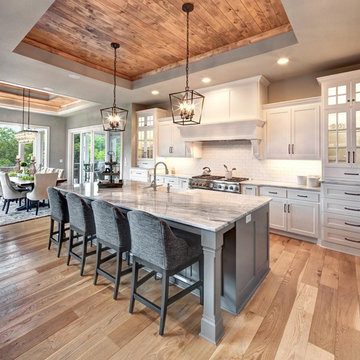
Example of a classic light wood floor and beige floor eat-in kitchen design in Kansas City with a farmhouse sink, white cabinets, white backsplash, subway tile backsplash, stainless steel appliances, an island, gray countertops and shaker cabinets
Find the right local pro for your project
 NB Design Group, Inc
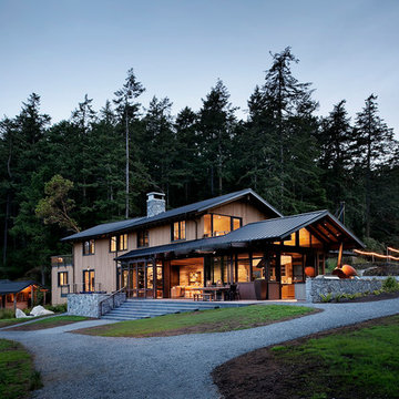
Rustic Modern Exterior of Private Residence Compound
Inspiration for a large rustic three-story exterior home remodel in Seattle
Inspiration for a large rustic three-story exterior home remodel in Seattle

 Denver Design Group
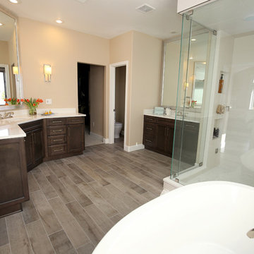
The master bathroom was refined with slight adjustments to the layout to allow for a generously sized shower and freestanding tub. The pebbled stone under the tub sets this portion of the bathroom apart to create a focal point beneath the stacked stone surrounded window. A perfect place to enjoy a soak while enjoying the view. Dual vanities provide plenty of storage without crowding the space and leaving the room feeling open and spacious. Custom mirrors complete the clean and bright appearance of the room.
Photos: Myndi Pressly

Sponsored
Columbus, OH

Structural Remodeling
Franklin County's Heavy Timber Specialists | Best of Houzz 2020!
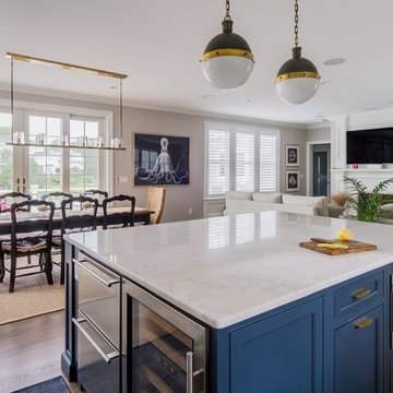
 ArchiPlicity, LLC
Katherine Jackson Architectural Photography
Kitchen - transitional kitchen idea in Boston
Kitchen - transitional kitchen idea in Boston
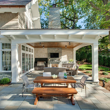
 John Kraemer & Sons
Builder: John Kraemer & Sons | Architect: Swan Architecture | Interiors: Katie Redpath Constable | Landscaping: Bechler Landscapes | Photography: Landmark Photography

 Flying Dormer
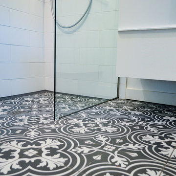
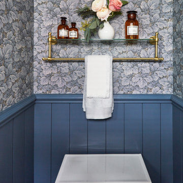
To create the illusion of space in this 5' x 8' Eureopean-style bathroom, we continued the bold black and white mosaic Portugese floor tile into the shower, whose floor is just slightly recessed, and angled so water drains to the center.
The rest of the bathroom is almost purely white and includes:
- white floating vanity with modern water-saving chrome faucet
- large white subway tile with mother of pearl accents including the mother of pearl-lined shampoo niche and vanity backsplash that goes all the way up to the ceiling which catches the light and adds a bit of bling.
- Adjustable handheld shower
- modern white dual flush toilet
- floating shelves
- Carrera marble countertop
- deep, custom made medicine cabinet for extra storage
- heated floor
 TKS Design Group
Download our free ebook, Creating the Ideal Kitchen. DOWNLOAD NOW
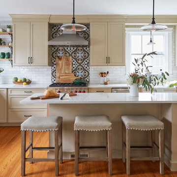
The homeowners came to us looking to update the kitchen in their historic 1897 home. The home had gone through an extensive renovation several years earlier that added a master bedroom suite and updates to the front façade. The kitchen however was not part of that update and a prior 1990’s update had left much to be desired. The client is an avid cook, and it was just not very functional for the family.
The original kitchen was very choppy and included a large eat in area that took up more than its fair share of the space. On the wish list was a place where the family could comfortably congregate, that was easy and to cook in, that feels lived in and in check with the rest of the home’s décor. They also wanted a space that was not cluttered and dark – a happy, light and airy room. A small powder room off the space also needed some attention so we set out to include that in the remodel as well.
See that arch in the neighboring dining room? The homeowner really wanted to make the opening to the dining room an arch to match, so we incorporated that into the design.
Another unfortunate eyesore was the state of the ceiling and soffits. Turns out it was just a series of shortcuts from the prior renovation, and we were surprised and delighted that we were easily able to flatten out almost the entire ceiling with a couple of little reworks.
Other changes we made were to add new windows that were appropriate to the new design, which included moving the sink window over slightly to give the work zone more breathing room. We also adjusted the height of the windows in what was previously the eat-in area that were too low for a countertop to work. We tried to keep an old island in the plan since it was a well-loved vintage find, but the tradeoff for the function of the new island was not worth it in the end. We hope the old found a new home, perhaps as a potting table.
Designed by: Susan Klimala, CKD, CBD
Photography by: Michael Kaskel
For more information on kitchen and bath design ideas go to: www.kitchenstudio-ge.com
 TKS Design Group
Download our free ebook, Creating the Ideal Kitchen. DOWNLOAD NOW
The homeowners came to us looking to update the kitchen in their historic 1897 home. The home had gone through an extensive renovation several years earlier that added a master bedroom suite and updates to the front façade. The kitchen however was not part of that update and a prior 1990’s update had left much to be desired. The client is an avid cook, and it was just not very functional for the family.
The original kitchen was very choppy and included a large eat in area that took up more than its fair share of the space. On the wish list was a place where the family could comfortably congregate, that was easy and to cook in, that feels lived in and in check with the rest of the home’s décor. They also wanted a space that was not cluttered and dark – a happy, light and airy room. A small powder room off the space also needed some attention so we set out to include that in the remodel as well.
See that arch in the neighboring dining room? The homeowner really wanted to make the opening to the dining room an arch to match, so we incorporated that into the design.
Another unfortunate eyesore was the state of the ceiling and soffits. Turns out it was just a series of shortcuts from the prior renovation, and we were surprised and delighted that we were easily able to flatten out almost the entire ceiling with a couple of little reworks.
Other changes we made were to add new windows that were appropriate to the new design, which included moving the sink window over slightly to give the work zone more breathing room. We also adjusted the height of the windows in what was previously the eat-in area that were too low for a countertop to work. We tried to keep an old island in the plan since it was a well-loved vintage find, but the tradeoff for the function of the new island was not worth it in the end. We hope the old found a new home, perhaps as a potting table.
Designed by: Susan Klimala, CKD, CBD
Photography by: Michael Kaskel
For more information on kitchen and bath design ideas go to: www.kitchenstudio-ge.com
 Powell Construction
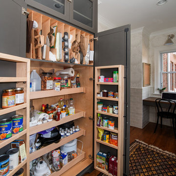
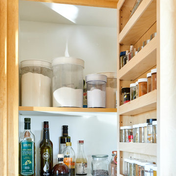
Details: In this new cabinet, spices are stored inside the door on adjustable trays. Cabinet shelves were made slightly shallower to accommodate the spice depth.
 Kimball Starr Interior Design
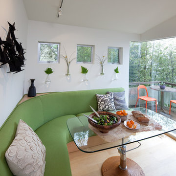
Small space living solutions are used throughout this contemporary 596 square foot tiny house. Adjustable height table in the entry area serves as both a coffee table for socializing and as a dining table for eating. Curved banquette is upholstered in outdoor fabric for durability and maximizes space with hidden storage underneath the seat. Kitchen island has a retractable countertop for additional seating while the living area conceals a work desk and media center behind sliding shoji screens.
Calming tones of sand and deep ocean blue fill the tiny bedroom downstairs. Glowing bedside sconces utilize wall-mounting and swing arms to conserve bedside space and maximize flexibility.

 O’Hara Interiors
Martha O'Hara Interiors, Interior Design & Photo Styling | John Kraemer & Sons, Remodel | Troy Thies, Photography
Please Note: All “related,” “similar,” and “sponsored” products tagged or listed by Houzz are not actual products pictured. They have not been approved by Martha O’Hara Interiors nor any of the professionals credited. For information about our work, please contact design@oharainteriors.com.
 TKS Design Group
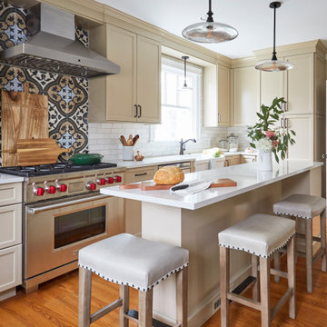
Download our free ebook, Creating the Ideal Kitchen. DOWNLOAD NOW
The homeowners came to us looking to update the kitchen in their historic 1897 home. The home had gone through an extensive renovation several years earlier that added a master bedroom suite and updates to the front façade. The kitchen however was not part of that update and a prior 1990’s update had left much to be desired. The client is an avid cook, and it was just not very functional for the family.
The original kitchen was very choppy and included a large eat in area that took up more than its fair share of the space. On the wish list was a place where the family could comfortably congregate, that was easy and to cook in, that feels lived in and in check with the rest of the home’s décor. They also wanted a space that was not cluttered and dark – a happy, light and airy room. A small powder room off the space also needed some attention so we set out to include that in the remodel as well.
See that arch in the neighboring dining room? The homeowner really wanted to make the opening to the dining room an arch to match, so we incorporated that into the design.
Another unfortunate eyesore was the state of the ceiling and soffits. Turns out it was just a series of shortcuts from the prior renovation, and we were surprised and delighted that we were easily able to flatten out almost the entire ceiling with a couple of little reworks.
Other changes we made were to add new windows that were appropriate to the new design, which included moving the sink window over slightly to give the work zone more breathing room. We also adjusted the height of the windows in what was previously the eat-in area that were too low for a countertop to work. We tried to keep an old island in the plan since it was a well-loved vintage find, but the tradeoff for the function of the new island was not worth it in the end. We hope the old found a new home, perhaps as a potting table.
Designed by: Susan Klimala, CKD, CBD
Photography by: Michael Kaskel
For more information on kitchen and bath design ideas go to: www.kitchenstudio-ge.com
 TKS Design Group
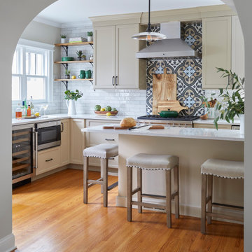
Download our free ebook, Creating the Ideal Kitchen. DOWNLOAD NOW
The homeowners came to us looking to update the kitchen in their historic 1897 home. The home had gone through an extensive renovation several years earlier that added a master bedroom suite and updates to the front façade. The kitchen however was not part of that update and a prior 1990’s update had left much to be desired. The client is an avid cook, and it was just not very functional for the family.
The original kitchen was very choppy and included a large eat in area that took up more than its fair share of the space. On the wish list was a place where the family could comfortably congregate, that was easy and to cook in, that feels lived in and in check with the rest of the home’s décor. They also wanted a space that was not cluttered and dark – a happy, light and airy room. A small powder room off the space also needed some attention so we set out to include that in the remodel as well.
See that arch in the neighboring dining room? The homeowner really wanted to make the opening to the dining room an arch to match, so we incorporated that into the design.
Another unfortunate eyesore was the state of the ceiling and soffits. Turns out it was just a series of shortcuts from the prior renovation, and we were surprised and delighted that we were easily able to flatten out almost the entire ceiling with a couple of little reworks.
Other changes we made were to add new windows that were appropriate to the new design, which included moving the sink window over slightly to give the work zone more breathing room. We also adjusted the height of the windows in what was previously the eat-in area that were too low for a countertop to work. We tried to keep an old island in the plan since it was a well-loved vintage find, but the tradeoff for the function of the new island was not worth it in the end. We hope the old found a new home, perhaps as a potting table.
Designed by: Susan Klimala, CKD, CBD
Photography by: Michael Kaskel
For more information on kitchen and bath design ideas go to: www.kitchenstudio-ge.com
 Change Your Bathroom©
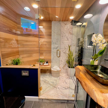
This transformation started with a builder grade bathroom and was expanded into a sauna wet room. With cedar walls and ceiling and a custom cedar bench, the sauna heats the space for a relaxing dry heat experience. The goal of this space was to create a sauna in the secondary bathroom and be as efficient as possible with the space. This bathroom transformed from a standard secondary bathroom to a ergonomic spa without impacting the functionality of the bedroom.
This project was super fun, we were working inside of a guest bedroom, to create a functional, yet expansive bathroom. We started with a standard bathroom layout and by building out into the large guest bedroom that was used as an office, we were able to create enough square footage in the bathroom without detracting from the bedroom aesthetics or function. We worked with the client on her specific requests and put all of the materials into a 3D design to visualize the new space.
Houzz Write Up: https://www.houzz.com/magazine/bathroom-of-the-week-stylish-spa-retreat-with-a-real-sauna-stsetivw-vs~168139419
The layout of the bathroom needed to change to incorporate the larger wet room/sauna. By expanding the room slightly it gave us the needed space to relocate the toilet, the vanity and the entrance to the bathroom allowing for the wet room to have the full length of the new space.
This bathroom includes a cedar sauna room that is incorporated inside of the shower, the custom cedar bench follows the curvature of the room's new layout and a window was added to allow the natural sunlight to come in from the bedroom. The aromatic properties of the cedar are delightful whether it's being used with the dry sauna heat and also when the shower is steaming the space. In the shower are matching porcelain, marble-look tiles, with architectural texture on the shower walls contrasting with the warm, smooth cedar boards. Also, by increasing the depth of the toilet wall, we were able to create useful towel storage without detracting from the room significantly.
This entire project and client was a joy to work with.
2