Artist Retreat
Living Room:
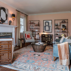
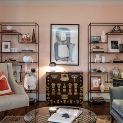
Every client has a design problem that leads them to reach out for help. In the case of this client, it all started with their living room. A long, rectangular formal living room in a traditional historic house is often resolved here in the South with a traditional color palette and endless symmetry. For this accomplished, artistic couple, redefining a traditional living room needed to reflect their eclectic tastes and be a welcoming environment for entertaining other artists in the community.
So how do you shake it up? This home was all about balance and carrying specific elements on throughout the rest of the house. Moments of symmetry - like the tall iron etageres along the back wall, and the black and brass lamps on the mantle - are enlivened with groupings of objects and different types of seating. The thin lines of the etageres also create a graphic quality against the wall, adding much needed height and a layer of depth to the room, while balancing the visual weight of the other furniture pieces in the space.
What we have now is a room that feels elevated, eclectic, and curated, but not overly stuffy and staid. We accomplished this through the Naive Peach paint color on the wall to enrich the blue-green tones in the living room. Decorative accents, like this orange pillow and orange blown glass objects on the mantle, make a similar statement as the wall color, but bolder. This duality of color, you will see, continues throughout the public spaces of the home.
One of the easiest ways to bring about a sense of play in a room is to introduce an element of the unexpected. On the mantle, we incorporated this brass owl into the design.
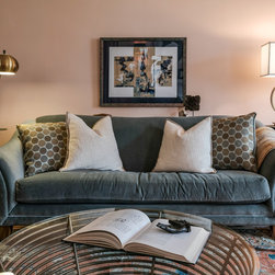
This luxurious velvet sofa is flanked by identical steel drums. We pulled the sofa off the wall and added a small console behind it for a landing spot for drinks and small sculptures. A brass arc floor lamp on one side of the couch, and a circle brass table lamp on the other side both echo the form and shape of the coffee table in the center of the room.
A matching side chair is waiting to be moved forward when the couple is entertaining, and the white lacquer console is a perfect spot for drinks. Want to see more? Stay tuned for more posts about this fantastic, eclectic house.
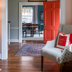
Entry:
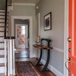
Let's talk first impressions. A big part of our work here at Catherine French Design is bringing both balance and that "wow" factor into a space. This can happen in many different ways, but one of my favorite personal design challenges for each new client we take on is to set the stage and hint at those design elements right at the beginning. With this particular couple, bringing the color punch from the living room onto the front door signals from the street that the interiors of this residence are far from ordinary. Add the client's "entree des artistes" sign, and you've set the stage for the entire home - elevated, artistic, with a hint of the unexpected.
From the street, this lovely white, sedate historic home now has a bold color statement. Balance is created with more black and white accents; styled here with a welcome mat, two different planters, and a surprise appearance by Geraldine. The house still plays well with others, but like our clients, speaks of artistic exploration.
Great interior design is an experience, not a photograph. Ultimately the goal is to experience your home not as a static image with only one view, but as a cohesive environment that pulls you from room to room. In this home, we visually connected the different spaces through color, texture, and interesting art. Upon opening the door, the view point at the end of the hall is of Osborne and Little's Derwent wallpaper in the same fun color. The juxtaposition of calming grays in the foreground with the whimsical powder bath in the background creates balance in the space, and allows the entryway to be the breath and transition between the two more visually rich rooms.
A sculptural wooden pendant and an asymmetrical gallery wall add visual interest to a more traditional entryway. Gorgeous, colorful oriental rugs continue the blue and orange color palette from the front door, living room, and dining room. Combined, these elements create a lasting first impression.
Next up? Wall colors and a chandelier to die for. Stay tuned for part 3 of this Artist Retreat.
Dinning:
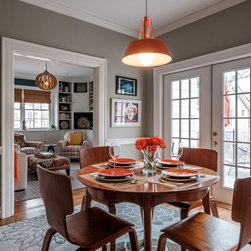
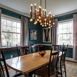
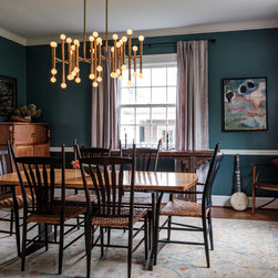
Welcome back to the Artist's Retreat. Today in part 3 we have a few gorgeous images of this glamorous, modern meets Asian-inspired dining room. A rich wall color plays the perfect supporting role for blending different wood tones in the furniture pieces, and sets the stage for perhaps my favorite chandelier in the whole wide world. I know white rooms are all the rage right now, but sometimes when you're throwing a fabulous dinner party, you want to create a more intimate setting to allow the conversation and spirits to flow. A deeper, more saturated wall color will do the trick. This wall color was selected to bring the blue tones from the living room into this side of the house. With a bit more sheen to the finish than your basic eggshell, the light reflects more off the walls. We added a lighter rug on the floor to compliment the lovely moody blue on the walls.
One element that is often overlooked in design is lighting - especially different levels of lighting. This Johnathan Adler Meurice Rectangle Chandelier was chosen as a perfect compliment to the dining chairs, adding drama and multiple levels of light to finish off the space. The brass details have a bamboo vibe that tie in with the other Asian-inspired pieces in the room.
Bold, abstract art work, and luminescent grey velvet curtains frame the room, creating the perfect backdrop for the seating area to shine. Add a non-traditional styling moment with this floral arrangement, and we have a great space for a sit-down meal.
PS. Did you notice the vintage banjo in the corner? This is an artist retreat after all, and you never know when the fun and funky couple who live here, along with a few of their friends, will break into an impromptu jam session!
Using Orange:
Good morning, y'all. I'm back on the blog today with an image heavy post in a continuation of our Artist Retreat series. Today, it's a photograph explosion of the breakfast area and den. I am going to dub this as my orange crush, because let's be serious, I am truly crushing on this space.
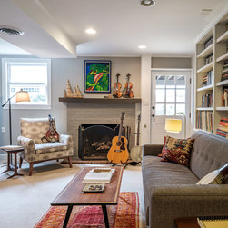
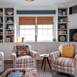
When it came to the breakfast area and the den, when we came on the client already had the clearest vision for these two spaces. This is truly where the palette for the rest of the house started - specifically with the orange pendant light that had travelled from California with the client. We carried the grey walls from the entryway on to the back of the house in these more informal spaces, and then brought the deep, moody blue tone from the dining room into the den as an accent in the bookcases and mini bar area.
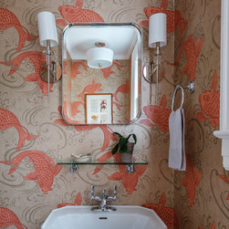
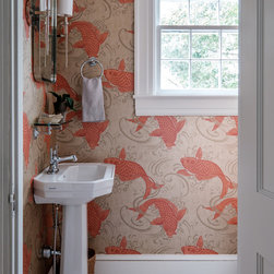
As it turns out, orange is a spirit color in this house, and there were plenty of existing accessories and dinnerware that had that striking pop already in play. It made the orange color of the koi wallpaper in the powder bath an easy decision.
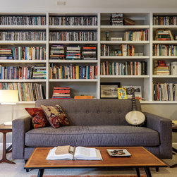
Part of what makes any space feel warm, personal, and well, finished, is artwork and a well-styled space. We unpacked many boxes that hadn't been opened in years - from before the couple's journey from California - to find treasured books and objects to display on these built-in shelves.
With an intimate seating arrangement, this room really excels with texture and a play on pattern and fabrics. This is a totally relaxed room, often serving as an afternoon napping spot, a place to watch a little tv, or to have great conversations with close friends.
The secret to well-styled shelves? It's all about balancing various forms, colors, and patterns so that your eye naturally travels around the collection. A single plate on one shelf leads to a shelf with a lot of vertical books followed by a horizontal framed print on the following one. A common color scheme helps tie in the various pieces.
Perhaps my favorite feature of this room? The hidden bar. Painted the same rich, moody blue color, it's an unexpected addition to the space. Add in some barware, a wine rack, and some unexpected original art, and this space is worthy of investigation.
These three art pieces work together because they share a similar color palette, shape, and form. With gorgeous natural light from the back yard, this den truly invites relaxation.
Love what you see? Need some help pulling your space together? We'd love to meet you for a consultation or afternoon design session and take on your design challenge. Reach out to us at hello@catherinefrenchdesign.com.
All images were styled by the Team at Catherine French Design, LLC. All photographs were taken by J. Sinclair Photography. Arista Builders, Inc. was the general contractor for this project.
Every client has a design problem that leads them to reach out for help. In the case of this client, it all started with their living room. A long, rectangular formal living room in a traditional historic house is often resolved here in the South with a traditional color palette and endless symmetry. For this accomplished, artistic couple, redefining a traditional living room needed to reflect their eclectic tastes and be a welcoming environment for entertaining other artists in the community.
So how do you shake it up? This home was all about balance and carrying specific elements on throughout the rest of the house. Moments of symmetry - like the tall iron etageres along the back wall, and the black and brass lamps on the mantle - are enlivened with groupings of objects and different types of seating. The thin lines of the etageres also create a graphic quality against the wall, adding much needed height and a layer of depth to the room, while balancing the visual weight of the other furniture pieces in the space.
What we have now is a room that feels elevated, eclectic, and curated, but not overly stuffy and staid. We accomplished this through the Naive Peach paint color on the wall to enrich the blue-green tones in the living room. Decorative accents, like this orange pillow and orange blown glass objects on the mantle, make a similar statement as the wall color, but bolder. This duality of color, you will see, continues throughout the public spaces of the home.
One of the easiest ways to bring about a sense of play in a room is to introduce an element of the unexpected. On the mantle, we incorporated this brass owl into the design.
This luxurious velvet sofa is flanked by identical steel drums. We pulled the sofa off the wall and added a small console behind it for a landing spot for drinks and small sculptures. A brass arc floor lamp on one side of the couch, and a circle brass table lamp on the other side both echo the form and shape of the coffee table in the center of the room.
A matching side chair is waiting to be moved forward when the couple is entertaining, and the white lacquer console is a perfect spot for drinks. Want to see more? Stay tuned for more posts about this fantastic, eclectic house.
Entry:
Let's talk first impressions. A big part of our work here at Catherine French Design is bringing both balance and that "wow" factor into a space. This can happen in many different ways, but one of my favorite personal design challenges for each new client we take on is to set the stage and hint at those design elements right at the beginning. With this particular couple, bringing the color punch from the living room onto the front door signals from the street that the interiors of this residence are far from ordinary. Add the client's "entree des artistes" sign, and you've set the stage for the entire home - elevated, artistic, with a hint of the unexpected.
From the street, this lovely white, sedate historic home now has a bold color statement. Balance is created with more black and white accents; styled here with a welcome mat, two different planters, and a surprise appearance by Geraldine. The house still plays well with others, but like our clients, speaks of artistic exploration.
Great interior design is an experience, not a photograph. Ultimately the goal is to experience your home not as a static image with only one view, but as a cohesive environment that pulls you from room to room. In this home, we visually connected the different spaces through color, texture, and interesting art. Upon opening the door, the view point at the end of the hall is of Osborne and Little's Derwent wallpaper in the same fun color. The juxtaposition of calming grays in the foreground with the whimsical powder bath in the background creates balance in the space, and allows the entryway to be the breath and transition between the two more visually rich rooms.
A sculptural wooden pendant and an asymmetrical gallery wall add visual interest to a more traditional entryway. Gorgeous, colorful oriental rugs continue the blue and orange color palette from the front door, living room, and dining room. Combined, these elements create a lasting first impression.
Next up? Wall colors and a chandelier to die for. Stay tuned for part 3 of this Artist Retreat.
Dinning:
Welcome back to the Artist's Retreat. Today in part 3 we have a few gorgeous images of this glamorous, modern meets Asian-inspired dining room. A rich wall color plays the perfect supporting role for blending different wood tones in the furniture pieces, and sets the stage for perhaps my favorite chandelier in the whole wide world. I know white rooms are all the rage right now, but sometimes when you're throwing a fabulous dinner party, you want to create a more intimate setting to allow the conversation and spirits to flow. A deeper, more saturated wall color will do the trick. This wall color was selected to bring the blue tones from the living room into this side of the house. With a bit more sheen to the finish than your basic eggshell, the light reflects more off the walls. We added a lighter rug on the floor to compliment the lovely moody blue on the walls.
One element that is often overlooked in design is lighting - especially different levels of lighting. This Johnathan Adler Meurice Rectangle Chandelier was chosen as a perfect compliment to the dining chairs, adding drama and multiple levels of light to finish off the space. The brass details have a bamboo vibe that tie in with the other Asian-inspired pieces in the room.
Bold, abstract art work, and luminescent grey velvet curtains frame the room, creating the perfect backdrop for the seating area to shine. Add a non-traditional styling moment with this floral arrangement, and we have a great space for a sit-down meal.
PS. Did you notice the vintage banjo in the corner? This is an artist retreat after all, and you never know when the fun and funky couple who live here, along with a few of their friends, will break into an impromptu jam session!
Using Orange:
Good morning, y'all. I'm back on the blog today with an image heavy post in a continuation of our Artist Retreat series. Today, it's a photograph explosion of the breakfast area and den. I am going to dub this as my orange crush, because let's be serious, I am truly crushing on this space.
When it came to the breakfast area and the den, when we came on the client already had the clearest vision for these two spaces. This is truly where the palette for the rest of the house started - specifically with the orange pendant light that had travelled from California with the client. We carried the grey walls from the entryway on to the back of the house in these more informal spaces, and then brought the deep, moody blue tone from the dining room into the den as an accent in the bookcases and mini bar area.
As it turns out, orange is a spirit color in this house, and there were plenty of existing accessories and dinnerware that had that striking pop already in play. It made the orange color of the koi wallpaper in the powder bath an easy decision.
Part of what makes any space feel warm, personal, and well, finished, is artwork and a well-styled space. We unpacked many boxes that hadn't been opened in years - from before the couple's journey from California - to find treasured books and objects to display on these built-in shelves.
With an intimate seating arrangement, this room really excels with texture and a play on pattern and fabrics. This is a totally relaxed room, often serving as an afternoon napping spot, a place to watch a little tv, or to have great conversations with close friends.
The secret to well-styled shelves? It's all about balancing various forms, colors, and patterns so that your eye naturally travels around the collection. A single plate on one shelf leads to a shelf with a lot of vertical books followed by a horizontal framed print on the following one. A common color scheme helps tie in the various pieces.
Perhaps my favorite feature of this room? The hidden bar. Painted the same rich, moody blue color, it's an unexpected addition to the space. Add in some barware, a wine rack, and some unexpected original art, and this space is worthy of investigation.
These three art pieces work together because they share a similar color palette, shape, and form. With gorgeous natural light from the back yard, this den truly invites relaxation.
Love what you see? Need some help pulling your space together? We'd love to meet you for a consultation or afternoon design session and take on your design challenge. Reach out to us at hello@catherinefrenchdesign.com.
All images were styled by the Team at Catherine French Design, LLC. All photographs were taken by J. Sinclair Photography. Arista Builders, Inc. was the general contractor for this project.
Project Year: 2017
Project Cost: $75,001 - $100,000
Country: United States