

Classic Blue Guest Room
The room was very simple with a nice neutral wall color. The older furniture was sentimental to the client and she wanted the bed and one other storage piece to stay.
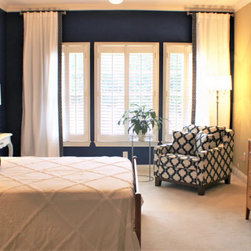
Notice the chair in the corner. As you enter the room, this is the first focal impression and it was my inspiration for the room. Everything was done to accentuate and work in harmony with that chair! I was thrilled when after suggesting that we paint two accent walls in Classic Blue, my conservative client, Sarah didn't throw me out of her house!! I didn't want to overwhelm the space with color...only add some importance behind the bed and at the window and to my relief, she was game!!
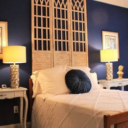
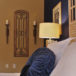
My challenge was to make something much more impactful of the simple maple bed that was staying. I wanted to bring in a bit of drama and also repeat the contrast in the blue and white print fabric of the chair. This set of three panels was the answer! It gave us some much needed height and intense contrast to make the bed more important! I chose two matching French desk-like pieces for bedside tables and changed the wood finish to a distressed cream for added contrast. The mercury glass lamps inject visual energy with their reflective surface and add an unexpected modern feel to the space.
The quatrefoil pattern in the chair is subtly repeated in the European shams and there is also a blue and white quatrefoil print banding that was added to the white window treatments at the leading edge. Simple but impactful accessories complete the space and add function and personality!
If you have thoughts or questions about this design, please call, text or email me. I would love to talk with you about YOUR next project!
Notice the chair in the corner. As you enter the room, this is the first focal impression and it was my inspiration for the room. Everything was done to accentuate and work in harmony with that chair! I was thrilled when after suggesting that we paint two accent walls in Classic Blue, my conservative client, Sarah didn't throw me out of her house!! I didn't want to overwhelm the space with color...only add some importance behind the bed and at the window and to my relief, she was game!!
My challenge was to make something much more impactful of the simple maple bed that was staying. I wanted to bring in a bit of drama and also repeat the contrast in the blue and white print fabric of the chair. This set of three panels was the answer! It gave us some much needed height and intense contrast to make the bed more important! I chose two matching French desk-like pieces for bedside tables and changed the wood finish to a distressed cream for added contrast. The mercury glass lamps inject visual energy with their reflective surface and add an unexpected modern feel to the space.
The quatrefoil pattern in the chair is subtly repeated in the European shams and there is also a blue and white quatrefoil print banding that was added to the white window treatments at the leading edge. Simple but impactful accessories complete the space and add function and personality!
If you have thoughts or questions about this design, please call, text or email me. I would love to talk with you about YOUR next project!
Country: United States