

Make it better than how you found it.
Leave It Better Than You Found It. You’re Welcome.
A $50–60K facelift, a house with good bones, and a reminder that you don’t always have to start over.
Not every house needs to be gutted.
Sometimes it needs someone to walk in, look past what’s currently there and ask three questions:
What should stay? What needs to go? And where will the money actually make a difference?
That was this house.
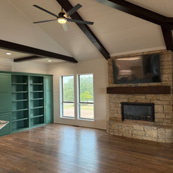
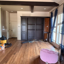
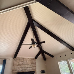
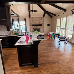
The bones were good. The kitchen cabinetry was substantial. The granite was perfectly usable. The family room had soaring ceilings, beams, paneling, a stone fireplace and a large built-in.
There was plenty worth saving.
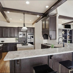
But visually, the house had become heavy. Dark cabinetry, an oversized dark kitchen hood, dark beams, dark built-ins, dated lighting and heavily textured walls were all competing for attention.
The goal wasn’t to make the house lighter by making everything light. The goal was to decide where the contrast belonged.
And sometimes that’s the difference between remodeling a house and simply making the house you already own considerably better.
The Improvement You Barely See
One of the biggest undertakings in this project is probably the one most people will never notice in the finished photographs:
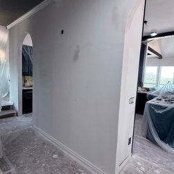
We skim-coated the walls.
The existing wall texture was heavy. Smoothing it gave the entire house a quieter backdrop and allowed the architecture and materials to become the interesting parts.
It’s painstaking work — multiple applications, drying time, sanding, corrections, priming and finally paint.
And here’s something I’ll happily carry into the next project:
You can rush a schedule. You cannot bully drywall into drying faster.
This project had roughly a month of planning followed by an extremely ambitious six-week construction schedule. If I were doing this amount of finish work again, I would give the trades more breathing room.
Good work takes the time it takes.
But since we were already undertaking substantial drywall work, it created an opportunity.
Why put the walls back exactly as we found them?
Enter the Arches
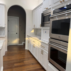
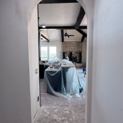
The existing squared openings into the kitchen felt awkward and didn’t relate particularly well to one another.
So we changed them.
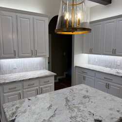
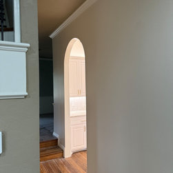
Turning the openings into arches gave the house an architectural language that had been missing. Suddenly the transitions between rooms felt intentional, and the curves created a beautiful counterpoint to all of those strong ceiling beams.
This is one of my favorite kinds of design decisions.
It doesn’t scream, LOOK WHAT WE BOUGHT.
It simply makes the house feel as though it should have always been that way.
The Kitchen — Or, Not Everything Had to Go
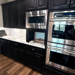
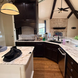
The homeowner wasn’t particularly excited about the existing granite.
And I’ll confess:
I am rarely president of the Granite Fan Club.
But I didn’t think the granite was actually the problem.
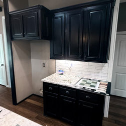
Surrounded by nearly black cabinetry, dark beams, a massive dark hood and dark hardware, the stone was being asked to fight everything around it.
My instinct was:
Give it a chance.
So we kept it.
Once the cabinetry became light, something interesting happened.
The granite became pretty.
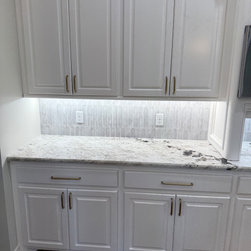
Suddenly its black and gray movement wasn’t contributing to the visual noise. It was giving a lighter kitchen character.
And that became one of my favorite lessons from this entire project:
Sometimes you don’t hate the thing. You hate everything that’s happening around the thing.
Replacing perfectly usable materials simply because they’re no longer the material of the moment isn’t always good design.
Sometimes the smarter decision is changing the context.
The Hood Had to Go
Now, I may have fought for the granite.
I did not fight for the original hood. ?
It was enormous, dark, ornate and visually connected to an already complicated ceiling full of dark beams.
I couldn’t wait to see it leave.
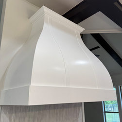
The replacement needed to be substantial enough to hold its own in the room without becoming another giant dark object.
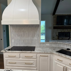
I designed a cleaner hood with a softer silhouette and simple detailing. Painting it with the cabinetry allowed the shape, rather than the color, to become the feature.
I’m in love with this hood.
There. I said it.
And Then We Changed Our Minds About the Backsplash
The original plan was herringbone.
We didn’t do it.
And I’m so glad.
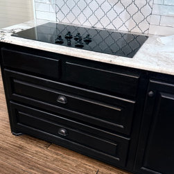
Instead, we chose an elongated tile with a pointed shape and let the geometry of the tile create the pattern.
It has movement without being busy. It relates beautifully to the new hood and gives the kitchen just enough personality.
Actually, the pointed shape had quite a bit of personality.
Let’s just say it turned out to be particularly well suited to the project. ?
You’re welcome.
Hardware Is Not One-Size-Fits-All
I love hardware.
And I don’t believe every cabinet in a kitchen automatically needs the same size pull simply because that’s easier to specify.
We played with scale.
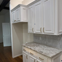
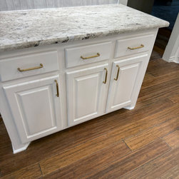
Longer drawers received longer pulls. Smaller drawers received appropriately scaled hardware. Upper cabinets received knobs.
Every size had a reason.
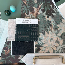
The warm brass finish brought warmth into the newly lightened cabinetry and connected beautifully with the new island lighting.
It’s subtle, but your eye notices rhythm even when you don’t consciously understand why something feels right.
Those are the details I love.
Two Lights Became One
The original island lighting was another thing I couldn’t wait to change.
Instead of replacing two fixtures with two prettier fixtures, I wanted fewer things competing with an already architectural ceiling.
So we went bigger.
One oversized lantern.
Its scale finally gives the island a focal point, while the warm metal connects with the new cabinet hardware.
Sometimes fewer things — at the right scale — make considerably more impact.
The Brown That Saved the Beams
Oh, the beams.
They were one of the strongest architectural elements in the house.
They were also, in person, a bit of a mess.
The existing finish was inconsistent, seams were visible, and the almost-black color made them extraordinarily heavy.
But painting them white would have been a mistake.
This house needs those beams.
I spent what felt like an unreasonable amount of time finding the right brown.
It couldn’t look chocolate.
It couldn’t look black.
And it absolutely could not look like somebody had simply painted the beams brown.
We found it.
Ironically, painting them made them look more convincingly like beautifully stained wood.
Against the freshly painted paneling, they became rich architectural lines instead of visual weight.
That brown has officially earned a permanent place in my design arsenal.
The Fireplace Didn’t Need a Dumpster Either
We kept the stone.
Again, the material itself wasn’t necessarily the problem. The surrounding decisions were making it feel dated.
The traditional dark mantel, rustic stone and nearly black beams were pushing the entire room in a much heavier direction than I wanted to continue.
So instead of tearing apart a perfectly good masonry fireplace, we changed the mantel.
A cleaner oak mantel was stained intentionally dark enough to distinguish itself from the floors and hold its own against the beams.
Different fireplace.
Same stone.
Keep. Correct. Enhance.
That became something of an unofficial philosophy for this project.
And Then There Was Green
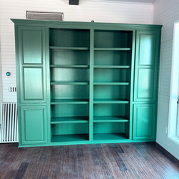
The family room built-in occupies a huge amount of visual real estate.
Painting it white would have been easy.
I didn’t want easy.
After removing so much visual heaviness elsewhere, the room needed somewhere for color to live.
The homeowners loved green, so we explored several options and ultimately landed on one of the brighter greens.
And then came a brief moment of panic.
There may have been a desire to change it almost immediately.
I wanted everyone to leave it alone for a minute. ?
Color is one of the hardest things to judge when everything around it is unfinished.
Sometimes the rest of the room simply needs time to catch up with the paint.
And it did.
The green gave that enormous built-in exactly what it needed — personality, energy and enough visual weight to balance the dark beams without returning the room to all that heaviness.
We also added more shelving.
This built-in needed to do more than look pretty. Because the room connects closely to the family’s everyday entrance from the garage, I envisioned woven baskets on the lower shelves for toys and the realities of family life, with books, photographs and meaningful objects above.
Pretty is good. Pretty that works is considerably better.
Paint Is Never Just “Pick a White”
Furniture would have been the next phase of this house.
But I was already thinking about it.
I had to.
Before selecting paint, I need some understanding of where a room is eventually going — upholstery, rugs, wood tones, artwork, window treatments and how one room relates to another.
Otherwise, we’re simply standing in an empty house choosing a pleasant white.
That’s not enough for me.
Design doesn’t have to happen all at once. But it should know where it’s going.
A house can evolve.
In fact, I think some of the best ones do.
So What Does a Facelift Like This Actually Cost?
Approximately $50,000–$60,000 went into this phase of the house.
I think it’s important to say that out loud because finished photographs rarely communicate the number of people, hours and individual decisions required to create what can look like a relatively simple transformation.
This wasn’t simply, “We painted the cabinets.”
The project involved a team — designer, general contractor, painter, electrician, AV, drywall and skim-coat work, finish carpenter, tile setter, hardware installer and final cleaning crew.
There was approximately one month of planning followed by six weeks of construction.
Could we have spent considerably more?
Absolutely.
We could have replaced the cabinetry.
We could have replaced the granite.
We could have torn out the fireplace.
We could have replaced the flooring.
We could have turned a facelift into a full renovation very quickly.
But spending more money wasn’t the design challenge.
Knowing where we didn’t need to spend it was.
Leave It Better Than You Found It
This isn’t the end of this home’s story.
There are still furnishings to select, rooms that can evolve and layers that could be added over time.
And that’s okay.
Some clients start and finish an entire home with me. Sometimes I’m there for a chapter.
Either way, my responsibility is the same:
Keep what’s worth keeping.
Correct what isn’t working.
Spend the money where it matters.
Give the next decision somewhere good to go.
Design doesn’t always mean starting over.
Sometimes it means recognizing the potential that was already there and knowing exactly what to do with it.
Every home has a story.
My job isn’t always to write the whole thing.
Sometimes it’s simply to leave the story considerably better than I found it.
You’re welcome.
A $50–60K facelift, a house with good bones, and a reminder that you don’t always have to start over.
Not every house needs to be gutted.
Sometimes it needs someone to walk in, look past what’s currently there and ask three questions:
What should stay? What needs to go? And where will the money actually make a difference?
That was this house.
The bones were good. The kitchen cabinetry was substantial. The granite was perfectly usable. The family room had soaring ceilings, beams, paneling, a stone fireplace and a large built-in.
There was plenty worth saving.
But visually, the house had become heavy. Dark cabinetry, an oversized dark kitchen hood, dark beams, dark built-ins, dated lighting and heavily textured walls were all competing for attention.
The goal wasn’t to make the house lighter by making everything light. The goal was to decide where the contrast belonged.
And sometimes that’s the difference between remodeling a house and simply making the house you already own considerably better.
The Improvement You Barely See
One of the biggest undertakings in this project is probably the one most people will never notice in the finished photographs:
We skim-coated the walls.
The existing wall texture was heavy. Smoothing it gave the entire house a quieter backdrop and allowed the architecture and materials to become the interesting parts.
It’s painstaking work — multiple applications, drying time, sanding, corrections, priming and finally paint.
And here’s something I’ll happily carry into the next project:
You can rush a schedule. You cannot bully drywall into drying faster.
This project had roughly a month of planning followed by an extremely ambitious six-week construction schedule. If I were doing this amount of finish work again, I would give the trades more breathing room.
Good work takes the time it takes.
But since we were already undertaking substantial drywall work, it created an opportunity.
Why put the walls back exactly as we found them?
Enter the Arches
The existing squared openings into the kitchen felt awkward and didn’t relate particularly well to one another.
So we changed them.
Turning the openings into arches gave the house an architectural language that had been missing. Suddenly the transitions between rooms felt intentional, and the curves created a beautiful counterpoint to all of those strong ceiling beams.
This is one of my favorite kinds of design decisions.
It doesn’t scream, LOOK WHAT WE BOUGHT.
It simply makes the house feel as though it should have always been that way.
The Kitchen — Or, Not Everything Had to Go
The homeowner wasn’t particularly excited about the existing granite.
And I’ll confess:
I am rarely president of the Granite Fan Club.
But I didn’t think the granite was actually the problem.
Surrounded by nearly black cabinetry, dark beams, a massive dark hood and dark hardware, the stone was being asked to fight everything around it.
My instinct was:
Give it a chance.
So we kept it.
Once the cabinetry became light, something interesting happened.
The granite became pretty.
Suddenly its black and gray movement wasn’t contributing to the visual noise. It was giving a lighter kitchen character.
And that became one of my favorite lessons from this entire project:
Sometimes you don’t hate the thing. You hate everything that’s happening around the thing.
Replacing perfectly usable materials simply because they’re no longer the material of the moment isn’t always good design.
Sometimes the smarter decision is changing the context.
The Hood Had to Go
Now, I may have fought for the granite.
I did not fight for the original hood. ?
It was enormous, dark, ornate and visually connected to an already complicated ceiling full of dark beams.
I couldn’t wait to see it leave.
The replacement needed to be substantial enough to hold its own in the room without becoming another giant dark object.
I designed a cleaner hood with a softer silhouette and simple detailing. Painting it with the cabinetry allowed the shape, rather than the color, to become the feature.
I’m in love with this hood.
There. I said it.
And Then We Changed Our Minds About the Backsplash
The original plan was herringbone.
We didn’t do it.
And I’m so glad.
Instead, we chose an elongated tile with a pointed shape and let the geometry of the tile create the pattern.
It has movement without being busy. It relates beautifully to the new hood and gives the kitchen just enough personality.
Actually, the pointed shape had quite a bit of personality.
Let’s just say it turned out to be particularly well suited to the project. ?
You’re welcome.
Hardware Is Not One-Size-Fits-All
I love hardware.
And I don’t believe every cabinet in a kitchen automatically needs the same size pull simply because that’s easier to specify.
We played with scale.
Longer drawers received longer pulls. Smaller drawers received appropriately scaled hardware. Upper cabinets received knobs.
Every size had a reason.
The warm brass finish brought warmth into the newly lightened cabinetry and connected beautifully with the new island lighting.
It’s subtle, but your eye notices rhythm even when you don’t consciously understand why something feels right.
Those are the details I love.
Two Lights Became One
The original island lighting was another thing I couldn’t wait to change.
Instead of replacing two fixtures with two prettier fixtures, I wanted fewer things competing with an already architectural ceiling.
So we went bigger.
One oversized lantern.
Its scale finally gives the island a focal point, while the warm metal connects with the new cabinet hardware.
Sometimes fewer things — at the right scale — make considerably more impact.
The Brown That Saved the Beams
Oh, the beams.
They were one of the strongest architectural elements in the house.
They were also, in person, a bit of a mess.
The existing finish was inconsistent, seams were visible, and the almost-black color made them extraordinarily heavy.
But painting them white would have been a mistake.
This house needs those beams.
I spent what felt like an unreasonable amount of time finding the right brown.
It couldn’t look chocolate.
It couldn’t look black.
And it absolutely could not look like somebody had simply painted the beams brown.
We found it.
Ironically, painting them made them look more convincingly like beautifully stained wood.
Against the freshly painted paneling, they became rich architectural lines instead of visual weight.
That brown has officially earned a permanent place in my design arsenal.
The Fireplace Didn’t Need a Dumpster Either
We kept the stone.
Again, the material itself wasn’t necessarily the problem. The surrounding decisions were making it feel dated.
The traditional dark mantel, rustic stone and nearly black beams were pushing the entire room in a much heavier direction than I wanted to continue.
So instead of tearing apart a perfectly good masonry fireplace, we changed the mantel.
A cleaner oak mantel was stained intentionally dark enough to distinguish itself from the floors and hold its own against the beams.
Different fireplace.
Same stone.
Keep. Correct. Enhance.
That became something of an unofficial philosophy for this project.
And Then There Was Green
The family room built-in occupies a huge amount of visual real estate.
Painting it white would have been easy.
I didn’t want easy.
After removing so much visual heaviness elsewhere, the room needed somewhere for color to live.
The homeowners loved green, so we explored several options and ultimately landed on one of the brighter greens.
And then came a brief moment of panic.
There may have been a desire to change it almost immediately.
I wanted everyone to leave it alone for a minute. ?
Color is one of the hardest things to judge when everything around it is unfinished.
Sometimes the rest of the room simply needs time to catch up with the paint.
And it did.
The green gave that enormous built-in exactly what it needed — personality, energy and enough visual weight to balance the dark beams without returning the room to all that heaviness.
We also added more shelving.
This built-in needed to do more than look pretty. Because the room connects closely to the family’s everyday entrance from the garage, I envisioned woven baskets on the lower shelves for toys and the realities of family life, with books, photographs and meaningful objects above.
Pretty is good. Pretty that works is considerably better.
Paint Is Never Just “Pick a White”
Furniture would have been the next phase of this house.
But I was already thinking about it.
I had to.
Before selecting paint, I need some understanding of where a room is eventually going — upholstery, rugs, wood tones, artwork, window treatments and how one room relates to another.
Otherwise, we’re simply standing in an empty house choosing a pleasant white.
That’s not enough for me.
Design doesn’t have to happen all at once. But it should know where it’s going.
A house can evolve.
In fact, I think some of the best ones do.
So What Does a Facelift Like This Actually Cost?
Approximately $50,000–$60,000 went into this phase of the house.
I think it’s important to say that out loud because finished photographs rarely communicate the number of people, hours and individual decisions required to create what can look like a relatively simple transformation.
This wasn’t simply, “We painted the cabinets.”
The project involved a team — designer, general contractor, painter, electrician, AV, drywall and skim-coat work, finish carpenter, tile setter, hardware installer and final cleaning crew.
There was approximately one month of planning followed by six weeks of construction.
Could we have spent considerably more?
Absolutely.
We could have replaced the cabinetry.
We could have replaced the granite.
We could have torn out the fireplace.
We could have replaced the flooring.
We could have turned a facelift into a full renovation very quickly.
But spending more money wasn’t the design challenge.
Knowing where we didn’t need to spend it was.
Leave It Better Than You Found It
This isn’t the end of this home’s story.
There are still furnishings to select, rooms that can evolve and layers that could be added over time.
And that’s okay.
Some clients start and finish an entire home with me. Sometimes I’m there for a chapter.
Either way, my responsibility is the same:
Keep what’s worth keeping.
Correct what isn’t working.
Spend the money where it matters.
Give the next decision somewhere good to go.
Design doesn’t always mean starting over.
Sometimes it means recognizing the potential that was already there and knowing exactly what to do with it.
Every home has a story.
My job isn’t always to write the whole thing.
Sometimes it’s simply to leave the story considerably better than I found it.
You’re welcome.
Project Cost: $25,001 - $50,000
Country: United States