Mid-Century Modern-ized
We've recently been called back to an extensive remodel project we did 15 years ago. The original architect must have had some familiarity with mid-century modernism, but the influence was sporadic and unevenly applied. We retained the best of that, and greatly expanded the theme in the renovations. We weren't able to get completed project photos back then, so my walk-through to program new work with the current owners was an interesting first look at our work from so far in the past. My conviction that design in a modernist vein tends to hold up well over time seems further validated in this this example. Other than the polished brass hardware finishes that the previous owner insisted upon, the design still looks reasonably fresh, although the new owners have different needs and, I sense, perhaps even a greater appreciation for contemporary art and architecture than the previous owner.
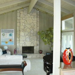
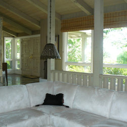
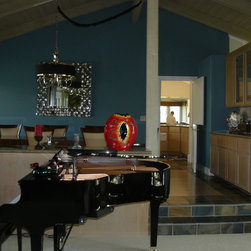
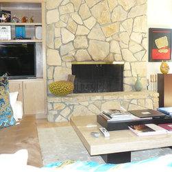
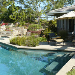
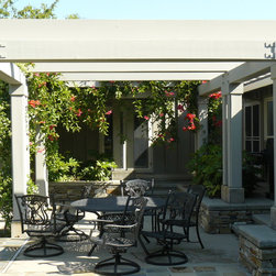
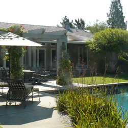
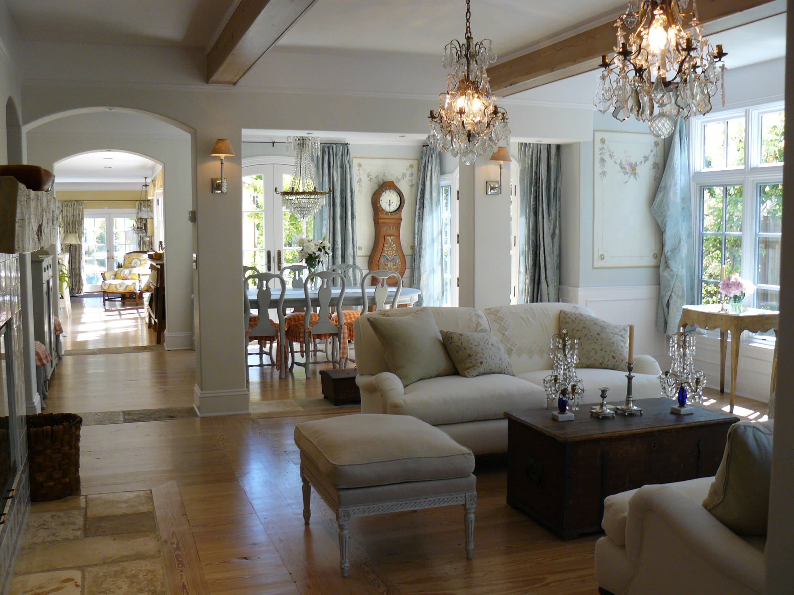
With its lush, and now mature, landscaped hillside setting, getting major exterior views has become difficult. My vignette photos are estimates to this, though the various exterior spaces are certainly each quite appealing. As for the interior, back when we were first called to work on the residence, the exact opposite issue was the problem. The unusual condition we found was that the large interior main space volume was almost completely undifferentiated, leaving large areas without a specific sense of purpose. Our solution, which still felt appropriate during my recent visit, was to create a series of orthogonally aligned large columnar forms, roughly 4 feet square, which defined "rooms" and made sense of the floor plan. Now, one can understand the extents of the living room, even though the adjacent family room can be completely opened along its perimeter by bi-folding pairs of doors, which conveniently park in recesses in their associated columnar elements.
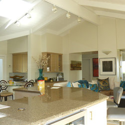
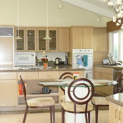
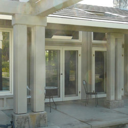
As might be expected with such a long span roof, exacerbated by eaves 5 feet wide, the interior could be rather gloomy when we first found it. Our solution in several places was to cut large openings through the wide eaves outside of the major spaces, greatly increasing the amount of natural light. In spaces without connection to exterior walls, as well as in the kitchen, we added skylights. Through the use of light-colored walls and pastel wood cabinetry finishes, incoming light can bounce and diffuse throughout.
With its lush, and now mature, landscaped hillside setting, getting major exterior views has become difficult. My vignette photos are estimates to this, though the various exterior spaces are certainly each quite appealing. As for the interior, back when we were first called to work on the residence, the exact opposite issue was the problem. The unusual condition we found was that the large interior main space volume was almost completely undifferentiated, leaving large areas without a specific sense of purpose. Our solution, which still felt appropriate during my recent visit, was to create a series of orthogonally aligned large columnar forms, roughly 4 feet square, which defined "rooms" and made sense of the floor plan. Now, one can understand the extents of the living room, even though the adjacent family room can be completely opened along its perimeter by bi-folding pairs of doors, which conveniently park in recesses in their associated columnar elements.
As might be expected with such a long span roof, exacerbated by eaves 5 feet wide, the interior could be rather gloomy when we first found it. Our solution in several places was to cut large openings through the wide eaves outside of the major spaces, greatly increasing the amount of natural light. In spaces without connection to exterior walls, as well as in the kitchen, we added skylights. Through the use of light-colored walls and pastel wood cabinetry finishes, incoming light can bounce and diffuse throughout.
Country: United States