Elevated Elegance
A dysfunctional space built by someone who loved angles a little too much, we made a big impact in this project with a tonal shift to better match the owners’ style and layout corrections that improved the overall flow and functionality of the room. The homeowners wanted a “peaceful place to start” each day that included luxury elements to create a feeling of Elevated Elegance instead of the chaos they felt stuck with when we first began.
Project Objectives:
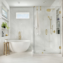
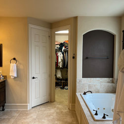
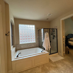
Our primary goal for this project was to bring a sense of order and peace to this space, adding much-needed storage and functionality without sacrificing key elements like the bathtub. We planned to substantially increase the size of the tiny shower, add meaningful storage to the vanities that was sorely lacking, improve the layout and functionality of the closet, and straighten out an oddly-angled wall that limited the potential of the space.
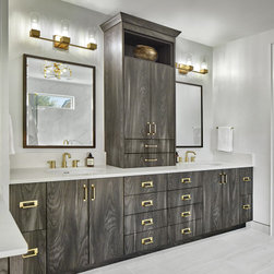
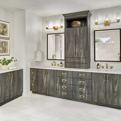
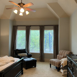
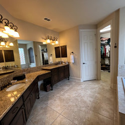
Our secondary goal was to improve the overall aesthetics of the space to match the owners’ preferred style. They wanted a luxury spa experience, and it was our job to deliver it. Instead of the original browns and tans with heavy wood accents and extensive tile work, we wanted to lighten up the space to create a more uplifting environment. We brought in brighter tones, like whites and golds, to contrast the unique dark grey wood grain of the cabinetry that helped ground the space without making it too masculine.
Challenges:
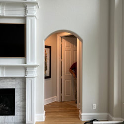
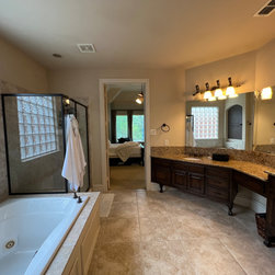
1. The entry to the primary suite was at an odd angle, for seemingly no reason. It created a difficult layout for vanities and cabinetry and left the primary suite more exposed to guests in the family room.
2. The plumbing would have to be rerouted through the solid concrete foundation – a difficult, labor-intensive task, but not impossible for us.
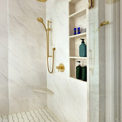
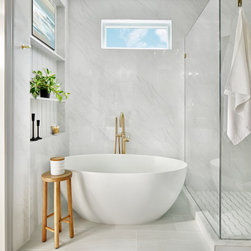
3. Enlarging the shower was non-negotiable; but with no room to expand the footprint where the shower and tub would be located, we had to get creative.
4. Because of reframing work that had to be done on the exterior wall, we had to patch new bricks into the existing pattern. However, the unique color and texture of the original bricks seemed to be impossible to match.
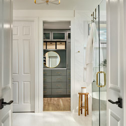
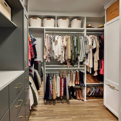
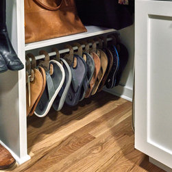
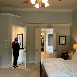
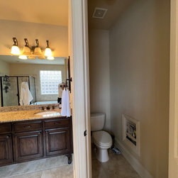
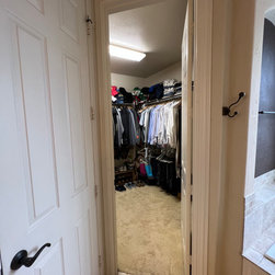
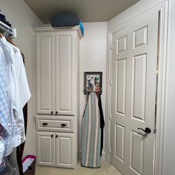
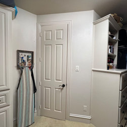
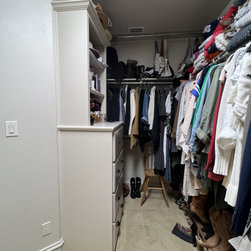
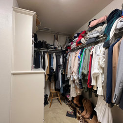
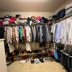
5. We needed to add storage solutions to critical areas in order to overcome the tiny space of the closet.
Solutions:
1. We were unafraid to blow out walls and move plumbing to make the design come to life. We reframed the primary bedroom entry to create a straight wall in the bathroom with the added benefit of a more private entrance to the primary suite.
2. Though it required extensive work, we relocated the plumbing through the concrete foundation to create the ideal layout.
3. Initially, we though to create an open wet area, but the homeowners preferred a closed-in shower. We used glass for the shower walls to keep the open feel and chose a smaller, rounded oval tub that perfectly fit next to the shower without appearing disproportional or out of scale with its surroundings.
4. Though it was difficult, we hunted down the perfect bricks and teamed up with our most trusted brick mason to create a seamless transition between the original brick and the patchwork.
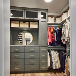
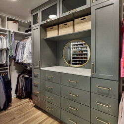
5. We realigned the access into the water closet, eliminating the unnecessary angled entry walls to properly align the space and creating better entries for both the water closet and the homeowners’ closet. We also added a functional storage unit and reconfigured the overall layout of the closet to improve the flow and minimize the chaos.
Project Objectives:
Our primary goal for this project was to bring a sense of order and peace to this space, adding much-needed storage and functionality without sacrificing key elements like the bathtub. We planned to substantially increase the size of the tiny shower, add meaningful storage to the vanities that was sorely lacking, improve the layout and functionality of the closet, and straighten out an oddly-angled wall that limited the potential of the space.
Our secondary goal was to improve the overall aesthetics of the space to match the owners’ preferred style. They wanted a luxury spa experience, and it was our job to deliver it. Instead of the original browns and tans with heavy wood accents and extensive tile work, we wanted to lighten up the space to create a more uplifting environment. We brought in brighter tones, like whites and golds, to contrast the unique dark grey wood grain of the cabinetry that helped ground the space without making it too masculine.
Challenges:
1. The entry to the primary suite was at an odd angle, for seemingly no reason. It created a difficult layout for vanities and cabinetry and left the primary suite more exposed to guests in the family room.
2. The plumbing would have to be rerouted through the solid concrete foundation – a difficult, labor-intensive task, but not impossible for us.
3. Enlarging the shower was non-negotiable; but with no room to expand the footprint where the shower and tub would be located, we had to get creative.
4. Because of reframing work that had to be done on the exterior wall, we had to patch new bricks into the existing pattern. However, the unique color and texture of the original bricks seemed to be impossible to match.
5. We needed to add storage solutions to critical areas in order to overcome the tiny space of the closet.
Solutions:
1. We were unafraid to blow out walls and move plumbing to make the design come to life. We reframed the primary bedroom entry to create a straight wall in the bathroom with the added benefit of a more private entrance to the primary suite.
2. Though it required extensive work, we relocated the plumbing through the concrete foundation to create the ideal layout.
3. Initially, we though to create an open wet area, but the homeowners preferred a closed-in shower. We used glass for the shower walls to keep the open feel and chose a smaller, rounded oval tub that perfectly fit next to the shower without appearing disproportional or out of scale with its surroundings.
4. Though it was difficult, we hunted down the perfect bricks and teamed up with our most trusted brick mason to create a seamless transition between the original brick and the patchwork.
5. We realigned the access into the water closet, eliminating the unnecessary angled entry walls to properly align the space and creating better entries for both the water closet and the homeowners’ closet. We also added a functional storage unit and reconfigured the overall layout of the closet to improve the flow and minimize the chaos.
Project Year: 2023
Project Cost: $150,001 - $200,000
Country: United States
Zip Code: 75033
Others who worked on this project: Vaughan Creative Media