

Azimut – Biella IT
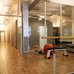
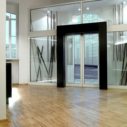
This venue, in which patients receive physical therapy, was ideated to welcome its guests in a friendly and functional manner. Medicine, sports activities and health and beauty are all provided in a single structure centered on rehabilitative services. Located in the heart of Biella and occupying a surface area of 1200 sq. m., Azimut Rehabilitation Center was built in a prime structure of a historic industrial building, an interior design project developed by Delrosso. The regular pattern formed by the beams and pillars of the original building blends with new forms, their functions differentiated by shape and color.
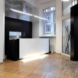
Instigated by the desire to create a specific conduit and to give life to a central, iconic area, the project revolves around a central space 5 meters in height, intended to house bathrooms and small rooms for medical visits. The plan tends to evoke the image of an architectural structure inserted within the older industrial structure in order to build an urban passage that is recognizable and thus familiar and welcoming.
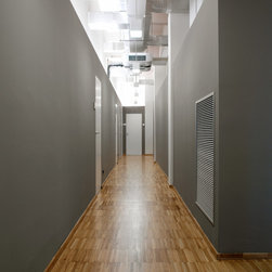
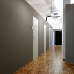
Surrounding the central body, a ring-like path leads visitors to the center’s service areas, such as the gym and changing rooms that access the swimming pool. Vast, open spaces alternate with more reserved and protected areas, inducing a collective and hospitable environment.
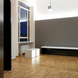
Two colors have been chosen for the building, which has been divided into an upper and lower level, the latter specifically adapted for human needs while the former extends toward the structure’s immense height. Selected for all of the central area and the 2.5 meters in height of the counter wall at the perimeter, gray optically lowers the vertical perception of space, adding a pleasant perspective to the space. Beyond the gray wall and on the upper portions, white adds airiness and luminosity. Lighting was given special emphasis with the intent of reinstating the warmth of natural light while giving a sense of openness. Concealed in the upper segments of the gray counterwall, light sources diffuse a glow that seems to come from the outside, uniting with the lights dispersed throughout, serving both a technical and a functional purpose, as though in an outdoor urban area. Even the chairs, which, like much of the furniture, were tailor made, emphasize the concept of urban space, providing guests an opportunity to wait comfortably.
Total area: 750 sqm
photo credits: Matteo Piazza
---
Uno spazio per il recupero delle attività motorie, pensato per ricevere gli ospiti in ambienti accoglienti e funzionali, dove la necessaria terapia fisica è accolta in una struttura in cui dialogano medicina, attività sportive e benessere. E’ Azimut, il centro di riabilitazione, nel cuore di Biella, costruito in una struttura primaria di uno storico edificio industriale, tema di un progetto di interior. La trama regolare di pilastri e travi dell’edificio originario si combina a nuovi volumi di progetto, le cui funzioni si differenziano per colori e forme. Spinto dalla volontà di creare un percorso e dare corpo ad un’area centrale icona, il progetto prevede un volume centrale, con un’altezza di 5 metri, capace di ospitare servizi e salette per le visite. Quasi ad evocare un volume architettonico a sua volta inserito all’interno dello storico fabbricato industriale, per costruire uno paesaggio urbano facilmente riconducibile all’esperienza e per questo familiare e accogliente.
Intorno al corpo centrale, si apre un percorso ad anello che porta il visitatore a tutti i servizi e gli spazi offerti dal centro, come la palestra o gli spogliatoi di accesso alla piscina. Ampi spazi a vista, che si alternano ad ambienti più protetti e riservati, suggeriscono l’idea di uno spazio collettivo e ospitale.
Due i colori scelti per l’intero spazio, idealmente diviso in una parte inferiore, a dimensione d’uomo, e una superiore, protesa verso l’ampia altezza della struttura. Il grigio, scelto per tutte le superfici del volume centrale e per i 2,5 metri di altezza della contro parete perimetrale, abbassa otticamente la percezione verticale dello spazio aggiungendo gradevolezza al luogo. Oltre la parete grigia, per tutta l’altezza dello spazio, è stato scelto il bianco, in grado di restituire luminosità e aria ai volumi.
Attenzione particolare al progetto d’illuminazione, attento a restituire la calda sensazione della luce naturale e di uno spazio mai rinchiuso. Le sorgenti luminose, nascoste nel perimetro alto della controparete grigia, diffondono una luce che sembra provenire dall’esterno e che si unisce ai punti luce distribuiti lungo il percorso, che come in uno spazio urbano aperto, sono tecniche e funzionali. Anche le sedute, disegnate su misura, così come molti arredi, sottolineano il concetto di spazio urbano e diventano panchine pensate per gli ospiti in attesa.
superficie: 750 mq
photo credits: Matteo Piazza
Instigated by the desire to create a specific conduit and to give life to a central, iconic area, the project revolves around a central space 5 meters in height, intended to house bathrooms and small rooms for medical visits. The plan tends to evoke the image of an architectural structure inserted within the older industrial structure in order to build an urban passage that is recognizable and thus familiar and welcoming.
Surrounding the central body, a ring-like path leads visitors to the center’s service areas, such as the gym and changing rooms that access the swimming pool. Vast, open spaces alternate with more reserved and protected areas, inducing a collective and hospitable environment.
Two colors have been chosen for the building, which has been divided into an upper and lower level, the latter specifically adapted for human needs while the former extends toward the structure’s immense height. Selected for all of the central area and the 2.5 meters in height of the counter wall at the perimeter, gray optically lowers the vertical perception of space, adding a pleasant perspective to the space. Beyond the gray wall and on the upper portions, white adds airiness and luminosity. Lighting was given special emphasis with the intent of reinstating the warmth of natural light while giving a sense of openness. Concealed in the upper segments of the gray counterwall, light sources diffuse a glow that seems to come from the outside, uniting with the lights dispersed throughout, serving both a technical and a functional purpose, as though in an outdoor urban area. Even the chairs, which, like much of the furniture, were tailor made, emphasize the concept of urban space, providing guests an opportunity to wait comfortably.
Total area: 750 sqm
photo credits: Matteo Piazza
---
Uno spazio per il recupero delle attività motorie, pensato per ricevere gli ospiti in ambienti accoglienti e funzionali, dove la necessaria terapia fisica è accolta in una struttura in cui dialogano medicina, attività sportive e benessere. E’ Azimut, il centro di riabilitazione, nel cuore di Biella, costruito in una struttura primaria di uno storico edificio industriale, tema di un progetto di interior. La trama regolare di pilastri e travi dell’edificio originario si combina a nuovi volumi di progetto, le cui funzioni si differenziano per colori e forme. Spinto dalla volontà di creare un percorso e dare corpo ad un’area centrale icona, il progetto prevede un volume centrale, con un’altezza di 5 metri, capace di ospitare servizi e salette per le visite. Quasi ad evocare un volume architettonico a sua volta inserito all’interno dello storico fabbricato industriale, per costruire uno paesaggio urbano facilmente riconducibile all’esperienza e per questo familiare e accogliente.
Intorno al corpo centrale, si apre un percorso ad anello che porta il visitatore a tutti i servizi e gli spazi offerti dal centro, come la palestra o gli spogliatoi di accesso alla piscina. Ampi spazi a vista, che si alternano ad ambienti più protetti e riservati, suggeriscono l’idea di uno spazio collettivo e ospitale.
Due i colori scelti per l’intero spazio, idealmente diviso in una parte inferiore, a dimensione d’uomo, e una superiore, protesa verso l’ampia altezza della struttura. Il grigio, scelto per tutte le superfici del volume centrale e per i 2,5 metri di altezza della contro parete perimetrale, abbassa otticamente la percezione verticale dello spazio aggiungendo gradevolezza al luogo. Oltre la parete grigia, per tutta l’altezza dello spazio, è stato scelto il bianco, in grado di restituire luminosità e aria ai volumi.
Attenzione particolare al progetto d’illuminazione, attento a restituire la calda sensazione della luce naturale e di uno spazio mai rinchiuso. Le sorgenti luminose, nascoste nel perimetro alto della controparete grigia, diffondono una luce che sembra provenire dall’esterno e che si unisce ai punti luce distribuiti lungo il percorso, che come in uno spazio urbano aperto, sono tecniche e funzionali. Anche le sedute, disegnate su misura, così come molti arredi, sottolineano il concetto di spazio urbano e diventano panchine pensate per gli ospiti in attesa.
superficie: 750 mq
photo credits: Matteo Piazza