

Studio Rossin- Biella IT
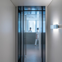
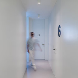
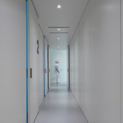
The project has a distribution layout that is built around two orthogonal main axes which distribute the work rooms and administrative areas with a progressive numbering that graphically identifies functions.
The project, although seemingly simple in its linearity and simplicity, is actually highly sophisticated in terms of technological content.
The architectural design, obtained through and sharp colors and lines, gives the space a strong identity aimed to communicate seriousness and professionalism, while maintaining an overall feeling of comfort and hospitality.
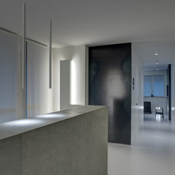
Few compositional elements and furniture: along the sides of the corridor they take the form of compact masses designed for storing various professional equipment.
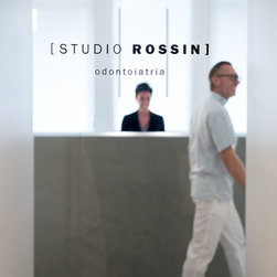
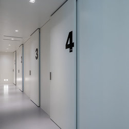
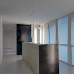
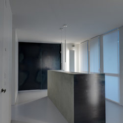
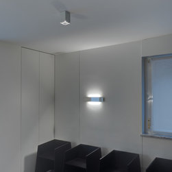
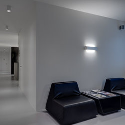
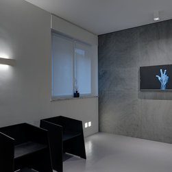
Sharp contrasts in the use of color and materials: white walls are contrasted with the dark gray iron and the warm gray of the stone wall of the waiting room; macro numbers have been applied on the doors flush to the wall in order to indicate in a clear way the function of each room; artistic black and white images of hands flowing on the monitor on the stone wall to indicate how the human approach is still and always a priority of main importance.
Sup. 200mq
Graphic design: Paola Romano
---
Il progetto ha un layout distributivo che si sviluppa attorno a 2 assi ortogonali principali che distribuiscono le sale di lavoro e le aree amministrative seguendo una numerazione progressiva che ne identifica graficamente le funzioni.
Il progetto, pur se apparentemente semplice nella sua linearità ed essenzialità, è in realtà altamente sofisticato in termini di contenuti tecnologici.
Il rigore architettonico, ottenuto attraverso linee e colori netti, conferisce allo spazio un’identità forte finalizzata a comunicare serietà e professionalità, pur mantenendo una complessiva sensazione di benessere e accoglienza.
Pochi gli elementi compositivi e di arredo: lungo le parti del corridoio essi assumono l’aspetto di masse compatte pensate per riporre le varie attrezzature professionali.
Contrasti netti nell’uso del colore e dei materiali: il bianco delle pareti viene contrapposto al grigio scuro del ferro e al grigio caldo della parete in pietra della sala di attesa; macro numeri sono stati applicati sulle porte raso muro a indicare in modo chiaro e pulito la destinazione delle singole stanze; immagini artistiche di mani scorrono in bianco e nero sul monitor della parete in pietra a indicare come l’approccio umano rimane comunque e sempre prioritario e di fondamentale rilevanza.
Sup. 200mq
Progetto grafico: Paola Romano
The project, although seemingly simple in its linearity and simplicity, is actually highly sophisticated in terms of technological content.
The architectural design, obtained through and sharp colors and lines, gives the space a strong identity aimed to communicate seriousness and professionalism, while maintaining an overall feeling of comfort and hospitality.
Few compositional elements and furniture: along the sides of the corridor they take the form of compact masses designed for storing various professional equipment.
Sharp contrasts in the use of color and materials: white walls are contrasted with the dark gray iron and the warm gray of the stone wall of the waiting room; macro numbers have been applied on the doors flush to the wall in order to indicate in a clear way the function of each room; artistic black and white images of hands flowing on the monitor on the stone wall to indicate how the human approach is still and always a priority of main importance.
Sup. 200mq
Graphic design: Paola Romano
---
Il progetto ha un layout distributivo che si sviluppa attorno a 2 assi ortogonali principali che distribuiscono le sale di lavoro e le aree amministrative seguendo una numerazione progressiva che ne identifica graficamente le funzioni.
Il progetto, pur se apparentemente semplice nella sua linearità ed essenzialità, è in realtà altamente sofisticato in termini di contenuti tecnologici.
Il rigore architettonico, ottenuto attraverso linee e colori netti, conferisce allo spazio un’identità forte finalizzata a comunicare serietà e professionalità, pur mantenendo una complessiva sensazione di benessere e accoglienza.
Pochi gli elementi compositivi e di arredo: lungo le parti del corridoio essi assumono l’aspetto di masse compatte pensate per riporre le varie attrezzature professionali.
Contrasti netti nell’uso del colore e dei materiali: il bianco delle pareti viene contrapposto al grigio scuro del ferro e al grigio caldo della parete in pietra della sala di attesa; macro numeri sono stati applicati sulle porte raso muro a indicare in modo chiaro e pulito la destinazione delle singole stanze; immagini artistiche di mani scorrono in bianco e nero sul monitor della parete in pietra a indicare come l’approccio umano rimane comunque e sempre prioritario e di fondamentale rilevanza.
Sup. 200mq
Progetto grafico: Paola Romano