

Search results for "U shaped house" in Home Design Ideas
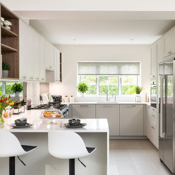
Trendy gray floor kitchen photo in London with an undermount sink, shaker cabinets, gray cabinets, stainless steel appliances, a peninsula and white countertops
U shaped kitchen design
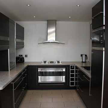
Open concept kitchen - mid-sized modern u-shaped open concept kitchen idea in London with black cabinets
Open concept kitchen - mid-sized modern u-shaped open concept kitchen idea in London with black cabinets
Find the right local pro for your project
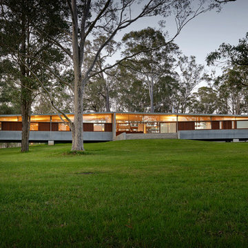
Architect: Fergus Scott Architects
Builder: ST & SG Booker
Photography: MIchael Nicholson Photography.
An extraordinary challenge confronted Fergus Scott when asked to design a house in an area marked for possible mine subsidence. A vast majority of land in the lower Hunter Valley region has been pronounced as an area in which mine subsidence may occur. To meet this obstruction, Fergus Scott designed a subtle, yet effectively engineered bird shaped house. His design consisted of a linear building pivoted from a fixed point at the centre of the house, the area used as an open planned kitchen and dining area. Remarkably this was the only section of the house with its structure securely fastened to the ground.
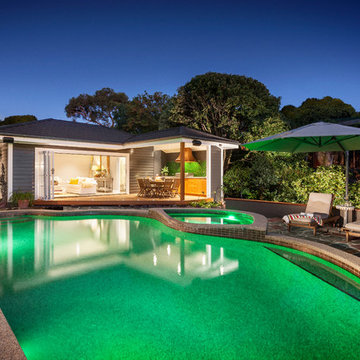
Mid-sized beach style backyard stone and custom-shaped pool house photo in Melbourne
In brief
Location, location, location
When looking for your perfect home where you can put down your grass roots and start a family there are many ‘must haves’ that we all have on our wish lists. The obvious contenders are price and location with many other niceties, like the number of bedrooms, layout and decor taking a back seat. As we all know, location can sell a home to those who strive to be in the right area, for transport links, local amenities and the all-important school catchment areas.
Like many other families throughout the UK our clients chose their house for its excellent location. Just ten minutes from the centre of Stafford by car, our client’s house is in a popular and sought-after suburb of the town for couples and families alike. They have always loved the location of their house for its easy access to work, schools, leisure facilities and social connections, but they were becoming increasingly frustrated with the layout of the ground floor of their home.
It’s inevitable that families will evolve and our needs from our properties will change too. Since the young family of four moved to their large four-bedroom detached house a few years ago, their property has been unable to meet their lifestyle needs and living patterns.
Although their property has adequate bedroom space for them and their two children, the layout of the downstairs living area was not functional and it obstructed their everyday life, making entertaining and family gatherings difficult.
Our First Meeting
Upon our initial consultation with our clients it was clear from the outset why they sought to make changes to the layout of their house. The property had been extended to create extra space by the previous owners, but unfortunately the design and build hadn’t been executed well at all. The rooms and layout were awkward in size and shape and it didn’t allow the family to come together and enjoy their home. They had the floor space, but it was sectioned off into separate rooms, some without a purpose.
The garden surrounds the house on all three sides and is of a good size in its entirety with different areas on each aspect. We could clearly see that the house itself didn’t address any particular aspect of the garden in any way.
Moving to a new house wasn’t an option, the family were happy with the location and size of the property. What they wanted was a modern, functional, stylish space for everyday family life, with the flexibility to accommodate their large extended family when needed and to ultimately add value to their property.
We were appointed by our clients to create a design solution to redesign the ground floor living area with a modern, light filled, open plan space that connects with the garden. It was clear from outset that our design intention was to break down the room barriers and to respond to the needs of the family, supporting their lifestyle now and for the future, bringing them together and creating a house they could call a home.
Delivering a project on time and within our client’s budget are always a top priority for our team. The family decided to stay in their house during construction, therefore it was even more essential to minimise the level of disruption to their daily lifestyle with a young family living on site.
The family needed help from our team at Croft Architecture to swiftly and successfully acquire Building Control Approval for their project to progress rapidly, ensuring project completion on time and to their determined budget.
Our Approach
Surveying the site
The client’s home is located on the entrance to a quiet cul-de-sac on a mature, leafy, suburban housing estate. Their home nestles into its well-established site, with ample space between the neighbouring properties and has considerable garden space to the rear and both sides.
During our initial visit we spent a long time with the family observing the existing layout, talking about how they currently live in the property, their annoyances with the house in its current form, how they would like to be able to live in their family home and how they aspired it to feel, look and live.
We walked through the house and it was clear that the existing layout didn’t work downstairs. The house had been extended onto before they had bought the property and the space hadn’t been well thought through in terms of how it would be used effectively.
The rooms directly to the left off the hallway, didn’t really have a proper function. The previously extended space had resulted in the house with too many rooms and subsequently this had led to a series of impractical spaces.
The long and narrow extension was home to a small U-shaped kitchen at the front of the house, which led onto the dining area and then onto a small room at the back of the extension. For the size of the house the kitchen and dining room in a much smaller and narrower area, leaving larger living areas to the rear of property with copious amounts of dead space. The small kitchen was tucked away at the front of the property which made life difficult for our clients to observe their children playing safely in the garden whilst preparing food and carrying out work in the kitchen. On the opposite side of the property there was another old extension which had a step down into it. This living area had a tiled floor and large glazed windows on all sides which made it feel almost like a conservatory.This area was rarely used by the family as it had no real function, plus it was hot in the summer and cold in the winter. It had become an under utilised space.
We walked around the property and it was clear that the house itself didn’t address their private garden space to any particular aspect in any way, meaning that the garden space was under used because of the poor connections.
The family wanted a combined kitchen, dining, lounge space for daily life and also for entertaining their family.
Design Approach
The size of the property presented the opportunity to substantially reconfigure the family home to create a series of dynamic living spaces oriented towards the large, south-facing garden.
Our team suggested removing the little kitchen from the front of the property and re positioning it within the unused glazed space at the back of the house.
The glazed room had internal French doors with a step down into the space separating it from the lounge. We proposed to remove the French doors, level the floor and make it into one room with the existing lounge.
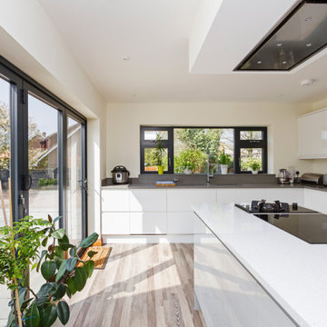
To connect the new open plan kitchen and living space to the rear and side garden sliding and folding doors were the solution, extending the family’s usable living space by creating a seamless indoor-outdoor flow. There was already a patio area there and it made sense for the kitchen to move to the rear of the house to be close to the patio for easy outside dining.
It was therefore logical to retain the existing living space in it's current location next to the new kitchen, maintaining the natural flow of the house for the family after eating and entertaining in the kitchen.
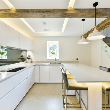
When making decisions regarding the kitchen design, we worked closely with the family. They thoroughly enjoy spending time cooking and entertaining with their large extended family. To assist with their culinary preparations our clients had aspired to have an induction hob within their new kitchen. As they were working through the design with us, they weren’t sure about an induction hob because of different cooking methods required for certain meals that they like to produce. They particularly like making chapatis which require a round pan and a gas hob. We didn’t see this as a problem and suggested having a single gas burner for purely this purpose whilst still installing an induction hob. They decided to go ahead with our idea, choosing a single gas burner and an induction hob, and it looks great!
The existing lounge space had a corner aspect at the rear property that protruded into the garden. Positioned next to the kitchen and dining space it seemed logical to us for the living area to also open out onto the patio, thus connecting the garden to the house on a wider aspect. To enhance the connection between the garden and the living room we thought that a corner door would work extremely well to really open up this space. The clients really liked the design concept to create a feature of the corner with glazed sliding doors that would completely open the house up to the garden. They were excited about the prospect of the allowing huge amounts of natural light into their home and the flexible access it would provide to the garden.
Once the new kitchen, dining and living space had been concluded, we then had to consider what the previous kitchen and dining area was going to be used for within the small, long side extension. We talked with our clients about a few possible uses. We noticed that the family have a piano and few other musical instruments. It made sense for this space to become a quiet part of the house for them to escape to, play music, read and generally relax in a snug area.
To shorten the length of the new music room and make an additional feature in the newly created open plan kitchen, dining and living area, we reclaimed some of the space from the back of the side extension and opened it up to the main open-plan space, thus creating another new snug. We added an additional design feature within the snug by creating a timber window seat. Not only does it provide extra seating, but it’s also created a snug within a snug, a haven for reading, napping and gazing out into the garden.
As part of their brief our clients also wanted a to incorporate a log burner into their newly remodelled home. To connect the new music room and snug to the living space we proposed to position a two-way log burner where the existing gas fire was located. By retaining a fire in the original location it would minimise the disruption and work required to install the wood burner. However, the theory didn’t turn into reality and the new fire resulted in being quite a task to get it to work. When the contractor began to strip back the existing fireplace, they discovered that fitting the pipe within the building was going to be more challenging than they anticipated because of the poorly constructed extension. It was difficult to execute but it was ultimately achieved.
What lies beneath?
It’s not until you uncover the fabric of the building that you fully understand what’s going on underneath. When the contractor exposed the structure of the house, we found out that the property had been poorly constructed, and they uncovered a lot of poor workmanship from the original builders. As the build progressed the inner skin of the extended structure was exposed, we found that it wasn’t actually strong enough and we needed to make it safe in order to proceed. Going forwards we ensured that the structure was safe, and all issues were identified and immediately rectified.
The previous extensions to the house also presented further challenges as the build progressed. We found that the floors between rooms were not level. We wanted to create the appearance of one space rather than lots of chopped up areas. To do so we needed to alter the floor and ceilings to ensure that they were flush right through the new open plan living space. Also, after removing the internal French doors, the down-stand beam where the doors had previously been were subsequently left prominent down from the ceiling. The design required careful planning and attention to detail to achieve the best looking finished results for the client.
For us, in principle our clients’ scheme at the outset was quite a simple project but when the strip out commenced there was actually a more going on underneath that needed attention before the project could start to take shape. A lot of things needed to be considered to make it work structurally and properly for the family.
When the carpet was initially lifted, we found a parquet floor underneath. The family and our team were extremely excited at the prospect of having a traditional parquet floor that could be sanded down and made good. However, when ‘all’ of the carpet was removed only half of the living room had been covered in parquet flooring and the other half was actually a solid concrete floor. Unfortunately, we couldn’t proceed with the flooring and our clients chose another floor finish.
Making connections
Our team at Croft Architecture have created a new, sleek, spacious family ‘hub’ that’s light with clean lines. The open plan space unites the family of four whilst providing the ability to gather the wider family and seamlessly connecting their home with the garden through the new full length sliding doors. Although they now have plenty of space to gather with the family, they also have areas of seclusion to spread out and escape to when needed.
A strong working relationship between our team, the client and Building Control enabled us to gain the necessary permissions promptly. We enjoyed working with the project team and we’re extremely pleased to successfully deliver the completed project. Although it wasn't in accordance with our client’s timescales with the discovery of hidden structural challenges, we spent the time carefully resolving the issues to unsure that our clients home was not only safe, but also looks great and functions perfectly.
Eat-in kitchen - mid-sized contemporary l-shaped eat-in kitchen idea in London with an undermount sink, flat-panel cabinets, white cabinets, metallic backsplash, mirror backsplash and a peninsula
Reload the page to not see this specific ad anymore

This Mid Century inspired kitchen was manufactured for a couple who definitely didn't want a traditional 'new' fitted kitchen as part of their extension to a 1930's house in a desirable Manchester suburb.
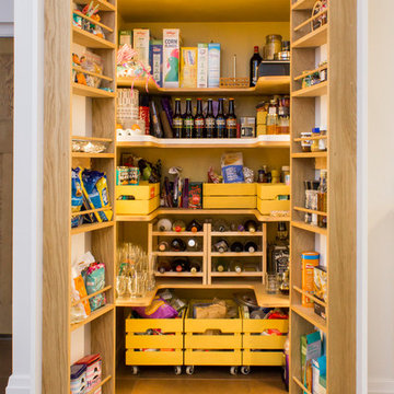
The walk in pantry was fitted into a bricked up recess previously occupied by a range. U-shaped shelves and larder racks mean there is plenty of storage for food meaning none needs to be stored in the kitchen cabinets. Strip LED lighting illuminates the interior.
Photo: Ian Hampson
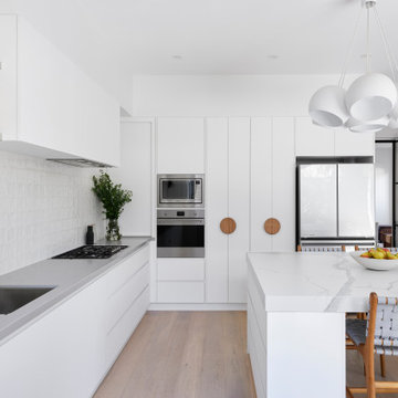
This lovely Malvern home saw a total transformation of all wet areas, including the main bathroom, ensuite, kitchen, and laundry.
A professional couple with two young children, our clients tasked us with turning their newly bought Malvern property into their dream home. The property was in great condition, but the interiors were outdated and lacked the functionality to support a young family’s busy lifestyle.
Because this was their forever home, we designed the spaces collaboratively with our clients focusing on nailing their aesthetic brief while providing them with a high level of functionality to suit their present and future needs.
Our brief:
The design needed to be child-friendly but with a sophisticated aesthetic
All materials needed to be durable and have longevity
A fresh, modern look with textures was a must
The clients love cooking, so a kitchen that was functional as well as beautiful was paramount.
The kitchen really is the central hub of this busy home, so we wanted to create a modern, bright, and welcoming space where all the family could gather and share quality time.
The first thing to go was the outdated, curved floor-to-ceiling window, which didn’t align with our client’s vision for their dream home. We replaced it with large modern bi-fold stacking doors that let natural light seep in.
We also removed an impractical external double door and replaced it with a tightly waterproofed servery bi-fold window, which our clients loved.
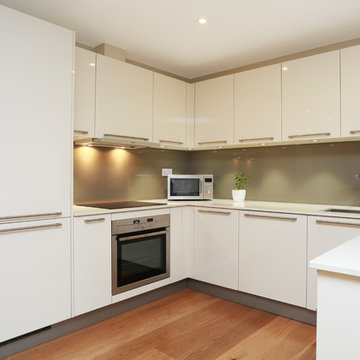
The existing U-shaped kitchen was impractical with only one access, which created accessibility issues. Our solution was to completely redesign the kitchen to create an L-shaped layout with a large central island and two accesses for even flow.
The table-like island was a priority in our client’s wish list because they wanted a spot where they could sit together and share meals and where the children could do homework after school. They loved the idea of sitting facing each other instead of in a line like you do in standard islands. That’s why we installed a custom-made powder-coated steel leg on the island, which looks beautiful and allows the family to sit on either side of it.
To update the room’s aesthetics, we selected high-quality and durable materials for a fresh and modern look. The sleek white cabinetry features a super matt melamine finish with anti-fingerprint technology, which is low-maintenance, easy to clean and great for when there are kids in the house.
To maximise every inch for functionality, we included smart storage solutions throughout the cabinetry, as well as a spacious pantry that can be tucked away when not in use.
To create visual intrigue and add a textured layer to the space, we juxtaposed the smooth surfaces of the cabinetry and porcelain benchtop with a textured, hand-made look tiled splashback. The splashback is easy to maintain thanks to its epoxy grout, which is waterproof and repels dirt and grime. We also included lovely natural timber handles to add an organic touch to the design.
We wanted the room to feel bright and happy, so LED downlights were evenly distributed throughout, complete with dimmers for when mood lighting was needed. We also used LED strip lighting under all overhead cabinetry and an automatic light in the pantry.
The finishing touch was the lovely hub pendant above the island, which certainly takes the room’s aesthetics to the next level.
To continue with the same modern tactile look in the laundry, we used a handmade square tile paired with led lighting to showcase the texture in the tile.
Because the space also needed to be easy to maintain (and child friendly), we used super matt melamine with anti-fingerprint technology for the cabinetry with porcelain benchtops for ultimate durability. We used large-format tiles, which are easy to maintain and create the illusion of space, perfect for this small room.
Lack of storage was solved with large floor to ceiling cupboards, which allowed us to use every inch of the room. To add a warm touch to this bright and airy space, we used circular timber handles.
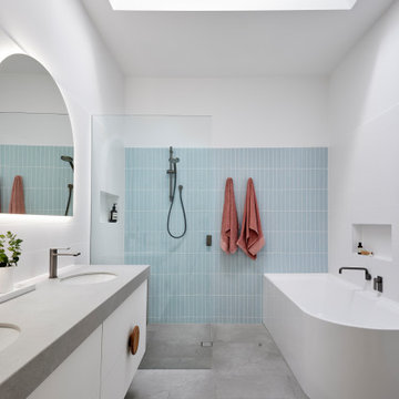
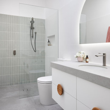
For the family bathroom and the ensuite, we continued the child-friendly theme by utilising large-format tiles pair with anti-fingerprint finishes for the cabinetry.
In line with the modern aesthetic of the kitchen and laundry, we wanted to create a sophisticated space that felt unique to the home. Because we also wanted the bathrooms to feel calm and serene, we introduced curves in the design for a softer look and feel.
The circular shape theme proposed by the custom mirrors continues in the basin, large free-standing bath and natural timber handles.
The client loved the idea of using gunmetal finishes instead of the traditional chrome finish, so we selected gunmetal tapware which looks amazing paired with the custom arch mirrors.
The led lighting around the mirrors provides function and form, being a decorative feature that creates mood lighting and additional task lighting. LED downlights were also evenly distributed throughout the spaces- all with dimmers for versatility.
Drawers were the preferred method of storage, and they include concealed power points for practicality which was a critical point of our brief.
This lovely Malvern home saw a total transformation of all wet areas, including the main bathroom, ensuite, kitchen, and laundry.
A professional couple with two young children, our clients tasked us with turning their newly bought Malvern property into their dream home. The property was in great condition, but the interiors were outdated and lacked the functionality to support a young family’s busy lifestyle.
Because this was their forever home, we designed the spaces collaboratively with our clients focusing on nailing their aesthetic brief while providing them with a high level of functionality to suit their present and future needs.
Our brief:
The design needed to be child-friendly but with a sophisticated aesthetic
All materials needed to be durable and have longevity
A fresh, modern look with textures was a must
The clients love cooking, so a kitchen that was functional as well as beautiful was paramount.
The kitchen really is the central hub of this busy home, so we wanted to create a modern, bright, and welcoming space where all the family could gather and share quality time.
The first thing to go was the outdated, curved floor-to-ceiling window, which didn’t align with our client’s vision for their dream home. We replaced it with large modern bi-fold stacking doors that let natural light seep in.
We also removed an impractical external double door and replaced it with a tightly waterproofed servery bi-fold window, which our clients loved.
The existing U-shaped kitchen was impractical with only one access, which created accessibility issues. Our solution was to completely redesign the kitchen to create an L-shaped layout with a large central island and two accesses for even flow.
The table-like island was a priority in our client’s wish list because they wanted a spot where they could sit together and share meals and where the children could do homework after school. They loved the idea of sitting facing each other instead of in a line like you do in standard islands. That’s why we installed a custom-made powder-coated steel leg on the island, which looks beautiful and allows the family to sit on either side of it.
To update the room’s aesthetics, we selected high-quality and durable materials for a fresh and modern look. The sleek white cabinetry features a super matt melamine finish with anti-fingerprint technology, which is low-maintenance, easy to clean and great for when there are kids in the house.
To maximise every inch for functionality, we included smart storage solutions throughout the cabinetry, as well as a spacious pantry that can be tucked away when not in use.
To create visual intrigue and add a textured layer to the space, we juxtaposed the smooth surfaces of the cabinetry and porcelain benchtop with a textured, hand-made look tiled splashback. The splashback is easy to maintain thanks to its epoxy grout, which is waterproof and repels dirt and grime. We also included lovely natural timber handles to add an organic touch to the design.
We wanted the room to feel bright and happy, so LED downlights were evenly distributed throughout, complete with dimmers for when mood lighting was needed. We also used LED strip lighting under all overhead cabinetry and an automatic light in the pantry.
The finishing touch was the lovely hub pendant above the island, which certainly takes the room’s aesthetics to the next level.
To continue with the same modern tactile look in the laundry, we used a handmade square tile paired with led lighting to showcase the texture in the tile.
Because the space also needed to be easy to maintain (and child friendly), we used super matt melamine with anti-fingerprint technology for the cabinetry with porcelain benchtops for ultimate durability. We used large-format tiles, which are easy to maintain and create the illusion of space, perfect for this small room.
Lack of storage was solved with large floor to ceiling cupboards, which allowed us to use every inch of the room. To add a warm touch to this bright and airy space, we used circular timber handles.
For the family bathroom and the ensuite, we continued the child-friendly theme by utilising large-format tiles pair with anti-fingerprint finishes for the cabinetry.
In line with the modern aesthetic of the kitchen and laundry, we wanted to create a sophisticated space that felt unique to the home. Because we also wanted the bathrooms to feel calm and serene, we introduced curves in the design for a softer look and feel.
The circular shape theme proposed by the custom mirrors continues in the basin, large free-standing bath and natural timber handles.
The client loved the idea of using gunmetal finishes instead of the traditional chrome finish, so we selected gunmetal tapware which looks amazing paired with the custom arch mirrors.
The led lighting around the mirrors provides function and form, being a decorative feature that creates mood lighting and additional task lighting. LED downlights were also evenly distributed throughout the spaces- all with dimmers for versatility.
Drawers were the preferred method of storage, and they include concealed power points for practicality which was a critical point of our brief.
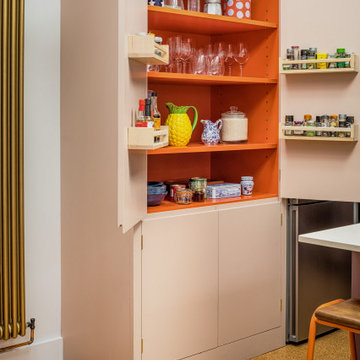
A kitchen to show the clients love of colour in three show-stopping shades; Paint and Papers 'Plumb brandy' and 'temple', plus Farrow And Ball's 'Charlotte's Locks'.
Painted flat panel with handle-less design and open shelving.
Reload the page to not see this specific ad anymore
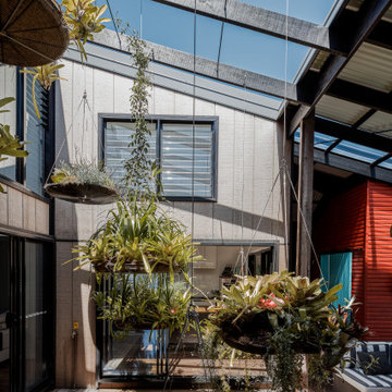
Diesel's House started with a very simple brief for a "U-shaped" house to provide privacy from neighbouring houses, bring the outdoors in, and have the informality, quirkiness and fun of a 1960's beach house. By wrapping the house around a courtyard on three sides and having a covered deck to the north, all rooms open onto a private outdoor green space. Views expand across the courtyard to the back yard and sky making spaces feel very generous. The house captures sea breezes in Summer and the sun in Winter; the occupants are comfortably connected to the time of day, the seasons and their environment. Passive solar design, natural ventilation supplemented by ceiling fans, solar energy and rainwater capture, and reuse of building materials all act to reduce environmental footprint. Diesel's house demonstrates that a suburban house in a subtropical climate does not have to be "heavy" on the environment.
A kitchen to show the clients love of colour in three show-stopping shades; Paint and Papers 'Plumb brandy' and 'temple', plus Farrow And Ball's 'Charlotte's Locks'.
Painted flat panel with handle-less design and open shelving.
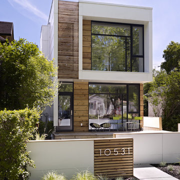
LG House (Edmonton
Design :: thirdstone inc. [^]
Photography :: Merle Prosofsky
Inspiration for a modern wood exterior home remodel in Edmonton
Inspiration for a modern wood exterior home remodel in Edmonton
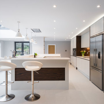
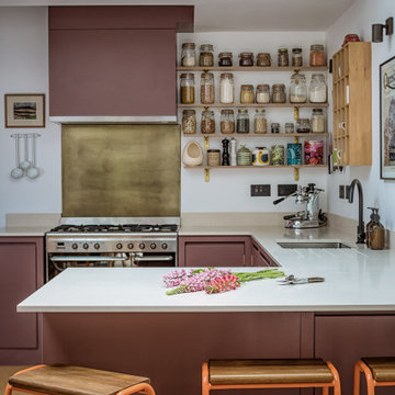
The appliances in this large, bright kitchen are built-in and seamlessly integrated into the furniture and cabinets from Stoneham Kitchens Fusion Pro range to provide a flush finish. This clean, smooth tlye is perfectly complimented by the U-saped central breakfast bar, finished dramatically with shark-nosed edges. The space is lit by a combination of LED lights in the food preparation area, pedant lighting over the bar stool seating and a skylight in the main diving area.
Showing Results for "U Shaped House"
Reload the page to not see this specific ad anymore
Gloss cream U-shaped kitchen with peninsula
Open concept kitchen - mid-sized modern u-shaped open concept kitchen idea in London with green backsplash, glass sheet backsplash, stainless steel appliances, a peninsula and flat-panel cabinets
Open concept kitchen - mid-sized modern u-shaped open concept kitchen idea in London with green backsplash, glass sheet backsplash, stainless steel appliances, a peninsula and flat-panel cabinets
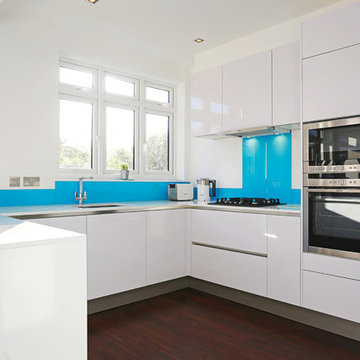
Polar white gloss lacquer U shaped kitchen with blue splashback
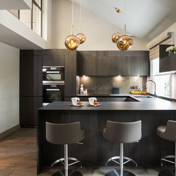
Open concept kitchen - large contemporary u-shaped open concept kitchen idea in London with glass-front cabinets, white cabinets, stainless steel appliances and a peninsula
Open concept kitchen - large contemporary u-shaped open concept kitchen idea in London with glass-front cabinets, white cabinets, stainless steel appliances and a peninsula
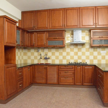
Example of a trendy u-shaped dark wood floor and brown floor kitchen design in London with an undermount sink, flat-panel cabinets, dark wood cabinets, gray backsplash, black appliances, a peninsula and black countertops
8