


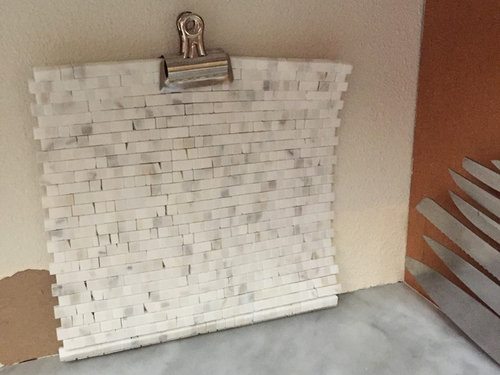
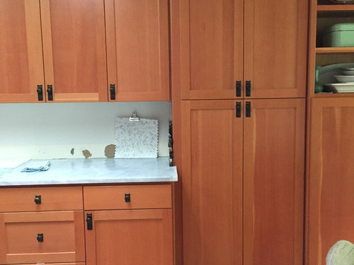
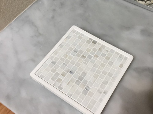
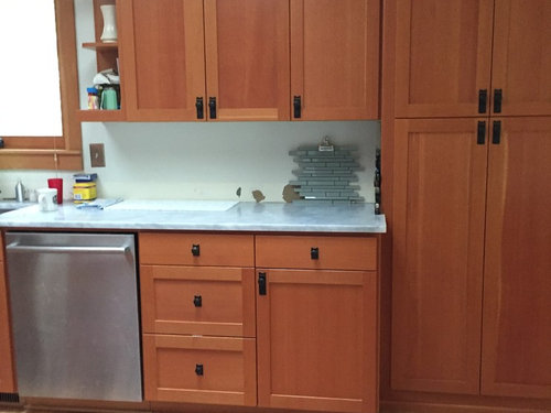
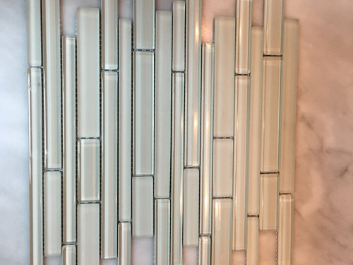
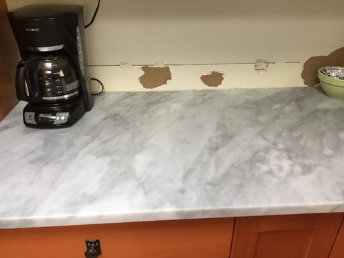
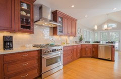
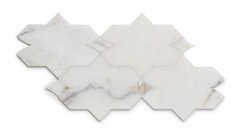
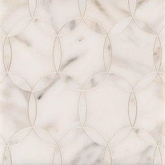
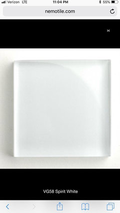
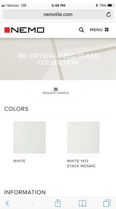
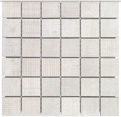
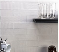
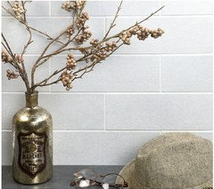
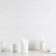
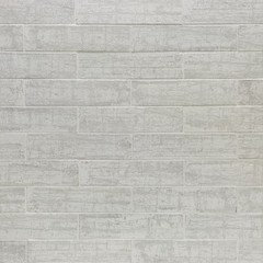
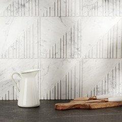
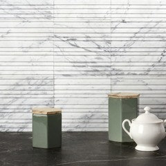
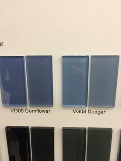
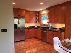
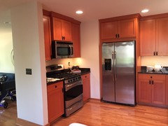
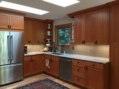
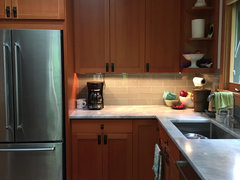
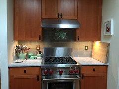
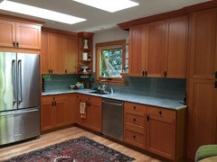
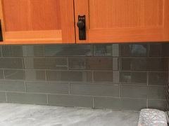
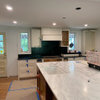
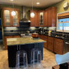
I've narrowed it down to two backsplash options (I think)
4 years ago

Featured Answer
Sort by:Oldest
Comments (28)
Related Professionals
Corcoran Kitchen & Bathroom Designers · Pleasant Grove Kitchen & Bathroom Designers · San Jacinto Kitchen & Bathroom Designers · Biloxi Kitchen & Bathroom Remodelers · Elk Grove Village Kitchen & Bathroom Remodelers · Glen Allen Kitchen & Bathroom Remodelers · Oceanside Kitchen & Bathroom Remodelers · Pueblo Kitchen & Bathroom Remodelers · Vancouver Kitchen & Bathroom Remodelers · Vashon Kitchen & Bathroom Remodelers · Alafaya Cabinets & Cabinetry · Jeffersontown Cabinets & Cabinetry · Vermillion Cabinets & Cabinetry · University Park Cabinets & Cabinetry · Santa Paula Tile and Stone Contractors 4 years ago
 4 years ago
 4 years ago
 4 years ago
- 4 years ago
- 4 years ago
- 4 years agolast modified: 4 years ago
- 4 years ago
 4 years agolast modified: 4 years ago
- 4 years agolast modified: 4 years ago
 4 years ago
- 4 years ago
- 4 years ago
- 4 years ago


Related Stories
FUN HOUZZEverything I Need to Know About Decorating I Learned from Downton Abbey
Mind your manors with these 10 decorating tips from the PBS series, returning on January 5
Full Story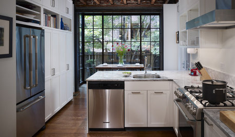
FEEL-GOOD HOME12 Very Useful Things I've Learned From Designers
These simple ideas can make life at home more efficient and enjoyable
Full Story
DECORATING GUIDESThe Dumbest Decorating Decisions I’ve Ever Made
Caution: Do not try these at home
Full Story
LIFEThe Polite House: How Can I Tell a Construction Crew to Pipe Down?
If workers around your home are doing things that bother you, there’s a diplomatic way to approach them
Full Story
LIFE‘I Saw a Glowing Orange Flame Racing Down the Hill to My House’
With more wildfires raging in California, a Sonoma County artist comes to terms with escaping the October fires intact
Full Story
KITCHEN CABINETSWhy I Combined Open Shelves and Cabinets in My Kitchen Remodel
A designer and her builder husband opt for two styles of storage. She offers advice, how-tos and cost info
Full Story
BATHROOM DESIGNWhich Flooring Should I Choose for My Bathroom?
Read this expert advice on 12 popular options to help you decide which bathroom flooring is right for you
Full Story
ENTRYWAYSHelp! What Color Should I Paint My Front Door?
We come to the rescue of three Houzzers, offering color palette options for the front door, trim and siding
Full Story
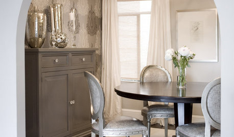
DINING ROOMSDesign Dilemma: I Need Ideas for a Gray Living/Dining Room!
See How to Have Your Gray and Fun Color, Too
Full Story

Steph L.