


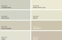
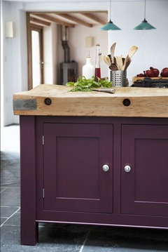
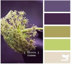
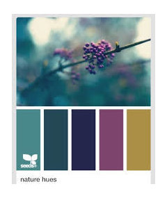
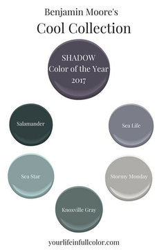
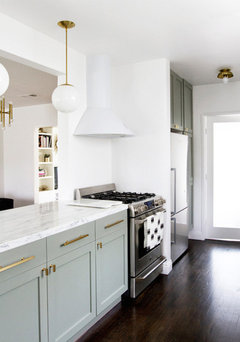
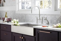
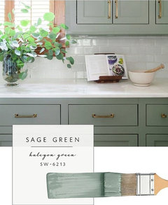
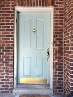
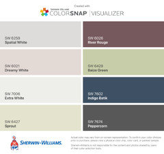
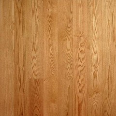
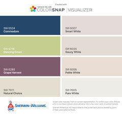
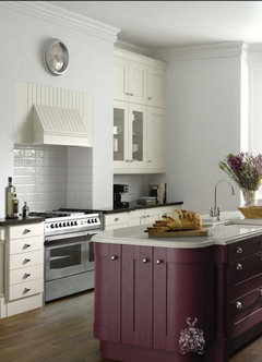
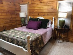
Gray-Green Color For Cabs
5 years ago
Featured Answer
Sort by:Oldest
Comments (60)
Related Professionals
Haines City Painters · Levittown Painters · Owensboro Painters · Watertown Painters · Tinton Falls Cabinets & Cabinetry · White Oak Cabinets & Cabinetry · Dunwoody Flooring Contractors · Shepherdsville Flooring Contractors · Waimalu Home Builders · Bay City General Contractors · Elyria General Contractors · Leon Valley General Contractors · Troy General Contractors · Haslett Kitchen & Bathroom Designers · South Park Township Kitchen & Bathroom Remodelers 5 years ago
 PRO5 years ago
- 5 years ago
 5 years agolast modified: 5 years ago
- 5 years ago
- 5 years ago
- PRO5 years ago
- 5 years ago
- 5 years ago
- 5 years ago
- 5 years ago
 5 years ago
- 5 years ago
 5 years agolast modified: 5 years agoNewEnglandgal thanked raee_gw zone 5b-6a Ohio
 5 years ago
- 5 years ago
- 5 years ago
 5 years ago
- 5 years agolast modified: 5 years ago
- 5 years ago
- 5 years ago
- 5 years ago
 5 years ago
- 5 years ago
- 5 years ago
 5 years ago
- 5 years ago
- 5 years ago
- 5 years agolast modified: 5 years ago


Related Stories
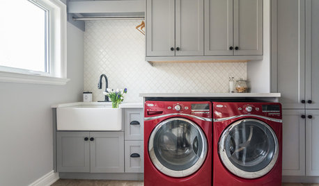
TRENDING NOWBlue, Green and Gray Cabinets Star in the Top New Laundry Rooms
White cabinets are still the most common choice in laundry rooms, but these trending photos tell a more colorful story
Full Story

DECORATING GUIDESColor Guide: How to Work With Charcoal Gray
The most modern neutral, charcoal gray looks great in dining rooms, living rooms and even nurseries. Here's how to use it best
Full Story
MOST POPULARRethinking Beige in a World Gone Gray
Gray, the ‘it’ neutral of recent years, has left beige in the shade. But is it time to revisit this easy-on-the-eyes wall color?
Full Story
GRAYDesigners Share Their Favorite Light Gray Paints
These versatile neutrals can help create a range of moods in any room
Full Story
DECORATING GUIDESColor of the Week: Decorating With Warm Gray
Tired of tan? Getting gloomy from cool gray? Make warm gray your new go-to neutral
Full Story
MOST POPULARWhat’s Your Neutral: Beige or Gray?
A designer shares 10 tips for using the neutral shade that works best for you
Full Story
EXTERIOR COLORExterior Color of the Week: 7 Ways With Warm Gray
See why this hue can be the perfect neutral for any house
Full StoryBEFORE AND AFTERSGray Cabinets Update a Texas Kitchen
Julie Shannon spent 3 years planning her kitchen update, choosing a gray palette and finding the materials for a transitional style
Full Story
DINING ROOMSColor Feast: When to Use Gray in the Dining Room
The right shade of gray pairs nicely with whites and woods to serve up elegance and sophistication
Full Story

User