

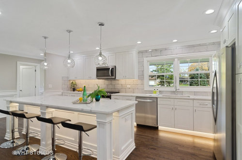
Nicest island that I've seen in a rehabbed/flipped house
3 years ago
Sort by:Oldest
Comments (14)
Related Stories
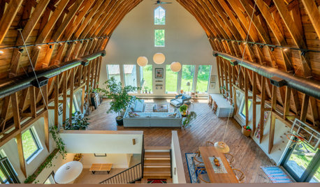
HOUZZ TVYou’ve Never Seen a Barn Conversion Like This Before
A family of four converts an 80-year-old barn into a warm, cozy home with a one-of-a-kind exposed interior roof frame
Full Story
LIFEThe Polite House: How Can I Kindly Get Party Guests to Use Coasters?
Here’s how to handle the age-old entertaining conundrum to protect your furniture — and friendships
Full Story
LIFEOh Yeah, There’s a Snake in the House
A Houzz contributor lives through her worst nightmare and comes out the other side with lessons learned and new footwear
Full Story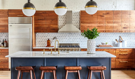
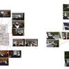
KITCHEN ISLANDSLet’s Go Island Hopping Again
Check out these 92 kitchens with binge-worthy islands in a variety of shapes, materials and styles
Full Story
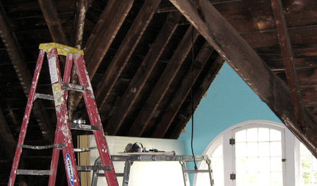
REMODELING GUIDES8 Lessons on Renovating a House from Someone Who's Living It
So you think DIY remodeling is going to be fun? Here is one homeowner's list of what you may be getting yourself into
Full Story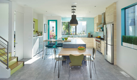
HOUZZ TOURSBold Color and Contemporary Barn House Charm
A designer with a love of bright color updates her 1890s cottage to create a modern-meets-traditional San Francisco home
Full Story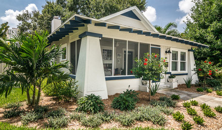
TRANSITIONAL HOMESHouzz Tour: Would-Be House Flipper Falls Hard for a Florida Bungalow
An investment project winds up becoming home for a St. Petersburg, Florida, design enthusiast
Full Story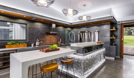
MOST POPULARDouble Take: What’s That Kitchen Island Made Of?
A mix of woven metal wire, acrylic and LED lighting makes this piece a star. See what happens when the owners entertain
Full Story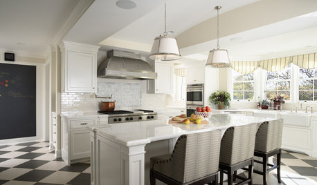
KITCHEN DESIGNHow to Detail a Kitchen Island with Legs
Turned, Square, Recessed or Flat? Find the Right Look for Your Island
Full Story

jennsbabysky
vinmarks
Related Professionals
Beavercreek Kitchen & Bathroom Designers · Wesley Chapel Kitchen & Bathroom Designers · Woodlawn Kitchen & Bathroom Designers · Artondale Kitchen & Bathroom Remodelers · Boca Raton Kitchen & Bathroom Remodelers · Mooresville Kitchen & Bathroom Remodelers · Barstow Interior Designers & Decorators · Bloomingdale Interior Designers & Decorators · Ames General Contractors · De Luz General Contractors · DeKalb General Contractors · Monroe General Contractors · Salmon Creek Kitchen & Bathroom Designers · Princeton Kitchen & Bathroom Remodelers · Elmwood Park Tile and Stone Contractorssushipup1
Sammy
mark1993
jakkom
antiquesilver
mama goose_gw zn6OH
J Inhof
User
jjb 61Original Author
brazensol
Alexia Emerson