

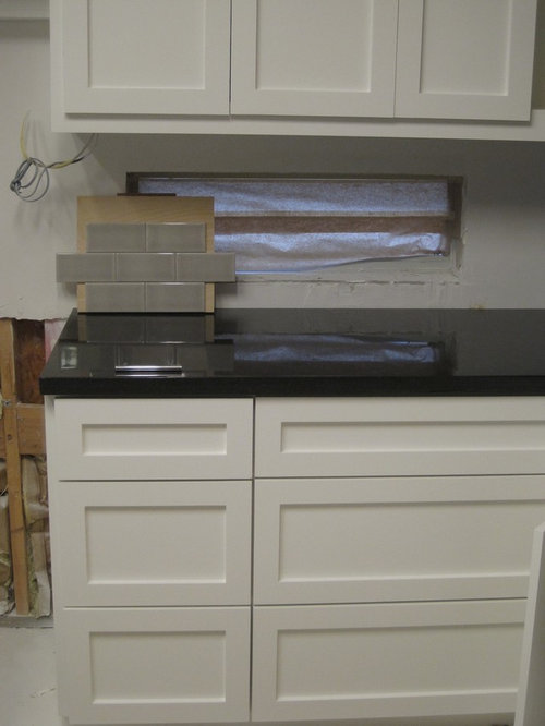
Opinions on backsplash options
10 years ago
Sort by:Oldest
Comments (33)
Related Stories

DECORATING GUIDESNo Neutral Ground? Why the Color Camps Are So Opinionated
Can't we all just get along when it comes to color versus neutrals?
Full Story
WALL TREATMENTSExpert Opinion: What’s Next for the Feature Wall?
Designers look beyond painted accent walls to wallpaper, layered artwork, paneling and more
Full Story
KITCHEN BACKSPLASHESKitchen Confidential: 8 Options for Your Range Backsplash
Find the perfect style and material for your backsplash focal point
Full Story
KITCHEN DESIGNHouzz Quiz: Which Kitchen Backsplash Material Is Right for You?
With so many options available, see if we can help you narrow down the selection
Full Story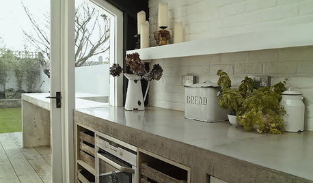
KITCHEN COUNTERTOPSKitchen Counters: Concrete, the Nearly Indestructible Option
Infinitely customizable and with an amazingly long life span, concrete countertops are an excellent option for any kitchen
Full Story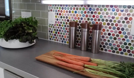
KITCHEN BACKSPLASHES15 Creative Kitchen Backsplashes for the Adventurous
Consider using snow skis, mirrors, bottle caps and other unusual materials for your next kitchen backsplash
Full Story
KITCHEN DESIGNHow to Add a Kitchen Backsplash
Great project: Install glass, tile or another decorative material for a gorgeous and protective backsplash
Full Story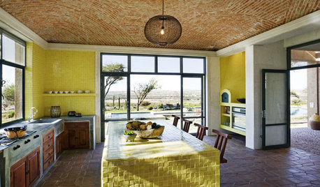
KITCHEN DESIGNKitchen Color: 7 Sensational Yellow Backsplashes
Warm up a white kitchen or add some zing to wood tones with a backsplash that glows
Full Story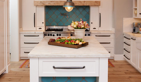
KITCHEN DESIGN10 Gorgeous Backsplash Alternatives to Subway Tile
Artistic installations, back-painted glass and pivoting windows prove there are backsplash possibilities beyond the platform
Full Story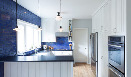
COLORKitchen Color: 15 Beautiful Blue Backsplashes
Blue is the new cool kid on the backsplash block, showing up in shades from pale ice to cobalt
Full Story
julia42Original Author
Evan
Related Professionals
Hammond Kitchen & Bathroom Designers · South Sioux City Kitchen & Bathroom Designers · Holden Kitchen & Bathroom Remodelers · Centerville Kitchen & Bathroom Remodelers · Chester Kitchen & Bathroom Remodelers · Wilson Kitchen & Bathroom Remodelers · Buena Park Cabinets & Cabinetry · Burlington Cabinets & Cabinetry · Cranford Cabinets & Cabinetry · Prospect Heights Cabinets & Cabinetry · Wyckoff Cabinets & Cabinetry · Tabernacle Cabinets & Cabinetry · Corsicana Tile and Stone Contractors · Green Valley Tile and Stone Contractors · Plum Design-Build Firmseam44
crl_
done_again_2
dcward89
julia42Original Author
OOTM_Mom
Vertise
Kitchen_ Reno
crl_
corgimum
julia42Original Author
KBSpider
Vertise
corgimum
ellendi
palimpsest
julia42Original Author
melkel31
corgimum
romy718
deedles
julia42Original Author
sprtphntc7a
michellemarie
julieste
julia42Original Author
a2gemini
michellemarie
Ivan I
nuggly
julia42Original Author