


7 Reasons Your Paint Color Looks Bad
*Lighting
*Wrong Undertones
*Cheap Paint
*Wrong Sheen
*Poorly Painted
*Too Dark
*Too Light
6. Too Dark. As striking as some people may think this black bathroom is, personally, I say it's too dark. There is a time and place for dark paint color but really think this one is out. I'm all for using a dark color in small areas but for those of us who are chlosithicphoibic, this is not a good choice - pretty but perhaps a bit too much.
5. Poorly Painted. So sad. It's bad enough when the wrong colors are chosen and even worse when it's painted poorly. There have been times when a client went with the cheapest paint quote they could find - and paid for it. Nothing kills a beautiful color palette quicker than a shabby painter. Another reason to NOT go with the cheapest quote.
4. Wrong Sheen - Can you see the shiny spot I have circled here? That is what happens when you have an eggshell finish on the wall and you go back to touch-up an area. You'll see it! I highly recommend using a flat matte finish for foyers or rooms that have a lot of light from windows. The light will just reflect right onto those spots and you will see it. Eggshell will also enhance any wall imperfections, nail pops or any other bump or lump that may be on your wall. Benjamin Moore has a washable matte that of course does not have a sheen and is washable. Use it.
3. Cheap Paint - Please use the best paint that you can afford. I certainly don't want you to go broke buying paint for your home but if you are in the market to paint, then get these best. You get what you pay for really works here. Many of the homes where I work in South Charlotte have very large, two story homes. That's a lot of painting to do and you certainly don't want to be painting every four years because you color had faded. Invest in the best. I recommend Benjamin Moore Aura or Regal Select.
2. Wrong Undertone - I believe that using and unifying undertones are the biggest challenge when it comes to choosing a color palette for your home. First you have to decide what works best in your home. If you have a lot of mahogany in your home than maybe a paint scheme with a pink undertone would work well. Have oak? Thank a yellow undertone is best. Slate tile? Try a paint color with a blue or gray undertone. See how this is working?
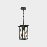
1. Lighting - The color of your shade and the type of bulb you have will really have a huge impact on your color. I always like to suggest an Alabaster glass shade for lighting fixtures. They go with all decors and do not alter your paint color as much as if you were to use an amber shade. It's also an easy fix if you do have the wrong shade, all you have to do is change it. You local box stores have many in stock.
7. Too Light. Doesn't this look delicious? Choosing paint color that is light is certainly NOT a bad thing. Keep in mind that the more natural lighting you have, the more washed out your paint color will be. For instance. If you have an open foyer like the picture in #4 the color that you choose there will be very washed out. As you get further away from a window or move closer inside the home, your color will look darker. This is tricky because what do you do? Choose a color that looks great in full light or in the shadows of your home? These are all 7 really good reasons that your paint color may look bad PLUS like I said earlier, there are at least a dozen more reasons that I can think of. If you need help with choosing color for your home, you can contact me. I'm Donna Frasca, a Color Specialist in the Charlotte area. I'll be glad to help you out.
Q