
Kitchen Design

A Two-Tone Cabinet Scheme Gives Your Kitchen the Best of Both Worlds
Waffling between paint and stain or dark and light? Here’s how to mix and match colors and materials

Sometimes the hardest thing about designing your kitchen isn’t finding a look you like, but rather choosing just one. In that case, consider a two-tone cabinet scheme, with one color or material for the upper cabinets, or other large element, and another color or material for the lower ones. It’s a good way to let your design pull you in two different style directions for a kitchen full of life and personality.
Mixing white cabinetry with wood can create a traditional or transitional effect, as in the previous example, or a sleek and modern one, as seen here. In this kitchen, the touch of wood on the bottom keeps the look from feeling too minimalist, especially when paired with a gorgeous natural stone.
Neutral on Neutral
You may have noticed in the previous kitchen that the white cabinets weren’t all the same shade. Mixing subtly varied neutral shades gives any room depth. Using different whites can achieve the sleekness of an all-white kitchen but with an elegant softness that makes the scheme more approachable.
Pair lowers in a makeup-inspired shade with white uppers, then use a barely there beige for the walls (Benjamin Moore’s Classic Gray is one of my favorite go-tos).
Wood on Glossy
This kitchen reverses the more common wood and lacquer combination, with wood upper cabinets and glossy gray lowers. Notice that the wood on the uppers has a pale tone (even paler than the other woods in the room) and a subtle grain that’s textural rather than a bold organic stripe. This allows the sense of natural warmth to come through while avoiding an in-your-face pattern that might visually shrink the room.
The backsplash is composed of classic white subway tiles that don’t fight for attention, so overall the look is eclectic but not outrageous.
Color on Neutral
Want a bolder hit of color in the kitchen that doesn’t overdo it? Using an accent on just the lower cabinets is a perfect compromise that brings in a fun hue while keeping the overall effect relaxed.
Red is a great kitchen color since it stimulates the appetite and can be picked up in details like knobs or small appliances. Pairing a saturated hue like this with pure gray or white is a safe bet for avoiding clashes if you aren’t confident about your color mixing.
However, there’s no rule that accent colors have to be confined to the lower cabinets. This kitchen pulls off a happy peach right at eye level because the shade is light and not too aggressive, and the remaining cabinets and walls are bright white. The overall effect is definitely captivating, and if you love color, it’s not too much to live with.
Navy on Wood
As I’ve mentioned on Houzz before, navy and blue-green hues are excellent for adding color that’s still neutral enough to effortlessly mix with other shades. The blue cabinets and orangey wood hutch are technically complementary tones (blue and orange are opposite on the color wheel), but since both are near-neutral, the effect feels lively without being wild.
As I’ve mentioned on Houzz before, navy and blue-green hues are excellent for adding color that’s still neutral enough to effortlessly mix with other shades. The blue cabinets and orangey wood hutch are technically complementary tones (blue and orange are opposite on the color wheel), but since both are near-neutral, the effect feels lively without being wild.
By using navy, wood and white (or other simple neutrals like gray or beige), you can create a kitchen scheme with plenty of variety that still hangs together as one statement. Simply look for natural dividing points to start and stop each finish: white uppers, darker lowers and a full wall of wood is an easy formula for mix-matching success.
Wood on Wood
Don’t worry, I didn’t forget about those who prefer unpainted cabinetry. Contrasting wood tones can create stunning traditional or modern effects — or land in the middle, as with this contemporary home. The easiest way to make two woods work is to go for a clear contrast, with one tone much darker than the other, and to stick to woods from the same region (rather than exotic ones with too much character to cooperate). The result blends the richness of a dark espresso stain with the Scandinavian airiness of a humble blond, without a lick of paint in sight.
Don’t worry, I didn’t forget about those who prefer unpainted cabinetry. Contrasting wood tones can create stunning traditional or modern effects — or land in the middle, as with this contemporary home. The easiest way to make two woods work is to go for a clear contrast, with one tone much darker than the other, and to stick to woods from the same region (rather than exotic ones with too much character to cooperate). The result blends the richness of a dark espresso stain with the Scandinavian airiness of a humble blond, without a lick of paint in sight.
Colorful Hutch
Adding an accent hue to a hutch or butler’s pantry is another way to integrate color in the kitchen without going overboard. Notice how this soft blue hutch matches the cabinetry style (with the same beadboard fronts) so that the look is still cohesive.
Read more stories about kitchen cabinets
Adding an accent hue to a hutch or butler’s pantry is another way to integrate color in the kitchen without going overboard. Notice how this soft blue hutch matches the cabinetry style (with the same beadboard fronts) so that the look is still cohesive.
Read more stories about kitchen cabinets


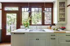
Pairing white and wood cabinet fronts gives your kitchen dynamic appeal: modern white for a sense of freshness and openness, and traditional wood for a sense of welcoming warmth. This scheme often features light white upper cabinets with rich wood lowers, but adding a full pantry wall in wood gives the added aura of an old-world chef’s kitchen.
If you have an island, use it to integrate the two concepts, with a wood front and crisp white top, so the whole look feels tied together.