


New This Week: 4 Ways With White-and-Wood Kitchens
Designers share fresh ideas for bringing dynamic style to this classic kitchen palette

Using a palette that focuses on white and wood elements is a reliable approach to creating a stylish and inviting kitchen. White brightens a kitchen, which can help with tasks like chopping, and promotes a light and airy atmosphere that’s welcoming to family and guests. And wood brings in visual warmth and texture, furthering an enticing vibe. But getting the balance right between white and wood elements isn’t always straightforward. Too much white can veer sterile and stark. Too much wood can make a space feel heavy. To deliver the right dose of each, consider these four ideas for creating a dynamic, balanced white-and-wood kitchen.

Need a pro for your kitchen remodeling project?
Let Houzz find the best pros for you
Let Houzz find the best pros for you
Other special features. Terrazzo-look quartz countertops. Shiplap-clad ceiling. Custom-made counter stools upholstered in a tie-dyed fabric. “Since this kitchen has a vaulted ceiling, the architect made sure that structure was securely supported by beams,” Oron says. “Beams are usually exposed and made from wood, but my client expressed an affinity for thin metal beams. We therefore installed thin structural metal beams across the kitchen ceiling and painted them in a black matte finish. The result is airy, modern, lively and fun.”
“Uh-oh” moment. “After the countertops were already installed, we realized the store we bought the slabs from accidentally ordered the wrong material,” Oron says. “At that point, the slabs were already cut and glued to the cabinets. That was a frustrating moment, because we knew that first, replacing the slab will delay the project; and second, we were afraid that taking off the countertops might damage the island cabinets. At the end of the day, we decided to go back to the store and ask them to order the original slabs. After a long week and a half, we got the right slabs installed without damaging the cabinets and were thrilled to see the outcome. That made a huge difference in the final look.”
Hire a local kitchen designer
2. Go With a Wood Countertop
Designers: Del Gavio Group (layout design) and 2vDesign (architecture)
Builder and contractor: Or Palmor of Unicon Construction Solutions
Location: San Francisco
Size: 200 square feet (19 square meters)
Homeowners’ request. This kitchen is part of a larger remodel of a three-story, two-condo unit. The owners wanted a contemporary look with wood features.
Design idea. If you’re going with all-white upper and lower cabinets, consider using a wood countertop on the island. Here, an island countertop made of a natural ash wood slab adds a generous dose of warmth to white Shaker-style cabinets and walls (Simply White by Behr) and a white subway tile backsplash. An oak door and hardwood floors add warmth and help create balance.
Other special features. Marble perimeter countertop. Rattan island stools. Glass globe pendant lights.
Browse counter stools in the Houzz Shop
Browse counter stools in the Houzz Shop
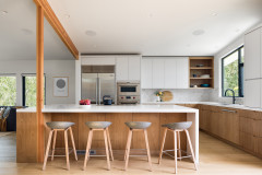
3. Bring In Wood Accents at Eye Level
Designers: Gina Loewer and Alyssa Banner of Northland Construction
Location: Sherwood, Oregon
Size: 170 square feet (16 square meters)
Homeowners’ request. “They wanted something fresh, bright, functional and open to the outside year-round,” designer Gina Loewer says.
Design idea. If you choose white upper cabinets, white countertops and wood base cabinets, consider bringing in wood elements at eye level or above to help break up the expanse of white. Here, floating wood shelves and a custom wood range hood detail do the job.
The base cabinets are hickory. The upper cabinets are painted in Snowbound by Sherwin-Williams. The countertops are white quartz. The wood flooring has a natural matte clear finish.
Wall paint: Agreeable Gray, Sherwin-Williams
Other special features. Brass hardware, faucet and light fixtures. Gray picket tile backsplash with white grout for graphic effect.
Designer tip. “Often clients will want to move their corner sinks, which is costly because window locations need to be modified as well,” Loewer says. “We retained the plumbing and window layouts to save money.”
Designer tip. “Often clients will want to move their corner sinks, which is costly because window locations need to be modified as well,” Loewer says. “We retained the plumbing and window layouts to save money.”
Wood accents in this kitchen also help bring warmth at eye level and above.
Designer: Chris Awadalla of Sanctuary Kitchen and Bath Design
Location: Denver
Size: 250 square feet (23 square meters)
Homeowners’ request. A warm contemporary kitchen with a Scandinavian influence. The owners also wanted to create more function for entertaining and to add more light. “We introduced a large clerestory window into the design and recessed appliances wherever possible to keep the space feeling light and open,” says designer Chris Awadalla, who used Houzz ideabooks with his clients for this project. “A large pantry is used for the family’s food storage needs, opening up the main kitchen for the cookware and utensils that are used on a daily basis.”
Design idea. Walnut-wrapped range hood, walnut shelves and walnut trim around the appliances bring warmth at eye level and above. This helps balance the white inset cabinets and walls (White Dove by Benjamin Moore) and matte white backsplash (3-by-8-inch tiles). “I felt that pairing a warm wood such as walnut with light oak floors would result in a space that feels inviting yet contemporary,” Awadalla says. “While the homeowners wanted a new feel to the space, they didn’t want an ultramodern kitchen. By introducing inset painted white cabinets in Benjamin Moore White Dove, we were able to lend a bit of a traditional feel while still maintaining an overall modern aesthetic.”
Other special features. Recessed 54-inch refrigerator and cabinet area with double ovens. “By recessing the major appliances into the wall, we were able to keep the space feeling very open,” Awadalla says.
Designer tip. “Try something new in a design, whether it’s a color scheme or a layout,” Awadalla says. “The kitchens that are most interesting are the ones that are unique.”
Designer tip. “Try something new in a design, whether it’s a color scheme or a layout,” Awadalla says. “The kitchens that are most interesting are the ones that are unique.”
4. Mix In Off-White Cabinets
Designer: Kristin Winn Weinrich of Four Brothers Design + Build
Location: Washington, D.C.
Size: 335 square feet (31 square meters)
Homeowner’s request. Update a former closed-off, French provincial-style kitchen to create a fresh, clean, open space with island seating. The homeowner “wanted the final product to feel special and eclectic, but not completely in contrast to the Georgian style of the row home,” designer Kristin Winn Weinrich says.
Design idea. To break up an expanse of white cabinets, consider mixing in some cabinets in an off-white or other neutral tone. Here, light gray cabinets (Gray Horse by Benjamin Moore) add visual variation to the matte white cabinets, white island base, white island countertop and white walls (Shadow White by Farrow & Ball).
A white oak island detail in a walnut stain, walnut stools and red oak flooring in a dark walnut stain provide plenty of warmth. “We started with the goal of a mostly white, more modern kitchen,” Weinrich says. “However, in development, it began to feel a bit sterile, so we brought in a secondary off-white, gray color and a more traditional Shaker-style door to better walk the line between blending contemporary and classic features. Bringing in natural wood was another mechanism we wanted to use to help soften the space.”
Island countertop: Iconic White by Silestone
Other special features. Paneled fridge and dishwasher. Induction cooktop with vent hood concealed in ceiling soffit. Black hardware, faucet, sconces and window framing. Marble-look perimeter countertop and backsplash.
Designer tip. “While it’s not that uncommon, a cooktop in front of the window is usually not the most obvious placement,” Weinrich says. “It worked really well for this layout though. Since we had the existing soffit running the perimeter of the room anyway — to support ducting on the upper level — I was able to utilize an in-ceiling hood for ventilation without obstructing the sightline to the exterior.”
“Uh-oh” moment. “The island end detail definitely evolved throughout the process,” Weinrich says. “Originally, we wanted to create an operable island end that could swing up to add additional seating. We opted for wood, since quartz would be too heavy, but it was still difficult to create a hinging mechanism without a fair amount of visible hardware and supports. In the end, the client decided that he still liked the wood and quartz, and we kept the finger joint for visual interest even though everything was fixed.”
Hardware: Sutton pulls by Jeffrey Alexander in matte black, Hardware Resources; perimeter countertop and backsplash: Natura, Dekton
More on Houzz
Read more kitchen stories
Browse kitchen photos
Hire a kitchen remodeler
Shop for kitchen products


Designer: Carmit Oron Interior Design
Location: Sunnyvale, California
Size: 400 square feet (37 square meters)
Homeowners’ request. “The first thing my client expressed to me was how much they’re drawn to the Eichler style, and their desire to implement similar elements within their own home,” says designer Carmit Oron, whose client found her through Houzz. “Paying homage to the Eichler form, their architect created vaulted ceilings and expansive openings to maximize natural light. As for the interior of the house, my goal was to establish modern, clean lines that are characteristic to Eichler homes, with lots of midcentury, boho feel.”
Design idea. Consider skipping a wood floor and going with concrete or tile. Here, concrete-look porcelain tiles (24 by 48 inches) balance base cabinets and floating shelves made of rift-sawn white oak veneer, a white ceramic tile backsplash in a straight-lay pattern and a light gray cabinet tower (Classic Gray by Benjamin Moore).