


Search results for "Incurred" in Home Design Ideas
**Check out the video of this transformation on our website**
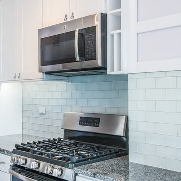
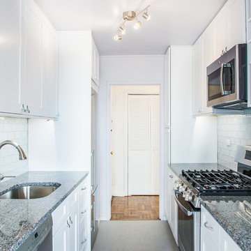
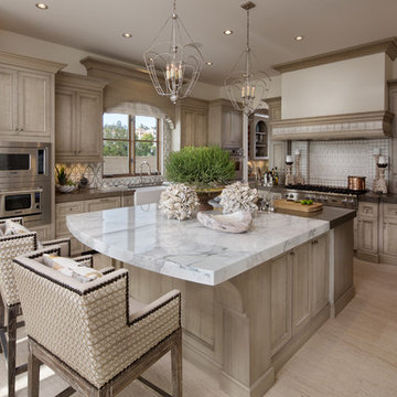
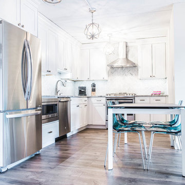
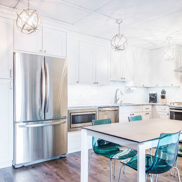
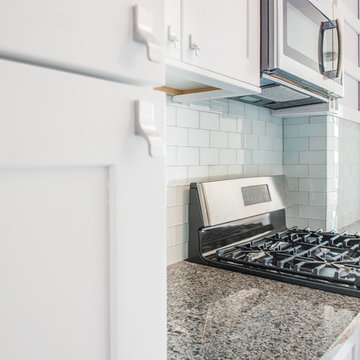
This small kitchen was way too small for this 2 bedrooms, 2 bathrooms apartment. Not only was it a very small kitchen, but the physical location of it made it very difficult to make it any bigger. There wasn't much that could have been done without incurring astronomical cost, which would get little or no return on the investment. The client wanted a kitchen that can be optimized in its current location to add a ton of value for resale.
This was difficult to do, because there was no moving of any mechanical around in the kitchen and even if we wanted to, the management of the building would not allow. For those of you who live in condos, co-ops or apartment building, you know how difficult it is to rework these foot prints. When we showed up, we saw the problems, but we also saw a huge opportunity where we can achieve those goals in the small space. This was accomplished by making some key changes and to incorporate some new things that was not possible when this kitchen was built years ago.
The crucial part of the design that would drive the entire new layout, was selecting the only appliance; that was the Refrigerator. Once we nailed down that refrigerator, we then proceeded to design the kitchen around it. We moved it to the other side of the wall where the sink was so that we can tap into the water line from the sink plumbing. It was crucial that it stays exactly 24" deep, not an inch more because we had to keep the entry as open as possible. Also, it was going to be directly in front of another big storage unit - The pantry. It is not ideal in most cases, but we needed the rest of the space to ramp up the design and open feel towards the side where all of the activities would take place, which happend to be the dining room and the view.
Once all that was figured out, we re-positioned the sink, dishwasher and the range and proceeded to wrap the cabinets around the columns to integrate them into the space. Thirty- six inches cabinets height was used so that they can be installed higher towards the ceiling height to give more room rather than the standard 18" required height between the counter tops. This was done to make the room feel a lot bigger than it really was. Not to mention, we also didn't want the faucet to be buried under the cabinets so that was also a necessary design detail for the space.
We then lowered both knee walls so that the counter top can sit on top of them, by removing that stop point that would have otherwise defined the kitchen area. This allowed us to pick up that extra footprint into the room for added prep space and enabled us to create the illusion of a kitchen that is looking longer than it really is. Every inch mattered when designing this kitchen and we made a conscious decision to use every one of that inch.
White cabinets were selected to do just what white cabinets are design to do; make a small or dark room appear bigger, brighter and more open. In this kitchen, this was amplified the more because of the kitchen location. It was perfect! We knew we did justice to the space because while we were there taking some photos, a few potential buyers walked in and went straight for the kitchen! They said its design just to fit the apartment.
Pantry roll out shelving, Double recycle bin, fancy handles, LED lighting, Quartz counter top, beautiful backslash tiles and grey linen floors finished off the kitchen which looked over a beautiful view of the George Washington Bridge from the top of this lovely 4th floor apartment.
Credit to Masterpiece Tile and Marble (Annmarie on the selection of Tiles and countertop and Val on the Construction to complete this project).
Davor Kokic Photography
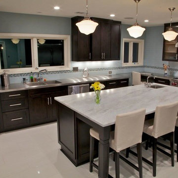
Seated home bar - large modern galley porcelain tile and gray floor seated home bar idea in Las Vegas with a drop-in sink, flat-panel cabinets, gray cabinets, marble countertops, gray backsplash, mirror backsplash and multicolored countertops
Find the right local pro for your project
Mid-sized island style master carpeted and beige floor bedroom photo in New York with multicolored walls and no fireplace
**Check out the video of this transformation on our website**
This small kitchen was way too small for this 2 bedrooms, 2 bathrooms apartment. Not only was it a very small kitchen, but the physical location of it made it very difficult to make it any bigger. There wasn't much that could have been done without incurring astronomical cost, which would get little or no return on the investment. The client wanted a kitchen that can be optimized in its current location to add a ton of value for resale.
This was difficult to do, because there was no moving of any mechanical around in the kitchen and even if we wanted to, the management of the building would not allow. For those of you who live in condos, co-ops or apartment building, you know how difficult it is to rework these foot prints. When we showed up, we saw the problems, but we also saw a huge opportunity where we can achieve those goals in the small space. This was accomplished by making some key changes and to incorporate some new things that was not possible when this kitchen was built years ago.
The crucial part of the design that would drive the entire new layout, was selecting the only appliance; that was the Refrigerator. Once we nailed down that refrigerator, we then proceeded to design the kitchen around it. We moved it to the other side of the wall where the sink was so that we can tap into the water line from the sink plumbing. It was crucial that it stays exactly 24" deep, not an inch more because we had to keep the entry as open as possible. Also, it was going to be directly in front of another big storage unit - The pantry. It is not ideal in most cases, but we needed the rest of the space to ramp up the design and open feel towards the side where all of the activities would take place, which happend to be the dining room and the view.
Once all that was figured out, we re-positioned the sink, dishwasher and the range and proceeded to wrap the cabinets around the columns to integrate them into the space. Thirty- six inches cabinets height was used so that they can be installed higher towards the ceiling height to give more room rather than the standard 18" required height between the counter tops. This was done to make the room feel a lot bigger than it really was. Not to mention, we also didn't want the faucet to be buried under the cabinets so that was also a necessary design detail for the space.
We then lowered both knee walls so that the counter top can sit on top of them, by removing that stop point that would have otherwise defined the kitchen area. This allowed us to pick up that extra footprint into the room for added prep space and enabled us to create the illusion of a kitchen that is looking longer than it really is. Every inch mattered when designing this kitchen and we made a conscious decision to use every one of that inch.
White cabinets were selected to do just what white cabinets are design to do; make a small or dark room appear bigger, brighter and more open. In this kitchen, this was amplified the more because of the kitchen location. It was perfect! We knew we did justice to the space because while we were there taking some photos, a few potential buyers walked in and went straight for the kitchen! They said its design just to fit the apartment.
Pantry roll out shelving, Double recycle bin, fancy handles, LED lighting, Quartz counter top, beautiful backslash tiles and grey linen floors finished off the kitchen which looked over a beautiful view of the George Washington Bridge from the top of this lovely 4th floor apartment.
Credit to Masterpiece Tile and Marble (Annmarie on the selection of Tiles and countertop and Val on the Construction to complete this project).
Davor Kokic Photography
Russell Abraham
Inspiration for a large modern open concept living room remodel in San Francisco
Inspiration for a large modern open concept living room remodel in San Francisco
Martin King Photography
Example of a large beach style light wood floor kitchen design in Orange County with a farmhouse sink, recessed-panel cabinets, light wood cabinets, marble countertops, white backsplash, stainless steel appliances and an island
Example of a large beach style light wood floor kitchen design in Orange County with a farmhouse sink, recessed-panel cabinets, light wood cabinets, marble countertops, white backsplash, stainless steel appliances and an island
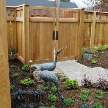
An Asian Style entry courtyard draws inspiration from the 1980's home's Asian Style roof-line and the owner's crane sculptures.
Donna Giguere Landscape Design
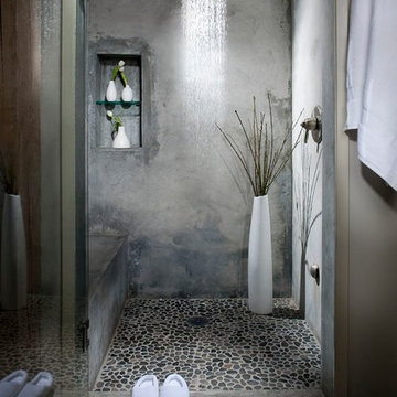
Urban gray tile pebble tile floor alcove shower photo in San Francisco with gray walls
This family wanted a casual, eat-in kitchen great for entertaining, and with enough storage to hold all the stuff that was displaced by the removal of several closets.
Floor plan and cabinet design/ install by Addhouse.
Photo by Monkeyboy Productions
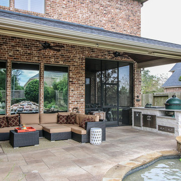
Our clients requested the final additions for their lovely outdoor living space. In the midst of their backyard oasis, we created the ideal transition from inside sitting area to the existing pool: an outdoor living area complete with an outdoor kitchen underneath a covered patio!
The patio cover boasts tongue and groove ceilings with recessed lighting and ceiling fans, even a sound system! An outdoor TV was wired in for additional entertainment while the burgers are grilling on this lovely stone kitchen.
Custom made, the outdoor kitchen perfectly nestles the Big Green Egg for the best smoked meal! There is ample food preparation space and storage in this kitchen.
The final touches were made when we resurfaced the existing ceiling in the screened in patio with matching tongue and groove stained wood! This space is fitted with easily accessible electrical outlets as well.
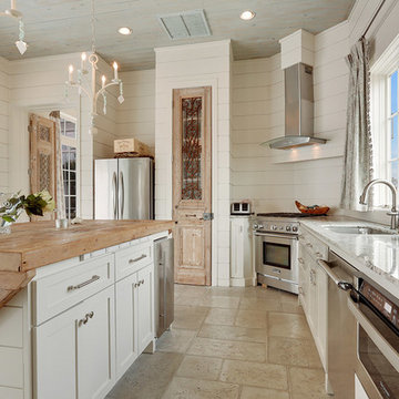
“Full apartment design”.
IF you have not yet seen this apartment conversion before, we strongly urge you to go to the bottom left of this page and click on the short 2-minutes video. It would put a lot of things into perspective when you come back and continue reading this.
It is true we were literally handed the keys and told a list of things that they wanted to have happen and we were to go into the apartment, look at the space and come up with a design that would satisfy all of that need. UNTIL we showed up! The unit had really seen some better days but we knew we had to look past that and come up with a concept that would work for them.
The immediate challenges were centered around 3 big ideas:
1. Adding a second bedroom to the already small footprint
2. Figuring out a way to make the kitchen bigger, better and brighter
3. Creating a master room walk in closet
It’s always difficult to add new rooms into existing footprint without expanding out or up and not incurring any opportunity cost. In this case, that was exactly what we had to do. Item one and two above had to be tackled as one. We went ahead and switched out the location of the dining room and eliminating an area where there was a “nook” type eat-in area. By doing so, we were able to cut right into that footprint and change the layout of the kitchen.
That one move allowed us to dig into the kitchen design because it was now the main focal point in the apartment. It was no longer an option to keep it in that tiny hole where it was, so we had to ensure that this design was functional and aesthetically pleasing at the same time. By adding the table into the space where an Island typically would go, we were able to both cut cost and still provide a dining experience. The Table serves as an Island as well when cooking.
We then proceeded to block in the existing doorway to the dining room. By doing this, we were able to create a full room which allowed us to put a door on the other side and called that room Bedroom #2. This was easier to do because all of the mechanicals were already in that space (light, heater and windows). By shifting things around, we also achieved a huge wall to wall closet from inside. PERFECT!
Then we moved into the Single bedroom. We thought it was a big room with a small closet, so by creatively adding an L shaped wall and steal some footprint into the bedroom side, we were able to put a door on that new room and design it for the walk-in closet. Even after this, the bedroom still holds a queen size bed with 2 night stands, a TV on the wall, a sitting chair and plenty of room to walk around. This was done by rethinking the location for the bed and night stands.
The bathroom was gutted to make sure there was no leaks and rebuild from the ground up. We kept all of the plumbing where it was, added a new vanity, medicine cabinet, tiles and lighting and it was done.
From there, the rest of the unit had new flooring all throughout, paint, and lighting. After completion and walk through, this project was handed over back to the clients.
Execution and collaboration between all the trades were: Reggie and his team from Premier Interiors and Rohan from RD Mechanical Services.
p.s. Please see our website to see the video.
**Check out the video of this transformation on our website**
This small kitchen was way too small for this 2 bedrooms, 2 bathrooms apartment. Not only was it a very small kitchen, but the physical location of it made it very difficult to make it any bigger. There wasn't much that could have been done without incurring astronomical cost, which would get little or no return on the investment. The client wanted a kitchen that can be optimized in its current location to add a ton of value for resale.
This was difficult to do, because there was no moving of any mechanical around in the kitchen and even if we wanted to, the management of the building would not allow. For those of you who live in condos, co-ops or apartment building, you know how difficult it is to rework these foot prints. When we showed up, we saw the problems, but we also saw a huge opportunity where we can achieve those goals in the small space. This was accomplished by making some key changes and to incorporate some new things that was not possible when this kitchen was built years ago.
The crucial part of the design that would drive the entire new layout, was selecting the only appliance; that was the Refrigerator. Once we nailed down that refrigerator, we then proceeded to design the kitchen around it. We moved it to the other side of the wall where the sink was so that we can tap into the water line from the sink plumbing. It was crucial that it stays exactly 24" deep, not an inch more because we had to keep the entry as open as possible. Also, it was going to be directly in front of another big storage unit - The pantry. It is not ideal in most cases, but we needed the rest of the space to ramp up the design and open feel towards the side where all of the activities would take place, which happend to be the dining room and the view.
Once all that was figured out, we re-positioned the sink, dishwasher and the range and proceeded to wrap the cabinets around the columns to integrate them into the space. Thirty- six inches cabinets height was used so that they can be installed higher towards the ceiling height to give more room rather than the standard 18" required height between the counter tops. This was done to make the room feel a lot bigger than it really was. Not to mention, we also didn't want the faucet to be buried under the cabinets so that was also a necessary design detail for the space.
We then lowered both knee walls so that the counter top can sit on top of them, by removing that stop point that would have otherwise defined the kitchen area. This allowed us to pick up that extra footprint into the room for added prep space and enabled us to create the illusion of a kitchen that is looking longer than it really is. Every inch mattered when designing this kitchen and we made a conscious decision to use every one of that inch.
White cabinets were selected to do just what white cabinets are design to do; make a small or dark room appear bigger, brighter and more open. In this kitchen, this was amplified the more because of the kitchen location. It was perfect! We knew we did justice to the space because while we were there taking some photos, a few potential buyers walked in and went straight for the kitchen! They said its design just to fit the apartment.
Pantry roll out shelving, Double recycle bin, fancy handles, LED lighting, Quartz counter top, beautiful backslash tiles and grey linen floors finished off the kitchen which looked over a beautiful view of the George Washington Bridge from the top of this lovely 4th floor apartment.
Credit to Masterpiece Tile and Marble (Annmarie on the selection of Tiles and countertop and Val on the Construction to complete this project).
Davor Kokic Photography
“Full apartment design”.
IF you have not yet seen this apartment conversion before, we strongly urge you to go to the bottom left of this page and click on the short 2-minutes video. It would put a lot of things into perspective when you come back and continue reading this.
It is true we were literally handed the keys and told a list of things that they wanted to have happen and we were to go into the apartment, look at the space and come up with a design that would satisfy all of that need. UNTIL we showed up! The unit had really seen some better days but we knew we had to look past that and come up with a concept that would work for them.
The immediate challenges were centered around 3 big ideas:
1. Adding a second bedroom to the already small footprint
2. Figuring out a way to make the kitchen bigger, better and brighter
3. Creating a master room walk in closet
It’s always difficult to add new rooms into existing footprint without expanding out or up and not incurring any opportunity cost. In this case, that was exactly what we had to do. Item one and two above had to be tackled as one. We went ahead and switched out the location of the dining room and eliminating an area where there was a “nook” type eat-in area. By doing so, we were able to cut right into that footprint and change the layout of the kitchen.
That one move allowed us to dig into the kitchen design because it was now the main focal point in the apartment. It was no longer an option to keep it in that tiny hole where it was, so we had to ensure that this design was functional and aesthetically pleasing at the same time. By adding the table into the space where an Island typically would go, we were able to both cut cost and still provide a dining experience. The Table serves as an Island as well when cooking.
We then proceeded to block in the existing doorway to the dining room. By doing this, we were able to create a full room which allowed us to put a door on the other side and called that room Bedroom #2. This was easier to do because all of the mechanicals were already in that space (light, heater and windows). By shifting things around, we also achieved a huge wall to wall closet from inside. PERFECT!
Then we moved into the Single bedroom. We thought it was a big room with a small closet, so by creatively adding an L shaped wall and steal some footprint into the bedroom side, we were able to put a door on that new room and design it for the walk-in closet. Even after this, the bedroom still holds a queen size bed with 2 night stands, a TV on the wall, a sitting chair and plenty of room to walk around. This was done by rethinking the location for the bed and night stands.
The bathroom was gutted to make sure there was no leaks and rebuild from the ground up. We kept all of the plumbing where it was, added a new vanity, medicine cabinet, tiles and lighting and it was done.
From there, the rest of the unit had new flooring all throughout, paint, and lighting. After completion and walk through, this project was handed over back to the clients.
Execution and collaboration between all the trades were: Reggie and his team from Premier Interiors and Rohan from RD Mechanical Services.
p.s. Please see our website to see the video.
Dallas Outdoor Kitchens, LLC
Mid-sized mountain style backyard concrete paver patio kitchen photo in Dallas with a gazebo
Mid-sized mountain style backyard concrete paver patio kitchen photo in Dallas with a gazebo
Showing Results for "Incurred"
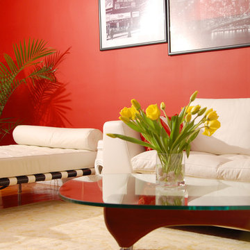
A contemporary feel was instilled in this traditional apartment. The bold color pallette was inspired by the vibrant personalities of these wonderful clients
1