Before and After: 4 White Kitchens With Contrasting Islands
See how a splash of gray, blue or green makes a kitchen island stand out in a sea of white cabinets
If you’re thinking about installing bright white kitchen cabinets and want to add a pop of pizzazz, consider painting your island cabinets a contrasting color. It’s a growing trend, according to Houzz research, and can have a subtle or bold impact depending on the paint shade and intensity. To see how pros make this two-tone approach look cohesive and stylish, check out the dramatic kitchen makeovers below, which feature the popular pairings of white with blue, green or gray.
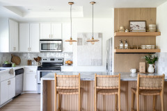
After: Designer Erin Lindsey, the cousin of one of the homeowners, and builder Antonio Quelhas opened up the layout by removing a wall between the kitchen and living room. After taking the space down to the studs, they built it back up with a more efficient cabinet layout that provides ample storage. There’s now a stove hood too.
Marble-look porcelain counters, a white glazed ceramic backsplash and white perimeter cabinets — with the Potter’s Mill door style in White Icing by Medallion Cabinetry — further brighten the space.
Marble-look porcelain counters, a white glazed ceramic backsplash and white perimeter cabinets — with the Potter’s Mill door style in White Icing by Medallion Cabinetry — further brighten the space.
The light wood stools and ceiling beam (not to mention the sandy-coated goldendoodle ZuZu) coordinate with the existing wood-look porcelain flooring and lend beachy vibes.
A new narrow island with seating and storage space has the same cabinet style but in a color called Gale. The soft gray-blue picks up the counter’s gray veining and ties in with the other fixtures and finishes in the house that have a coastal feel. And the contrasting color, though soft, gives the kitchen personality and a focal point, Lindsey says.
Read more about this kitchen remodel
“After” photos by Erin Kelly Photography
2. Dark to Dapper
Kitchen at a Glance
Who lives here: A couple with two teenagers and two dogs
Location: Peters Township, Pennsylvania
Size: 430 square feet (40 square meters)
Designer: Maria Cross of McQueen Building
Before: Squat upper cabinets, a tiny island and tight square footage made this Pennsylvania kitchen feel cramped and cluttered, and dark finishes didn’t help. With two teenagers and two dogs, the homeowners wanted more space, function and style.
New to home remodeling? Click here to learn the basics
After: Designer Maria Cross expanded the kitchen by 165 square feet by removing the wall between it and the rarely used dining room. She also took down the awkward bulkhead over the former island. At 430 square feet, the new kitchen has a larger island with seating for four and a more efficient U-shaped layout.
White Shaker-style cabinets extend to the ceiling, which maximizes storage space. Pale gray walls (Gossamer Veil by Sherwin-Williams), a light-reflecting gray glass tile backsplash with white grout and marble-look quartz countertops keep the room bright. White oak flooring and a white oak band on the range add a warm, organic element.
Whereas the previous kitchen was low-energy, this one looks fresh and lively — and not just because there’s a pup zooming through the photo!
Need a pro for your home remodeling project?
Let Houzz find the best pros for you
Let Houzz find the best pros for you
A lot of the new energy in the space comes from the contrast between the light tones and the sophisticated, nearly black charcoal gray island (Iron Ore by Sherwin-Williams).
Black details, including a black faucet, undermount composite sink and cabinet pulls, tie the island color to the rest of the room.
Read more about this kitchen remodel
Black details, including a black faucet, undermount composite sink and cabinet pulls, tie the island color to the rest of the room.
Read more about this kitchen remodel
“After” photos by Spacecrafting / Architectural Photography
3. Cramped to Crisp
Kitchen at a Glance
Who lives here: A couple with young kids
Location: Apple Valley, Minnesota
Size: 450 square feet (42 square meters)
Design-build pros: Steve McDonald and Angela Barnhart of White Birch Design
Before: While decently sized, this Minnesota kitchen suffered from bulky soffits, a poorly proportioned island, outdated appliances and a surfeit of midtone wood. The homeowners wanted it to have a more welcoming feel, a comfortable flow and an updated look, along with an island that offered more seating.
After: Design-build pros Steve McDonald and Angela Barnhart of White Birch Design removed the wall between the kitchen and the unused formal dining room to increase the space by 138 square feet. After taking the space down to the studs and removing the soffits, they created a layout that better suits the young family.
The extra space also allowed them to install a new beverage station with glass-front upper cabinets for displaying glassware, cubbies for wine bottles and a beverage fridge.
Very pale greige walls (Agreeable Gray by Sherwin-Williams) subtly contrast with bright white cabinets (Pure White by Sherwin-Williams) and backsplash tiles. The perimeter countertops are honed black granite.
The kitchen’s centerpiece is an 11-foot island offering seating for five.
The renovation team gave it a dark base (Naval by Sherwin-Williams) and a light top (marble-look quartz with gray veining). Blue and orange are complementary colors, meaning they’re opposite each other on the color wheel and thus create high contrast. So the navy base looks even more striking paired with the caramel-colored faux leather stools and coordinating wood-look vinyl floors.
Read more about this kitchen remodel
“After” photos by Alyssa Lee Photography
4. Zero to ’50s
Kitchen at a Glance
Who lives here: A young family
Location: Edina, Minnesota
Size: 366 square feet (34 square meters); 23¼ by 15¾ feet
Designer: Emily Pueringer Design Studio
Contractor: Quality Cut Design | Remodel
Before: With their family growing, this couple felt like the compact kitchen in their 1957 ranch house was bursting at the seams. And the room and adjacent dining space (which you can see through the door on the left) were dimly lit.
After: Working with interior designer Emily Pueringer and Quality Cut Design | Remodel, the couple bumped out the kitchen and dining room to add about 300 square feet onto the home. The new kitchen is in that bump-out and open to the dining room, and most of the old kitchen space is now a mudroom.
With a nod to the home’s midcentury modern architecture, the homeowners made a bold and fun choice for the backsplash: bright green geometric mosaic tile by local company Mercury Mosaics and Tile.
The new large island has some bold elements too, including hickory paneling on the back. The caramel leather counter stools (dead ringers for those in the previous project) blend with the wood’s warm tones.
Shop for counter stools on Houzz
Pueringer doubled down on the tile’s vibrant hue by painting the rest of the island cabinetry to match (Country Squire by Sherwin-Williams). Polished Cambria quartz in Queen Anne, a velvety gray with white veining, tops the island, while its inverse, Cambria Brittanicca, tops the main cabinets. Brass pendant lights and cabinet pulls look like jewelry fittings beside all of that emerald.
A bonus to the kitchen expansion is that the family’s black Lab, Trooper, now has plenty of room to stretch out.
Read more about this kitchen remodel
More on Houzz
Read more kitchen stories
Browse kitchen photos
Hire a kitchen remodeler
Shop for kitchen products
A bonus to the kitchen expansion is that the family’s black Lab, Trooper, now has plenty of room to stretch out.
Read more about this kitchen remodel
More on Houzz
Read more kitchen stories
Browse kitchen photos
Hire a kitchen remodeler
Shop for kitchen products








1. Brown to Beachy
Kitchen at a Glance
Who lives here: A couple, their dog and a baby on the way
Location: Boynton Beach, Florida
Size: 240 square feet (22 square meters)
Designer: Erin Lindsey of Lindross Remodeling
Builder: Antonio Quelhas of Portal Construction Group
Before: This 1980s kitchen was near the beach in Florida, but you’d never know it from its heavy cabinetry, dark brown-and-beige color scheme and closed-off layout. Plus, no vent hood meant the homeowners were constantly setting off the smoke alarm.
Find a local interior designer on Houzz