


Kitchen Design

Kitchen of the Week
Kitchen of the Week: Tall, Dark and Handsome
East-meets-West ideas inspire a designer in this well-balanced urban glam kitchen

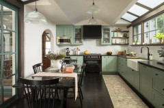
East meets West, industrial meets earthy, cool meets warm — all these contrasts ultimately resulted in a style that interior designer Linette Dai calls urban glam. In the kitchen of this new build in Southern California, Dai combined striking marble with dark-stained wood, along with nods to traditional Japanese and European modern styles. In addition, she knew the husband was the one who most liked to spend time cooking for the family. “I wanted to create a kitchen that was tall, dark and handsome,” she says.
“I didn’t want to do the typical light wood and white, Scandinavian thing here,” Dai says. Growing up in Japan, Taiwan and America and traveling the world have given the designer a strong foundation in a range of style. For this project, nods to Zen throughout the house were gleaned from time spent in Japan. Dai kept feng shui in mind, particularly when it came to flow and balance. For the kitchen counters, she looked to Europe for inspiration.
“I wanted to incorporate a more dramatic marble in the kitchen,” she says. The one she chose is called Arabescato Corchia and it comes from Italy. It provided the urban glam look Dai was going for. On the island, she used a thicker marble countertop, giving it a stronger presence. “This was inspired by European modern design,” she says. “It allows the marble to have a stronger presence, and visually you can see it vertically from across the room.”
Browse counter stools in the Houzz Shop
A large separate pantry gave Dai the freedom to skip upper cabinets in the kitchen. She also maximized the storage potential of the lower cabinets, opting for tricked-out drawers rather than cabinet doors. This allowed for storing items like glassware and china. The result is a clean-lined, open look above the counters that makes the kitchen feel airy and larger than its 220-square-foot footprint.
Dai took advantage of the space by extending the countertop’s striking marble 18 inches up the range wall, capping it with a shallow shelf along the top. She also added a minimalist vent hood with a slatted detail, which she repeated on the island and in a few other spots in the house.
Dai took advantage of the space by extending the countertop’s striking marble 18 inches up the range wall, capping it with a shallow shelf along the top. She also added a minimalist vent hood with a slatted detail, which she repeated on the island and in a few other spots in the house.
On this side of the island are display shelves for cookbooks. Next to them, Dai repeated the slat detail used on the range hood. The island also contains a prep sink.
The large wood volume to the left of the window is the refrigerator.
Find a cabinet pro
The large wood volume to the left of the window is the refrigerator.
Find a cabinet pro
The other side of the kitchen contains the main sink, the dishwasher and more countertop space. Note how Dai extended the backsplash up to meet the window for a clean-lined look.
The shelves to the right of the sink nod to Japanese design. “The joinery intersects in a way that was inspired by Japanese carpentry,” Dai says.
Shop for a kitchen faucet
The shelves to the right of the sink nod to Japanese design. “The joinery intersects in a way that was inspired by Japanese carpentry,” Dai says.
Shop for a kitchen faucet
The dramatic light fixture by artisan Katy Skelton has an interesting intersection where the U shape meets the bar. White leather wraps the center of the bar. “It’s a little touch of luxury,” Dai says. “We try to make sure all our projects reflect the individuality of the clients, elevated through the thoughtfulness of small details like this.”
The main sink is NativeStone, a blend of cement and natural jute fiber that looks like concrete but is lighter. “I wanted to maintain a sense of earthiness with the sink,” Dai says. “White would have been too stark, and stainless steel would have leaned too industrial.” The color of the sink ties in with the veining in the marble.
The kitchen is open to the dining room, seen at the back of this photo.
Sink: Native Trails
The kitchen is open to the dining room, seen at the back of this photo.
Sink: Native Trails
“When everything is so open, it can feel too casual sometimes,” Dai says. “I wanted to infuse a sense of formality to the dining room.” This meant delineating it from the kitchen. Dai added columns to demarcate the space and designed a tray ceiling to add a bit of formality overhead. LED lights are tucked into the recesses of the ceiling’s millwork for ambiance. The dramatic chandelier adds to the urban glam feel.
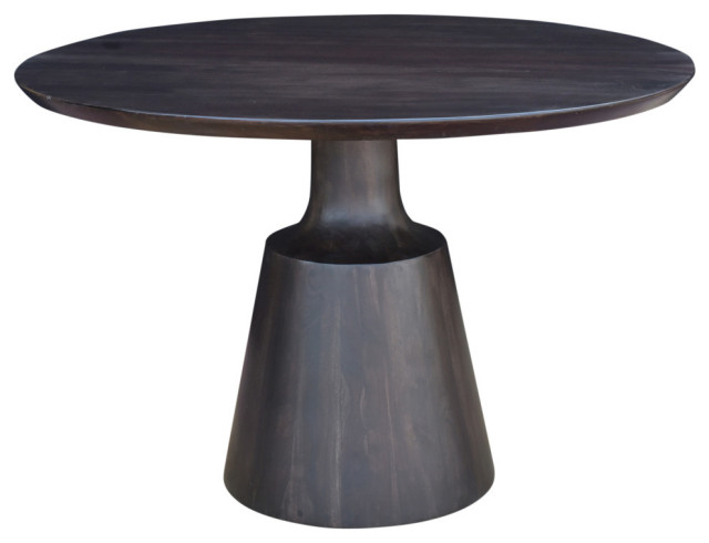
While her clients originally envisioned a rectangular table, Dai had a better idea. “There was already so much boxiness through the strong angular elements that I envisioned a round table,” she says. “Round tables promote a sense of community and the flow of conversation. As they are a couple with four kids, I pictured it being happy and festive for the whole family as they enjoy each other’s company.” A circular table also helped with the room’s feng shui. “A lot of the feng shui in this home had to do with flow and balance,” Dai says.
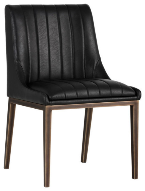
The Wishbone chairs by iconic Danish furniture designer Hans Wegner add some European modern style to the room. “I used faux fur on the seats to add another touch of luxury,” Dai says.
New to home remodeling? Learn the basics
While her clients originally envisioned a rectangular table, Dai had a better idea. “There was already so much boxiness through the strong angular elements that I envisioned a round table,” she says. “Round tables promote a sense of community and the flow of conversation. As they are a couple with four kids, I pictured it being happy and festive for the whole family as they enjoy each other’s company.” A circular table also helped with the room’s feng shui. “A lot of the feng shui in this home had to do with flow and balance,” Dai says.
The Wishbone chairs by iconic Danish furniture designer Hans Wegner add some European modern style to the room. “I used faux fur on the seats to add another touch of luxury,” Dai says.
New to home remodeling? Learn the basics
Perhaps the most urban glam element in the entire house is the gorgeous bar that lines an entire wall of the dining room. Wine storage in the middle is flanked by marble that’s even more dramatic than the Arabescato Corchia in the kitchen. This marble is called White Beauty.
While the marble’s veining patterns look continuous, they are not. They were cut into smaller pieces — three on each side — to be installed after the shelves were built. This is an example of why hiring an interior designer is crucial. Dai says finding a way to arrange them to lend the illusion of a continuous slab was painstaking. “I went to the slab yard and worked a long time with the fabricator to lay out the stone. It was meticulous,” she says. “We were trying to be as resourceful as possible with the stone to have it cover as much as possible.”
To keep things warmer and less industrial, she opted to stain the wood of the built-ins ebony rather than painting them black. “Staining the wood gave it a softer appearance,” Dai says. “You can see the texture of the graining in the wood.”
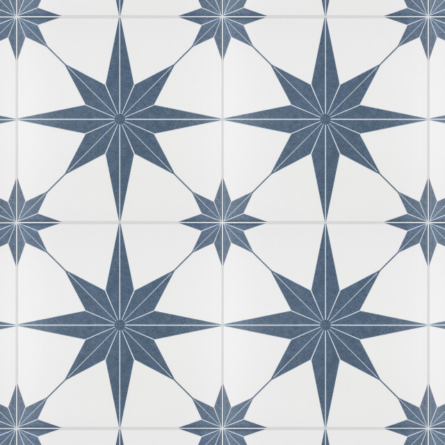
Finally, this is one of the heroes of the kitchen design: the walk-in pantry that made the lack of upper cabinets possible. It combines deep drawers and open shelving for storage and has plenty of counter space. The backsplash tile adds a playful detail that nods to the marble in the kitchen and dining room.
More on Houzz
Read more kitchen stories
Browse kitchen photos
Hire a kitchen remodeler
Shop for kitchen products
More on Houzz
Read more kitchen stories
Browse kitchen photos
Hire a kitchen remodeler
Shop for kitchen products


Sponsored
Leading Interior Designers in Columbus, Ohio & Ponte Vedra, Florida
Kitchen at a Glance
Who lives here: A couple and their four children
Location: Orange County, California
Size: 220 square feet (20 square meters)
Designer: Linette Dai
Dai was involved from the beginning of the planning phase of the new build, and she designed a lot of the interior architectural elements. The design began with one of the homeowners’ must-haves: concrete floors.
“Knowing concrete floors were our starting point, I did not want the kitchen to go too cold or too industrial,” Dai says. “I wanted to go for a more urban glam look.” This meant striving for balance by incorporating lots of wood elements that would provide warm contrast to the cool concrete.
Find an interior designer on Houzz