


Search results for "Analyze" in Home Design Ideas
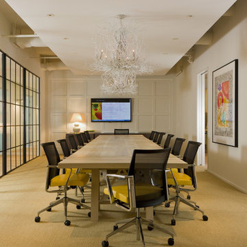
Bergeson & Campbell conference room
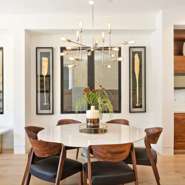
Huge trendy carpeted dining room photo in DC Metro with beige walls
Huge trendy carpeted dining room photo in DC Metro with beige walls
Tria Giovan
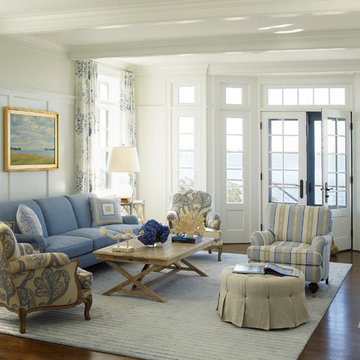
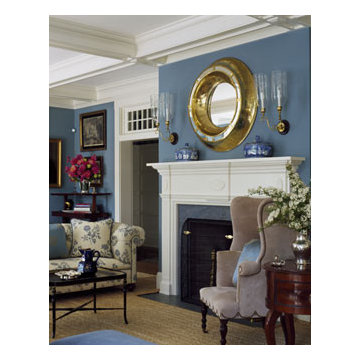
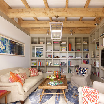
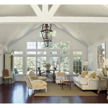
Beach style formal living room photo in New York with beige walls
Beach style formal living room photo in New York with beige walls
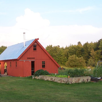
This is a wood storage barn with a gasification type outdoor wood boiler inside. There is a workshop greenhouse inside and lots of second floor storage. see our work here http://buildadk.com/
Find the right local pro for your project
Inspiration for a mid-sized contemporary light wood floor and beige floor great room remodel in Orange County with white walls and no fireplace
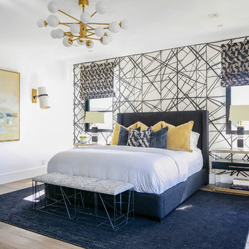
Inspiration for a contemporary light wood floor and beige floor bedroom remodel in Orange County with white walls
Photographer:Rob Karosis
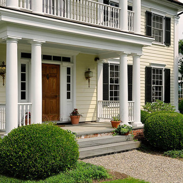
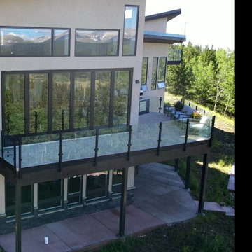
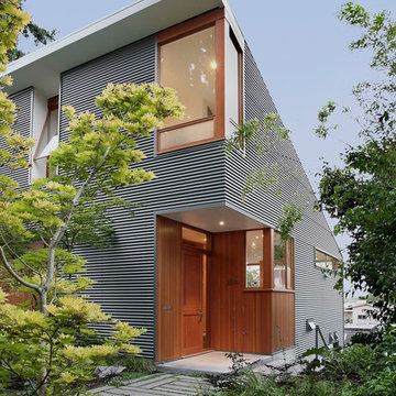
Inspiration for a timeless exterior home remodel in New York
Inspiration for a timeless exterior home remodel in New York
Study room - large transitional freestanding desk dark wood floor and brown floor study room idea in Chicago with gray walls and no fireplace
Peter Murdock
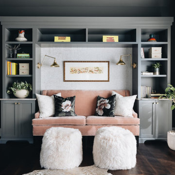
Family room library - contemporary family room library idea in New York with beige walls and a media wall
Family room library - contemporary family room library idea in New York with beige walls and a media wall
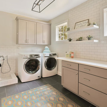
Example of a transitional utility room design in Richmond with shaker cabinets, gray cabinets, white walls and a side-by-side washer/dryer
Estate Houses.
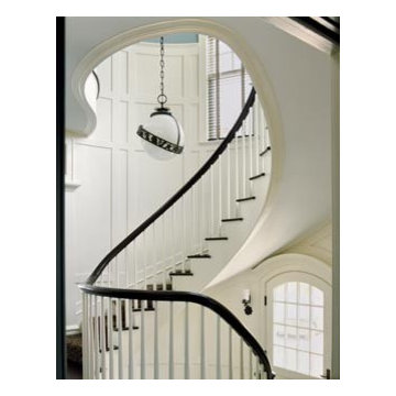
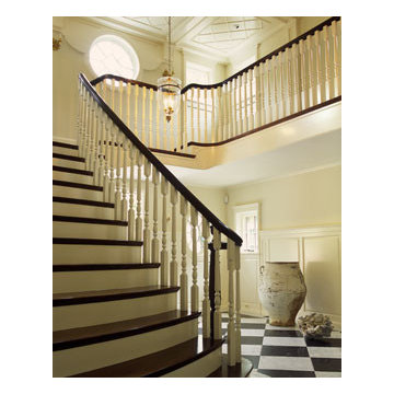
Example of a classic staircase design in Bridgeport
Example of a classic staircase design in Bridgeport
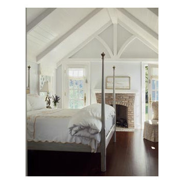
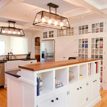
Photo by Jody Dole
This charming farmhouse sits atop a grassy hill overlooking a serene Connecticut River Estuary. The new design reformulated the first floor plan making it much more functional and visually exciting. It encompassed the reorganization of multiple spaces including the Mudroom, Kitchen, Dining Room, Family Room, Sun Room, Laundry, Bathroom, and Master Closet. The design also added, deleted, and relocated windows and French doors to greatly enhance exterior views, draw in more natural light, and seamlessly upgrade the articulation of exterior elevations. Improvements to the plumbing and mechanical systems were also made. The overall feeling is both sophisticated and yet very much down to earth.
John R. Schroeder, AIA is a professional design firm specializing in architecture, interiors, and planning. We have over 30 years experience with projects of all types, sizes, and levels of complexity. Because we love what we do, we approach our work with enthusiasm and dedication. We are committed to the highest level of design and service on each and every project. We engage our clients in positive and rewarding collaborations. We strive to exceed expectations through our attention to detail, our understanding of the “big picture”, and our ability to effectively manage a team of design professionals, industry representatives, and building contractors. We carefully analyze budgets and project objectives to assist clients with wise fund allocation.
We continually monitor and research advances in technology, materials, and construction methods, both sustainable and otherwise, to provide a responsible, well-suited, and cost effective product. Our design solutions are highly functional using both innovative and traditional approaches. Our aesthetic style is flexible and open, blending cues from client desires, building function, site context, and material properties, making each project unique, personalized, and enduring.
Showing Results for "Analyze"
Country House.
Living room - traditional living room idea in Bridgeport
Living room - traditional living room idea in Bridgeport
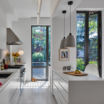
Brooklyn Townhouse White and Modern Kitchen. Photography by Joseph M. Kitchen Photography.
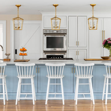
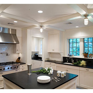
Inspiration for a mid-sized contemporary galley painted wood floor and white floor kitchen remodel in New York with an undermount sink, flat-panel cabinets, white cabinets, stainless steel appliances, an island, white countertops and gray backsplash
Inspiration for a mid-sized contemporary galley painted wood floor and white floor kitchen remodel in New York with an undermount sink, flat-panel cabinets, white cabinets, stainless steel appliances, an island, white countertops and gray backsplash
Estate Houses.
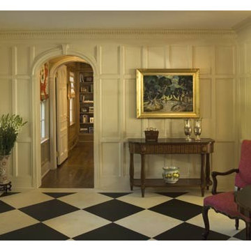
Elegant multicolored floor entryway photo in New York
Elegant multicolored floor entryway photo in New York
1