Kitchen Makeovers
Kitchen of the Week
Kitchen of the Week: Elegant Mix of Wood and White
Removing a pantry allows a designer to create a more beautiful and functional space
It’s tough to think about removing an existing pantry, but in the case of this Canadian kitchen, it was a no-brainer for interior designer Aniko Nicholson. Getting rid of the pantry’s awkwardly angled walls and taking over the space opened up myriad possibilities — a larger island, a range alcove that serves as a focal point, more room to walk around and a better flow between rooms.
As for aesthetics, the designer picked up on cues from one of the homeowners’ favorite home decor shops and the couple’s affinity for wood finishes. The owners had grown up in Haliburton, Ontario, also known as Cottage Country. “This instilled in them a deep appreciation for the outdoors and the rustic charm of cottage living, inspiring the inclusion of a shiplap ceiling in our design,” Nicholson says. The result is a farmhouse kitchen infused with contemporary touches and a well-balanced mix of beautiful textures.
As for aesthetics, the designer picked up on cues from one of the homeowners’ favorite home decor shops and the couple’s affinity for wood finishes. The owners had grown up in Haliburton, Ontario, also known as Cottage Country. “This instilled in them a deep appreciation for the outdoors and the rustic charm of cottage living, inspiring the inclusion of a shiplap ceiling in our design,” Nicholson says. The result is a farmhouse kitchen infused with contemporary touches and a well-balanced mix of beautiful textures.
After: Nicholson focused on several key elements, such as the new focal point range alcove centered on a larger island. She also carefully balanced wood into the two-tone cabinetry scheme.
This included reclaimed barn beams, like the one seen here over the range. The fridge, at the far left, the island base and additional cabinets are beautiful white oak. So is the interior of the display cabinet on the right. The other cabinets are painted Swiss Coffee by Benjamin Moore.
In between the fridge and the range, Nicholson created a convenient beverage station. There’s a beverage fridge on the bottom and, above it, a coffee station with cabinet doors that slide back and out of the way. The coffee maker, cups, mugs, teabags and other accoutrements are inside this cabinet, as well as countertop space for prepping a morning brew.
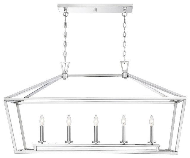
Shop for kitchen lighting
Before: One of the most impactful changes Nicholson made was removing the pantry, seen here to the left of the fridge. It jutted out 5 to 6 feet, blocking the flow between the kitchen and living room. It also made the cabinet and appliance run to the right feel cramped. And it limited the length of the island.
“This pivotal decision to remove the pantry enabled us to reconfigure the layout, allowing us to extend the cabinetry further and center the range on a larger island,” Nicholson says.
“This pivotal decision to remove the pantry enabled us to reconfigure the layout, allowing us to extend the cabinetry further and center the range on a larger island,” Nicholson says.
In process: With the pantry gone, Nicholson was able to extend this wall of cabinets and appliances. The alcove next to the white oak pantry cabinet is where she placed the white oak panel-front fridge. She was also able to scoot the range farther away from the corner. Getting rid of the pantry also made room for a longer island. The new island measures 10 feet, 2 inches by 4 feet, 5 inches.
Removing the angled walls of the pantry also allowed for a larger opening between the living room and the kitchen. Nicholson added reclaimed barn beams around this opening. “The homeowners knew of a timber frame pro who was able to hollow out the solid beam to fit around a structural I-beam,” Nicholson says.
“In place of the pantry, we installed floor-to-ceiling cabinets, creating a stunning display of white oak,” she says. “This not only improved functionality, but also enhanced the aesthetic appeal of the kitchen. With the pantry gone, conversations can flow seamlessly between the kitchen and living room.” Nicholson also notes that there are lovely views out the living room windows that the kitchen can enjoy and that widening the opening between the rooms allows the spaces to share the natural light.
After: Here’s the focal point that resulted from having more room on this side of the kitchen. Nicholson centered the range alcove on the new larger island. “For the island and range backsplash, we opted for Dekton Arga XGloss, offering a rich texture,” she says. Dekton is a sintered stone surface.
The countertops around the perimeter are Ethereal Glow quartz by Silestone. They have tan veining that picks up on the tones in the white oak cabinetry and the beams.
Find a local countertop pro
The countertops around the perimeter are Ethereal Glow quartz by Silestone. They have tan veining that picks up on the tones in the white oak cabinetry and the beams.
Find a local countertop pro
Before: The cabinetry around the window blocked the natural light. And the kitchen had bulkheads that ran along the top of both cabinet walls. Luckily, the bulkhead seen here over the window and the cabinets to the left of it turned out to be hollow. It had been put there for aesthetic purposes and didn’t contain any ductwork.
After: Nicholson was able to remove the bulkhead and leave some breathing room around the window. This also was an opportunity to add gunmetal sconces on either side of the window. The room mixes metals, including the gunmetal, copper pendant lights and polished nickel faucets. The backsplash is handmade tile in a subtle variety of white and off-white tones.
The new cabinetry improved storage, with designated slats for baking sheets and cutting boards, inserts for cutlery, and slide-outs on either side of the range for herbs, spices, oils and utensils. There are deep drawers for pots and pans, and the corner cabinets have pullout storage systems to make access easier. There’s even a paper towel dispenser on this side of the island near the sink. And there’s a garbage and recycling setup that includes a composting section.
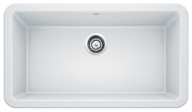
Browse white farmhouse sinks in the Houzz Shop
Nicholson’s new layout not only allowed for a larger island, but also for more space around it. “There is about 4 feet between the island and the cabinetry now for a much better flow,” she says. The island was built for prepping on one side and includes a prep sink. The opposite side is for seating. And the island itself is packed with storage.
To the right of the main sink, Nicholson added a countertop cabinet with glass doors. The interior of the cabinet brings more white oak to this end of the kitchen. The drawers below it give this end of the cabinet run a china cabinet look.
To the right of the main sink, Nicholson added a countertop cabinet with glass doors. The interior of the cabinet brings more white oak to this end of the kitchen. The drawers below it give this end of the cabinet run a china cabinet look.
Unlike the bulkhead over the sink, the bulkhead that ran along the range wall contained necessary ductwork. Nicholson was able to conceal it by customizing the interiors of some of the cabinets and adding thick crown molding between the cabinets and the ceiling.
“No space was underutilized,” she says. She included hidden storage on the seating side of the island by adding quick-release cabinet doors behind the beadboard. There’s shallow storage there for items like vases. “On either end of the island we included charging stations that are discreetly hidden but are perfectly positioned for when you’re at the island and in need of a charge,” Nicholson says.
The homeowners have a love of vintage items and family pieces, so the designer gave them open white oak shelving to the right of the range alcove. These also come in handy for cookbook storage.
New to home remodeling? Learn the basics
The kitchen is open to the dining area. The shiplap ceiling continues uninterrupted through both spaces. So does the Benjamin Moore Dune White wall paint, creating a cohesive look. The china-cabinet-like cabinetry on the left and the island create a clean delineation between the rooms within the open floor plan.
More on Houzz
Read more kitchen stories
Browse kitchen photos
Hire a kitchen remodeler
Shop for kitchen products
More on Houzz
Read more kitchen stories
Browse kitchen photos
Hire a kitchen remodeler
Shop for kitchen products







Kitchen at a Glance
Who lives here: A couple
Location: Midhurst, Ontario
Size: 252 square feet (23 square meters); 21 by 12 feet
Designer: Aniko Nicholson Design
Before: “This was a very dark kitchen, even though it was already an open concept,” Nicholson says. “The cabinetry and flooring were pretty much the same color — a very orangey-red cherry wood. My client really loved cherry wood, and it’s fine and wonderful to have such an appreciation for wood. But there was just so much of it, and too much variation, which overwhelmed the space and made it feel busy.”
This inspired a strategy of carefully curating where wood would appear throughout the room. “Because my clients had such an appreciation for wood, we discussed that we would use it strategically,” Nicholson says. “While we were cutting down on the overall amount of wood, I assured them that everywhere we used it would be spectacular.”
In addition, the cabinetry wasn’t strategically placed, there was no focal point, and the lighting needed improvement.
Find a local interior designer on Houzz