

Kitchen Makeovers
Kitchen of the Week
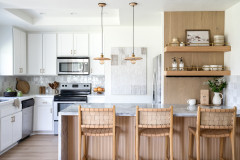
Kitchen of the Week: White-and-Wood Style With an Exposed Ceiling
An island loosens up a once-closed layout, while lighter finishes brighten the room and enhance its warm wood elements

When designer Jenni Jacobs first walked into her clients’ 1980s post-and-beam home, she was impressed. “I could tell these owners had great taste,” she says. “They had updated the rest of the home in a light and airy contemporary style, so this kitchen was in desperate need of an upgrade to match what they had already done.”
The desperation stemmed from dated materials and features, including aging honey oak cabinets, black granite countertops and salmon-colored tile flooring. Plus, a peninsula cut the kitchen off from the living room and dining area. Jacobs got to work, aligning the kitchen with the warm contemporary look of the rest of the home. A new multipurpose island improves traffic flow. Soft greige cabinets, white marble-look quartz countertops and a creamy white ceramic tile backsplash significantly brighten things up. New hardwood flooring and the existing post-and-beam wood ceiling now envelop the space in warmth.
The desperation stemmed from dated materials and features, including aging honey oak cabinets, black granite countertops and salmon-colored tile flooring. Plus, a peninsula cut the kitchen off from the living room and dining area. Jacobs got to work, aligning the kitchen with the warm contemporary look of the rest of the home. A new multipurpose island improves traffic flow. Soft greige cabinets, white marble-look quartz countertops and a creamy white ceramic tile backsplash significantly brighten things up. New hardwood flooring and the existing post-and-beam wood ceiling now envelop the space in warmth.
After: Jacobs stripped back the kitchen and replaced the peninsula with an island that improves traffic flow. Light greige cabinets (Revere Pewter by Benjamin Moore), creamy white backsplash tiles and white marble-look countertops brighten the look and allow the ceiling to be the “showstopper in this kitchen,” she says.
Jacobs chose the cabinet paint color to complement the ceiling tones and new white oak hardwood flooring. “We knew we wanted a touch of warmth but knew we didn’t want white or a cool gray, so we decided on this greige color that really complements the warmth of the wood in the home,” she says. The counter stools combine mahogany, oil-rubbed bronze and white fabric that coordinates with the overall palette. An overhang on the end of the island allows for a fourth stool if needed.
Cabinetry: Luxury Line, Tedd Wood; cabinet hardware: Amwell bar pull in flat black, Top Knobs; counter stools: Jagger in Natural, Arhaus
Find kitchen remodelers near you
Before: This shot of the former kitchen shows how the peninsula closed it off from adjacent areas. “You had to go all the way around to get into the kitchen,” Jacobs says. The peninsula stuck out from the back of an unnecessary coat closet near the home’s front entry.
After: Jacobs incorporated the coat closet into the new kitchen, increasing the footprint by 10 square feet and allowing her to extend storage. On the far left are pantry cabinets. Next to them is a new 36-inch paneled refrigerator with bottom freezer. “When you put a panel on the refrigerator with bottom freezer, it completely disappears, which is lovely,” Jacobs says.
A 24-inch stainless steel microwave drawer sits to the right of the fridge. A stainless steel beverage refrigerator with tempered glass door is in the island across from the sink. “We felt like the microwave was good for that corner, which feels like a prep and serving area,” Jacobs says.
Appliances: Thermador
Shop from a curated selection of items for your kitchen
Rollout shelves in the upper part of the pantry cabinet next to the fridge provide easy access to dry goods and other items. “This is the space we captured from that coat closet,” Jacobs says. “Along with the paneled refrigerator, that whole wall now anchors the kitchen and creates balance with the range and the hood on the other side. We aligned the size of that pantry to match the refrigerator doors.” The bottom cabinet contains rollout shelves for small appliances.
12 Clever Kitchen Cabinet Storage Ideas
12 Clever Kitchen Cabinet Storage Ideas
Before: The former kitchen had this tight corner with a glass-front angled upper cabinet. “I feel like the angled cabinets are a bit more dated,” Jacobs says. “It’s not easily accessible storage. Squaring off the corners makes them more sleek and easier to access.” This photo also shows the dark counters and granite tile backsplash. “They were probably floor tiles,” Jacobs says.
After: Upper cabinets with metal mesh fronts lighten the look and offer storage for glassware, cookbooks and liquor bottles. A pair of stained white oak shelves for decorative accessories and favorite glassware float next to a single squared-off upper cabinet.
The updated backsplash consists of white ceramic tiles with a light gray grout. “We wanted something that kept the kitchen feeling light but we liked the movement and subtle variation of this tile,” Jacobs says. “Installing it in a grid pattern makes it feel more contemporary rather than a staggered subway installation.”
Backsplash: Cloe in white, 2½ by 8 inches, Bedrosians Tile and Stone; countertops: Calacatta Plata, Viatera by LX Hausys; shelves: Tedd Wood
12 Creative Coffee and Beverage Stations
The sink and range stayed in the same location, but Jacobs updated both. “We now have a gorgeous fireclay sink with a drop-edge detail carrying our quartz countertops down there,” she says. “It’s functional but also very beautiful.” The farmhouse-style sink is paired with a Euro-style flat black pull-down faucet. A paneled dishwasher sits to the left of the sink. A cabinet with rollouts for pots and pans is to the right of the sink.
Above the sink, three swing-arm matte black sconces provide task lighting. Jacobs also added LED suspension lights on a cable system to the ceiling for improved general illumination. “There was track light before,” she says. “It didn’t give much light to the space. We needed better illumination that was spread out more.”
The 36-inch stainless steel dual-fuel standard-depth range is paired with a powerful stainless steel vent hood. A pullout to the right of the range keeps spices and cooking oils close by.
Sconces: Cone 1-Light swing light in matte black, 8 inches, Innovations Lighting
8 Clever New Kitchen Appliance Features
A trash and recycling pullout in the island includes open shelves for storing trash can liners and grocery bags. “By putting the trash in the island across from the sink, it was also a good central location,” Jacobs says.
New to home remodeling? Learn the basics
New to home remodeling? Learn the basics
Before: This view of the former kitchen shows the impeded flow caused by the peninsula, as well as the darker appearance of the space.
After: The new island helped open up the kitchen layout. “It’s just so much more inviting and comfortable, whether you’re in the kitchen or the breakfast area,” Jacobs says. “It’s so much better than before. I think I’m most proud that we created a space that feels really unique but appropriate for the home. The homeowners now have a kitchen where they can entertain family and friends and feel comfortable.”
Wall paint: White Dove, Benjamin Moore
More on Houzz
Read more kitchen stories
Browse kitchen photos
Hire a kitchen remodeler
Shop for kitchen products
Wall paint: White Dove, Benjamin Moore
More on Houzz
Read more kitchen stories
Browse kitchen photos
Hire a kitchen remodeler
Shop for kitchen products


Kitchen at a Glance
Who lives here: A couple
Location: Peabody, Massachusetts
Size: 170 square feet (16 square meters)
Designer: Jenni Jacobs of McGuire + Co. Kitchen & Bath
Before: In the former kitchen, the homeowners thought the location of the appliances and sink worked for their needs. But the basic honey oak cabinets, black granite countertops, granite tile backsplash and salmon-colored ceramic floor tile needed updating. Plus, the abundance of brown and dark tones drew attention away from the attractive exposed wood ceiling. A peninsula, partially visible here at the lower left, cut the kitchen off from the living room and dining area.