


Search results for "Distinctive desires" in Home Design Ideas
A book loving family of four, Dan, Julia and their two daughters were looking to add on to and rearrange their three bedroom, one bathroom home to suit their unique needs for places to study, rest, play, and hide and go seek. A generous lot allowed for a addition to the north of the house connecting to the middle bedroom/den, and the design process, while initially motivated by the need for a more spacious and private master bedroom and bathroom, evolved to focus around Dan & Julia distinct desires for home offices.
Dan, a Minnesotan Medievalist, craved a cozy, wood paneled room with a nook for his reading chair and ample space for books, and, Julia, an American Studies professor with a focus on history of progressive children's literature, imagined a bright and airy space with plenty of shelf and desk space where she could peacefully focus on her latest project. What resulted was an addition with two offices, one upstairs, one downstairs, that were animated very differently by the presence of the connecting stair--Dan's reading nook nestled under the stair and Julia's office defined by a custom bookshelf stair rail that gave her plenty of storage down low and a sense of spaciousness above. A generous corridor with large windows on both sides serves as the transitional space between the addition and the original house as well as impromptu yoga room. The master suite extends from the end of the corridor towards the street creating a sense of separation from the original house which was remodeled to create a variety of family rooms and utility spaces including a small "office" for the girls, an entry hall with storage for shoes and jackets, a mud room, a new linen closet, an improved great room that reused an original window that had to be removed to connect to the addition. A palette of local and reclaimed wood provide prominent accents throughout the house including pecan flooring in the addition, barn doors faced with reclaimed pine flooring, reused solid wood doors from the original house, and shiplap paneling that was reclaimed during remodel.
Photography by: Michael Hsu
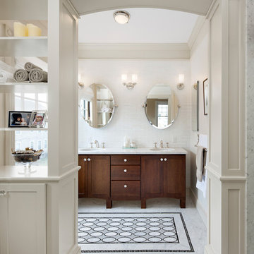
A growing family and the need for more space brought the homeowners of this Arlington home to Feinmann Design|Build. As was common with Victorian homes, a shared bathroom was located centrally on the second floor. Professionals with a young and growing family, our clients had reached a point where they recognized the need for a Master Bathroom for themselves and a more practical family bath for the children. The design challenge for our team was how to find a way to create both a Master Bath and a Family Bath out of the existing Family Bath, Master Bath and adjacent closet. The solution had to consider how to shrink the Family Bath as small as possible, to allow for more room in the master bath, without compromising functionality. Furthermore, the team needed to create a space that had the sensibility and sophistication to match the contemporary Master Suite with the limited space remaining.
Working with the homes original floor plans from 1886, our skilled design team reconfigured the space to achieve the desired solution. The Master Bath design included cabinetry and arched doorways that create the sense of separate and distinct rooms for the toilet, shower and sink area, while maintaining openness to create the feeling of a larger space. The sink cabinetry was designed as a free-standing furniture piece which also enhances the sense of openness and larger scale.
In the new Family Bath, painted walls and woodwork keep the space bright while the Anne Sacks marble mosaic tile pattern referenced throughout creates a continuity of color, form, and scale. Design elements such as the vanity and the mirrors give a more contemporary twist to the period style of these elements of the otherwise small basic box-shaped room thus contributing to the visual interest of the space.
Photos by John Horner
Skysight Photography
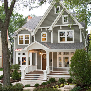
Large farmhouse white two-story wood and board and batten exterior home photo in Other
Large farmhouse white two-story wood and board and batten exterior home photo in Other
Find the right local pro for your project
Example of a trendy kitchen design in New York with flat-panel cabinets, gray cabinets, beige backsplash, stone slab backsplash and stainless steel appliances
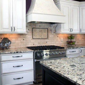
Make no mistake: Heidi’s passion was the basis of the project.
Heidi loves to cook. Given a choice, she might live full-time in the kitchen. She revels in creating culinary delights for family and friends. She lives to entertain.
Her kitchen is her castle. It has to be just right. But, it wasn’t.
For starters, she wanted a different stove. Looking around, other things jumped out. This wasn’t the cooking mecca she envisioned. There were better options available. The ball started rolling.
“I needed a bigger island and a bigger stove,” Heidi said. “That led to ‘We need a bigger kitchen.’”
This wasn’t a new revelation. She had been researching kitchens for some time. She didn’t have all the details, but she had a plan.
“My vision was to have it very clean and simple, but I wanted some artistic flair,” she explained.
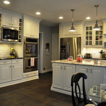
Our task was to design the kitchen her passion demanded. It needed more countertop space. It needed more storage space. It needed functional elements that were big, bold and suited to the needs of an active, passionate user.
So, first things first. We started with a Viking Professional stove and oven that would make Julia Child proud. “I told Kevin (her husband) it’s coming with us if we move,” Heidi said. The custom stove hood was custom-made on site of wood and dual-color Venetian plaster, with a Ventahood exhaust inside. Two corbels accent its artistic look and feel, hewing to Heidi’s desire to make the kitchen both fully functional and pleasing to the eye.
When working at the deluxe Viking unit, Heidi doesn’t have to go far for pots and pans, either. The new island has three large base drawers built into it directly across from the range. She can literally turn around, take what she needs from the drawers, and go right back to work.
We nearly doubled the cabinet space in the kitchen, offering many more storage and organizational options. The drawers are all soft-close, full-extension design. The doors are soft-close. The upper cabinet above the refrigerator has vertical tray dividers, easing the sometimes arduous task of sorting trays and cookie sheets.
Heidi sought an antique look for her cabinetry. To achieve this, we utilized maple cabinets with a mink wash treatment and ancient bronze hardware. We ordered matching panels for the dishwasher and refrigerator doors, creating a seamless look with the cabinetry.
We maintained visual interest by staggering the heights of the different cabinets. Upper cabinets feature double-stack crown moldings. Some cabinets have rain glass inserts to display decorative items within.
Meanwhile, the entire area was brightened with a plethora of new lighting. Eight recessed lights in the 9-foot ceiling illuminate the counter space. Undercabinet lights brighten any food preparation work. In-cabinet lighting spotlights decorative items within glass-door cabinetry. Above-cabinet lights offer just the right ambiance to complete the scene.
Above the island hang two distinctive, eye-catching chandeliers that definitely set off the kitchen’s mix of antiquity and artistry. Heidi simply would not be denied these fixtures, with their oil-rubbed bronze finish and Renaissance-era feel. “Everybody doubted me on them,” she said. “My kitchen’s not that big. I had to have these big, beautiful, glamorous lights. They make the room extra special.”
The island itself took a bit of doing. Ultimately, we created a two-tier structure that provided invaluable food preparation and staging space, plus a dining area that allowed the owners to get rid of a kitchen table that had fallen out of favor. The 120-inch length of the island allows it to meet these dual needs. The island offers plenty of room for people to gather around during parties, with wide open spaces that offer guests ready access to food and drink. The increased seating space offers Heidi’s family a comfortable dining table, with more than enough room for plates and serving dishes. She bought accompanying chairs that blend with the island’s cherry base and the granite countertop’s multicolored brown hues. Two corbels built into posts on the island base give it a sturdy, dignified look.
Heidi selected the white tumbled travertine subway field tile that makes up the backsplash ringing the main kitchen area. During its installation, she personally directed the placement of floral bronze metal accent pieces scattered into the backsplash. She helped create a six-tile decorative mural insert above the expansive range of her new Viking range.
We put in a farmer’s sink with space galore for food, dishes or whatever Heidi desired. The structure and decorative feet of the sink, plus the mounted corbels above, create a furniture resemblance. “I just love my sink,” she said. “It’s big, it’s nice, and my family just loves it because they can help with the dishes and can easily reach into it.”
Space wasn’t necessarily the final frontier in Heidi’s kitchen, but she definitely wanted more. We removed a wall from a pantry, transforming its small dark space into additional cabinets and counter area. Heidi keeps small appliances on the new counter and prepares her daughters’ lunches there.
The rest of the former pantry was converted into a laundry area and new mudroom. By stacking the washer and dryer in the laundry area, space was freed up next to it to add new storage cabinets and a countertop for laundry sorting.
On the other side of the mudroom, we opened and renovated a previous cramped closet for greater functionality and efficiency. By adding shelving and hanging hooks near the top, and storage drawers at the bottom, the variety and quantity of items it can accommodate was multiplied several times. This allowed the closet space to be narrowed by 18 inches, widening an adjacent hallway to the dining room. The top of the drawers doubles as a bench, further enhancing the area’s usability.
The entire mudroom area can be closed off to the kitchen via a pocket door built into the reworked closet. The door has full-view etched glass, allowing light into the mudroom and visibility from the kitchen.
The flooring in the kitchen and new mudroom – formerly engineered hardwood – was replaced with stonefire noce ceramic tile. Its color was chosen to blend in with the family room carpet, now a true neighbor after we took out a wall between the two rooms.
The remainder of the living room wall was converted into two pillars that were custom-built on site and resemble the posts on the island. Removing the wall was a last-minute call by the owners. After living with the results for just a short time, Heidi called it “the best decision ever.” It’s not hard to see why – both the newly-remodeled kitchen and the family room seem larger, with a smarter and more efficient traffic flow.
Accenting the freshly-opened space is a new sliding patio door whose color matches its casings. Its grid design matches those in nearby windows.
The door casings bear the literal touch of the homeowners, who saved thousands of dollars by painting many parts of the project. Heidi personally painted the walls, window casings, base molding, shoe molding, pocket door and mudroom. She applied many coats of Venetian plaster to the stove range hood to create its soft, velvety look.
We saved the homeowners at least $500 by researching the corbels used in the kitchen. After learning the steep price charged for corbels by the cabinet manufacturer, we found an online catalog that offered them for substantially less. Heidi gladly chose from the catalog, and this decorative touch was added at a great savings.
In addition, we worked to keep the project within budget by providing Heidi with material allowances for the countertops, plumbing fixtures and all tiles. She had no problem working within these parameters – a win-win situation for all concerned.
When all is said and done, the greatest achievement is hearing Heidi talk about the joy her new kitchen has brought her, and how it has benefited her family. “It’s exactly what I wanted,” she said, standing in front of the kitchen and spreading her arms wide to take in the expanse. “My vision is this right here.”
For this home we were hired as the Architect only. Siena Custom Builders, Inc. was the Builder.
+/- 5,200 sq. ft. home (Approx. 42' x 110' Footprint)
Cedar Siding - Cabot Solid Stain - Pewter Grey
The Clients contacted Cecil Baker + Partners to reconfigure and remodel the top floor of a prominent Philadelphia high-rise into an urban pied-a-terre. The forty-five story apartment building, overlooking Washington Square Park and its surrounding neighborhoods, provided a modern shell for this truly contemporary renovation. Originally configured as three penthouse units, the 8,700 sf interior, as well as 2,500 square feet of terrace space, was to become a single residence with sweeping views of the city in all directions.
The Client’s mission was to create a city home for collecting and displaying contemporary glass crafts. Their stated desire was to cast an urban home that was, in itself, a gallery. While they enjoy a very vital family life, this home was targeted to their urban activities - entertainment being a central element.
The living areas are designed to be open and to flow into each other, with pockets of secondary functions. At large social events, guests feel free to access all areas of the penthouse, including the master bedroom suite. A main gallery was created in order to house unique, travelling art shows.
Stemming from their desire to entertain, the penthouse was built around the need for elaborate food preparation. Cooking would be visible from several entertainment areas with a “show” kitchen, provided for their renowned chef. Secondary preparation and cleaning facilities were tucked away.
The architects crafted a distinctive residence that is framed around the gallery experience, while also incorporating softer residential moments. Cecil Baker + Partners embraced every element of the new penthouse design beyond those normally associated with an architect’s sphere, from all material selections, furniture selections, furniture design, and art placement.
Barry Halkin and Todd Mason Photography
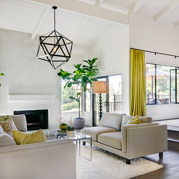
This custom home was thoughtfully designed for a young, active family in the heart of wine country. Designed to address the clients’ desire for indoor / outdoor living, the home embraces its surroundings and is sited to take full advantage of the panoramic views and outdoor entertaining spaces. The interior space of the three bedroom, 2.5 bath home is divided into three distinct zones: a public living area; a two bedroom suite; and a separate master suite, which includes an art studio. Casually relaxed, yet startlingly original, the structure gains impact through the sometimes surprising choice of materials, which include field stone, integral concrete floors, glass walls, Honduras mahogany veneers and a copper clad central fireplace. This house showcases the best of modern design while becoming an integral part of its spectacular setting.
Living room - 1950s living room idea in Sacramento with a ribbon fireplace
We joined forces with JHL Design’s Holly Freres and Liz Morgan to transform a dark and dated Pearl District penthouse into an elegant and timeless home. The space was designed with European metropolitan interiors in mind, giving it the “Parisian Modern” look the clients desired.
The team replaced cherry casework and red and ochre walls with clean white and neutral shades to brighten the space. The new applied wood paneling serves as an interesting architectural detail while modern fixtures and furniture keep it from feeling too traditional. The project also included new casework, new wood floors and carpet, new terrazzo countertops, new vanity and plumbing fixtures, and reworked cabinetry in the kitchen and pantry.
Photos by Haris Kenjar.
Make no mistake: Heidi’s passion was the basis of the project.
Heidi loves to cook. Given a choice, she might live full-time in the kitchen. She revels in creating culinary delights for family and friends. She lives to entertain.
Her kitchen is her castle. It has to be just right. But, it wasn’t.
For starters, she wanted a different stove. Looking around, other things jumped out. This wasn’t the cooking mecca she envisioned. There were better options available. The ball started rolling.
“I needed a bigger island and a bigger stove,” Heidi said. “That led to ‘We need a bigger kitchen.’”
This wasn’t a new revelation. She had been researching kitchens for some time. She didn’t have all the details, but she had a plan.
“My vision was to have it very clean and simple, but I wanted some artistic flair,” she explained.
Our task was to design the kitchen her passion demanded. It needed more countertop space. It needed more storage space. It needed functional elements that were big, bold and suited to the needs of an active, passionate user.
So, first things first. We started with a Viking Professional stove and oven that would make Julia Child proud. “I told Kevin (her husband) it’s coming with us if we move,” Heidi said. The custom stove hood was custom-made on site of wood and dual-color Venetian plaster, with a Ventahood exhaust inside. Two corbels accent its artistic look and feel, hewing to Heidi’s desire to make the kitchen both fully functional and pleasing to the eye.
When working at the deluxe Viking unit, Heidi doesn’t have to go far for pots and pans, either. The new island has three large base drawers built into it directly across from the range. She can literally turn around, take what she needs from the drawers, and go right back to work.
We nearly doubled the cabinet space in the kitchen, offering many more storage and organizational options. The drawers are all soft-close, full-extension design. The doors are soft-close. The upper cabinet above the refrigerator has vertical tray dividers, easing the sometimes arduous task of sorting trays and cookie sheets.
Heidi sought an antique look for her cabinetry. To achieve this, we utilized maple cabinets with a mink wash treatment and ancient bronze hardware. We ordered matching panels for the dishwasher and refrigerator doors, creating a seamless look with the cabinetry.
We maintained visual interest by staggering the heights of the different cabinets. Upper cabinets feature double-stack crown moldings. Some cabinets have rain glass inserts to display decorative items within.
Meanwhile, the entire area was brightened with a plethora of new lighting. Eight recessed lights in the 9-foot ceiling illuminate the counter space. Undercabinet lights brighten any food preparation work. In-cabinet lighting spotlights decorative items within glass-door cabinetry. Above-cabinet lights offer just the right ambiance to complete the scene.
Above the island hang two distinctive, eye-catching chandeliers that definitely set off the kitchen’s mix of antiquity and artistry. Heidi simply would not be denied these fixtures, with their oil-rubbed bronze finish and Renaissance-era feel. “Everybody doubted me on them,” she said. “My kitchen’s not that big. I had to have these big, beautiful, glamorous lights. They make the room extra special.”
The island itself took a bit of doing. Ultimately, we created a two-tier structure that provided invaluable food preparation and staging space, plus a dining area that allowed the owners to get rid of a kitchen table that had fallen out of favor. The 120-inch length of the island allows it to meet these dual needs. The island offers plenty of room for people to gather around during parties, with wide open spaces that offer guests ready access to food and drink. The increased seating space offers Heidi’s family a comfortable dining table, with more than enough room for plates and serving dishes. She bought accompanying chairs that blend with the island’s cherry base and the granite countertop’s multicolored brown hues. Two corbels built into posts on the island base give it a sturdy, dignified look.
Heidi selected the white tumbled travertine subway field tile that makes up the backsplash ringing the main kitchen area. During its installation, she personally directed the placement of floral bronze metal accent pieces scattered into the backsplash. She helped create a six-tile decorative mural insert above the expansive range of her new Viking range.
We put in a farmer’s sink with space galore for food, dishes or whatever Heidi desired. The structure and decorative feet of the sink, plus the mounted corbels above, create a furniture resemblance. “I just love my sink,” she said. “It’s big, it’s nice, and my family just loves it because they can help with the dishes and can easily reach into it.”
Space wasn’t necessarily the final frontier in Heidi’s kitchen, but she definitely wanted more. We removed a wall from a pantry, transforming its small dark space into additional cabinets and counter area. Heidi keeps small appliances on the new counter and prepares her daughters’ lunches there.
The rest of the former pantry was converted into a laundry area and new mudroom. By stacking the washer and dryer in the laundry area, space was freed up next to it to add new storage cabinets and a countertop for laundry sorting.
On the other side of the mudroom, we opened and renovated a previous cramped closet for greater functionality and efficiency. By adding shelving and hanging hooks near the top, and storage drawers at the bottom, the variety and quantity of items it can accommodate was multiplied several times. This allowed the closet space to be narrowed by 18 inches, widening an adjacent hallway to the dining room. The top of the drawers doubles as a bench, further enhancing the area’s usability.
The entire mudroom area can be closed off to the kitchen via a pocket door built into the reworked closet. The door has full-view etched glass, allowing light into the mudroom and visibility from the kitchen.
The flooring in the kitchen and new mudroom – formerly engineered hardwood – was replaced with stonefire noce ceramic tile. Its color was chosen to blend in with the family room carpet, now a true neighbor after we took out a wall between the two rooms.
The remainder of the living room wall was converted into two pillars that were custom-built on site and resemble the posts on the island. Removing the wall was a last-minute call by the owners. After living with the results for just a short time, Heidi called it “the best decision ever.” It’s not hard to see why – both the newly-remodeled kitchen and the family room seem larger, with a smarter and more efficient traffic flow.
Accenting the freshly-opened space is a new sliding patio door whose color matches its casings. Its grid design matches those in nearby windows.
The door casings bear the literal touch of the homeowners, who saved thousands of dollars by painting many parts of the project. Heidi personally painted the walls, window casings, base molding, shoe molding, pocket door and mudroom. She applied many coats of Venetian plaster to the stove range hood to create its soft, velvety look.
We saved the homeowners at least $500 by researching the corbels used in the kitchen. After learning the steep price charged for corbels by the cabinet manufacturer, we found an online catalog that offered them for substantially less. Heidi gladly chose from the catalog, and this decorative touch was added at a great savings.
In addition, we worked to keep the project within budget by providing Heidi with material allowances for the countertops, plumbing fixtures and all tiles. She had no problem working within these parameters – a win-win situation for all concerned.
When all is said and done, the greatest achievement is hearing Heidi talk about the joy her new kitchen has brought her, and how it has benefited her family. “It’s exactly what I wanted,” she said, standing in front of the kitchen and spreading her arms wide to take in the expanse. “My vision is this right here.”
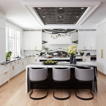
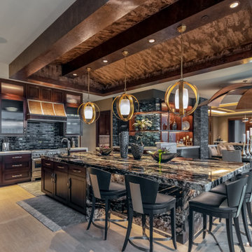
A DEANE client returned in 2022 for an update to their kitchen remodel project from 2006. This incredible transformation was driven by the desire to create a glamorous space for both cooking and entertaining. The frameless cabinetry with a mitered door and satin brass hardware is deliberately understated to highlight the marble. Dramatic and bold, the continuous, book-matched Panda White marble was used throughout the open footprint, including the fireplace surround, to give the space a cohesive feel. The custom, tapered hood, also covered in Panda White is a commanding centerpiece. The expansive space allowed for two waterfall-edge islands with mitered countertops - one for cooking with black-stained oak cabinets for storage and a prep sink, and the second to seat 6 for dining, which replaced the original informal eating area. A tray ceiling with wallpaper detailing elegantly frames both together.
No detail was overlooked in the design process. A coffee station with retractable doors and beverage drawers was situated to graciously welcome guests. A Wolf 60” range, walnut interiors, customized drawer inserts, unlacquered brass finishes and a Galley Workstation elevate this kitchen into a truly sophisticated space.
Sponsored
Over 300 locations across the U.S.
Schedule Your Free Consultation
Ferguson Bath, Kitchen & Lighting Gallery
Ferguson Bath, Kitchen & Lighting Gallery
This project began with an entire penthouse floor of open raw space which the clients had the opportunity to section off the piece that suited them the best for their needs and desires. As the design firm on the space, LK Design was intricately involved in determining the borders of the space and the way the floor plan would be laid out. Taking advantage of the southwest corner of the floor, we were able to incorporate three large balconies, tremendous views, excellent light and a layout that was open and spacious. There is a large master suite with two large dressing rooms/closets, two additional bedrooms, one and a half additional bathrooms, an office space, hearth room and media room, as well as the large kitchen with oversized island, butler's pantry and large open living room. The clients are not traditional in their taste at all, but going completely modern with simple finishes and furnishings was not their style either. What was produced is a very contemporary space with a lot of visual excitement. Every room has its own distinct aura and yet the whole space flows seamlessly. From the arched cloud structure that floats over the dining room table to the cathedral type ceiling box over the kitchen island to the barrel ceiling in the master bedroom, LK Design created many features that are unique and help define each space. At the same time, the open living space is tied together with stone columns and built-in cabinetry which are repeated throughout that space. Comfort, luxury and beauty were the key factors in selecting furnishings for the clients. The goal was to provide furniture that complimented the space without fighting it.
As a conceptual urban infill project, the Wexley is designed for a narrow lot in the center of a city block. The 26’x48’ floor plan is divided into thirds from front to back and from left to right. In plan, the left third is reserved for circulation spaces and is reflected in elevation by a monolithic block wall in three shades of gray. Punching through this block wall, in three distinct parts, are the main levels windows for the stair tower, bathroom, and patio. The right two-thirds of the main level are reserved for the living room, kitchen, and dining room. At 16’ long, front to back, these three rooms align perfectly with the three-part block wall façade. It’s this interplay between plan and elevation that creates cohesion between each façade, no matter where it’s viewed. Given that this project would have neighbors on either side, great care was taken in crafting desirable vistas for the living, dining, and master bedroom. Upstairs, with a view to the street, the master bedroom has a pair of closets and a skillfully planned bathroom complete with soaker tub and separate tiled shower. Main level cabinetry and built-ins serve as dividing elements between rooms and framing elements for views outside.
Architect: Visbeen Architects
Builder: J. Peterson Homes
Photographer: Ashley Avila Photography
This custom home was thoughtfully designed for a young, active family in the heart of wine country. Designed to address the clients’ desire for indoor / outdoor living, the home embraces its surroundings and is sited to take full advantage of the panoramic views and outdoor entertaining spaces. The interior space of the three bedroom, 2.5 bath home is divided into three distinct zones: a public living area; a two bedroom suite; and a separate master suite, which includes an art studio. Casually relaxed, yet startlingly original, the structure gains impact through the sometimes surprising choice of materials, which include field stone, integral concrete floors, glass walls, Honduras mahogany veneers and a copper clad central fireplace. This house showcases the best of modern design while becoming an integral part of its spectacular setting.
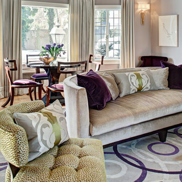
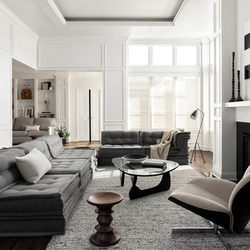
These clients, an entrepreneur and a physician with three kids, chose their Tudor home for the neighborhood, though it didn’t match their modern-transitional taste. They asked us to help them transform their into a place to play and entertain with clean lines and lively color, namely her favorites: bold purple and refreshing apple green.
Their previous layout had a stifled flow with a large sectional sofa that dominated the room, and an awkward assortment of furniture that they wanted to discard with the exception of a vintage stone dining table from her mother. The living room served as a pass through to both the family and dining rooms. The client wanted the living room to be less like a glorified hallway and become a destination. Our solution was to unify the design of this living space with the related rooms by using repetition of color and by creating usable areas for family game night, entertaining and small get togethers.
The generous proportions of the room enabled us to create three functional spaces: a game table with seating for four and adjacent pull up seating for family play; a seating area at the fireplace that accommodates a large group or small conversation; and seating at the front window that provides a view of the street (not seen in the photograph). The space went from awkward to one that is used daily for family activities and socializing.
As they were not interested in touching the existing architecture, transformations were made using new light fixtures, paint, distinctive furniture and art. The client had a strict budget but desired the highly styled look of couture design pieces with curves and movement. We accomplished this look by pairing a few distinctive couture items with inspired pieces that are budget balancers.
We combined the couture game table with more affordable chairs inspired by a classic klismos style, as one might pair Louboutins with stylish jeans. Right- and left-arm chairs with an interesting castle-like fret base detail flank windows.
To help the clients better understand the use of the color scheme, we keyed the floor plan to show how the greens and purples traveled in a balanced manner around the room and throughout the adjacent dining and family rooms. We paired apple green accents with layered hues of lavender, orchid and aubergine. Neutral taupe and ivory tones ground the bold colors.
The custom rug in ivory, aubergine, pale taupe, grey-lavender was inspired by a picture the client found, but we dramatically increased the scale of the pattern in proportion to our room size. This curvy movement is echoed in the sophisticated shapes of the furniture throughout the redesigned room—from the curved sofas to the circular cutouts in the cube end table.
At the windows the solid sateen panels with contrasting aubergine banding have the hand of silk, and are also cost conscious, creating room in the budget for the stunning custom pillows in Italian embroidered silk.
The distinctive color and shapes throughout provide the whimsy the clients' desired with the function they needed, creating an inviting living room that is now a daily destination.
Designed by KBK Interior Design
www.KBKInteriorDesign.com
Photo by Wing Wong
Showing Results for "Distinctive Desires"
Sponsored
Over 300 locations across the U.S.
Schedule Your Free Consultation
Ferguson Bath, Kitchen & Lighting Gallery
Ferguson Bath, Kitchen & Lighting Gallery
Photo - Jessica Glynn Photography
Example of a mid-sized transitional enclosed light wood floor and beige floor living room design in New York with multicolored walls, a standard fireplace, a stone fireplace and a wall-mounted tv
Example of a mid-sized transitional enclosed light wood floor and beige floor living room design in New York with multicolored walls, a standard fireplace, a stone fireplace and a wall-mounted tv
The Clients contacted Cecil Baker + Partners to reconfigure and remodel the top floor of a prominent Philadelphia high-rise into an urban pied-a-terre. The forty-five story apartment building, overlooking Washington Square Park and its surrounding neighborhoods, provided a modern shell for this truly contemporary renovation. Originally configured as three penthouse units, the 8,700 sf interior, as well as 2,500 square feet of terrace space, was to become a single residence with sweeping views of the city in all directions.
The Client’s mission was to create a city home for collecting and displaying contemporary glass crafts. Their stated desire was to cast an urban home that was, in itself, a gallery. While they enjoy a very vital family life, this home was targeted to their urban activities - entertainment being a central element.
The living areas are designed to be open and to flow into each other, with pockets of secondary functions. At large social events, guests feel free to access all areas of the penthouse, including the master bedroom suite. A main gallery was created in order to house unique, travelling art shows.
Stemming from their desire to entertain, the penthouse was built around the need for elaborate food preparation. Cooking would be visible from several entertainment areas with a “show” kitchen, provided for their renowned chef. Secondary preparation and cleaning facilities were tucked away.
The architects crafted a distinctive residence that is framed around the gallery experience, while also incorporating softer residential moments. Cecil Baker + Partners embraced every element of the new penthouse design beyond those normally associated with an architect’s sphere, from all material selections, furniture selections, furniture design, and art placement.
Barry Halkin and Todd Mason Photography
The Porch House located just west of Springfield, Missouri, presented Hufft Projects with a unique challenge. The clients desired a residence that referenced the traditional forms of farmhouses but also spoke to something distinctly modern. A hybrid building emerged and the Porch House greets visitors with its namesake – a large east and south facing ten foot cantilevering canopy that provides dramatic cover.
The residence also commands a view of the expansive river valley to the south. L-shaped in plan, the house’s master suite is located in the western leg and is isolated away from other functions allowing privacy. The living room, dining room, and kitchen anchor the southern, more traditional wing of the house with its spacious vaulted ceilings. A chimney punctuates this area and features a granite clad fireplace on the interior and an exterior fireplace expressing split face concrete block. Photo Credit: Mike Sinclair
1