


Search results for "Transported" in Home Design Ideas
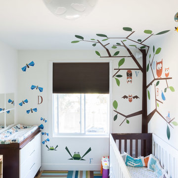
Photo: Hoi Ning Wong © 2014 Houzz
Nursery - small contemporary gender-neutral nursery idea in San Francisco with multicolored walls
Nursery - small contemporary gender-neutral nursery idea in San Francisco with multicolored walls
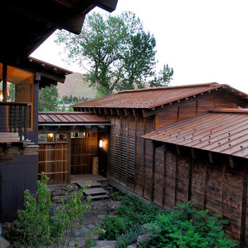
Native and drought tolerant plants combined with sculpted pines and an ornamental flowering tree lead through the entry gateway and introduce the intimate entry courtyard.
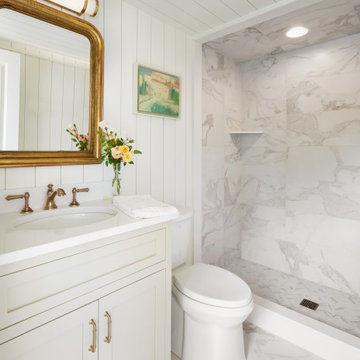
Tiny House bathroom
Photography: Gieves Anderson
Noble Johnson Architects was honored to partner with Huseby Homes to design a Tiny House which was displayed at Nashville botanical garden, Cheekwood, for two weeks in the spring of 2021. It was then auctioned off to benefit the Swan Ball. Although the Tiny House is only 383 square feet, the vaulted space creates an incredibly inviting volume. Its natural light, high end appliances and luxury lighting create a welcoming space.
Find the right local pro for your project
The Entry and Parking Courtyard : The approach to the front of the house leads up the driveway into a spacious cobbled courtyard framed by a series of stone walls , which in turn are surrounded by plantings. The stone walls also allow the formation of a secondary room for entry into the garages. The walls extend the architecture of the house into the garden allowing the house to be grounded to the site and connect to the greater landscape.
Photo credit: ROGER FOLEY
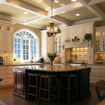
Features: Custom Wood Hood with Pull Out Spice Racks,
Mantel, Motif, and Corbels; Varied Height Cabinetry; Art for
Everyday Turned Posts # F-1; Art for Everyday Corbels
# CBL-TCY1, Beadboard; Wood Mullion and Clear
Beveled Glass Doors; Bar Area; Double Panel Doors;
Coffered Ceiling; Enhancement Window; Art for
Everyday Mantels # MTL-A1 and # MTL-A0; Desk Area
Cabinets- Main Kitchen: Honey Brook Custom in Maple Wood
with Seapearl Paint and Glaze; Voyager Full Overlay Door
Style with C-2 Lip
Cabinets- Island & Bar Area: Honey Brook Custom in Cherry
Wood with Colonial Finish; Voyager Full Overlay Door
Style with C-2 Lip
Countertops- Main Kitchen: Golden Beach Granite with
Double Pencil Edge
Countertops- Island and Bar Area: Golden Beach Granite
with Waterfall Edge
Kitchen Designer: Tammy Clark
Photograph: Kelly Keul Duer
Customer Photo of Transportation Fascination Wall Decal Set by My Wonderful Walls
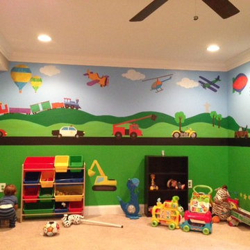
Huge trendy boy kids' room photo in Other with green walls
Huge trendy boy kids' room photo in Other with green walls
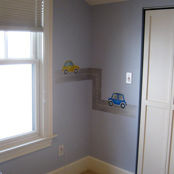
Wall mural for nursery in transportation theme room.
Example of a classic kids' room design in St Louis
Example of a classic kids' room design in St Louis

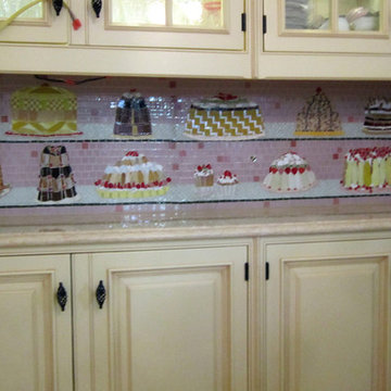
A mosaic backsplash of cakes and fancy pastries. This mosaic is like a view into the front window of a French pâtisserie! With a couple of bumblebees thrown in for good measure. Photo credit, C. Fisher
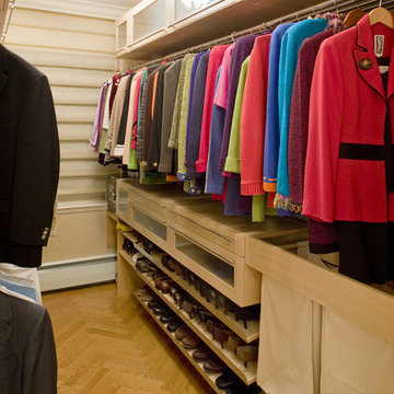
New York Classically Metro Modern Apartment
Elegant walk-in closet photo in New York
Elegant walk-in closet photo in New York
Regan Wood Photography
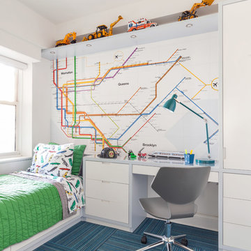
Example of a trendy carpeted and blue floor kids' bedroom design in New York with white walls
Example of a trendy carpeted and blue floor kids' bedroom design in New York with white walls
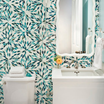
Bathroom - small transitional bathroom idea in Seattle with white cabinets, a two-piece toilet and an undermount sink

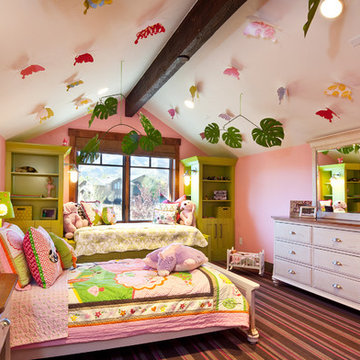
Inspiration for an eclectic girl carpeted and multicolored floor kids' room remodel in Salt Lake City with pink walls
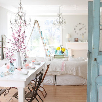
Dining room - shabby-chic style medium tone wood floor dining room idea in Other with gray walls
The Bentley Collection is inspired by the Campaign style of the 18th and 19th centuries. The original Campaign designs were crafted for the gentlemen officer class of the British army. With sea voyages that typically lasted over three months and journeys that ranged from tropical jungles to scorching deserts, ease of transport and assembly were essential considerations in the design. The officers, accustomed to the best, required their traveling furniture in high style. Thus, the living room and bedroom suites that graced their tents would also be perfectly suitable in a fashionable London townhouse. Campaign furniture helped make life “under canvas” feel like home. In a modern day sense, this collection can do the same for you. Of course, you can’t fold the Bentley pieces for easy transport, but the concept remains the same: functional details help define successful style.
Arhaus Furniture
Showing Results for "Transported"
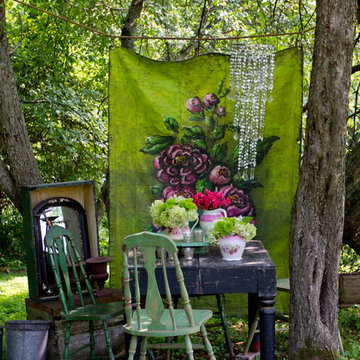
Photo: Rikki Snyder © 2014 Houzz
Photo of a shabby-chic style shade landscaping in New York.
Photo of a shabby-chic style shade landscaping in New York.
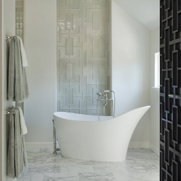
Photo Credit: David Duncan Livingston
Example of a trendy freestanding bathtub design in San Francisco
Example of a trendy freestanding bathtub design in San Francisco
Photo by: Rikki Snyder © 2012 Houzz
Photo by: Rikki Snyder © 2012 Houzz
http://www.houzz.com/ideabooks/4018714/list/My-Houzz--An-Antique-Cape-Cod-House-Explodes-With-Color
1