Designers Share Their Favorite Light Gray Paints
These versatile neutrals can help create a range of moods in any room
Whether their designs are surrounded by Lake Minnetonka’s mist, San Francisco’s fog, Toronto’s ice, L.A.’s glare, Denver’s snowdrifts or Atlanta’s steamy air, design pros seeking fresh neutral paints are looking to light gray. “Grays can be so transparent and versatile that they can pair with just about anything,” says interior designer Crystal Russell. Here’s a look at 10 light gray paints design pros love and why.
2. Silver Tradition by Behr
Designer and owner of Earnest Home Erin Souder knew she wanted something very neutral for her 100-year-old Ohio farmhouse. “It didn’t cast blue or yellow,” she says. “I find that very important in an older house where things tend to look dingy if they are yellow cast.”
Designer and owner of Earnest Home Erin Souder knew she wanted something very neutral for her 100-year-old Ohio farmhouse. “It didn’t cast blue or yellow,” she says. “I find that very important in an older house where things tend to look dingy if they are yellow cast.”
3. Revere Pewter by Benjamin Moore
“Because of the fog in San Francisco, gray paint can sometimes look blue, so we need a warmer gray,” interior designer Tineke Triggs says. “This one is my go-to color.” Here it provides a great backdrop for bold colors in the painting on the wall and textiles in the room.
Browse furniture and accessories in the Houzz Shop
Interior designer Lauren Davenport is based in not-so-foggy Atlanta, but she also loves the depth and versatility of this neutral shade. “Revere Pewter plays well with a myriad of colors yet can stand on its own as a neutral backdrop,” she says. “The color can read light gray, brown, green and sometimes blue depending on the lighting and fabrics in the room.”
4. Paper White by Benjamin Moore
“This is a beautiful white that has gray and blue undertones,” interior designer Emily Griffin says. “Depending on how it’s lit, it reveals stunning colors.” In this north Toronto entryway, it reads as gray with the slightest hint of periwinkle to it.
“This is a beautiful white that has gray and blue undertones,” interior designer Emily Griffin says. “Depending on how it’s lit, it reveals stunning colors.” In this north Toronto entryway, it reads as gray with the slightest hint of periwinkle to it.
5. Repose Gray by Sherwin-Williams
Interior designer Carl Mattison specializes in taking dilapidated historic Atlanta homes and breathing new life into them. A range of warm and cool grays play a big role in his aesthetic, which appeals to many buyers.
“Warm grays tend to fall on the scale of less blue and a bit more taupe at times. It also could be said they are less ‘silvery,’” the designer says. “Repose Gray is very light in person. It pairs well with brighter white trims and a buttery Chardonnay.” Does he mean paint colors or wines? You be the judge.
6. Knitting Needles by Sherwin-Williams
Mattison also finds Knitting Needles works with all sorts of colors, materials, styles and light. “This is very similar to Repose Gray but a little cooler in tone,” he says. “It’s a great neutral gray that pretty much goes with everything. It’s the little black dress of the paint world.”
Find a painter near you
7. Gray Wisp by Benjamin Moore
“An easy color to live with,” interior designer Jane Haley says of this hue. “It is a great color because it is neutral gray, it’s cool and it will take on greens or blues if put with those colors.” Those properties infused this South Padre Island, Texas, home with subtle coastal color.
“An easy color to live with,” interior designer Jane Haley says of this hue. “It is a great color because it is neutral gray, it’s cool and it will take on greens or blues if put with those colors.” Those properties infused this South Padre Island, Texas, home with subtle coastal color.
8. Mindful Gray by Sherwin-Williams
One color came up a lot when I was asking designers for their go-to light grays. “This is a warm gray that reads cooler when painted,” Clark says. “It easily balances out other warm colors in a space. For example, if you have true brown or red-yellow-brown-tone flooring, Mindful Gray is a smart tool to counter those tones.” The designer recommends balancing it with both sides of the warm-cool spectrum for the best look.
One color came up a lot when I was asking designers for their go-to light grays. “This is a warm gray that reads cooler when painted,” Clark says. “It easily balances out other warm colors in a space. For example, if you have true brown or red-yellow-brown-tone flooring, Mindful Gray is a smart tool to counter those tones.” The designer recommends balancing it with both sides of the warm-cool spectrum for the best look.
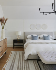
A good example of the warm-cool balance Clark mentions appears in this boho-meets-nautical bedroom. Mindful Gray pulls together warm tans and cool blues.
Interior designer Jane Haley is also a big fan of Mindful Gray. “My favorite neutral gray that still has warmth is Mindful Gray, which I have used in 25%, 50% and 100% for walls and ceilings. It also paints up beautifully in an oil-based enamel for cabinets,” she says.
Interior designer Jane Haley is also a big fan of Mindful Gray. “My favorite neutral gray that still has warmth is Mindful Gray, which I have used in 25%, 50% and 100% for walls and ceilings. It also paints up beautifully in an oil-based enamel for cabinets,” she says.
9. Gray Owl by Benjamin Moore
For this bathroom in Denver, interior designer Crystal Russell knew exactly the light gray she needed. “This particular gray was very soft and modern, with just enough cool gray, but with a subtle green undertone,” she says. “The color just reads very ‘quiet,’ and you can pick up more or less green during different hours of the day. It’s truly a perfect soothing bathroom color.”
See more of this bathroom
10. Graytint by Benjamin Moore
Los Angeles interior designer Shannon Ggem used this almost imperceptible gray on the walls in this bathroom. “I love Graytint because it’s like that backlit gray light on an overcast day,” she says.
Los Angeles interior designer Shannon Ggem used this almost imperceptible gray on the walls in this bathroom. “I love Graytint because it’s like that backlit gray light on an overcast day,” she says.
Wall paint: Coventry Gray, Benjamin Moore
Your turn: Have you found a light gray that you love? Please share your favorite light gray paint colors in the Comments.
More on Houzz
What’s Your Neutral: Beige or Gray?
Read more about decorating with gray
Find a pro for your next project
Shop for home products
Your turn: Have you found a light gray that you love? Please share your favorite light gray paint colors in the Comments.
More on Houzz
What’s Your Neutral: Beige or Gray?
Read more about decorating with gray
Find a pro for your next project
Shop for home products





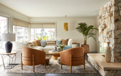


Paint names can be deceiving, interior designer Greg Clark says. “This is a warmer gray, or greige,” he says. “It gives warmth to a room without being too warm, and has a great contrast with white trim. And depending on the lighting it can appear cooler.” The hue provides just the right foreground for the view of Minnesota’s Lake Minnetonka outside these windows.
Find an interior designer on Houzz