


Search results for "Bigger quantities" in Home Design Ideas
Photography by Emily Payne
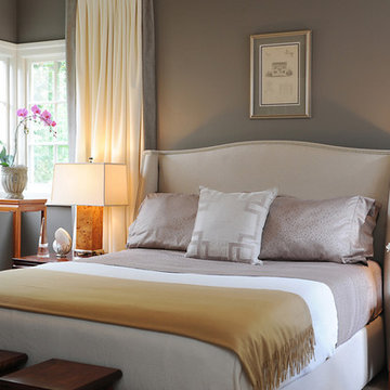
Elegant master bedroom photo in San Francisco with gray walls
Elegant master bedroom photo in San Francisco with gray walls

Make no mistake: Heidi’s passion was the basis of the project.
Heidi loves to cook. Given a choice, she might live full-time in the kitchen. She revels in creating culinary delights for family and friends. She lives to entertain.
Her kitchen is her castle. It has to be just right. But, it wasn’t.
For starters, she wanted a different stove. Looking around, other things jumped out. This wasn’t the cooking mecca she envisioned. There were better options available. The ball started rolling.
“I needed a bigger island and a bigger stove,” Heidi said. “That led to ‘We need a bigger kitchen.’”
This wasn’t a new revelation. She had been researching kitchens for some time. She didn’t have all the details, but she had a plan.
“My vision was to have it very clean and simple, but I wanted some artistic flair,” she explained.
Our task was to design the kitchen her passion demanded. It needed more countertop space. It needed more storage space. It needed functional elements that were big, bold and suited to the needs of an active, passionate user.
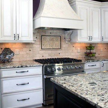
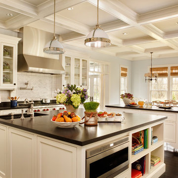
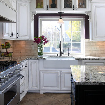
So, first things first. We started with a Viking Professional stove and oven that would make Julia Child proud. “I told Kevin (her husband) it’s coming with us if we move,” Heidi said. The custom stove hood was custom-made on site of wood and dual-color Venetian plaster, with a Ventahood exhaust inside. Two corbels accent its artistic look and feel, hewing to Heidi’s desire to make the kitchen both fully functional and pleasing to the eye.
When working at the deluxe Viking unit, Heidi doesn’t have to go far for pots and pans, either. The new island has three large base drawers built into it directly across from the range. She can literally turn around, take what she needs from the drawers, and go right back to work.
We nearly doubled the cabinet space in the kitchen, offering many more storage and organizational options. The drawers are all soft-close, full-extension design. The doors are soft-close. The upper cabinet above the refrigerator has vertical tray dividers, easing the sometimes arduous task of sorting trays and cookie sheets.
Heidi sought an antique look for her cabinetry. To achieve this, we utilized maple cabinets with a mink wash treatment and ancient bronze hardware. We ordered matching panels for the dishwasher and refrigerator doors, creating a seamless look with the cabinetry.
We maintained visual interest by staggering the heights of the different cabinets. Upper cabinets feature double-stack crown moldings. Some cabinets have rain glass inserts to display decorative items within.
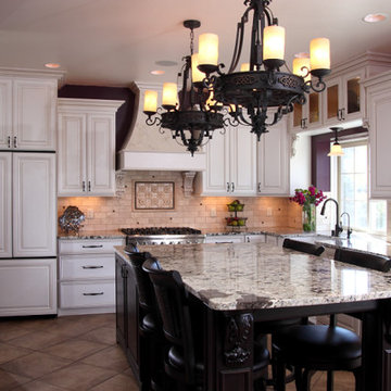
Meanwhile, the entire area was brightened with a plethora of new lighting. Eight recessed lights in the 9-foot ceiling illuminate the counter space. Undercabinet lights brighten any food preparation work. In-cabinet lighting spotlights decorative items within glass-door cabinetry. Above-cabinet lights offer just the right ambiance to complete the scene.
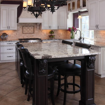
Above the island hang two distinctive, eye-catching chandeliers that definitely set off the kitchen’s mix of antiquity and artistry. Heidi simply would not be denied these fixtures, with their oil-rubbed bronze finish and Renaissance-era feel. “Everybody doubted me on them,” she said. “My kitchen’s not that big. I had to have these big, beautiful, glamorous lights. They make the room extra special.”
The island itself took a bit of doing. Ultimately, we created a two-tier structure that provided invaluable food preparation and staging space, plus a dining area that allowed the owners to get rid of a kitchen table that had fallen out of favor. The 120-inch length of the island allows it to meet these dual needs. The island offers plenty of room for people to gather around during parties, with wide open spaces that offer guests ready access to food and drink. The increased seating space offers Heidi’s family a comfortable dining table, with more than enough room for plates and serving dishes. She bought accompanying chairs that blend with the island’s cherry base and the granite countertop’s multicolored brown hues. Two corbels built into posts on the island base give it a sturdy, dignified look.
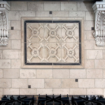
Heidi selected the white tumbled travertine subway field tile that makes up the backsplash ringing the main kitchen area. During its installation, she personally directed the placement of floral bronze metal accent pieces scattered into the backsplash. She helped create a six-tile decorative mural insert above the expansive range of her new Viking range.
We put in a farmer’s sink with space galore for food, dishes or whatever Heidi desired. The structure and decorative feet of the sink, plus the mounted corbels above, create a furniture resemblance. “I just love my sink,” she said. “It’s big, it’s nice, and my family just loves it because they can help with the dishes and can easily reach into it.”
Space wasn’t necessarily the final frontier in Heidi’s kitchen, but she definitely wanted more. We removed a wall from a pantry, transforming its small dark space into additional cabinets and counter area. Heidi keeps small appliances on the new counter and prepares her daughters’ lunches there.
The rest of the former pantry was converted into a laundry area and new mudroom. By stacking the washer and dryer in the laundry area, space was freed up next to it to add new storage cabinets and a countertop for laundry sorting.
On the other side of the mudroom, we opened and renovated a previous cramped closet for greater functionality and efficiency. By adding shelving and hanging hooks near the top, and storage drawers at the bottom, the variety and quantity of items it can accommodate was multiplied several times. This allowed the closet space to be narrowed by 18 inches, widening an adjacent hallway to the dining room. The top of the drawers doubles as a bench, further enhancing the area’s usability.
The entire mudroom area can be closed off to the kitchen via a pocket door built into the reworked closet. The door has full-view etched glass, allowing light into the mudroom and visibility from the kitchen.
The flooring in the kitchen and new mudroom – formerly engineered hardwood – was replaced with stonefire noce ceramic tile. Its color was chosen to blend in with the family room carpet, now a true neighbor after we took out a wall between the two rooms.
The remainder of the living room wall was converted into two pillars that were custom-built on site and resemble the posts on the island. Removing the wall was a last-minute call by the owners. After living with the results for just a short time, Heidi called it “the best decision ever.” It’s not hard to see why – both the newly-remodeled kitchen and the family room seem larger, with a smarter and more efficient traffic flow.
Accenting the freshly-opened space is a new sliding patio door whose color matches its casings. Its grid design matches those in nearby windows.
The door casings bear the literal touch of the homeowners, who saved thousands of dollars by painting many parts of the project. Heidi personally painted the walls, window casings, base molding, shoe molding, pocket door and mudroom. She applied many coats of Venetian plaster to the stove range hood to create its soft, velvety look.
We saved the homeowners at least $500 by researching the corbels used in the kitchen. After learning the steep price charged for corbels by the cabinet manufacturer, we found an online catalog that offered them for substantially less. Heidi gladly chose from the catalog, and this decorative touch was added at a great savings.
In addition, we worked to keep the project within budget by providing Heidi with material allowances for the countertops, plumbing fixtures and all tiles. She had no problem working within these parameters – a win-win situation for all concerned.
When all is said and done, the greatest achievement is hearing Heidi talk about the joy her new kitchen has brought her, and how it has benefited her family. “It’s exactly what I wanted,” she said, standing in front of the kitchen and spreading her arms wide to take in the expanse. “My vision is this right here.”
Find the right local pro for your project
This project involved reworking the entire first floor of an existing two story home. Dark spaces interrupted by a confusing and awkward circulation pattern have been replaced with light filled spaces and a rational path from room to room. It's a lesson that quality of space trumps quantity of space every time.
Visit http://tinyurl.com/3hyhqb3 to see more pictures of this project including some before photos.
Photography by Tony May
An open floor plan between the Kitchen, Dining, and Living areas is thoughtfully divided by sliding barn doors, providing both visual and acoustic separation. The rear screened porch and grilling area located off the Kitchen become the focal point for outdoor entertaining and relaxing. Custom cabinetry and millwork throughout are a testament to the talents of the builder, with the project proving how design-build relationships between builder and architect can thrive given similar design mindsets and passions for the craft of homebuilding.
Make no mistake: Heidi’s passion was the basis of the project.
Heidi loves to cook. Given a choice, she might live full-time in the kitchen. She revels in creating culinary delights for family and friends. She lives to entertain.
Her kitchen is her castle. It has to be just right. But, it wasn’t.
For starters, she wanted a different stove. Looking around, other things jumped out. This wasn’t the cooking mecca she envisioned. There were better options available. The ball started rolling.
“I needed a bigger island and a bigger stove,” Heidi said. “That led to ‘We need a bigger kitchen.’”
This wasn’t a new revelation. She had been researching kitchens for some time. She didn’t have all the details, but she had a plan.
“My vision was to have it very clean and simple, but I wanted some artistic flair,” she explained.
Our task was to design the kitchen her passion demanded. It needed more countertop space. It needed more storage space. It needed functional elements that were big, bold and suited to the needs of an active, passionate user.
So, first things first. We started with a Viking Professional stove and oven that would make Julia Child proud. “I told Kevin (her husband) it’s coming with us if we move,” Heidi said. The custom stove hood was custom-made on site of wood and dual-color Venetian plaster, with a Ventahood exhaust inside. Two corbels accent its artistic look and feel, hewing to Heidi’s desire to make the kitchen both fully functional and pleasing to the eye.
When working at the deluxe Viking unit, Heidi doesn’t have to go far for pots and pans, either. The new island has three large base drawers built into it directly across from the range. She can literally turn around, take what she needs from the drawers, and go right back to work.
We nearly doubled the cabinet space in the kitchen, offering many more storage and organizational options. The drawers are all soft-close, full-extension design. The doors are soft-close. The upper cabinet above the refrigerator has vertical tray dividers, easing the sometimes arduous task of sorting trays and cookie sheets.
Heidi sought an antique look for her cabinetry. To achieve this, we utilized maple cabinets with a mink wash treatment and ancient bronze hardware. We ordered matching panels for the dishwasher and refrigerator doors, creating a seamless look with the cabinetry.
We maintained visual interest by staggering the heights of the different cabinets. Upper cabinets feature double-stack crown moldings. Some cabinets have rain glass inserts to display decorative items within.
Meanwhile, the entire area was brightened with a plethora of new lighting. Eight recessed lights in the 9-foot ceiling illuminate the counter space. Undercabinet lights brighten any food preparation work. In-cabinet lighting spotlights decorative items within glass-door cabinetry. Above-cabinet lights offer just the right ambiance to complete the scene.
Above the island hang two distinctive, eye-catching chandeliers that definitely set off the kitchen’s mix of antiquity and artistry. Heidi simply would not be denied these fixtures, with their oil-rubbed bronze finish and Renaissance-era feel. “Everybody doubted me on them,” she said. “My kitchen’s not that big. I had to have these big, beautiful, glamorous lights. They make the room extra special.”
The island itself took a bit of doing. Ultimately, we created a two-tier structure that provided invaluable food preparation and staging space, plus a dining area that allowed the owners to get rid of a kitchen table that had fallen out of favor. The 120-inch length of the island allows it to meet these dual needs. The island offers plenty of room for people to gather around during parties, with wide open spaces that offer guests ready access to food and drink. The increased seating space offers Heidi’s family a comfortable dining table, with more than enough room for plates and serving dishes. She bought accompanying chairs that blend with the island’s cherry base and the granite countertop’s multicolored brown hues. Two corbels built into posts on the island base give it a sturdy, dignified look.
Heidi selected the white tumbled travertine subway field tile that makes up the backsplash ringing the main kitchen area. During its installation, she personally directed the placement of floral bronze metal accent pieces scattered into the backsplash. She helped create a six-tile decorative mural insert above the expansive range of her new Viking range.
We put in a farmer’s sink with space galore for food, dishes or whatever Heidi desired. The structure and decorative feet of the sink, plus the mounted corbels above, create a furniture resemblance. “I just love my sink,” she said. “It’s big, it’s nice, and my family just loves it because they can help with the dishes and can easily reach into it.”
Space wasn’t necessarily the final frontier in Heidi’s kitchen, but she definitely wanted more. We removed a wall from a pantry, transforming its small dark space into additional cabinets and counter area. Heidi keeps small appliances on the new counter and prepares her daughters’ lunches there.
The rest of the former pantry was converted into a laundry area and new mudroom. By stacking the washer and dryer in the laundry area, space was freed up next to it to add new storage cabinets and a countertop for laundry sorting.
On the other side of the mudroom, we opened and renovated a previous cramped closet for greater functionality and efficiency. By adding shelving and hanging hooks near the top, and storage drawers at the bottom, the variety and quantity of items it can accommodate was multiplied several times. This allowed the closet space to be narrowed by 18 inches, widening an adjacent hallway to the dining room. The top of the drawers doubles as a bench, further enhancing the area’s usability.
The entire mudroom area can be closed off to the kitchen via a pocket door built into the reworked closet. The door has full-view etched glass, allowing light into the mudroom and visibility from the kitchen.
The flooring in the kitchen and new mudroom – formerly engineered hardwood – was replaced with stonefire noce ceramic tile. Its color was chosen to blend in with the family room carpet, now a true neighbor after we took out a wall between the two rooms.
The remainder of the living room wall was converted into two pillars that were custom-built on site and resemble the posts on the island. Removing the wall was a last-minute call by the owners. After living with the results for just a short time, Heidi called it “the best decision ever.” It’s not hard to see why – both the newly-remodeled kitchen and the family room seem larger, with a smarter and more efficient traffic flow.
Accenting the freshly-opened space is a new sliding patio door whose color matches its casings. Its grid design matches those in nearby windows.
The door casings bear the literal touch of the homeowners, who saved thousands of dollars by painting many parts of the project. Heidi personally painted the walls, window casings, base molding, shoe molding, pocket door and mudroom. She applied many coats of Venetian plaster to the stove range hood to create its soft, velvety look.
We saved the homeowners at least $500 by researching the corbels used in the kitchen. After learning the steep price charged for corbels by the cabinet manufacturer, we found an online catalog that offered them for substantially less. Heidi gladly chose from the catalog, and this decorative touch was added at a great savings.
In addition, we worked to keep the project within budget by providing Heidi with material allowances for the countertops, plumbing fixtures and all tiles. She had no problem working within these parameters – a win-win situation for all concerned.
When all is said and done, the greatest achievement is hearing Heidi talk about the joy her new kitchen has brought her, and how it has benefited her family. “It’s exactly what I wanted,” she said, standing in front of the kitchen and spreading her arms wide to take in the expanse. “My vision is this right here.”
Eat-in kitchen - large traditional dark wood floor eat-in kitchen idea in Portland with stainless steel appliances, recessed-panel cabinets, white cabinets, white backsplash, subway tile backsplash, granite countertops, an undermount sink, two islands and black countertops
Michael Hsu
Large trendy open concept medium tone wood floor living room photo in Austin with white walls, a standard fireplace, a plaster fireplace and no tv
Large trendy open concept medium tone wood floor living room photo in Austin with white walls, a standard fireplace, a plaster fireplace and no tv
Photo by Andrew Hyslop
Example of a small 1960s open concept living room design in Louisville with a concrete fireplace
Example of a small 1960s open concept living room design in Louisville with a concrete fireplace
Make no mistake: Heidi’s passion was the basis of the project.
Heidi loves to cook. Given a choice, she might live full-time in the kitchen. She revels in creating culinary delights for family and friends. She lives to entertain.
Her kitchen is her castle. It has to be just right. But, it wasn’t.
For starters, she wanted a different stove. Looking around, other things jumped out. This wasn’t the cooking mecca she envisioned. There were better options available. The ball started rolling.
“I needed a bigger island and a bigger stove,” Heidi said. “That led to ‘We need a bigger kitchen.’”
This wasn’t a new revelation. She had been researching kitchens for some time. She didn’t have all the details, but she had a plan.
“My vision was to have it very clean and simple, but I wanted some artistic flair,” she explained.
Our task was to design the kitchen her passion demanded. It needed more countertop space. It needed more storage space. It needed functional elements that were big, bold and suited to the needs of an active, passionate user.
So, first things first. We started with a Viking Professional stove and oven that would make Julia Child proud. “I told Kevin (her husband) it’s coming with us if we move,” Heidi said. The custom stove hood was custom-made on site of wood and dual-color Venetian plaster, with a Ventahood exhaust inside. Two corbels accent its artistic look and feel, hewing to Heidi’s desire to make the kitchen both fully functional and pleasing to the eye.
When working at the deluxe Viking unit, Heidi doesn’t have to go far for pots and pans, either. The new island has three large base drawers built into it directly across from the range. She can literally turn around, take what she needs from the drawers, and go right back to work.
We nearly doubled the cabinet space in the kitchen, offering many more storage and organizational options. The drawers are all soft-close, full-extension design. The doors are soft-close. The upper cabinet above the refrigerator has vertical tray dividers, easing the sometimes arduous task of sorting trays and cookie sheets.
Heidi sought an antique look for her cabinetry. To achieve this, we utilized maple cabinets with a mink wash treatment and ancient bronze hardware. We ordered matching panels for the dishwasher and refrigerator doors, creating a seamless look with the cabinetry.
We maintained visual interest by staggering the heights of the different cabinets. Upper cabinets feature double-stack crown moldings. Some cabinets have rain glass inserts to display decorative items within.
Meanwhile, the entire area was brightened with a plethora of new lighting. Eight recessed lights in the 9-foot ceiling illuminate the counter space. Undercabinet lights brighten any food preparation work. In-cabinet lighting spotlights decorative items within glass-door cabinetry. Above-cabinet lights offer just the right ambiance to complete the scene.
Above the island hang two distinctive, eye-catching chandeliers that definitely set off the kitchen’s mix of antiquity and artistry. Heidi simply would not be denied these fixtures, with their oil-rubbed bronze finish and Renaissance-era feel. “Everybody doubted me on them,” she said. “My kitchen’s not that big. I had to have these big, beautiful, glamorous lights. They make the room extra special.”
The island itself took a bit of doing. Ultimately, we created a two-tier structure that provided invaluable food preparation and staging space, plus a dining area that allowed the owners to get rid of a kitchen table that had fallen out of favor. The 120-inch length of the island allows it to meet these dual needs. The island offers plenty of room for people to gather around during parties, with wide open spaces that offer guests ready access to food and drink. The increased seating space offers Heidi’s family a comfortable dining table, with more than enough room for plates and serving dishes. She bought accompanying chairs that blend with the island’s cherry base and the granite countertop’s multicolored brown hues. Two corbels built into posts on the island base give it a sturdy, dignified look.
Heidi selected the white tumbled travertine subway field tile that makes up the backsplash ringing the main kitchen area. During its installation, she personally directed the placement of floral bronze metal accent pieces scattered into the backsplash. She helped create a six-tile decorative mural insert above the expansive range of her new Viking range.
We put in a farmer’s sink with space galore for food, dishes or whatever Heidi desired. The structure and decorative feet of the sink, plus the mounted corbels above, create a furniture resemblance. “I just love my sink,” she said. “It’s big, it’s nice, and my family just loves it because they can help with the dishes and can easily reach into it.”
Space wasn’t necessarily the final frontier in Heidi’s kitchen, but she definitely wanted more. We removed a wall from a pantry, transforming its small dark space into additional cabinets and counter area. Heidi keeps small appliances on the new counter and prepares her daughters’ lunches there.
The rest of the former pantry was converted into a laundry area and new mudroom. By stacking the washer and dryer in the laundry area, space was freed up next to it to add new storage cabinets and a countertop for laundry sorting.
On the other side of the mudroom, we opened and renovated a previous cramped closet for greater functionality and efficiency. By adding shelving and hanging hooks near the top, and storage drawers at the bottom, the variety and quantity of items it can accommodate was multiplied several times. This allowed the closet space to be narrowed by 18 inches, widening an adjacent hallway to the dining room. The top of the drawers doubles as a bench, further enhancing the area’s usability.
The entire mudroom area can be closed off to the kitchen via a pocket door built into the reworked closet. The door has full-view etched glass, allowing light into the mudroom and visibility from the kitchen.
The flooring in the kitchen and new mudroom – formerly engineered hardwood – was replaced with stonefire noce ceramic tile. Its color was chosen to blend in with the family room carpet, now a true neighbor after we took out a wall between the two rooms.
The remainder of the living room wall was converted into two pillars that were custom-built on site and resemble the posts on the island. Removing the wall was a last-minute call by the owners. After living with the results for just a short time, Heidi called it “the best decision ever.” It’s not hard to see why – both the newly-remodeled kitchen and the family room seem larger, with a smarter and more efficient traffic flow.
Accenting the freshly-opened space is a new sliding patio door whose color matches its casings. Its grid design matches those in nearby windows.
The door casings bear the literal touch of the homeowners, who saved thousands of dollars by painting many parts of the project. Heidi personally painted the walls, window casings, base molding, shoe molding, pocket door and mudroom. She applied many coats of Venetian plaster to the stove range hood to create its soft, velvety look.
We saved the homeowners at least $500 by researching the corbels used in the kitchen. After learning the steep price charged for corbels by the cabinet manufacturer, we found an online catalog that offered them for substantially less. Heidi gladly chose from the catalog, and this decorative touch was added at a great savings.
In addition, we worked to keep the project within budget by providing Heidi with material allowances for the countertops, plumbing fixtures and all tiles. She had no problem working within these parameters – a win-win situation for all concerned.
When all is said and done, the greatest achievement is hearing Heidi talk about the joy her new kitchen has brought her, and how it has benefited her family. “It’s exactly what I wanted,” she said, standing in front of the kitchen and spreading her arms wide to take in the expanse. “My vision is this right here.”
Reload the page to not see this specific ad anymore
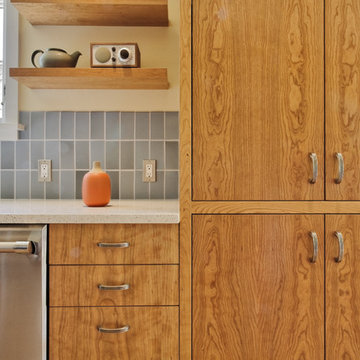
Designed for a 1930s Portland, OR home, this kitchen remodel aims for a clean, timeless sensibility without sacrificing the space to generic modernism. Cherry cabinets, Ice Stone countertops and Heath tile add texture and variation in an otherwise sleek, pared down design. A custom built-in bench works well for eat-in breakfasts. Period reproduction lighting, Deco pulls, and a custom formica table root the kitchen to the origins of the home.
All photos by Matt Niebuhr. www.mattniebuhr.com
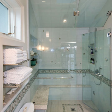
Inspiration for a contemporary bathroom remodel in San Francisco
Bill Bolin Photography
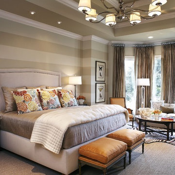
Inspiration for a timeless bedroom remodel in Dallas with gray walls
Inspiration for a timeless bedroom remodel in Dallas with gray walls
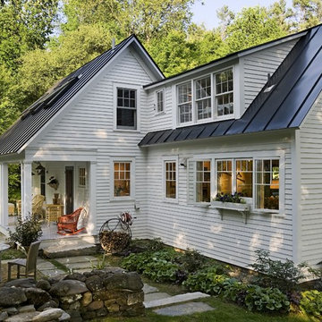
This exterior image shows how the original three-window shed dormer was extended to allow access to the upstairs addition. The carved out porch provides a beautiful connection to the newly renovated landscape.
Renovation/Addition. Rob Karosis Photography
Showing Results for "Bigger Quantities"
Reload the page to not see this specific ad anymore
SGM Photography
Inspiration for a small contemporary master white tile and stone tile marble floor bathroom remodel in New York with an undermount sink, white cabinets, marble countertops and flat-panel cabinets
Inspiration for a small contemporary master white tile and stone tile marble floor bathroom remodel in New York with an undermount sink, white cabinets, marble countertops and flat-panel cabinets
1