

Search results for "Eliminates" in Home Design Ideas
Porcelain tile flooring and custom-built narrow shelving to maximize storage space
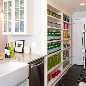
Transitional kitchen photo in DC Metro with a farmhouse sink, open cabinets, white cabinets and stainless steel appliances
Transitional kitchen photo in DC Metro with a farmhouse sink, open cabinets, white cabinets and stainless steel appliances
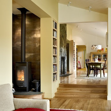
Living room library - contemporary living room library idea in Burlington with beige walls and a wood stove
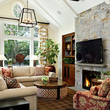
Example of a transitional dark wood floor family room design in San Francisco with white walls
Find the right local pro for your project
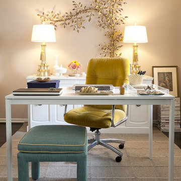
Home office - shabby-chic style freestanding desk home office idea in Orange County with beige walls
view of kitchen with dining room beyond
photo by Sara Terranova
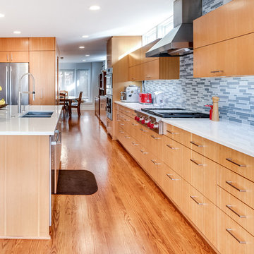
Inspiration for a mid-sized contemporary l-shaped medium tone wood floor and brown floor open concept kitchen remodel in Kansas City with flat-panel cabinets, light wood cabinets, quartz countertops, glass tile backsplash, stainless steel appliances, an island, white countertops, a double-bowl sink and blue backsplash
Inspiration for a mid-sized contemporary l-shaped medium tone wood floor and brown floor open concept kitchen remodel in Kansas City with flat-panel cabinets, light wood cabinets, quartz countertops, glass tile backsplash, stainless steel appliances, an island, white countertops, a double-bowl sink and blue backsplash
Design+Build: Mr&Mrs Construction & Remodeling / Photography: Agnieszka Jakubowicz
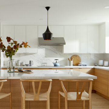
Kitchen - contemporary kitchen idea in San Francisco
Kitchen - contemporary kitchen idea in San Francisco
Martinkovic Milford Architects services the San Francisco Bay Area. Learn more about our specialties and past projects at: www.martinkovicmilford.com/houzz
photos: Matt Delphenich
Example of a trendy kitchen design in Boston with wood countertops, flat-panel cabinets, white cabinets and stainless steel appliances
Example of a trendy kitchen design in Boston with wood countertops, flat-panel cabinets, white cabinets and stainless steel appliances
Photography by Rob Karosis
Inspiration for a large timeless u-shaped medium tone wood floor enclosed kitchen remodel in New York with marble countertops, shaker cabinets, white cabinets, paneled appliances, white backsplash, stone slab backsplash and an island
Inspiration for a large timeless u-shaped medium tone wood floor enclosed kitchen remodel in New York with marble countertops, shaker cabinets, white cabinets, paneled appliances, white backsplash, stone slab backsplash and an island
Basement Media Room
Example of an urban underground white floor basement design in Cincinnati with white walls
Example of an urban underground white floor basement design in Cincinnati with white walls
Inspiration for a mid-sized transitional wallpaper powder room remodel in Boston with a pedestal sink, blue walls and a freestanding vanity
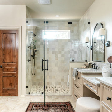
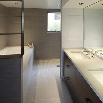
Example of a transitional master beige tile and white tile beige floor and double-sink alcove shower design in Oklahoma City with recessed-panel cabinets, beige cabinets, white walls, an undermount sink, marble countertops, a hinged shower door, gray countertops and a built-in vanity

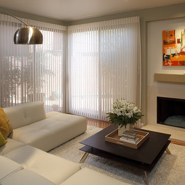
Living room - mid-sized contemporary medium tone wood floor living room idea in Dallas with a standard fireplace, green walls and a stone fireplace
Photographer: Tom Crane
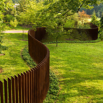
Made of 300, 10-foot steel blades set upright 8 inches apart, the award winning Cor-Ten Cattails Sculptural fence was designed for a home in Berwyn, Pennsylvania as a yard sculpture that also keeps deer out.
Made of COR-TEN, a steel alloy that eliminates the need for painting and maintains a rich, dark rust color without corroding, the fence stanchions were cut with a plasma cutter from sheets of the alloy.
Each blade stands 8 feet above grade, set in concrete 3 feet below, weighs 80-90 pounds and is 5/8 inch thick. The profile of the blades is an irregular trapezoid with no horizontal connections or supports. Only the gate has two horizontal bars, and each leaf weighs 1200 pounds.
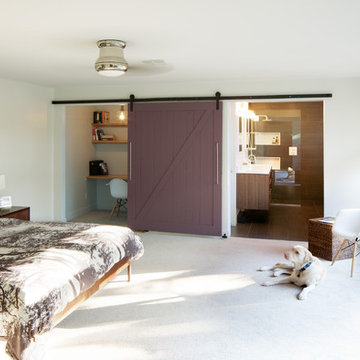
New master bedroom. Custom barn door to close off office and master bathroom. Floating vanity in master bathroom by AvenueTwo:Design. www.avetwo.com.
All photography by:
www.davidlauerphotography.com
Photographer: Bernard André
Example of a classic family room design in San Francisco
Example of a classic family room design in San Francisco
Showing Results for "Eliminates"
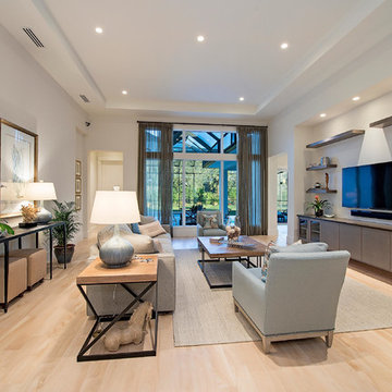
View of Great Room/Living Room from front entry: 41 West Coastal Retreat Series reveals creative, fresh ideas, for a new look to define the casual beach lifestyle of Naples.
More than a dozen custom variations and sizes are available to be built on your lot. From this spacious 3,000 square foot, 3 bedroom model, to larger 4 and 5 bedroom versions ranging from 3,500 - 10,000 square feet, including guest house options.
Download our free ebook, Creating the Ideal Kitchen. DOWNLOAD NOW
For many, extra time at home during COVID left them wanting more from their homes. Whether you realized the shortcomings of your space or simply wanted to combat boredom, a well-designed and functional home was no longer a want, it became a need. Tina found herself wanting more from her Old Irving Park home and reached out to The Kitchen Studio about adding function to her kitchen to make the most of the available real estate.
At the end of the day, there is nothing better than returning home to a bright and happy space you love. And this kitchen wasn’t that for Tina. Dark and dated, with a palette from the past and features that didn’t make the most of the available square footage, this remodel required vision and a fresh approach to the space. Lead designer, Stephanie Cole’s main design goal was better flow, while adding greater functionality with organized storage, accessible open shelving, and an overall sense of cohesion with the adjoining family room.
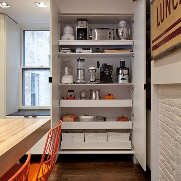
The original kitchen featured a large pizza oven, which was rarely used, yet its footprint limited storage space. The nearby pantry had become a catch-all, lacking the organization needed in the home. The initial plan was to keep the pizza oven, but eventually Tina realized she preferred the design possibilities that came from removing this cumbersome feature, with the goal of adding function throughout the upgraded and elevated space. Eliminating the pantry added square footage and length to the kitchen for greater function and more storage. This redesigned space reflects how she lives and uses her home, as well as her love for entertaining.
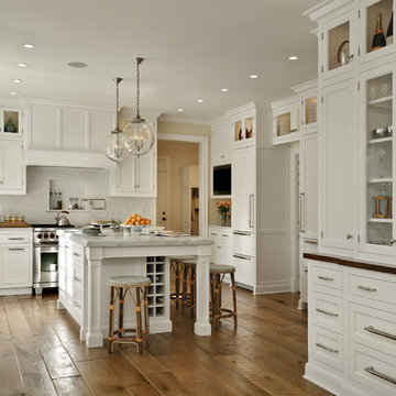
The kitchen features a classic, clean, and timeless palette. White cabinetry, with brass and bronze finishes, contrasts with rich wood flooring, and lets the large, deep blue island in Woodland’s custom color Harbor – a neutral, yet statement color – draw your eye.
The kitchen was the main priority. In addition to updating and elevating this space, Tina wanted to maximize what her home had to offer. From moving the location of the patio door and eliminating a window to removing an existing closet in the mudroom and the cluttered pantry, the kitchen footprint grew. Once the floorplan was set, it was time to bring cohesion to her home, creating connection between the kitchen and surrounding spaces.
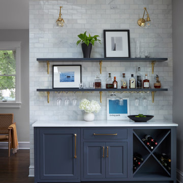
The color palette carries into the mudroom, where we added beautiful new cabinetry, practical bench seating, and accessible hooks, perfect for guests and everyday living. The nearby bar continues the aesthetic, with stunning Carrara marble subway tile, hints of brass and bronze, and a design that further captures the vibe of the kitchen.
Every home has its unique design challenges. But with a fresh perspective and a bit of creativity, there is always a way to give the client exactly what they want [and need]. In this particular kitchen, the existing soffits and high slanted ceilings added a layer of complexity to the lighting layout and upper perimeter cabinets.
While a space needs to look good, it also needs to function well. This meant making the most of the height of the room and accounting for the varied ceiling features, while also giving Tina everything she wanted and more. Pendants and task lighting paired with an abundance of natural light amplify the bright aesthetic. The cabinetry layout and design compliments the soffits with subtle profile details that bring everything together. The tile selections add visual interest, drawing the eye to the focal area above the range. Glass-doored cabinets further customize the space and give the illusion of even more height within the room.
While her family may be grown and out of the house, Tina was focused on adding function without sacrificing a stunning aesthetic and dreamy finishes that make the kitchen the gathering place of any home. It was time to love her kitchen again, and if you’re wondering what she loves most, it’s the niche with glass door cabinetry and open shelving for display paired with the marble mosaic backsplash over the range and complimenting hood. Each of these features is a stunning point of interest within the kitchen – both brag-worthy additions to a perimeter layout that previously felt limited and lacking.
Whether your remodel is the result of special needs in your home or simply the excitement of focusing your energy on creating a fun new aesthetic, we are here for it. We love a good challenge because there is always a way to make a space better – adding function and beauty simultaneously.
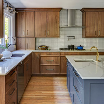
With using the walnut cabinets, we tried to keep the sizes as uniform as possible but there were some aspects the client wanted. One of those was the corner appliance garage. Hiding these necessary evils in a beautiful cabinet with easy accessibility was the perfect marriage.
1