


Search results for "Embracing" in Home Design Ideas
phillip harris
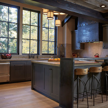
Inspiration for a rustic u-shaped open concept kitchen remodel in San Francisco with shaker cabinets, blue cabinets and paneled appliances
Inspiration for a rustic u-shaped open concept kitchen remodel in San Francisco with shaker cabinets, blue cabinets and paneled appliances
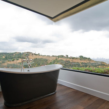
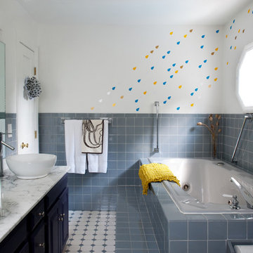
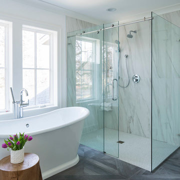
Inspiration for a timeless dark wood floor freestanding bathtub remodel in Los Angeles
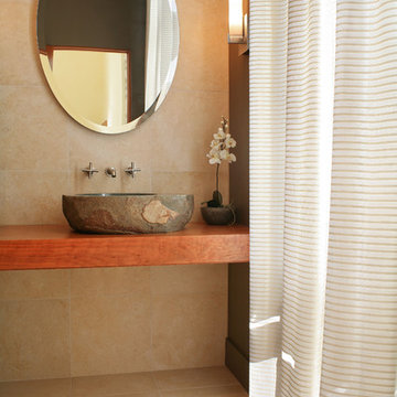
Simple forms combine for an elegant space.
Photo: Joe DeMaio
Minimalist powder room photo in Milwaukee with a vessel sink, wood countertops and brown countertops
Minimalist powder room photo in Milwaukee with a vessel sink, wood countertops and brown countertops
Find the right local pro for your project
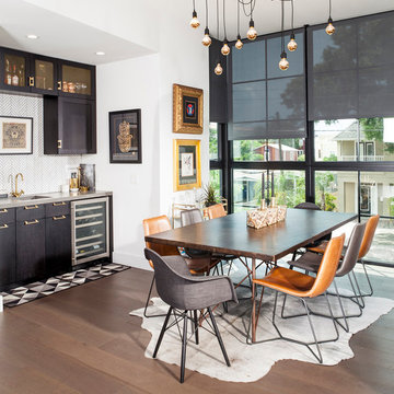
Urban medium tone wood floor dining room photo in Tampa with white walls and no fireplace
Modern farmhouse kitchen. Brown kitchen table surrounded by plush chairs + a breakfast bar with comfy stools.
Kitchen - large transitional medium tone wood floor, brown floor and exposed beam kitchen idea in New York with a farmhouse sink, paneled appliances and an island
Kitchen - large transitional medium tone wood floor, brown floor and exposed beam kitchen idea in New York with a farmhouse sink, paneled appliances and an island
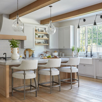
Martha O'Hara Interiors, Interior Design | REFINED LLC, Builder | Troy Thies Photography | Shannon Gale, Photo Styling
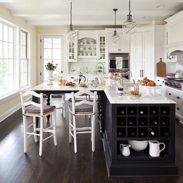
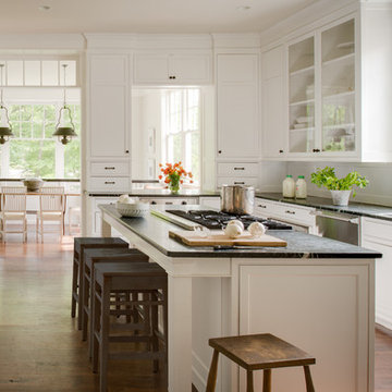
Inspiration for a mid-sized timeless dark wood floor kitchen remodel in Minneapolis with shaker cabinets, white cabinets, white backsplash, an undermount sink, marble countertops, ceramic backsplash, an island and paneled appliances
Inspiration for a mid-sized timeless dark wood floor kitchen remodel in Minneapolis with shaker cabinets, white cabinets, white backsplash, an undermount sink, marble countertops, ceramic backsplash, an island and paneled appliances
Reynolds Cabinetry and Millwork -- Photography by Nathan Kirkman
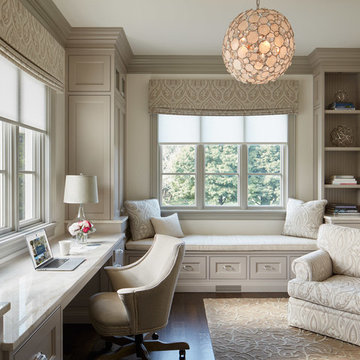
Study room - traditional built-in desk dark wood floor study room idea in Chicago with white walls and no fireplace
Study room - traditional built-in desk dark wood floor study room idea in Chicago with white walls and no fireplace
Omicron Granite & Tile
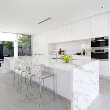
Inspiration for a contemporary galley kitchen remodel in Miami with flat-panel cabinets, white cabinets, white backsplash, stainless steel appliances, an island and a double-bowl sink
Inspiration for a contemporary galley kitchen remodel in Miami with flat-panel cabinets, white cabinets, white backsplash, stainless steel appliances, an island and a double-bowl sink
Michelle Lee Wilson Photography
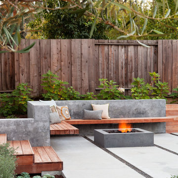
Inspiration for a contemporary backyard patio remodel in San Francisco with a fire pit
Inspiration for a contemporary backyard patio remodel in San Francisco with a fire pit
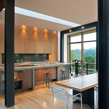
This modern lake house is located in the foothills of the Blue Ridge Mountains. The residence overlooks a mountain lake with expansive mountain views beyond. The design ties the home to its surroundings and enhances the ability to experience both home and nature together. The entry level serves as the primary living space and is situated into three groupings; the Great Room, the Guest Suite and the Master Suite. A glass connector links the Master Suite, providing privacy and the opportunity for terrace and garden areas.
Won a 2013 AIANC Design Award. Featured in the Austrian magazine, More Than Design. Featured in Carolina Home and Garden, Summer 2015.
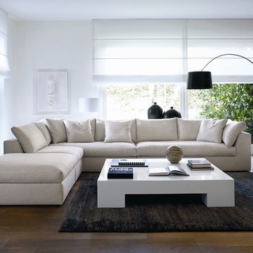
Modular sofa system available in two versions, Small or Plus. Components for both sizes include a chaise, one-armed end unit, central unit, corner, and two ottomans.
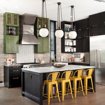
Inspiration for an industrial l-shaped medium tone wood floor kitchen remodel in Tampa with a farmhouse sink, green cabinets, white backsplash, stainless steel appliances, an island and gray countertops

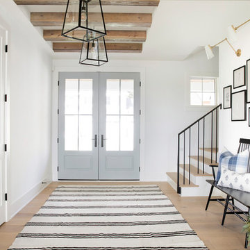
Country light wood floor entryway photo in Minneapolis with white walls and a glass front door

Staircase - industrial l-shaped open and cable railing staircase idea in Tampa
Martha O'Hara Interiors, Interior Design & Photo Styling | City Homes, Builder | Troy Thies, Photography
Please Note: All “related,” “similar,” and “sponsored” products tagged or listed by Houzz are not actual products pictured. They have not been approved by Martha O’Hara Interiors nor any of the professionals credited. For information about our work, please contact design@oharainteriors.com.
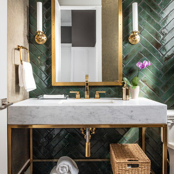
Powder room with a punch! Handmade green subway tile is laid in a herringbone pattern for this feature wall. The other three walls received a gorgeous gold metallic print wallcovering. A brass and marble sink with all brass fittings provide the perfect contrast to the green tile backdrop. Walnut wood flooring
Photo: Stephen Allen
Showing Results for "Embracing"
Shelly Harrison Photography
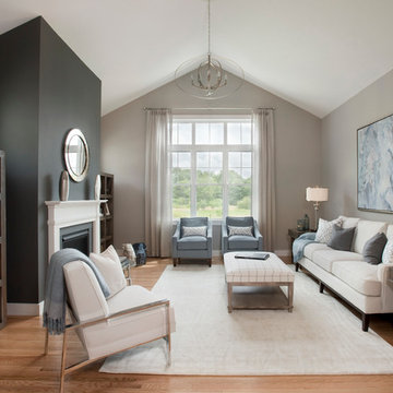
Inspiration for a mid-sized transitional formal and open concept light wood floor living room remodel in Boston with gray walls, a standard fireplace, a plaster fireplace and no tv
Inspiration for a mid-sized transitional formal and open concept light wood floor living room remodel in Boston with gray walls, a standard fireplace, a plaster fireplace and no tv
This is the model unit for modern live-work lofts. The loft features 23 foot high ceilings, a spiral staircase, and an open bedroom mezzanine.
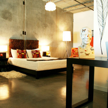
Bedroom - industrial concrete floor and gray floor bedroom idea in Portland
Bedroom - industrial concrete floor and gray floor bedroom idea in Portland
Elegant u-shaped kitchen photo in DC Metro with an undermount sink, recessed-panel cabinets, white cabinets and stainless steel appliances
1