


How to Mix Patterns Like a Pro
See which combinations of stripes, geometrics, florals and more work best to give a personality boost to your rooms

Introducing a new pattern to a space adds a lot of life, energy and personality in a way a solid color rarely can. But why restrict yourself to playing with just one pattern? Combining two or more may seem daunting, but if you follow some of these formulas, you’ll be mixing and matching like a pro in no time.
First, to make it easier to understand how different patterns relate, let’s identify four major categories of patterns. In reality, patterns are endless in number, but when it comes to mixing different types, we’ll start by looking at the main ones.
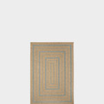
1. Stripes. Stripes, especially in a two-color, one-to-one ratio, are probably the easiest pattern to work with, so much so that you can treat them as a “neutral.” That means they can mix easily with any other pattern, almost as if they weren’t a pattern at all.
Classic navy-and-white or black-and-white stripes are the most classic and timeless, but you can use stripes to add bright colors as well. In a tone-on-tone effect like this bedroom wallpaper, the hue is actually softer and less dramatic than when used as a solid.
Either way, stripes work beautifully with other stripes or with completely different patterns.
Look for an interior designer to help you find your style
Some designers also consider polka dots to be in the category of neutral patterns, with a repeating shape so simple that it reads as more of a texture. The round lines add an extra sense of softness, which can feel a bit feminine or romantic and make a space welcoming.
Shop for furniture
Shop for furniture
Foolproof Plan 1: Dots and Stripes
Mix a few different sizes of stripes, and maybe a polka dot too, and you’ve got a hard-to-go-wrong scheme with plenty of personality and energy.
Mix a few different sizes of stripes, and maybe a polka dot too, and you’ve got a hard-to-go-wrong scheme with plenty of personality and energy.
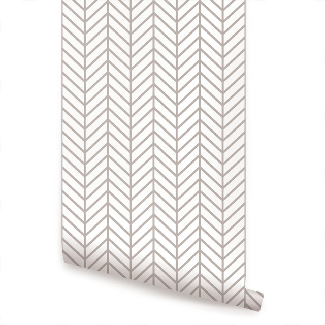
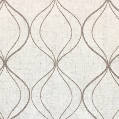
2. Geometrics. A geometric pattern is made of repeating forms that are usually very simple and linear, often using basic shapes like triangles, squares and circles. Technically, stripes are a geometric pattern, but in interior design a true geometric is one notch more complex than that, such as this wallpaper.
Geometrics can be much more complex than a basic repeating shape. This room shows a striped rug, a chevron pillow and richly patterned side chairs: All are geometric, using simple angular lines, but the degree of complexity varies greatly.
Using just angular geometrics, with no curves, is one of the easiest ways to mix multiple patterns without worry.
Using just angular geometrics, with no curves, is one of the easiest ways to mix multiple patterns without worry.
Foolproof Plan 2: Same-Scale Geometrics
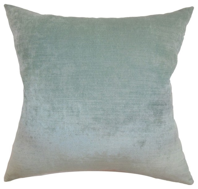
Another easy way to mix multiple geometric patterns is to choose patterns with a similar thickness to the lines. These pillows use very different patterns, but they all contain thin lines at approximately the same scale. A single pillow in a chunky pattern might look out of place, but since they all share a similar line weight they look coordinated.
Another easy way to mix multiple geometric patterns is to choose patterns with a similar thickness to the lines. These pillows use very different patterns, but they all contain thin lines at approximately the same scale. A single pillow in a chunky pattern might look out of place, but since they all share a similar line weight they look coordinated.
3. Florals. Florals are essentially the complete opposite of stripes: They feature complex, curving lines in patterns that feel natural and wild.
Botanical prints also include leafy patterns that don’t feature blossoms but have a similar organic nature, and, just as in nature, these differing prints tend to mesh together easily (as long as their lush color palettes coordinate).
Foolproof Plan 3: Sharp Angles With Bold Florals
Opposites attract. Combine a neutral, angular geometric featuring triangles (or basic stripes) and let a pop of colorful floral with gentle curves play against the sharp lines.
Opposites attract. Combine a neutral, angular geometric featuring triangles (or basic stripes) and let a pop of colorful floral with gentle curves play against the sharp lines.
4. Organics. There are lots of other organic patterns that take inspiration from nature or feature motifs or images that are non-geometric. Animal prints fall under this category, as well as natural textures like marbling or strié (which looks a bit like wood grain, but in fabric or paper).
A zebra stripe, being essentially just a variation on a basic black-and-white stripe, is a great element to toss into any design (in a small dose) to add a little organic drama.
A zebra stripe, being essentially just a variation on a basic black-and-white stripe, is a great element to toss into any design (in a small dose) to add a little organic drama.
This is where things start to get a bit complicated, since there are many patterns that can sit in a gray area between geometric and organic, such as ikat patterns or tribal-inspired prints, which feature somewhat geometric-looking repeating lines but with an organic rawness.
Luckily, there are other aspects of a pattern we can look at to guide us in how to mix and match.
Luckily, there are other aspects of a pattern we can look at to guide us in how to mix and match.
Other Considerations
Color. Mixing patterns within a restrained color palette is a great way to use a variety of actual patterns without having any jarring contrast. Nautical schemes, for example, often use a variety of different fabrics, all in blue and white, to let the different lines and shapes provide the visual interest.
Color. Mixing patterns within a restrained color palette is a great way to use a variety of actual patterns without having any jarring contrast. Nautical schemes, for example, often use a variety of different fabrics, all in blue and white, to let the different lines and shapes provide the visual interest.
Instead of choosing one color pairing to use for every patterned piece, you can also try picking one favorite fabric or item and using that piece to inspire colors for the other accents. Here, you can see that each fabric draws colors from the ottoman upholstery, so the collection has lots of variety but is tied together and cohesive.
Sometimes just having the same background color — usually a neutral — can help tie patterns together. These disparate pillows don’t share a strict color scheme of motif, but they all have a soft white background to relate them to one another, which helps them feel like a set.
Foolproof Plan 4: Black and White
It’s about as classic as they come: Mixing several patterns in strict black and white virtually always works, even if the scales and styles are different. To play it extra safe, keep all the patterns at least 50 percent white so you don’t accidentally overdo the black, unless you’re going for a gothic look.
It’s about as classic as they come: Mixing several patterns in strict black and white virtually always works, even if the scales and styles are different. To play it extra safe, keep all the patterns at least 50 percent white so you don’t accidentally overdo the black, unless you’re going for a gothic look.
Scale
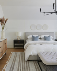
The size of a pattern can be at least as important as its style. A very small pattern can easily be missed from a distance, while a bold pattern will command attention even from across the room.
Mixing scales of patterns can be tricky, though not if you take one of these two approaches: going all different or all the same. This room uses the former approach, with a large-scale floral on the chairs and a smaller-scale pattern on the pillows and vases and a more subtler pattern on the wallpaper behind the shelves.
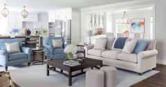
This room uses three patterns at the same scale: one stripe, one chevron and one more organic pattern. They all appear to be the same “size,” with the linear stripes and chevrons at about the same spacing as the objects in the more complex print. The science isn’t exact, but to a casual glance no one pattern sticks out as being much larger or smaller than the others.
Naturally, it also helps that these differing fabrics are in roughly the same color scheme as well. Combining differing strategies for mixing patterns definitely helps get a great result.
Naturally, it also helps that these differing fabrics are in roughly the same color scheme as well. Combining differing strategies for mixing patterns definitely helps get a great result.
Ways to Mix a Lot of Pattern
Traditional rugs. Rugs in rich, traditional patterns are a bit like stripes in that they can almost be treated like a neutral with no pattern at all. Their fine, intricate designs and rich, sophisticated colors make them easy to mix with other patterns that are either more subtle, more bold or both.
Traditional rugs. Rugs in rich, traditional patterns are a bit like stripes in that they can almost be treated like a neutral with no pattern at all. Their fine, intricate designs and rich, sophisticated colors make them easy to mix with other patterns that are either more subtle, more bold or both.
Traditional motifs. Like a traditional rug, other delicate, timeless patterns such as toile and fine china prints can be easily tossed into a space and contrasted against other traditional elements or much more contemporary designs.
This room feels rich and sumptuous partly because it includes three diverse patterns, but to the casual glance, only the geometric wall treatment feels like a true pattern. The traditional umbrella stand and rug appear much less graphic, blending in perfectly yet holding their own.
This room feels rich and sumptuous partly because it includes three diverse patterns, but to the casual glance, only the geometric wall treatment feels like a true pattern. The traditional umbrella stand and rug appear much less graphic, blending in perfectly yet holding their own.
Painterly dots. Here’s a trendy look that’s easy to use at home. Painterly dots blend the versatile character of polka dots with an organic, casual elegance for an effect that’s easy to mix and always adds vibrancy and fun.
Chevron. Chevron is a classic for a reason: This simple pattern is just one notch more bold than a classic stripe, meaning it’s still easy to mix with nearly anything, but it also gives a real sense of dynamic energy because of its many diagonal lines.
Foolproof Plan 5: The Powerful Trio
Here’s a potent recipe: Mix a chevron or plain stripe with a smaller geometric and a cheerful floral to achieve an easy yet dramatic look.
Foolproof Plan 5: The Powerful Trio
Here’s a potent recipe: Mix a chevron or plain stripe with a smaller geometric and a cheerful floral to achieve an easy yet dramatic look.
Other Approaches
The 60-30-10 approach. This is a great ratio for mixing two or more major patterns with a small accent. Choose a major pattern to dominate the space and let that be about 60 percent of the visible pattern, such as this large area rug. Then choose a second, coordinating pattern to be 30 percent, like these striped drapes. Lastly, let just about 10 percent be a bold, contrasting choice, such as these marbled fabric chairs, or try a mix of pillows.
The math doesn’t need to be exact, but if you clearly have a structure of dominant and non-dominant patterns, the whole set can be bold yet coherent.
This balance can often be achieved by repeating one pattern in multiple places, such as in this room, which features the same fabric on the head chairs and drapery. A second pattern is found in the subtle rug.
Keep in mind, the pattern you’re seeing the most of shouldn’t be so bold that it becomes overwhelming when you use that much of it. The more you plan to use, the less intense the main pattern should be.
Keep in mind, the pattern you’re seeing the most of shouldn’t be so bold that it becomes overwhelming when you use that much of it. The more you plan to use, the less intense the main pattern should be.
The pillow approach. Rather than picking a dominant pattern, you can take the opposite route and let all of the patterns be equally small accents. This is most often seen in mixed pillow collections where no two are alike. By using just a small dash of each pattern, you make sure than no single pattern stands out. This approach is fairly easy because you can add and subtract accessories over time, with low commitment. Just be sure to include a few solids, and choose patterns from distinctly different categories.
Feel ready to go pro status? You can combine the last two approaches to mix a ton of pattern and keep it all balanced. In this space, about 60 percent of the pattern is in the subtle wall treatment, with 30 percent in the geometric rug and 10 percent spread between the eclectic, mismatched pillows.
If that seems like too much for you, just stick to a simpler technique. However, keep in mind that items like pillows are easy to move between rooms (or return to the store) if you find the look isn’t quite adding up. Play with it until it feels just right, and trust your own eye.
If that seems like too much for you, just stick to a simpler technique. However, keep in mind that items like pillows are easy to move between rooms (or return to the store) if you find the look isn’t quite adding up. Play with it until it feels just right, and trust your own eye.

Sponsored
Leading Interior Designers in Columbus, Ohio & Ponte Vedra, Florida