


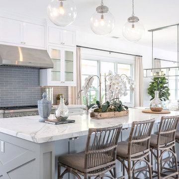
Search results for "Real time visual" in Home Design Ideas
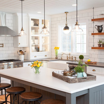
After six years of living in their Huntley IL home, Chris and Meghan were tired of their dark, dingy, outdated kitchen and it was finally time for a long-anticipated change. “The kitchen is the place where we live, it’s where we do everything,” Meghan said. “It was important that it be a space where we wanted to be.” Meghan loves cooking and enjoys including their girls in healthy meal prepping, this led them to want a brighter, more enjoyable kitchen with increased functionality and improved storage.
For Chris especially, the laundry room was an entirely dysfunctional eyesore. “We had a washer and a dryer, but it was all kind-of cobbled together!” Chris said. “There were always laundry piles everywhere, we weren’t really sure what we wanted to do in there, but it was time for us to make a change.” The mess of the space was stressful every time they walked in the door from the garage each day. Kids’ backpacks and shoes piled up haphazardly in the makeshift boot-bench closet left the family feeling disorganized and stressed. They needed space for folding clothes and locker cubbies to help keep the family organized.
Having known Christine and Todd in the Huntley community for years, Chris and Meghan were familiar with their work. “We already trusted them personally and having seen their projects for years we knew they did top notch work. After we reviewed the initial round of designs, we knew that hiring them was definitely the right choice,” Meghan and Chris said. Although Chris had done a lot of work in their home himself, the kitchen and laundry room renovation was such a large undertaking that he didn’t want to steal time away from his family to spend what would surely be many long weekends doing the job himself. “That would not have been a wise choice for us,” Chris laughed.
“Our designer, Michelle was very, very, easy to work with; anything we wanted to see or weren’t sure about, she went above and beyond to make this easy for us. She was easy to get hold of and always quick to respond,” the couple said. Michelle pulled ideas that mirrored the couple’s taste and style and was adept at directing the couple to limited choices that didn’t overwhelm them and kept the process moving. “I have a hard time making decisions. Michelle made the decision-making process so easy. I loved how she listened to what I liked and then presented three great options for me to choose from,” Meghan said.
The main objectives for the kitchen were better storage solutions, they wanted the space to reflect their lifestyle and taste, and they wanted it to last for years with low maintenance. One of the first steps in creating a more functional kitchen was relocating the refrigerator, creating an improved workflow for the busy family.
“We didn’t know that we could even move the refrigerator to a new location where it is now, that was something that we never would have thought of,” Chris said. “The new refrigerator location makes the kitchen feel so much bigger. We didn’t add any space, but our whole kitchen with the new design just seems like it’s so much larger than before!” Meghan said.
The perimeter mist colored cabinets helped warm and brighten the entire room, while the graphite colored cabinets on the island added contrast. Using this fresh, clean color palette satisfied the couple’s desire for a bright space that was the exact opposite of what they had before. Organization accessories were also added to the cabinets such as a spice drawer tray and roll outs to create hidden convenience.
“I absolutely love the hidden spices – it makes cooking so much more enjoyable!” Chris said. “And all the pull outs, and the double trash bin, who would think you could get so excited about organization!” the couple said in unison.
One thing they hated in their original kitchen was how dark the space felt. Added lighting on the ceiling with the new light fixtures combined with the lighter cabinetry colors throughout solved this problem. “Our new kitchen has this warm, almost cozy feeling that our old kitchen never had, it’s just a space that I love spending my time in now,” Meghan said. The light airy feeling was accentuated with the use of floating white shelves on either side of the decorative range hood. “We have so much cabinetry space, the new design is amazing we actually have more storage space than we will ever need,” Meghan said.
The island was extended to create more work surface and added space for stool seating. “The new island changes how we live. Now the kids can be in the kitchen with us, doing homework, eating breakfast, and the three of us have special dinners there when Chris is working late,” Meghan said.
The Carrara Marmi Quartz countertops were chosen because they are, not only beautiful, but are made from hard-working material that doesn’t require maintenance. The white subway tile backsplash that wraps to the ceiling behind the focal point cooktop range/hood compliments the crisp white countertops perfectly, while brushed brass hardware and light fixtures keep the design fresh and new.
The couple had a few fears at the beginning of the project, as most homeowners do. Their biggest fear was being out of their kitchen and laundry room for an extended time. The crew made it very easy for the family to work in a limited space keeping the washer and dryer hooked up the majority of the time, and also getting appliances working with minimal downtime.
“They above and beyond accommodated us to get us through the process,” Meghan said. “They did a great job making sure we were as comfortable as possible throughout the process,” Chris added.
“Our project manager DJ did a great job. He was very good at updating us on schedule changes, getting guys in as quickly as possible. Everyone that stepped in the house was nice and did great work,” said Chris. They thought Advance’s carpenter was phenomenal and were impressed when he took a conceptual idea from a photograph and worked with designer Michelle to create a one of a kind range/hood that has become the topic of conversation with friends and family who visit the new kitchen. “He was in our house literally every day for several weeks. He was easy to work with and good at what he did,” Meghan and Chris said.
The focal point of the kitchen; a hand-crafted, custom-built ventilation hood was clad with handpicked reclaimed barnwood. Advance Design’s carpenter built the framework and the cladding to create a one-of-a-kind design element that the couple loves.
“I think it was especially fun for him to create something unique from scratch, showcasing his talent in this area,” Meghan said. “I love that my kitchen is not like everyone else’s. I got to pick out the wood on my hood and watch it being built and was able to choose what pieces of wood went where on it. It’s totally unique.”
Red Oak flooring was toothed-in throughout the kitchen and the rest of the first floor anywhere changes were made. Then the whole floor was refinished to tone down the orange undertones in the existing floor stain, ultimately changing the color complexion of the entire first floor. The result is a completely new feeling to the entire home.
Renovating the laundry room was extremely important to Meghan and Chris, but they had trouble visualizing what the possibilities were for the seemingly small space. Michelle produced beautiful 3D illustrations that helped them envision the space in a whole new way.
“I must have told Michelle 100 times that I am a visual person, seeing the designs in 3D made it so easy to make decisions and see what we could really do with our space,” Meghan said.
A dividing wall and doorway were removed between the existing laundry room and hallway formerly containing a coat closet, providing space to design specialized graphite colored cabinetry matching the kitchen island to house custom storage cubbies for each family member. Adding the tall utility cabinetry in the new laundry area helped solve the storage issue, tucking away cleaning supplies, household items, and even the cat got its own cubby.
“I love how everything is now hidden in its own space. I can’t tell you how much I hated coming home and seeing everything sitting around on counters,” Chris said.
Electrical outlets were planned for the inside of utility cabinets, so devices could charge in hidden locations. Stacking the washer and dryer allowed for wider countertop space to provide a folding area and a special space for clothes to hang. “The way I do laundry has been completely transformed! I can actually fold clothes and hang them now right out of the washer and dryer,” Meghan said.
“The end result in the kitchen and the laundry/mud room was an updated light and bright space, with a smarter work flow that better meets the needs of this family,” Michelle said.
“I would totally recommend Advance Design,” Meghan said. “Sometimes I sit and just look at my kitchen and laundry room and think ‘Wow, I can’t believe I get to live here!’ It’s an understatement to say we love our new space.”
Q: Which of these floors are made of actual "Hardwood" ?
A: None.
They are actually Luxury Vinyl Tile & Plank Flooring skillfully engineered for homeowners who desire authentic design that can withstand the test of time. We brought together the beauty of realistic textures and inspiring visuals that meet all your lifestyle demands.
Ultimate Dent Protection – commercial-grade protection against dents, scratches, spills, stains, fading and scrapes.
Award-Winning Designs – vibrant, realistic visuals with multi-width planks for a custom look.
100% Waterproof* – perfect for any room including kitchens, bathrooms, mudrooms and basements.
Easy Installation – locking planks with cork underlayment easily installs over most irregular subfloors and no acclimation is needed for most installations. Coordinating trim and molding available.
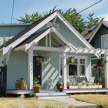
This is a little project we did for a friend a few years ago. Our client approached us after the south face of her house had deteriorated to the point that severe rot and mold had invaded the structure. She also wanted to give the front of her house a facelift and create some more curb appeal. On little projects like these, budget often dictates our design solution and our approach is to maximize value on behalf of our clients. We don't trying to win design awards with these small projects nor are we trying to get published. Our goal is to simply and elegantly solve the problem we are presented with at a price point that our client can afford.
There are several ideas we incorporated into this design solution. Foremost was to solve the water infiltration into the building envelope. The structure faces due south and takes a beating from all of the winter storms we get here in the Pacific Northwest. In the summer, harsh sun warps and cracks most siding materials. This solution entailed stripping the entire south facing facade down to the studs, tearing out all of the rotted lumber and reframing this wall to accept new windows. This wall was then insulated, sheathed, covered with a high performance building paper and then sided with a cementitious siding material.We added a cover at the front door to both protect the house and to announce the entry.
The element of time plays a large role in our designs and in this case we wanted to highlight the transition from the outer environment to protected interior of the home. Finally, with the addition of the minimal arbor we created a public space on the front of the house that allows for gathering, gives the house more visual interest and provides a public zone between the house and the street. This zone is literally a way for our client, who runs a business on the upper level of her home, to get out of her house and interact with the world. In short, this was a contextual solution that blends in well with its neighbors and promotes community through a classic front porch design. Our client spends a lot of time here in the summers chatting with neighbors, enjoying a glass of wine and watching the setting sun.
There are several ideas we incorporated into this desgn solution. Foremost was to solve the water infiltration into the building enevelope. The structure faces due south and takes a beating from all of the winter storms we get here in the Pacific Northwest. In the summer, harsh sun warps and cracks most siding materials. This solution entailed stripping the entire south facing facade down to the studs, tearing out all of the rotted lumber and refaming this wall to accept new windows. This wall was then insulated, sheathed, covered with a high performance building paper and then sided with a cementitious siding material.We added a cover at the front door to both protect the house and to announce the entry.
The element of time plays a large role in our designs and in this case we wanted to highlight the transiton from the outer environment to protected interior of the home. Finally, with the addition of the minimal arbor we created a public space on the front of the house that allows for gathering, gives the house more visual interest and provides a public zone between the house and the street. This zone is a literally way for out client, who runs a business on the upper level of her home, to get our her house and interact with the world. In short, this was a contextual solution that blends in well with its neighbors and promotes community through a classic front porch design. Our client spends a lot of time here in the summers chatting with neighbors, enjoying a glass of wine and watching the setting sun.
Find the right local pro for your project
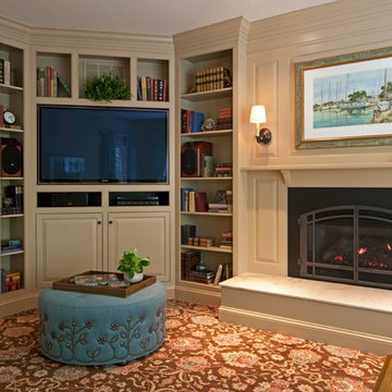
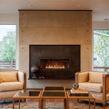
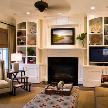
This room was redesigned to accommodate the latest in audio/visual technology. The exposed brick fireplace was clad with wood paneling, sconces were added and the hearth covered with marble.
photo by Anne Gummerson
Easton, Maryland Traditional Kitchen Design by #JenniferGilmer with a lake view
http://gilmerkitchens.com/
Photography by Bob Narod
This Coastal Inspired Farmhouse with bay views puts a casual and sophisticated twist on beach living.
Interior Design by Blackband Design and Home Build by Arbor Real Estate.
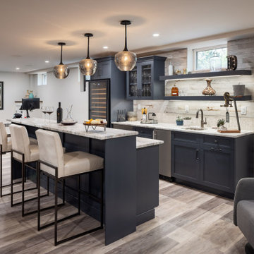
When my client had to move from her company office to work at home, she set up in the dining room. Despite her best efforts, this was not the long-term solution she was looking for. My client realized she needed a dedicated space not on the main floor of the home. On one hand, having your office space right next to the kitchen is handy. On the other hand, it made separating work and home life was not that easy.
The house was a ranch. In essence, the basement would run entire length of the home. As we came down the steps, we entered a time capsule. The house was built in the 1950’s. The walls were covered with original knotty pine paneling. There was a wood burning fireplace and considering this was a basement, high ceilings. In addition, there was everything her family could not store at their own homes. As we wound though the space, I though “wow this has potential”, Eventually, after walking through the laundry room we came to a small nicely lit room. This would be the office.
My client looked at me and asked what I thought. Undoubtedly, I said, this can be a great workspace, but do you really want to walk through this basement and laundry to get here? Without reservation, my client said where do we start?
Once the design was in place, we started the renovation. The knotty pine paneling had to go. Specifically, to add some insulation and control the dampness and humidity. The laundry room wall was relocated to create a hallway to the office.
At the far end of the room, we designated a workout zone. Weights, mats, exercise bike and television are at the ready for morning or afternoon workouts. The space can be concealed by a folding screen for party time. Doors to an old closet under the stairs were relocated to the workout area for hidden storage. Now we had nice wall for a beautiful console and mirror for storage and serving during parties.
In order to add architectural details, we covered the old ugly support columns with simple recessed millwork panels. This detail created a visual division between the bar area and the seating area in front of the fireplace. The old red brick on the fireplace surround was replaced with stack stone. A mantle was made from reclaimed wood. Additional reclaimed wood floating shelves left and right of the fireplace provides decorative display while maintaining a rustic element balancing the copper end table and leather swivel rocker.
We found an amazing rug which tied all of the colors together further defining the gathering space. Russet and burnt orange became the accent color unifying each space. With a bit of whimsy, a rather unusual light fixture which looks like roots from a tree growing through the ceiling is a conversation piece.
The office space is quite and removed from the main part of the basement. There is a desk large enough for multiple screens, a small bookcase holding office supplies and a comfortable chair for conference calls. Because working from home requires many online meetings, we added a shiplap wall painted in Hale Navy to contrast with the orange fabric on the chair. We finished the décor with a painting from my client’s father. This is the background online visitors will see.
The last and best part of the renovation is the beautiful bar. My client is an avid collector of wine. She already had the EuroCave refrigerator, so I incorporated it into the design. The cabinets are painted Temptation Grey from Benjamin Moore. The counter tops are my favorite hard working quartzite Brown Fantasy. The backsplash is a combination of rustic wood and old tin ceiling like porcelain tiles. Together with the textures of the reclaimed wood and hide poofs balanced against the smooth finish of the cabinets, we created a comfortable luxury for relaxing.
There is ample storage for bottles, cans, glasses, and anything else you can think of for a great party. In addition to the wine storage, we incorporated a beverage refrigerator, an ice maker, and a sink. Floating shelves with integrated lighting illuminate the back bar. The raised height of the front bar provides the perfect wine tasting and paring spot. I especially love the pendant lights which look like wine glasses.
Finally, I selected carpet for the stairs and office. It is perfect for noise reduction. Meanwhile for the overall flooring, I specifically selected a high-performance vinyl plank floor. We often use this product as it is perfect to install on a concrete floor. It is soft to walk on, easy to clean and does not reduce the overall height of the space.
Download our free ebook, Creating the Ideal Kitchen. DOWNLOAD NOW
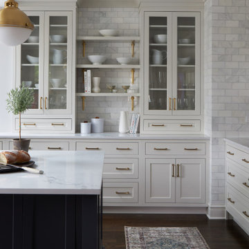
For many, extra time at home during COVID left them wanting more from their homes. Whether you realized the shortcomings of your space or simply wanted to combat boredom, a well-designed and functional home was no longer a want, it became a need. Tina found herself wanting more from her Old Irving Park home and reached out to The Kitchen Studio about adding function to her kitchen to make the most of the available real estate.
At the end of the day, there is nothing better than returning home to a bright and happy space you love. And this kitchen wasn’t that for Tina. Dark and dated, with a palette from the past and features that didn’t make the most of the available square footage, this remodel required vision and a fresh approach to the space. Lead designer, Stephanie Cole’s main design goal was better flow, while adding greater functionality with organized storage, accessible open shelving, and an overall sense of cohesion with the adjoining family room.
The original kitchen featured a large pizza oven, which was rarely used, yet its footprint limited storage space. The nearby pantry had become a catch-all, lacking the organization needed in the home. The initial plan was to keep the pizza oven, but eventually Tina realized she preferred the design possibilities that came from removing this cumbersome feature, with the goal of adding function throughout the upgraded and elevated space. Eliminating the pantry added square footage and length to the kitchen for greater function and more storage. This redesigned space reflects how she lives and uses her home, as well as her love for entertaining.
The kitchen features a classic, clean, and timeless palette. White cabinetry, with brass and bronze finishes, contrasts with rich wood flooring, and lets the large, deep blue island in Woodland’s custom color Harbor – a neutral, yet statement color – draw your eye.
The kitchen was the main priority. In addition to updating and elevating this space, Tina wanted to maximize what her home had to offer. From moving the location of the patio door and eliminating a window to removing an existing closet in the mudroom and the cluttered pantry, the kitchen footprint grew. Once the floorplan was set, it was time to bring cohesion to her home, creating connection between the kitchen and surrounding spaces.
The color palette carries into the mudroom, where we added beautiful new cabinetry, practical bench seating, and accessible hooks, perfect for guests and everyday living. The nearby bar continues the aesthetic, with stunning Carrara marble subway tile, hints of brass and bronze, and a design that further captures the vibe of the kitchen.
Every home has its unique design challenges. But with a fresh perspective and a bit of creativity, there is always a way to give the client exactly what they want [and need]. In this particular kitchen, the existing soffits and high slanted ceilings added a layer of complexity to the lighting layout and upper perimeter cabinets.
While a space needs to look good, it also needs to function well. This meant making the most of the height of the room and accounting for the varied ceiling features, while also giving Tina everything she wanted and more. Pendants and task lighting paired with an abundance of natural light amplify the bright aesthetic. The cabinetry layout and design compliments the soffits with subtle profile details that bring everything together. The tile selections add visual interest, drawing the eye to the focal area above the range. Glass-doored cabinets further customize the space and give the illusion of even more height within the room.
While her family may be grown and out of the house, Tina was focused on adding function without sacrificing a stunning aesthetic and dreamy finishes that make the kitchen the gathering place of any home. It was time to love her kitchen again, and if you’re wondering what she loves most, it’s the niche with glass door cabinetry and open shelving for display paired with the marble mosaic backsplash over the range and complimenting hood. Each of these features is a stunning point of interest within the kitchen – both brag-worthy additions to a perimeter layout that previously felt limited and lacking.
Whether your remodel is the result of special needs in your home or simply the excitement of focusing your energy on creating a fun new aesthetic, we are here for it. We love a good challenge because there is always a way to make a space better – adding function and beauty simultaneously.
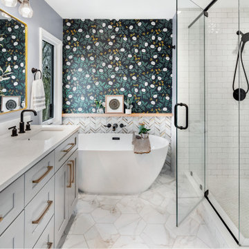
In this farmhouse inspired bathroom there are four different patterns in just this one shot. The key to it all working is color! Using the same colors in all four, makes this bath look cohesive and fun, without being too busy. The gold in the accent tile ties in with the gold in the wallpaper, and the white ties all four together. By keeping a neutral gray on the wall and vanity, the eye has time to rest making this bath a real stunner!
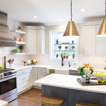
When this suburban family decided to renovate their kitchen, they knew that they wanted a little more space. Advance Design worked together with the homeowner to design a kitchen that would work for a large family who loved to gather regularly and always ended up in the kitchen! So the project began with extending out an exterior wall to accommodate a larger island and more moving-around space between the island and the perimeter cabinetry.
Style was important to the cook, who began collecting accessories and photos of the look she loved for months prior to the project design. She was drawn to the brightness of whites and grays, and the design accentuated this color palette brilliantly with the incorporation of a warm shade of brown woods that originated from a dining room table that was a family favorite. Classic gray and white cabinetry from Dura Supreme hits the mark creating a perfect balance between bright and subdued. Hints of gray appear in the bead board detail peeking just behind glass doors, and in the application of the handsome floating wood shelves between cabinets. White subway tile is made extra interesting with the application of dark gray grout lines causing it to be a subtle but noticeable detail worthy of attention.
Suede quartz Silestone graces the countertops with a soft matte hint of color that contrasts nicely with the presence of white painted cabinetry finished smartly with the brightness of a milky white farm sink. Old melds nicely with new, as antique bronze accents are sprinkled throughout hardware and fixtures, and work together unassumingly with the sleekness of stainless steel appliances.
The grace and timelessness of this sparkling new kitchen maintains the charm and character of a space that has seen generations past. And now this family will enjoy this new space for many more generations to come in the future with the help of the team at Advance Design Studio.
Photographer: Joe Nowak
Dura Supreme Cabinetry
Our clients had been in their home since the early 1980’s and decided it was time for some updates. We took on the kitchen, two bathrooms and a powder room.
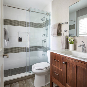
This petite master bathroom primarily had storage and space planning challenges. Since the wife uses a larger bath down the hall, this bath is primarily the husband’s domain and was designed with his needs in mind. We started out by converting an existing alcove tub to a new shower since the tub was never used. The custom shower base and decorative tile are now visible through the glass shower door and help to visually elongate the small room. A Kohler tailored vanity provides as much storage as possible in a small space, along with a small wall niche and large medicine cabinet to supplement. “Wood” plank tile, specialty wall covering and the darker vanity and glass accents give the room a more masculine feel as was desired. Floor heating and 1 piece ceramic vanity top add a bit of luxury to this updated modern feeling space.
Designed by: Susan Klimala, CKD, CBD
Photography by: Michael Alan Kaskel
For more information on kitchen and bath design ideas go to: www.kitchenstudio-ge.com
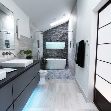
The goal of this project was to upgrade the builder grade finishes and create an ergonomic space that had a contemporary feel. This bathroom transformed from a standard, builder grade bathroom to a contemporary urban oasis. This was one of my favorite projects, I know I say that about most of my projects but this one really took an amazing transformation. By removing the walls surrounding the shower and relocating the toilet it visually opened up the space. Creating a deeper shower allowed for the tub to be incorporated into the wet area. Adding a LED panel in the back of the shower gave the illusion of a depth and created a unique storage ledge. A custom vanity keeps a clean front with different storage options and linear limestone draws the eye towards the stacked stone accent wall.
Houzz Write Up: https://www.houzz.com/magazine/inside-houzz-a-chopped-up-bathroom-goes-streamlined-and-swank-stsetivw-vs~27263720
The layout of this bathroom was opened up to get rid of the hallway effect, being only 7 foot wide, this bathroom needed all the width it could muster. Using light flooring in the form of natural lime stone 12x24 tiles with a linear pattern, it really draws the eye down the length of the room which is what we needed. Then, breaking up the space a little with the stone pebble flooring in the shower, this client enjoyed his time living in Japan and wanted to incorporate some of the elements that he appreciated while living there. The dark stacked stone feature wall behind the tub is the perfect backdrop for the LED panel, giving the illusion of a window and also creates a cool storage shelf for the tub. A narrow, but tasteful, oval freestanding tub fit effortlessly in the back of the shower. With a sloped floor, ensuring no standing water either in the shower floor or behind the tub, every thought went into engineering this Atlanta bathroom to last the test of time. With now adequate space in the shower, there was space for adjacent shower heads controlled by Kohler digital valves. A hand wand was added for use and convenience of cleaning as well. On the vanity are semi-vessel sinks which give the appearance of vessel sinks, but with the added benefit of a deeper, rounded basin to avoid splashing. Wall mounted faucets add sophistication as well as less cleaning maintenance over time. The custom vanity is streamlined with drawers, doors and a pull out for a can or hamper.
A wonderful project and equally wonderful client. I really enjoyed working with this client and the creative direction of this project.
Brushed nickel shower head with digital shower valve, freestanding bathtub, curbless shower with hidden shower drain, flat pebble shower floor, shelf over tub with LED lighting, gray vanity with drawer fronts, white square ceramic sinks, wall mount faucets and lighting under vanity. Hidden Drain shower system. Atlanta Bathroom.
A traditional house that meanders around courtyards built as though it where built in stages over time. Well proportioned and timeless. Presenting its modest humble face this large home is filled with surprises as it demands that you take your time to experience it.
Sponsored
Over 300 locations across the U.S.
Schedule Your Free Consultation
Ferguson Bath, Kitchen & Lighting Gallery
Ferguson Bath, Kitchen & Lighting Gallery
www.RenderingSpace.com
Rendering Space provides high-end Real Estate and Property Marketing in the Pacific Northwest. We combine art with technology to provide the most visually engaging marketing available. Homes by Brent Keys homesbybrentkeys.com
Conceived as a remodel and addition, the final design iteration for this home is uniquely multifaceted. Structural considerations required a more extensive tear down, however the clients wanted the entire remodel design kept intact, essentially recreating much of the existing home. The overall floor plan design centers on maximizing the views, while extensive glazing is carefully placed to frame and enhance them. The residence opens up to the outdoor living and views from multiple spaces and visually connects interior spaces in the inner court. The client, who also specializes in residential interiors, had a vision of ‘transitional’ style for the home, marrying clean and contemporary elements with touches of antique charm. Energy efficient materials along with reclaimed architectural wood details were seamlessly integrated, adding sustainable design elements to this transitional design. The architect and client collaboration strived to achieve modern, clean spaces playfully interjecting rustic elements throughout the home.
Greenbelt Homes
Glynis Wood Interiors
Photography by Bryant Hill
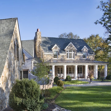
A traditional house that meanders around courtyards built as though it where built in stages over time. Well proportioned and timeless. Presenting its modest humble face this large home is filled with surprises as it demands that you take your time to experiance it.
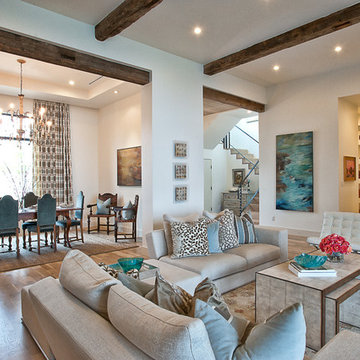
In this combination living room/ family room, form vs function is at it's best.. Formal enough to host a cocktail party, and comfortable enough to host a football game. The wrap around sectional accommodates 5-6 people and the oversized ottoman has room enough for everyone to put their feet up! The high back, stylized wing chair offers comfort and a lamp for reading. Decorative accessories are placed in the custom built bookcases freeing table top space for drinks, books, etc. Magazines and current reading are neatly placed in the rattan tray for easy access. The overall neutral color palette is punctuated by soft shades of blue around the room.
LORRAINE G VALE
photo by Michael Costa
Showing Results for "Real Time Visual"

Sponsored
Over 300 locations across the U.S.
Schedule Your Free Consultation
Ferguson Bath, Kitchen & Lighting Gallery
Ferguson Bath, Kitchen & Lighting Gallery
Product: Authentic Limestone for Exterior Living Spaces.
Ancient Surfaces
Contacts: (212) 461-0245
Email: Sales@ancientsurfaces.com
Website: www.AncientSurfaces.com
The design of external living spaces is known as the 'Al Fresco' design style as it is called in Italian. 'Al Fresco' translates into 'the open' or 'the cool/fresh exterior'. Customizing a fully functional outdoor kitchen, pizza oven, BBQ, fireplace or Jacuzzi pool spa all out of old reclaimed Mediterranean stone pieces is no easy task and shouldn’t be created out of the lowest common denominator of building materials such as concrete, Indian slates or Turkish travertine.
The one thing you can bet the farmhouse on is that when the entire process unravels and when your outdoor living space materializes from the architects rendering to real life, you will be guaranteed a true Mediterranean living experience if your choice of construction material was as authentic and possible to the Southern Mediterranean regions.
We believe that the coziness of your surroundings brought about by the creative usage of our antique stone elements will only amplify that authenticity.
whether you are enjoying a relaxing time soaking the sun inside one of our Jacuzzi spa stone fountains or sharing unforgettable memories with family and friends while baking your own pizzas in one of our outdoor BBQ pizza ovens, our stone designs will always evoke in most a feeling of euphoria and exultation that one only gets while being on vacation is some exotic European island surrounded with the pristine beauty of indigenous nature and ancient architecture...
Nestled into sloping topography, the design of this home allows privacy from the street while providing unique vistas throughout the house and to the surrounding hill country and downtown skyline. Layering rooms with each other as well as circulation galleries, insures seclusion while allowing stunning downtown views. The owners' goals of creating a home with a contemporary flow and finish while providing a warm setting for daily life was accomplished through mixing warm natural finishes such as stained wood with gray tones in concrete and local limestone. The home's program also hinged around using both passive and active green features. Sustainable elements include geothermal heating/cooling, rainwater harvesting, spray foam insulation, high efficiency glazing, recessing lower spaces into the hillside on the west side, and roof/overhang design to provide passive solar coverage of walls and windows. The resulting design is a sustainably balanced, visually pleasing home which reflects the lifestyle and needs of the clients.
Photography by Andrew Pogue
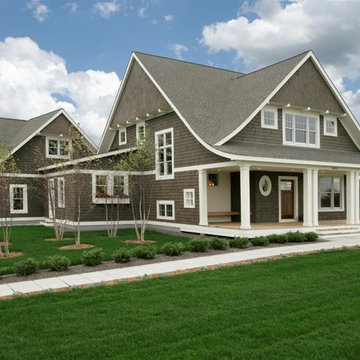
A Classic that will stand the test of time. - Cape Cod Shingle Style Home.
Photography: Phillip Mueller Photography
House plan is available for purchase at http://simplyeleganthomedesigns.com/Lakeland_Unique_Cape_Cod_House_Plan.html
1