


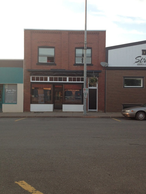
Desperately seeking exterior ideas
Lorraine Cassidy
10 years ago
Featured Answer
Sort by:Oldest
Comments (13)
 PRO
PROKevin Patrick O'Brien Architect, Inc.
10 years agoLorraine Cassidy thanked Kevin Patrick O'Brien Architect, Inc.- PRO
Kevin Patrick O'Brien Architect, Inc.
10 years agoLorraine Cassidy thanked Kevin Patrick O'Brien Architect, Inc. Related Professionals
Bayshore Gardens Architects & Building Designers · Glens Falls Architects & Building Designers · Los Alamitos Architects & Building Designers · Fox Lake Kitchen & Bathroom Designers · Hillsboro Kitchen & Bathroom Designers · Cedar Rapids Furniture & Accessories · Rome Furniture & Accessories · Fargo Furniture & Accessories · Discovery Bay Furniture & Accessories · Bellingham General Contractors · Harvey General Contractors · Jacinto City General Contractors · North Lauderdale General Contractors · Rowland Heights General Contractors · Saginaw General Contractors- PRO
Kevin Patrick O'Brien Architect, Inc.
10 years agoLorraine Cassidy thanked Kevin Patrick O'Brien Architect, Inc. - PRO
Kevin Patrick O'Brien Architect, Inc.
10 years agoLorraine Cassidy thanked Kevin Patrick O'Brien Architect, Inc.  PRO
PROScott Design, Inc.
10 years agolast modified: 10 years agoLorraine Cassidy thanked Scott Design, Inc.
Lorraine Cassidy
10 years ago- PRO
Kevin Patrick O'Brien Architect, Inc.
10 years agoLorraine Cassidy thanked Kevin Patrick O'Brien Architect, Inc. Lorraine Cassidy
10 years agopam
8 years agopam
8 years ago
Related Stories

UPHOLSTERYSeeking a Quiet, Relaxed Spot? Try Upholstering Your Walls
Upholstery can envelop an entire room, a framed panel or a single wall. See some design options and learn what to expect
Full Story
KITCHEN OF THE WEEKKitchen of the Week: Seeking Balance in Virginia
Poor flow and layout issues plagued this kitchen for a family, until an award-winning design came to the rescue
Full Story
LANDSCAPE DESIGNHow to Make Your Brick House Feel at Home in the Landscape
Use these tips to pull your home’s colors into your garden for a more cohesive exterior look
Full Story
CONTRACTOR TIPSBuilding Permits: The Submittal Process
In part 2 of our series examining the building permit process, learn what to do and expect as you seek approval for your project
Full Story
EXTERIORS8 Homes With Exterior Paint Colors Done Right
Get ideas for an exterior palette from these homes that run the gamut from Mediterranean to modern
Full Story
EXTERIORSWhere Front Yards Collide: Property Lines in Pictures
Some could be twins; others channel the Odd Couple. You may never look at property boundaries the same way again
Full Story
TRADITIONAL ARCHITECTUREHow to Research Your Home's History
Learn what your house looked like in a previous life to make updates that fit — or just for fun
Full Story
PETSWe Want to See the Most Creative Pet Spaces in the World
Houzz is seeking pet-friendly designs from around the globe. Get out your camera and post your photos now!
Full Story
ECLECTIC HOMESMy Houzz: Family’s Personal Style Warms Up a New House
A Northwest family seeks out a kid-friendly neighborhood and makes a ‘development home’ their own
Full Story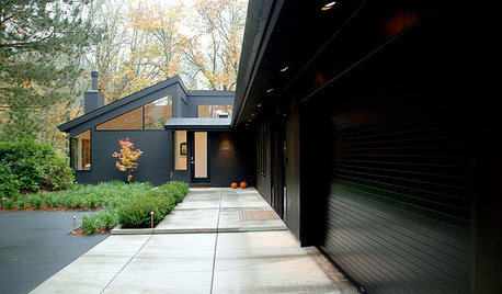
EXTERIOR COLOROn Trend: Bold and Black Exterior House Color
All-black and coal-gray exteriors make a nonconformist statement on homes of any style and size
Full Story


A Crew of Two