


Search results for "Business goals" in Home Design Ideas
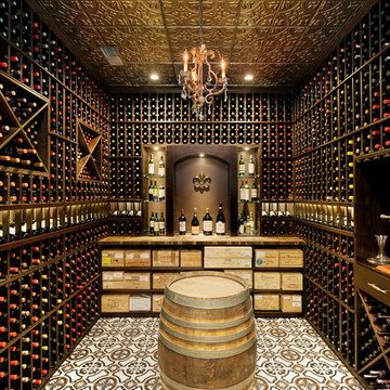
Custom Wine Cellar with ample storage
Wine cellar - traditional multicolored floor wine cellar idea in Chicago with storage racks
Wine cellar - traditional multicolored floor wine cellar idea in Chicago with storage racks
The goal in building this home was to create an exterior esthetic that elicits memories of a Tuscan Villa on a hillside and also incorporates a modern feel to the interior.
Modern aspects were achieved using an open staircase along with a 25' wide rear folding door. The addition of the folding door allows us to achieve a seamless feel between the interior and exterior of the house. Such creates a versatile entertaining area that increases the capacity to comfortably entertain guests.
The outdoor living space with covered porch is another unique feature of the house. The porch has a fireplace plus heaters in the ceiling which allow one to entertain guests regardless of the temperature. The zero edge pool provides an absolutely beautiful backdrop—currently, it is the only one made in Indiana. Lastly, the master bathroom shower has a 2' x 3' shower head for the ultimate waterfall effect. This house is unique both outside and in.
Find the right local pro for your project
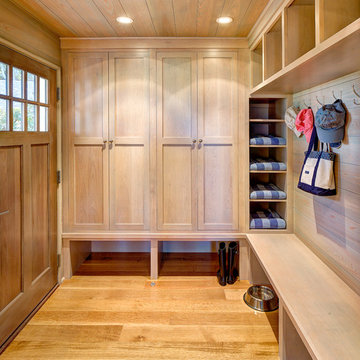
This light and airy laundry room/mudroom beckons you with two beautiful white capiz seashell pendant lights, custom floor to ceiling cabinetry with crown molding, raised washer and dryer with storage underneath, wooden folding counter, and wall paper accent wall
A remodeled retro kitchen mixed with a few original architectural elements of this Spanish home. Highlights here are aqua glazed lava stone counter tops, custom designed hand silk-screened fabrics, and children's art inside the upper cabinet panels. To know more about this makeover, please read the "Houzz Tour" feature article here: http://www.houzz.com/ideabooks/32975037/list/houzz-tour-midcentury-meets-mediterranean-in-california
Bernard Andre photography.
Living room - mid-sized contemporary formal and enclosed light wood floor and beige floor living room idea in Seattle with white walls
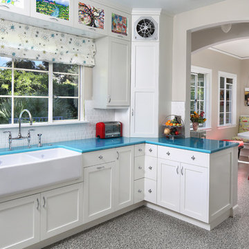
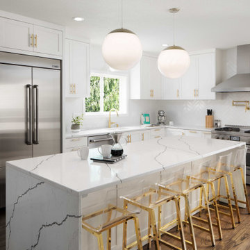
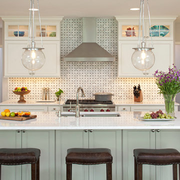
The owners of this kitchen had spent the money to upgrade the finishes in their kitchen upon building the home 12 years ago, but after living in the space for several years they realized how nonfunctional the layout really was. The (then) two preschool aged children had grown into busy, hungry teenagers with many friends who also liked to hang out at the house. So the family needed a more functional kitchen with better traffic flow, space for daily activities revolving around the kitchen at different times of day, and a kitchen that could accommodate cooking for and serving large groups. Furthermore, the dark, traditional finishes no longer reflected the homeowners’ style. They requested a brighter, more relaxed, coastal style that reflected their love of the seaside cities they like to visit.
Originally, the kitchen was U-shaped with a narrow island in the middle. The island created narrow aisles that bottle-necked at the dishwasher, refrigerator, and cooktop areas. There was a pass-through from the foyer into the kitchen, but the owners never liked that the pass-through was also located so close to the powder room. The awkward proximity was unappealing and made guests feel uncomfortable.
The kitchen’s storage was made up of lots of narrow cabinets, apothecary drawers, clipped corner units, and very few drawers. It lacked useful storage for the larger items the family used on a daily basis. And the kitchen’s only pantry was small closet that had only builder-grade, narrow shelving with no illumination to be able to see the contents inside.
Overall, the kitchen’s lighting plan was poorly executed. Only six recessed cans illuminated the entire kitchen and nook areas. The under cabinet lighting was not evenly distributed either. In fact, the builder had mis-placed the under cabinet lighting around the decorative pilasters which made for choppy, dark cubbies. Further, the builder didn’t include any lighting over the sink or the bar area, which meant whoever was doing the dishes was always in their own shadow. That, coupled with the steep overhang of the game room above made the bar area feel like a dim, cavernous space that wasn’t inviting or task oriented. The kitchen looked out into the main living space, but the raised bar and a narrow wall (which held the only large cabinet in the kitchen) created more of a barrier than a relationship to the living room or breakfast nook. In fact, one couldn’t even see the breakfast nook from the cooktop or sink areas due to its orientation. The raised bar top was too narrow to comfortably sit to either dine at or chat from due to the lack of knee space. The the homeowners confided that the kitchen felt more like a dark, dirty prison than place where the family, or their guests, wanted to gather and commune.
The clients' needs and desires were:
➢ to create a kitchen that would be a space the family loved to be in; to relate to the adjacent spaces all around, and to have better flow for entertaining large groups
➢ to remove the walls between the breakfast nook and living area and to be able to utilize the natural light from the windows in both those areas
➢ to incorporate a functional chopping block for prepping fresh food for home cooked meals, an island with a large sink and drain board, 2 pull out trash cans, and seating for at least the 2 teens to eat or do homework
➢ to design a kitchen and breakfast nook with an airy, coastal, relaxed vibe that blended with the rest of the house's coastal theme
➢ to integrate a layered lighting plan which would include ample general illumination, specific task lighting, decorative lighting, and lots of illuminated storage
➢ to design a kitchen with not only more storage for all the husband’s kitchen gadgets and collection of oils and spices, but smart storage, including a coffee/breakfast bar and a place to store and conceal the toaster oven and microwave
➢ to find a way to utilize the large open space between the kitchen, pantry area, and breakfast nook
Twelve Stones Designs achieved the owner's goals by:
➢ removing the walls between the kitchen and living room to allow the natural light to filter in from the adjacent rooms and to create a connection between the kitchen, nook, and living spaces for a sense of unity and communion
➢ removing the existing pantry and designing 3 large pantry style cabinets with LED tape lights and rollout drawers to house lots of kitchen appliances, gadgets, and tons of groceries. We also took the cabinets all the way up to the 9’ ceiling for additional storage for seasonal items and bulk storage.
➢ designing 2 islands - 1 with a gorgeous black walnut chopping block that houses a drawer for chopping and carving knives and a custom double pull out trash unit for point of use utilization - and 1 that houses the dishwasher, a large Blanco Gourmet sink with integrated drain board, woven baskets for fresh root vegetables and kitchen towels, plenty of drawer storage for kitchen items, and bar seating for up to 4 diners.
➢ closing off the space between the kitchen and the powder room to create a beautiful new private alcove for the powder room as well as adding some decorative storage. This also gave us space to include more tall storage near the new range for precision placement of the husband’s extensive oil and spice collection as well as a location for a combo-steam oven the wife wanted for baking and cooking healthy meals.
The project is enhanced functionally by:
➢ incorporated USB and standard receptacles for the kids’ laptops and phone charging in the large island
➢ designing the small island to include additional open shelving for items used on a daily basis such as a variety of bowls, plates, and colanders. This set up also works well for the husband who prefers to “plate” his dinners in restaurant-style fashion before presenting them to the table.
➢ the integration of specific storage units, such as double stacked cutlery drawers, a custom spice pull-out, a Kuerig coffee and tea pod drawer, and custom double stacked utensil drawers
➢ moving the refrigerator to the old oven location - this eliminated the bottle neck as well as created a better relationship to the eating table. It also utilizes the floor space between the pantry, nook, and kitchen
➢ creating a banquet style breakfast nook - this banquette seating not only doubles the amount of seating for large gatherings but it better utilizes the odd space between the kitchen and the previous nook area. It also helps to create a distinct pathway from the mudroom room through the pantry area, kitchen, nook, and living room.
➢ the coffee/breakfast bar area which includes the perfect location for the concealed microwave and toaster oven, convenient storage for the coffee pods and tea accoutrements. Roll-out drawers below also house the smoothie maker, hot water kettle, and a plethora of smoothie-making ingredients such as protein powders, smoothie additives, etc. Furthermore, the drawers below the Keurig house measuring utensil, cutlery, baking supplies and tupperware storage.
➢ incorporating lots of wide drawers and pullouts to accommodate large cookware.
➢ utilizing as much vertical space as possible by building storage to the ceiling which accommodates the family’s abundant amount of serving platters, baking sheets, bakeware, casserole dishes, and additional cutting boards.
The project is enhanced aesthetically by:
➢ new 5-piece Versailles pattern porcelain tile that now seamlessly joins the entire down stairs area together creating a bright, cohesiveness feeling instead of choppy separated spaces - it also adds a coastal feeling
➢ designing a cabinet to conceal the microwave and toaster oven
➢ the coastal influenced light fixtures over the nook table and island
➢ the sandy colors of the Langdon Cambria countertops. The swirling pattern and sparkling quartz pieces remind the homeowner of black-and-tan sandy beaches
➢ the striped banquet seating whose creamy white background and blue-green stripes were the inspiration for the cabinet and wall colors.
➢ All the interior doors were painted black to coordinate with the blacks and grays in the backsplash tile and countertop. This also adds a hint of tailored formality to an otherwise casual space.
➢ the use of WAC's Oculux small aperture LED units for the overhead lighting complimented with Diode LED strips for task lighting under the cabinets and inside the pantry and glass wall cabinets. All of the lighting applications are on separate dimmer switches.
Innovative uses of materials or construction methods by Realty Restoration LLC:
➢ Each 1-1/2” x 3” block of reclaimed end-grain black walnut that makes up the center island chopping block was hand milled and built in the shop. It was designed to look substantial and proportional to the surrounding elements, executed by creating the 4 inch tall top with a solid wood chamfered edge band.
➢ The metal doors on either side of the vent hood were also custom designed for this project and built in the Realty Restoration LLC shop. They are made 1x2, 11-gauge mild steel with ribbed glass. Weighing 60 lbs a piece, heavy duty cabinet hinges were added to support the weight of the door and keep them from sagging.
➢ Under-cabinet receptacles were added along the range wall in order to have a clean, uninterrupted backsplash.
Design obstacles to overcome:
➢ Because we were removing the demising walls between the kitchen and living room, we had to find a way to plumb and vent the new island. We did this by tunneling through the slab (the slab had post tension cables which prevented us from just trenching) to run a new wet vent through a nearby structural wall. We pulled the existing hot and cold lines between upper floor joists and ran them down the structural wall as well and up through a conduit in the tunnel.
➢ Since we were converting from wall overs to a gas range it allowed us to utilize the 220 feed for the wall ovens to provide a new sub panel for all the new kitchen circuits
➢ Due to framing deficiencies inherited from the original build there was a 1-1/2” differential in the floor-to-ceiling height over a 20 foot span; by utilizing the process of cutting and furring coupled with the crown moulding details on the cabinet elevations we were able to mask the problem and provide seamless transitions between the cabinet components.
Evidence of superior craftsmanship:
➢ uniquely designed, one-of-a-kind metal “X” end panels on the large island. The end panels were custom made in the Realty Restoration LLC shop and fitted to the exact dimensions of the island. The welding seams are completely indistinguishable - the posts look like they are cut from a single sheet of metal
➢ square metal posts on the small island were also custom made and designed to compliment and carry through the metal element s throughout the kitchen
➢ the beautiful, oversized end panels on the pantry cabinets which give the breakfast nook a tailored look
➢ integrating a large format 5 piece Versailles tile pattern to seamlessly flow from the existing spaces into the new kitchen space
➢ By constructing a custom cabinet that jogged around a corner we could not remodel (housing the entry way coat closet) we were able to camouflage the adjacent wall offset within the upper and lower cabinets. By designing around the existing jog in the structural walls we accomplished a few things: we were able to find the space to house, and hide, the microwave and toaster oven yet still have a clean cohesive appearance from the kitchen side. Additionally, the owners were able to keep their much needed coat closet and we didn’t have to increase the budget with unnecessary structural work.

Sponsored
Columbus, OH
8x Best of Houzz
Dream Baths by Kitchen Kraft
Your Custom Bath Designers & Remodelers in Columbus I 10X Best Houzz
“We could never have envisioned what could be” – Steiner Ranch Homeowner and Client
It is an especially fulfilling Project for an Interior Designer when the outcome exceeds Client expectations, and imagination. This remodeling project required instilling modern sensibilities, openness, styles and textures into a dated house that was past its prime. Strategically, the goal was to tear down where it made sense without doing a complete teardown.
Starting with the soul of the home, the kitchen, we expanded out room by room to create a cohesiveness and flow that invites, supports and provides the warmth and relaxation that only a home can.
In the Kitchen, we started by removing the wooden beams and adding bright recessed lighting. We removed the old limestone accent wall and moved the sink and cooktop from the island on to the countertop – the key goal was to create room for the family to gather around the kitchen. We replaced all appliances with modern Energy Star ones, along with adding a wine rack.
The first order of business for the Living Room was to brighten it up by adding more lighting and replacing an unused section with a glass door to the backyard. Multi-section windows were replaced with large no-split glass overlooking the backyard. Once more, the limestone accent was removed to create a clean, modern look. Replacing the dated wooden staircase with the clean lines of a metal, wire and wooded staircase added interest and freshness. An odd bend in the staircase was removed to clean things up.
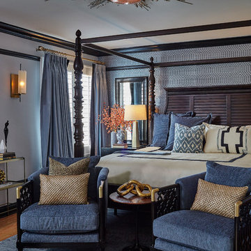
The Master Bedroom went from what looked like a motel room with green carpet and cheap blinds to an oasis of luxury and charm. A section of the wraparound doors were closed off to increase privacy, accentuate the best view from the bedroom and to add usable space. Artwork, rug, contemporary bed and other accent pieces brought together the seamless look across the home.
The Master Bathroom remodel started by replacing the standard windows with a single glass pane that enhanced the view of the outdoors. The dated shower was replaced by a walk-in shower and soaking tub to create the ultimate at-home spa experience. Lighted LED mirrors frame His & Hers sinks and bathe them in a soft light.
The flooring was upgraded throughout the house to reflect the contemporary color scheme.
Each of the smaller bedrooms were similarly upgraded to match the clean and modern décor of the rest of the house.
After such a transformation inside, it was only appropriate that the exterior needed an upgrade as well. All of the legacy limestone accents were replaced by stucco and the color scheme extended from the interior of the house to the gorgeous wrap around balconies, trim, garage doors etc. to complete the inside outside transformation.
Our clients, Erica + Luca, are a power couple each running their own businesses, and for the past six years have also been social parents raising two boys. Their home sits hillside, adjacent to a green space where they have beautiful views, but limited access to enjoy the outdoors. Introspecs created an interior space plan which opens the main level rooms to one another, to both increase visual sight lines + allow separate activities to take place simultaneously. Our goal was to maintain a family-focused house with a large in-kitchen eating island + tons of pantry storage while still honoring adult cocktail hour + entertaining friends. We translated their edgy Euro taste into the finishes which beautifully dresses up the functional layout + resonates with their lifestyle.
Designed and Built by Sacred Oak Homes
Photo by Stephen G. Donaldson
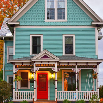
Inspiration for a victorian blue three-story wood exterior home remodel in Boston with a shingle roof
Inspiration for a victorian blue three-story wood exterior home remodel in Boston with a shingle roof
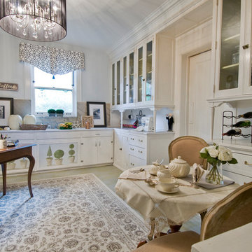
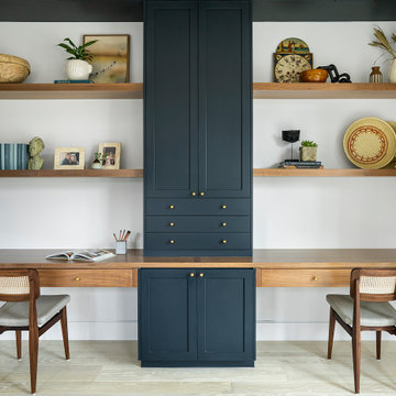
This 1920's era home had seen better days and was in need of repairs, updates and so much more. Our goal in designing the space was to make it functional for today's families. We maximized the ample storage from the original use of the room and also added a ladie's writing desk, tea area, coffee bar, wrapping station and a sewing machine. Today's busy Mom could now easily relax as well as take care of various household chores all in one, elegant room.
Michael Jacob--Photographer
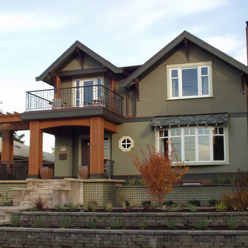
Example of a large arts and crafts green two-story mixed siding exterior home design in Seattle
Aliza Schlabach Photography
Dining room - mid-sized transitional medium tone wood floor dining room idea in Philadelphia with white walls and no fireplace
Dining room - mid-sized transitional medium tone wood floor dining room idea in Philadelphia with white walls and no fireplace
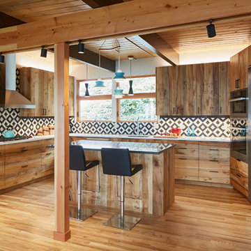
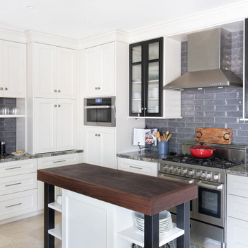
This kitchen pays tribute to the owner's love of wood and craft woodworking.
Sally Painter Photography
Kitchen - mid-sized rustic u-shaped medium tone wood floor and beige floor kitchen idea in Portland with an undermount sink, flat-panel cabinets, medium tone wood cabinets, quartz countertops, multicolored backsplash, cement tile backsplash, stainless steel appliances and an island
Kitchen - mid-sized rustic u-shaped medium tone wood floor and beige floor kitchen idea in Portland with an undermount sink, flat-panel cabinets, medium tone wood cabinets, quartz countertops, multicolored backsplash, cement tile backsplash, stainless steel appliances and an island
Trendy formal and enclosed medium tone wood floor, brown floor and wallpaper living room photo in New York with blue walls, a standard fireplace and a stone fireplace
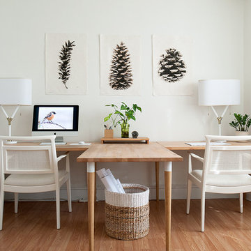
shared desk space for designer and assistant
Photo by Rebecca McAlpin
Study room - mid-sized transitional freestanding desk medium tone wood floor and beige floor study room idea in Philadelphia with white walls
Study room - mid-sized transitional freestanding desk medium tone wood floor and beige floor study room idea in Philadelphia with white walls
Showing Results for "Business Goals"
Sponsored
Columbus, OH
The Creative Kitchen Company
Franklin County's Kitchen Remodeling and Refacing Professional
Dresner Design possesses the expertise to design cutting edge, cost-effective kitchens, baths and closets for developer’s multi-unit projects. They were recently part of the design team for The Ronsley, River North's best new luxury condominium development.
This former industrial timber loft building was transformed into an incredible 41-unit building, and Dresner Design was hired to design both the kitchens and baths using Italian cabinetry from Stosa Cucine.
Challenges:
All the units were the same but with varying configurations. The goal was to make all the units feel and look the same but each of the layouts was different- making 30 layouts in all.
Concept:
The kitchens and baths were designed to be sleek and modern, blending in with the loft style. The kitchen islands fabricated with wood compliments the wood ceilings and beams typical of loft living. White kitchens are always timeless and the Ronsley used the most beautiful and high-end cabinetry made of 100% lacquer.
Photography by Jim Tschetter
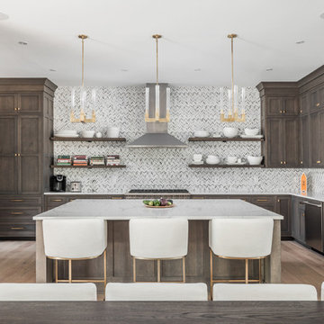
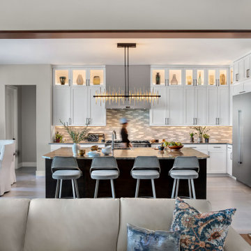
A sophisticated yet relaxed home for a busy family. Designed with the goal of unifying the spaces, the kitchen, family room, and dining rooms are the heart of this home. White cabinetry and a gorgeous tile pattern are easily blended with stainless accents to create a fresh, easy home, great for entertaining family and friends.
Landmark Photography
Learn more about our showroom and kitchen and bath design: http://www.mingleteam.com
Inquire About Our Design Services
When we first started talking in the spring of 2015, I was impressed. She was witty, realistic, and understood that as much as she loves my shows on HGTV, design does not does not happen in 43 minutes! She told me about her space, and how she felt that her bedroom seemed “blah” to her. She had no retreat. Molly desperately longed for a place that she could spend time in, read in, play in and above all, relax in.
What we did:
Many people are terrified of hiring a designer. Rightfully so, they are investing a pretty penny in their homes. They want to make sure that everything, down to the last floral arrangement, is to their liking, because they will have to live it (and pay for it). Unfortunately, a client can unintentionally stifle a designer’s creativity through micro-management. This can produce lackluster results and ultimately cause more time (and money) to be spent on a project than is really necessary.
With Molly, that was never an issue. Before she even showed me the room in question, she said that I could have full creative license to do what I needed to do to her bedroom. SAY WHAAH!?
With Molly giving me complete creative freedom, I planned everything out and got down to business. The result: Bite-your-bottom-lip sexy. I don’t get jealous of too many of my clients’ spaces, but this one still takes my breath away every time I look at the pics!
The craziest part was that by adding more furniture, it actually made the space feel larger.
Molly and her husband Patrick loved the finished space, and promised me I will be back to finish the rest of the house!
Here’s the highlights of the rest of the project:
I came up with a space plan with three options.
Next, we reviewed mood boards and fabric schemes that would work for both Molly and her hubby Patrick.
We started with the bed. My goal was to add edge to its otherwise traditional style.
We decided to spice things up by painting the trim work in the room black.
We built in layers of lighting with dimmers. In a bedroom everything should be on dimmers, right? Right.
We designed and customized bedding, chairs and window treatments.
Together with Molly, we selected the most perfect wallpaper. This geometric “grasscloth” adds so much depth and dimension that was just missing before.
What I love:
That light fixture. I mean it is really, really amazing in person.
The porcupine mirror. This thing came packaged like it was the hope diamond, and everyone was terrified to handle it. But it really became a highlight of the room.
3