


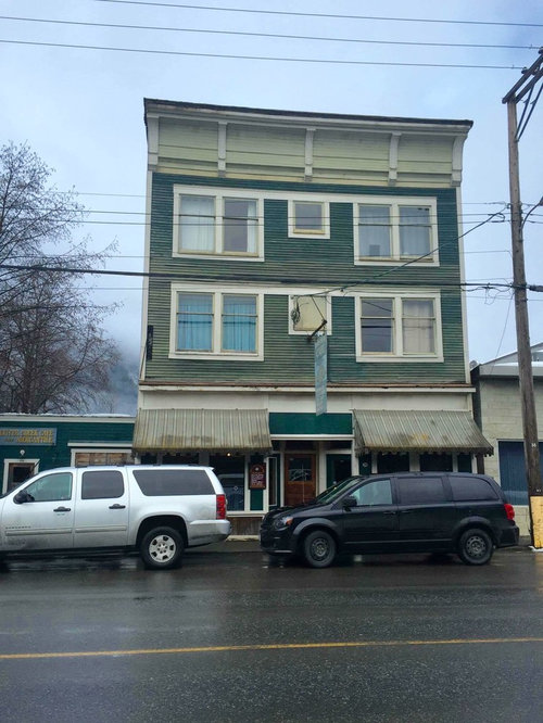
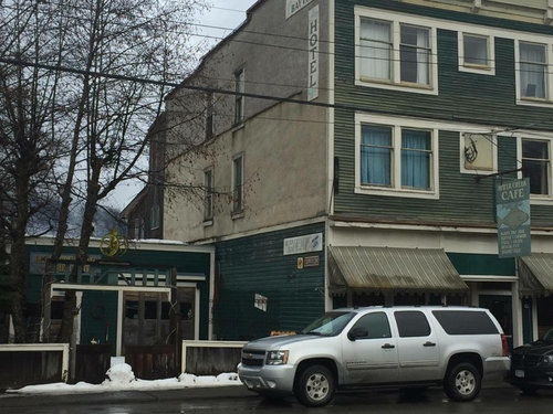
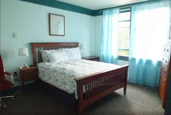
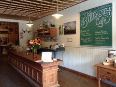
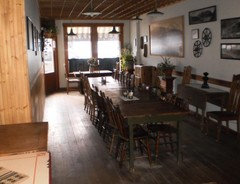
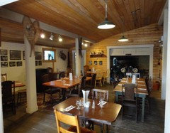
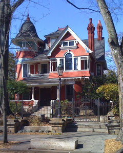
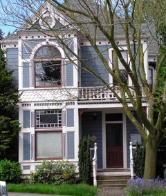
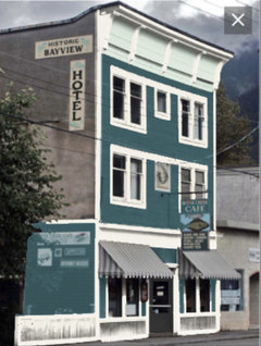
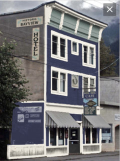
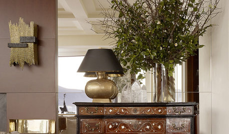
Little Hotel
shauney22
8 years ago
Featured Answer
Sort by:Oldest
Comments (59)

shauney22
8 years agolefty47
8 years agolast modified: 8 years agoRelated Professionals
Bonney Lake Architects & Building Designers · Haslett Kitchen & Bathroom Designers · Medford Furniture & Accessories · Skokie Furniture & Accessories · Surprise Furniture & Accessories · San Elizario Furniture & Accessories · The Crossings General Contractors · Arizona City General Contractors · Buena Park General Contractors · Exeter General Contractors · Foothill Ranch General Contractors · Irving General Contractors · North New Hyde Park General Contractors · Rossmoor General Contractors · Spencer General Contractorsshauney22
8 years agoshauney22
8 years agoUser
8 years agoshirlpp
8 years agoUser
8 years agolast modified: 8 years agosusiesworld
8 years ago
Lois P
8 years agoshirlpp
8 years ago
Rusty Empire
8 years agolast modified: 8 years ago PRO
PROFinstads Carpet One
8 years agolefty47
8 years ago- PRO
Finstads Carpet One
8 years ago 
robin701
8 years agoUser
8 years agoMelissa
8 years ago
terry toon
8 years agoCandy T
8 years agoshauney22
8 years agoRusty Empire
8 years agoCandy T
8 years agoshauney22
8 years agoshauney22
8 years ago
lynartist
8 years agoshauney22
8 years ago
jjuchli
8 years agomramsey
8 years agolast modified: 8 years agorobin701
8 years agocramps36
8 years ago PRO
PROUser
8 years agosquirrelyq
8 years agosquirrelyq
8 years agoRusty Empire
8 years agolast modified: 8 years agoUser
8 years agomarywhanson
8 years ago
groveraxle
8 years agoterry toon
8 years ago- PRO
Finstads Carpet One
8 years ago shauney22
8 years agoUser
8 years ago
Irene Morresey
8 years agoer612
8 years agoUser
8 years ago- PRO
Patricia Colwell Consulting
8 years ago  PRO
PROArocordis Design
8 years agojjuchli
8 years agoUser
8 years ago- PRO
Finstads Carpet One
8 years ago


Related Stories
DECORATING GUIDESTravel Takeaways: Decorating Lessons From a Lavish Paris Hotel
Bring Belle Époque style home with rich colors, courageous patterns and textures, and an unmistakable sense of individuality
Full Story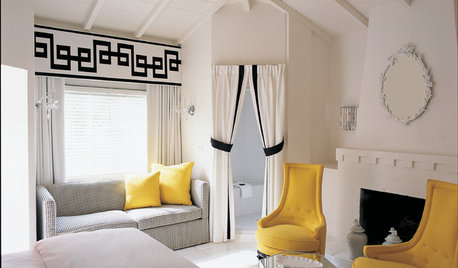
TRAVEL BY DESIGNTravel in Style: 10 Designer Hotels to Inspire You
Pick up some decorating ideas or just revel in the decor and furnishings of these eye-popping hotels by famous designers
Full Story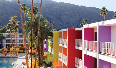
COLORColor Me Dazzled: The Saguaro Hotel in Palm Springs
No dusty neutrals for this desert hideaway — The Saguaro hotel revels in electrifying color from every arc of the rainbow
Full Story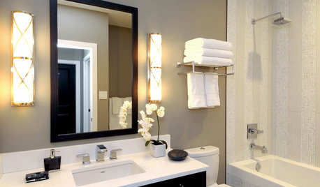
BATHROOM DESIGNYour Bath: Hotel-Style Towel Racks
Get the Great Look of an Upscale Hotel's Wall-Mounted Towel Shelf
Full Story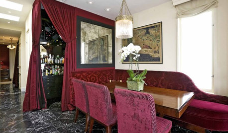
Yes, Please: Parisian Hotel Flair
Bring on the Bling to Recreate the City of Romance at Home
Full Story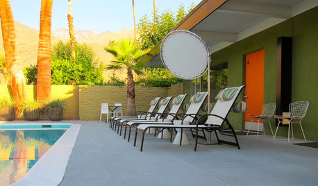
TRAVEL BY DESIGNMaking New Memories at a Midcentury Palm Springs Hotel
Travel back in time at the restored Desert Star while you’re visiting for Modernism Week
Full Story
HOUZZ TOURSHouzz Tour: Boutique Hotel Style Reigns in Raleigh
Sleek style and comfort emerge from an unfortunate architectural mishmash, and even the dog comes out ahead
Full Story
BEFORE AND AFTERSA Chilly Massachusetts Bathroom Gets the Hotel-Spa Treatment
Luxurious details including a steam shower and radiant-heat flooring create a relaxing private master bathroom for a couple
Full Story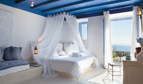
TRAVEL BY DESIGNHotel to Home: Capture a Greek Haven's Divine Design
Bliss and style get along swimmingly at Mykonos Blu resort in Greece, with aquatic colors, breezy decor and incredible views
Full Story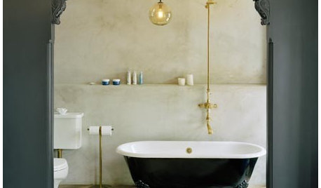
GLAM STYLEAdd a Little Gothic Glamour, Chateau Marmont Style
Vintage-Chic Styling Ideas Inspired by Sophia Coppola's "Somewhere"
Full Story


shauney22Original Author