


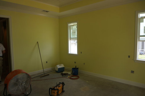
Cannot decide on paint color for Master Bedroom Need color help!
mgm1441
10 years ago
last modified: 10 years ago


Featured Answer
Sort by:Oldest
Comments (18)
 PRO
PROGantt's Decorating
10 years ago- PRO
Gantt's Decorating
10 years ago Related Professionals
Dania Beach Architects & Building Designers · White Oak Architects & Building Designers · Rancho Mirage Kitchen & Bathroom Designers · Franklin Furniture & Accessories · Thousand Oaks Furniture & Accessories · Walnut Creek Furniture & Accessories · Chino Hills Furniture & Accessories · Little Chute Furniture & Accessories · Rogers Furniture & Accessories · Temple Terrace Furniture & Accessories · Cottage Grove General Contractors · Decatur General Contractors · DeRidder General Contractors · Palestine General Contractors · Rolling Hills Estates General Contractors
mgm1441
10 years ago
elcieg
10 years agolast modified: 10 years agocalidesign
10 years ago- PRO
Gantt's Decorating
10 years ago elcieg
10 years agolast modified: 10 years agobellesum
10 years ago
Melissa E
10 years ago
vjs12
10 years ago
DIAspoton
10 years ago- PRO
Gantt's Decorating
10 years ago 
decoenthusiaste
10 years agomariaed
10 years agolast modified: 10 years agomariaed
10 years agolast modified: 10 years ago PRO
PROLana Chu
9 years agolast modified: 9 years agoamykinsinbatavia
6 years ago

Related Stories

COLORPick-a-Paint Help: How to Create a Whole-House Color Palette
Don't be daunted. With these strategies, building a cohesive palette for your entire home is less difficult than it seems
Full Story
COLORPick-a-Paint Help: How to Quit Procrastinating on Color Choice
If you're up to your ears in paint chips but no further to pinning down a hue, our new 3-part series is for you
Full Story
SMALL SPACESDownsizing Help: Where to Put Your Overnight Guests
Lack of space needn’t mean lack of visitors, thanks to sleep sofas, trundle beds and imaginative sleeping options
Full Story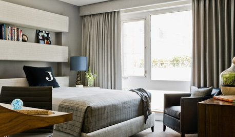
BEDROOMS10 Stylish Bedrooms With a Decidedly Masculine Vibe
Cut the fluff and get right to the point with crisper edges, toned-down colors and a whole lot less stuff
Full Story
EXTERIORSHelp! What Color Should I Paint My House Exterior?
Real homeowners get real help in choosing paint palettes. Bonus: 3 tips for everyone on picking exterior colors
Full Story
LIFEHow to Decide on a New Town
These considerations will help you evaluate a region and a neighborhood, so you can make the right move
Full Story
COLORPaint-Picking Help and Secrets From a Color Expert
Advice for wall and trim colors, what to always do before committing and the one paint feature you should completely ignore
Full Story
Storage Help for Small Bedrooms: Beautiful Built-ins
Squeezed for space? Consider built-in cabinets, shelves and niches that hold all you need and look great too
Full Story
UNIVERSAL DESIGNMy Houzz: Universal Design Helps an 8-Year-Old Feel at Home
An innovative sensory room, wide doors and hallways, and other thoughtful design moves make this Canadian home work for the whole family
Full Story
BATHROOM WORKBOOKStandard Fixture Dimensions and Measurements for a Primary Bath
Create a luxe bathroom that functions well with these key measurements and layout tips
Full Story


Keitha